
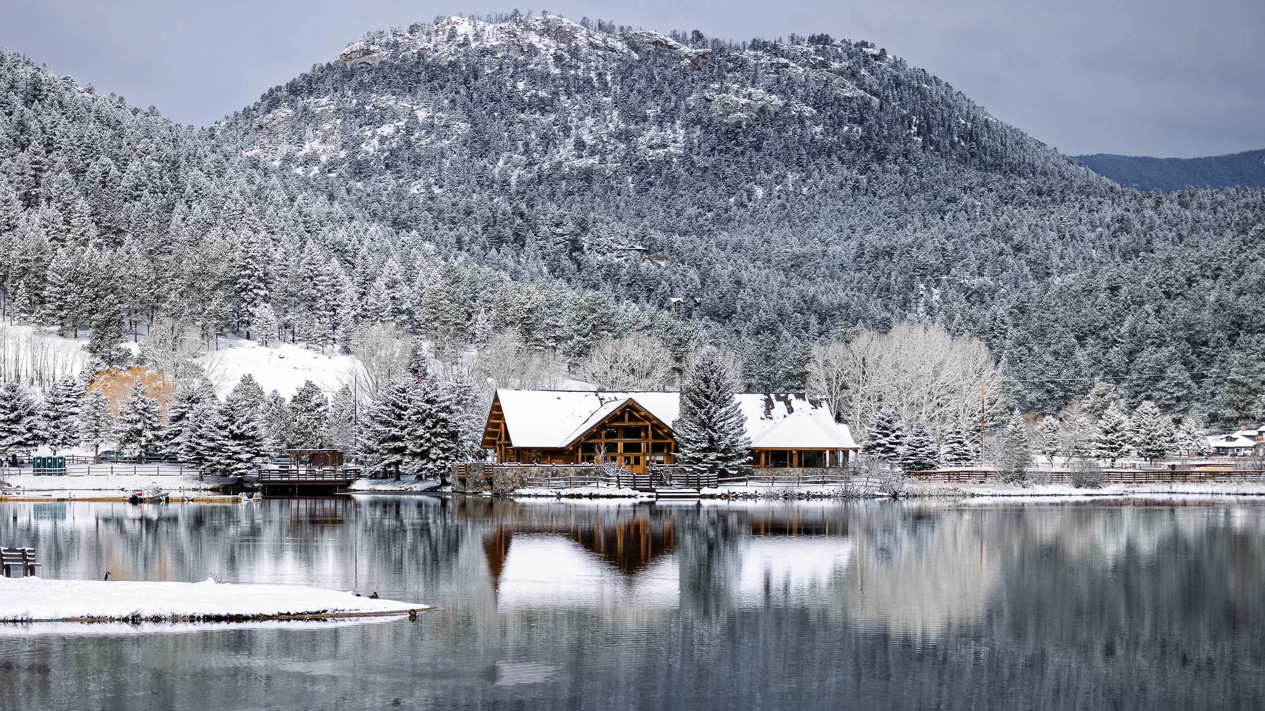
Commercial Photography & Fine Art for Professional Spaces
Commercial Fine Art Photography Licensing
Beyond Documentation — Visual Language for the Built Environment
Commercial spaces communicate before anyone says a word. The artwork on the walls, the quality of the photography in the presentation deck, the visual identity of a lobby or boardroom — these are not decorative decisions. They are strategic ones. I work with architects, interior designers, developers, corporate clients, and project teams to provide fine art imagery and commercial photography that elevates professional environments and communicates their character with intention.
Purposeful Atmosphere: My work is intentionally quiet and restrained, helping to reduce visual noise in high-traffic or high-stress environments.
Versatility in Scale: Whether you need a singular focal point for a lobby or a curated gallery wall for an office suite, my collections are designed to maintain aesthetic integrity at any size.
Technical Precision: With a background in precise architectural work, I ensure that all perspective and lighting details meet the high standards of design professionals.
What I Provide
Curated Fine Art for Commercial Interiors
Access to the full Fine Art Gallery for large-scale licensed prints suitable for corporate lobbies, office suites, boardrooms, and hospitality installations. The collections span western Americana, atmospheric landscapes, industrial documentary, European architectural studies, and botanical work — giving design teams a range of tonal registers and subject matter to work with across multiple spaces and contexts. Custom sizing available for site-specific installations on ChromaLuxe® Metal, TruLife Acrylic, and Photo Rag paper, and Wood.
Architectural & Commercial Photography
High-resolution interior and exterior photography that honors your design intent. Whether documenting a completed project for a portfolio submission, capturing construction milestones, or creating imagery for marketing and leasing materials, I bring the same disciplined eye to commercial assignments that defines my fine art practice. Perspective and lighting are treated with the precision that design professionals require.
Purposeful Atmosphere
My work is intentionally quiet and restrained — reducing visual noise in high-traffic or high-stress environments rather than adding to it. This makes the collections particularly effective in corporate, healthcare, and hospitality settings where calm, permanence, and visual restraint are priorities.
Versatility in Scale
Whether you need a singular focal point for a lobby, a curated gallery wall for an office suite, or consistent imagery across multiple locations, my collections maintain aesthetic integrity at any size — from intimate 16×20 paper prints to 60×40 large-format metal installations.
Regional Identity
My portfolio is deeply rooted in Missouri, Colorado, and the broader American West and Midwest. For regional clients seeking artwork that speaks to local geography and cultural identity — from the limestone bluffs of the Missouri River to the high-altitude light of the Colorado Rockies — the collections offer a specific sense of place that generic stock imagery cannot replicate.
Industries Served
Corporate offices · Law firms · Financial institutions · Real estate developers · Senior living communities · Mixed-use hospitality · Co-working environments · University and civic spaces
Let’s Discuss Your Project

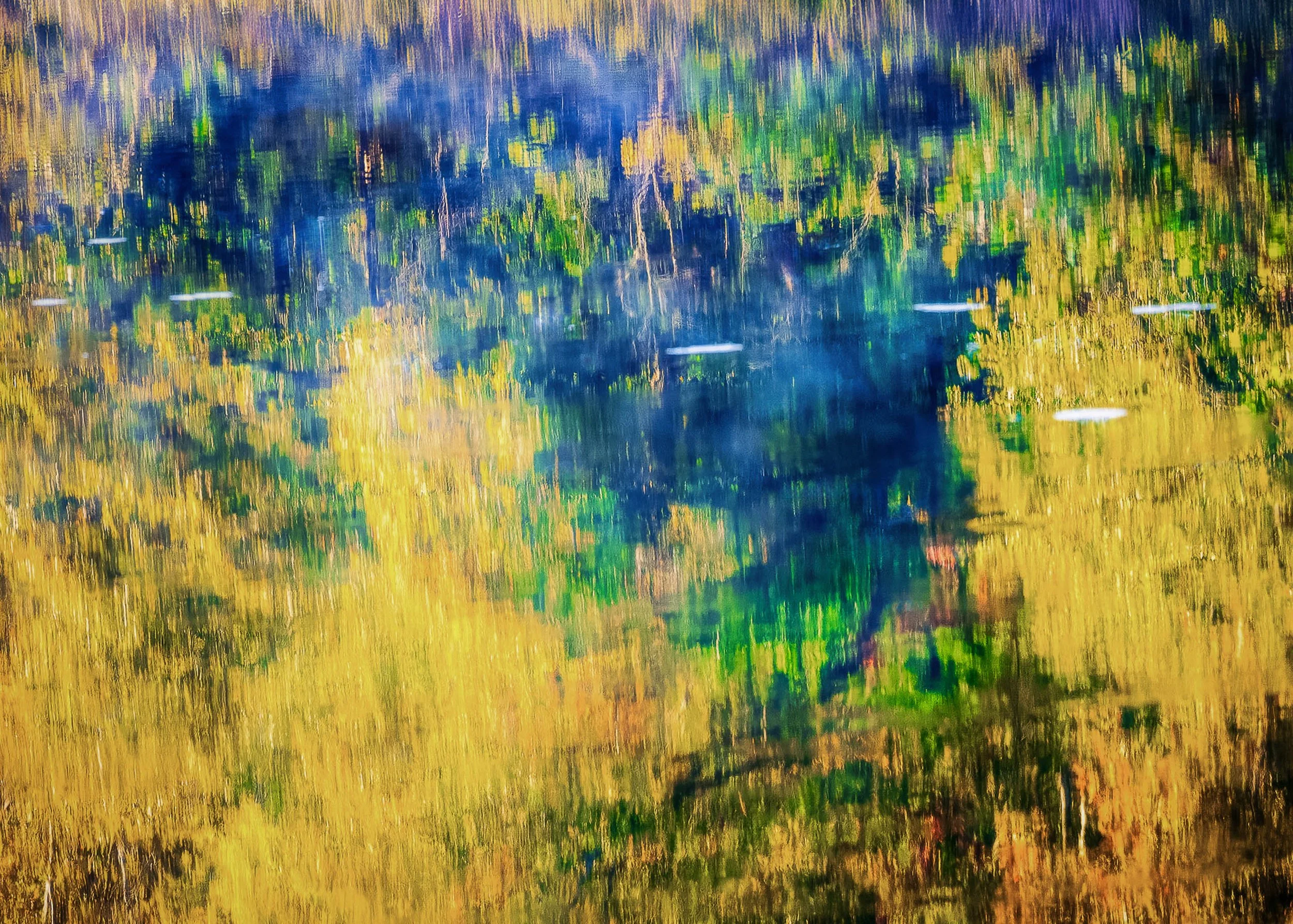
Reflections of Fall is an atmospheric landscape study exploring color, reflection, and the quiet stillness of autumn light. Captured during peak seasonal transition, the photograph transforms reflected trees, layered foliage, and softened water movement into a contemplative composition of luminous golds, muted greens, and deep shadow tones. Drawing from the painterly color sensibilities of Ernst Haas and the restrained pacing of reflective landscape photography, the image emphasizes atmosphere, abstraction, and the emotional calm created when light and water briefly align.
The composition balances mirrored reflections against subtle movement within the water surface, allowing the scene to function simultaneously as landscape and abstraction. Rather than documenting autumn literally, the photograph focuses on the shifting visual rhythm created through reflection, color layering, and softened natural texture. The resulting image explores stillness, seasonal transition, and the quiet emotional resonance often found in fleeting moments of reflected light.
Water turns a bank of trees into an abstract painting. The reflection softens edges, stretches color vertically, and lets a light breeze rewrite the surface as brushwork. Autumn's short peak makes it the season for it.
Design & Styling
The golden reflections and layered foliage of Reflections of Fall bring autumn warmth to living rooms, dining rooms, offices, and hospitality spaces. Its soft, abstract quality suits modern and traditional rooms alike.
Curated Pairings
To create a cohesive gallery presentation around reflection and autumn color, consider these companion pieces:
For reflective atmosphere: Pair with Reflections of Glass and Stone, extending the visual dialogue between reflection, abstraction, and layered surface textures.
For seasonal pacing: Complement this piece with Where the Light Gathered (Panorama), sharing the same restrained atmospheric transitions and contemplative visual rhythm.
For autumn light: Pair with Canopy of Amber and Sky, backlit autumn foliage in Tower Grove Park, the same season seen from below.
Fine Art Presentation
Available as a signed fine art print on ChromaLuxe® Metal (gloss, semi-gloss, or matte), Glossy Anti-Glare Acrylic (TruLife), canvas, wood, and archival paper (framed or unframed). Acrylic is the recommended presentation: its depth and luminosity carry the layered golds, greens, and water reflections. ChromaLuxe® Metal is the alternative for crisper color and edges.
Note: Custom and oversized photographic prints are available. Please contact the studio directly to discuss custom framing, matting, or specialized museum glass options.
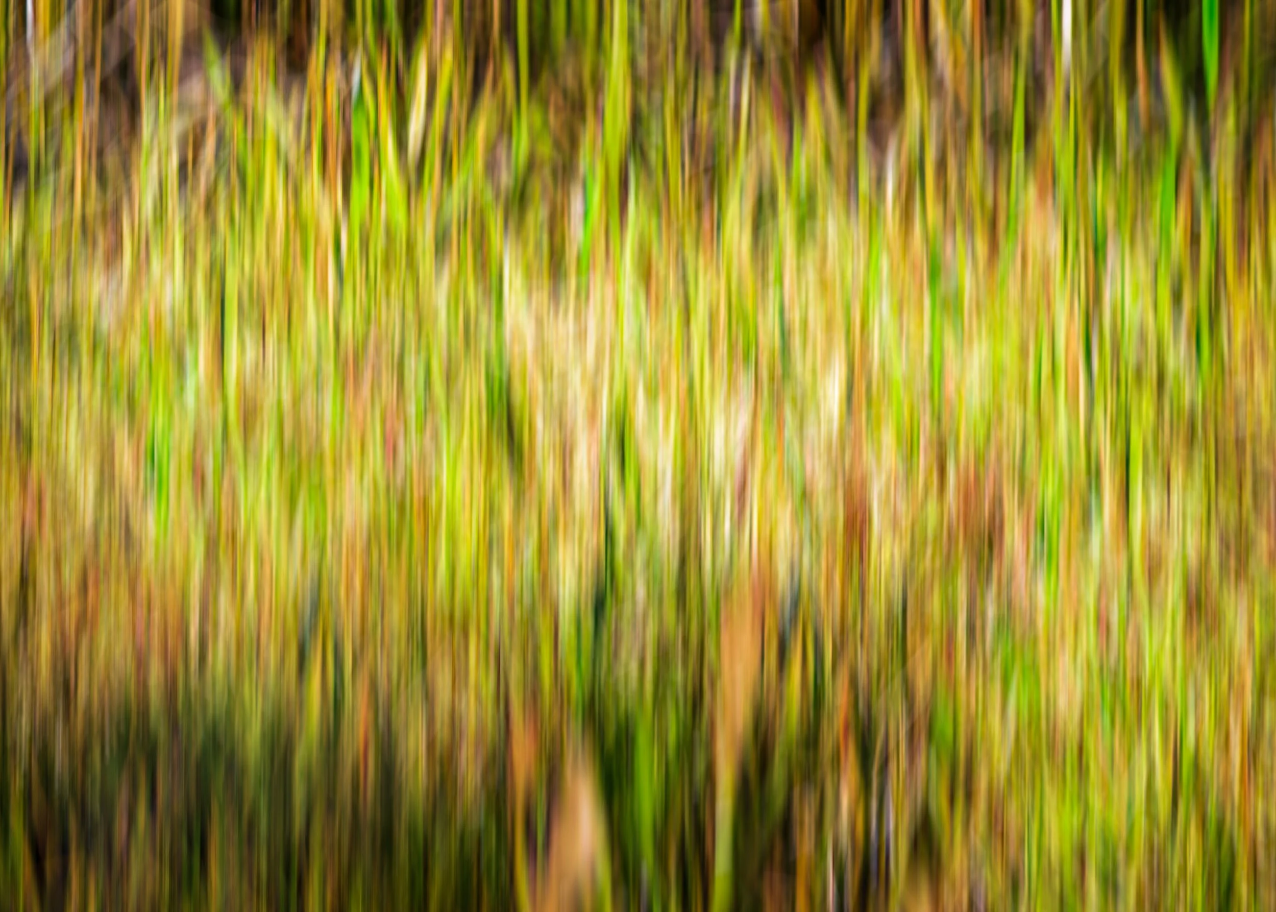
Woven Gold turns a stand of tall grass into pure rhythm and color through intentional camera movement — each blade rendered as a vertical streak of green, gold, amber, and rust, woven together into a single continuous field of motion. Rather than documenting the grass itself, the image captures the feeling of light moving through it: warm, alive, and in constant, gentle motion.
The palette shifts naturally across the frame, from deeper olive passages to a pale, sunlit patch left of center, giving the eye places to rest within the overall movement. It's a piece built entirely on color and rhythm rather than subject — abstraction in service of feeling rather than place.
Intentional camera movement is a discipline of chance. The camera is moved during a slow exposure, and a stand of grass becomes a set of parallel strokes: the photographer controls the direction, the speed, and the moment, and the light supplies the rest. Vertical movement keeps the grass upright as a streak, so the image still reads as a field, only felt rather than seen.
Color does the work that detail usually does: olive at the edges, gold and amber through the middle, rust where the strokes deepen, and one pale sunlit patch left of center that reads like a clearing. The tradition it belongs to runs from the color abstractions of Ernst Haas, who turned motion into color, to the Impressionist habit of painting the light rather than the object.
Design & Styling
With its warm, harmonious palette and calming abstract movement, Woven Gold is especially well suited to healthcare and hospitality environments seeking a restorative, non-representational piece — as well as contemporary residential and corporate spaces looking for color and energy without a literal subject.
Curated Pairings
To build a wall around intentional camera movement and abstract color, consider these companion pieces:
For a shared technique: Pair with Aspen Curtain, another ICM study built on vertical rhythm and color.
For a shared journey: Complement with The Long Way to Long Lake, an ICM study of the trail toward Long Lake near Crested Butte.
Fine Art Presentation
Available as a signed fine art print in ChromaLuxe® Metal (gloss, semi-gloss, or matte), framed paper, framed canvas, and acrylic presentation formats. To preserve the richness of the color transitions, ChromaLuxe® Metal or Acrylic presentation is recommended, and this piece works especially well at larger scale.
Note: Custom and oversized photographic prints are available. Please contact the studio directly to discuss custom framing, matting, or specialized museum glass options.
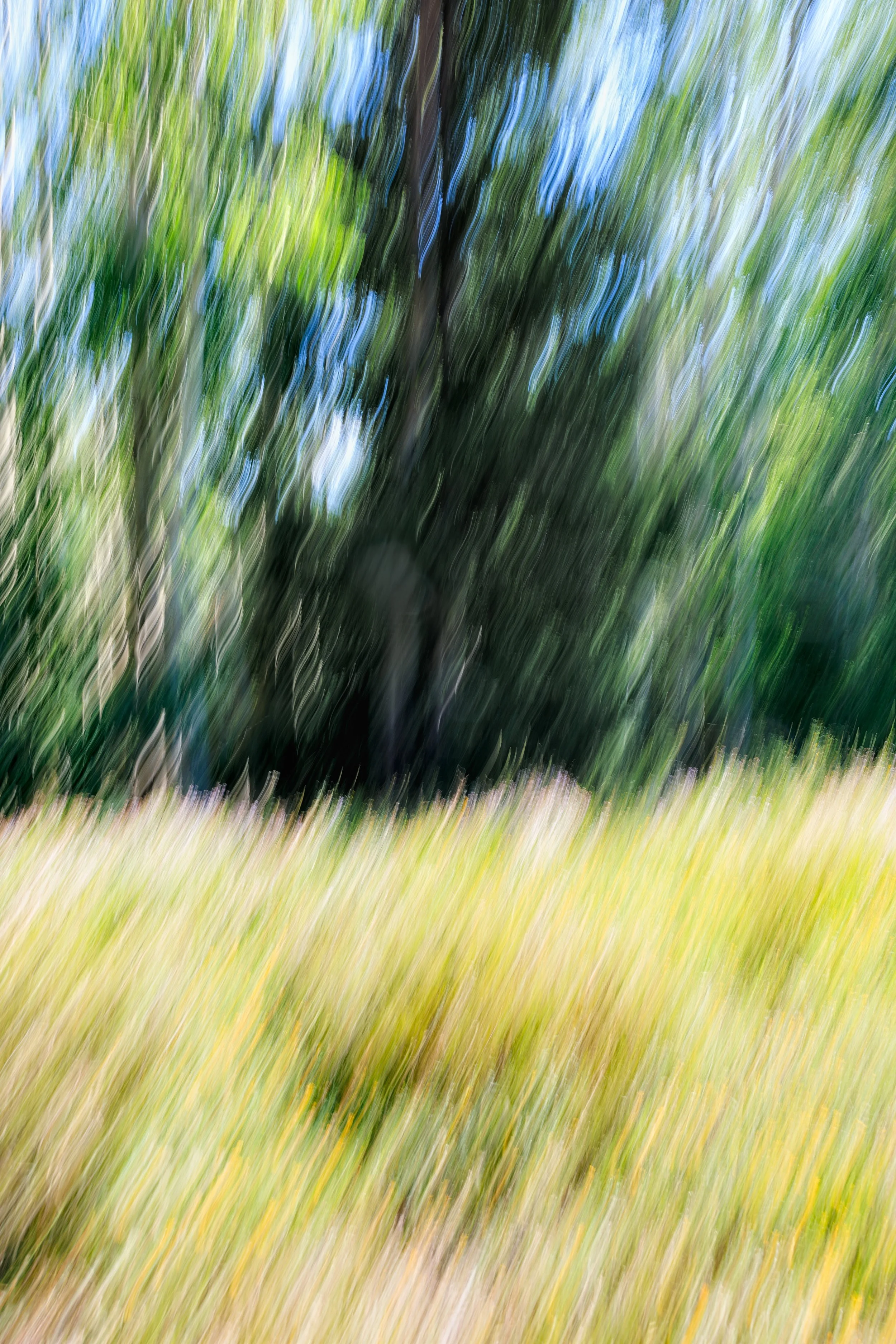
The Long Way to Long Lake is an intentional camera movement study made along the trail to Long Lake outside Crested Butte, Colorado — a single vertical pan through a stand of aspen rising from a sunlit summer meadow. Rather than freezing the scene, the camera was moved deliberately through the exposure, dissolving bark and branch and blade of grass into long, continuous streaks of color. What remains is structure without detail: three bands of tone — gold meadow below, deep green canopy above it, pale blue sky breaking through at the top — held together by a single solid trunk that survives the motion intact, anchoring the eye at the center of the frame.
The effect sits closer to a watercolor wash than a photograph, and that is by design. Color does the work that line and detail usually do: warm gold separates from cool blue, and the deep green of the canopy holds the composition's darkest, quietest note. It is a departure from the crisp, resolved landscapes that define most of the photographer's work — an experiment in what a place feels like in motion rather than what it looks like standing still.
Drawing on the same restraint and singular-idea sensibility found throughout the photographer's Color & Atmosphere collection, this piece asks the viewer to read a familiar subject — an aspen grove — as pure color and rhythm. It rewards a slower look: the longer the eye stays with it, the more the trunk, the tree line, and the horizon reassert themselves out of the blur.
Design & Styling
The soft, painterly palette and complete absence of hard lines make The Long Way to Long Lake especially well suited to wellness environments, spas, medical and dental offices, boutique hotels, and contemporary residential interiors seeking color and warmth without visual noise. It reads calmly at a distance and holds interest up close, making it equally at home in a waiting room or a living room gallery wall.
Curated Pairings
To build a cohesive grouping, consider these companion pieces from the Color & Atmosphere collection:
Pair with Canopy of Amber and Sky, continuing the exploration of tree canopy, warm light, and layered natural color.
For atmospheric contrast: Pair with Reflections of Fall, extending the impressionistic, color-forward treatment of the natural world into a different season and setting.
Fine Art Presentation
Available as a signed fine art print in ChromaLuxe® Metal (gloss, semi-gloss, or matte), framed paper, framed canvas, wood, and acrylic presentation formats. To preserve the soft tonal gradation between the meadow, canopy, and sky bands, ChromaLuxe® Metal or Acrylic presentation is highly recommended — both hold smooth color transitions without introducing texture that would compete with the image's intentional softness.
Note: Custom and oversized photographic prints are available. Please contact the studio directly to discuss custom framing, matting, or specialized museum glass options.
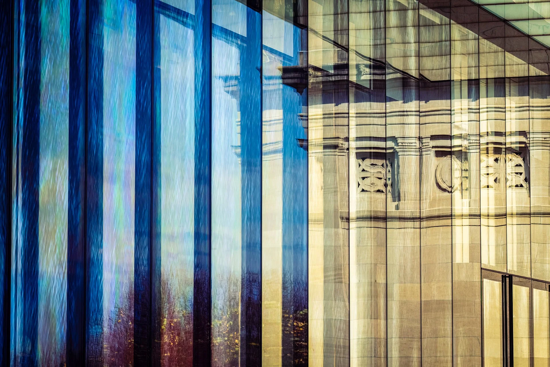
Reflections of Glass and Stone is a contemporary architectural photograph captured at the St. Louis Art Museum in Forest Park during autumn, exploring the layered relationship between historic stone architecture and modern reflective glass surfaces. Autumn light, softened reflections, and luminous blue tonal fields transform the museum façade into a contemplative study of geometry, transparency, and shifting urban atmosphere. Drawing from the painterly color sensibilities of Ernst Haas and the restrained abstraction of contemporary architectural photography, the image emphasizes reflection, structure, and emotional stillness over literal representation.
The composition balances rigid architectural geometry against fluid reflected movement, allowing the photograph to function simultaneously as cityscape, abstraction, and atmospheric study of light. Rather than documenting the museum directly, the image explores the quiet visual tension created as autumn light, reflective glass, and historic stone surfaces dissolve into layered color and abstract form.
Historic stone and modern glass share a single view here, and the glass does what glass does best: it lets the older building appear inside the newer one, softened and rearranged by autumn light.
Design & Styling
The layered dialogue of historic stone and modern glass at the St. Louis Art Museum makes Reflections of Glass and Stone a natural fit for museum and gallery-adjacent spaces, design offices, law and financial firms, and modern St. Louis homes. Its blue tonal fields suit clean, contemporary walls.
Curated Pairings
To create a cohesive gallery presentation around reflection and architecture, consider these companion pieces:
For color and layered structure: Pair with Where Sisters Rise, extending the visual dialogue between layered color and atmospheric structure through a very different subject.
For restraint and reflection: Complement this piece with Quiet Crossing, sharing the same restrained pacing and contemplative relationship between reflection, structure, and calm.
For glass and sky: Pair with Blue Interval, another St. Louis building that dissolves into reflected sky.
Fine Art Presentation
Available as a signed fine art print on ChromaLuxe® Metal (gloss, semi-gloss, or matte), Glossy Anti-Glare Acrylic (TruLife), canvas, wood, and archival paper (framed or unframed). ChromaLuxe® Metal is the recommended presentation: it holds the crisp edges of stone and glass and the luminous blue fields. Acrylic is the alternative for extra depth in the reflections.
Note: Custom and oversized photographic prints are available. Please contact the studio directly to discuss custom framing, matting, or specialized museum glass options.
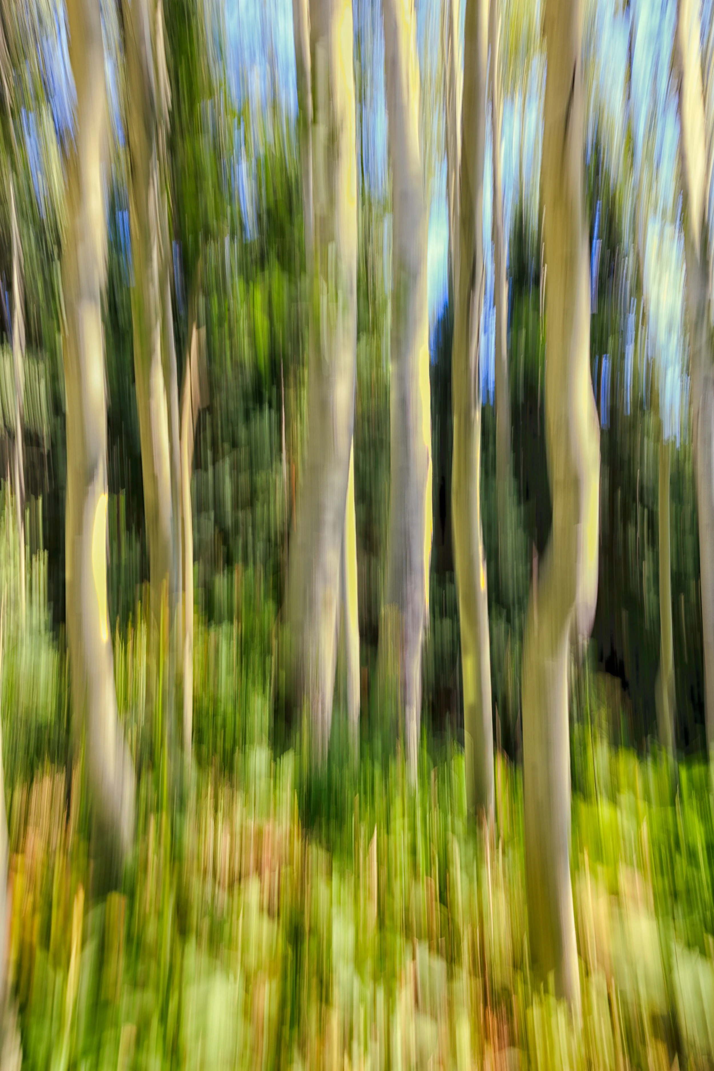
Aspen Curtain Some places are best remembered not as they looked, but as they felt.
Pale aspen trunks rise through the frame as vertical streaks of light and motion, the forest around them dissolved into rhythm rather than record. The eye doesn't land on any single tree — it moves with the blur itself, up through a deepened canopy of green and shadow, catching fragments of blue sky between the trunks. There is no subject here in the usual sense. The movement is the subject.
This is intentional camera movement, not a technical accident — the same impulse that led Ernst Haas, late in his career, to abandon the sharp document in favor of color and motion as their own form of seeing. Where Ansel Adams sought the mountain rendered in total clarity, this image asks a different question: what does a place feel like when you're moving through it rather than standing still in front of it. Shot on a hike to Long Lake outside Crested Butte, Colorado.
Design & Styling: Passing Through's abstraction and rich, saturated palette make it a distinctive choice for spaces that want art to read as sophisticated rather than merely decorative — boutique hospitality lobbies, mountain-modern offices, gallery walls, and design-forward residential settings. Its vertical rhythm suits a tall, narrow wall or a stairwell as well as a larger statement placement.
Curated Pairings:
Pair Aspen Curtain with Quiet Cathedral for a two-piece grouping built around the same aspen groves of the Kebler Pass / Crested Butte region, or with Enduring Silence for a quieter, more contemplative wall arrangement built on shared restraint.
Fine Art Presentation:
Aspen Curtain is available on Glossy Anti-Glare Acrylic (TruLife) and archival paper or Canson BFK Rives fine art paper, framed or unframed. The rich, saturated color and deep canopy shadow in this piece are well suited to acrylic's added contrast and punch; paper renders it with a softer, more painterly quality. ChromaLuxe® Metal (gloss, semi-gloss, or matte) is also available for a glossier, higher-contrast presentation.
Custom sizing is available beyond the standard offerings listed — contact the studio for a quote on oversized or non-standard dimensions.
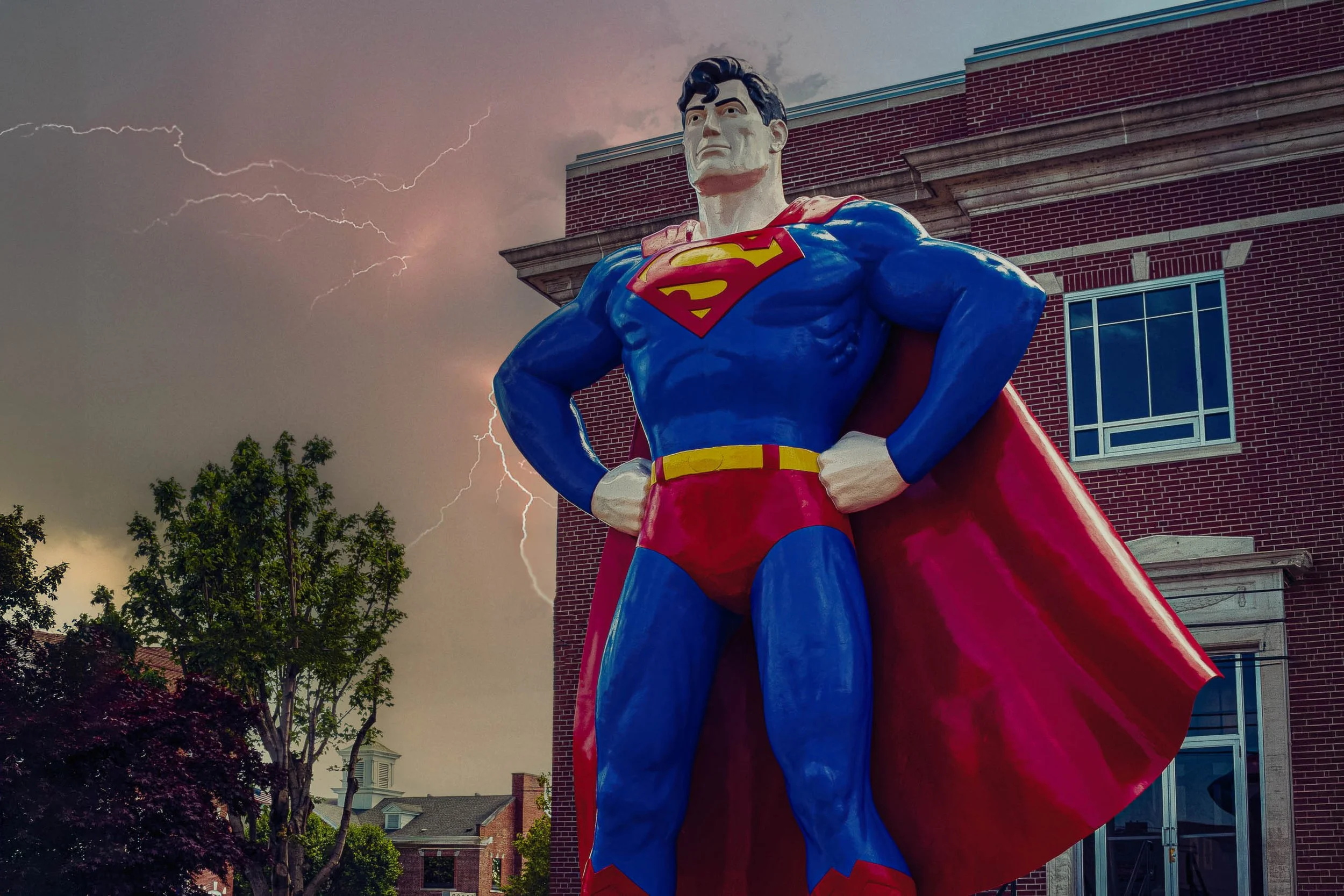
Storm Over Metropolis frames the town's namesake guardian — the towering Superman statue that has stood watch over Metropolis, Illinois since the town declared itself his official hometown — at the exact moment a summer storm rolled in overhead. Shot low and close, the statue fills the frame against a brick courthouse building and a sky torn open by lightning, the pose reading less like a photograph of a statue and more like an origin panel pulled from a comic page.
The color treatment leans directly into that comic-book identity rather than working against it. Bold, separated primaries in the suit and cape, clean graphic edges along the statue's silhouette, and a saturated, stormlit sky push the image toward illustration without losing the specificity of place — the real brick, the real courthouse cornice, the real tree caught in the same gust as the storm front. The lightning bolt threading through the clouds on the left ties the whole frame together, a genuine weather event that happens to look like it was scripted for the scene.
This is Americana photographed as spectacle rather than nostalgia — a roadside icon treated with the same graphic confidence as the character it depicts, camera turned skyward the way a kid looking up at the statue for the first time would see it.
Design & Styling
With its bold primary palette, graphic linework, and unmistakable pop-culture subject, Storm Over Metropolis is built for game rooms, media rooms, breweries and taprooms, comic and collectibles shops, kids' spaces, offices with personality, and hospitality spaces that lean into fun. The saturated red, blue, and yellow give designers a specific palette to build around, and it pairs naturally with exposed brick, black steel, and neon signage.
Curated Pairings
To build a wall around American icons, storms, and saturated Americana, consider these companion pieces:
For scale and spectacle: Pair with The Last Giant — both capture an oversized American icon (a locomotive, a superhero) photographed to emphasize its sheer, monumental scale.
For storm drama: Complement with Waiting Out the Storm — two very different American scenes, one shared sky.
For Americana color: Add Cottonwoods and Chrome — bold, saturated nostalgia across two very different American subjects.
Fine Art Presentation
Available as a signed fine art print on ChromaLuxe® Metal (gloss, semi-gloss, or matte), Glossy Anti-Glare Acrylic (TruLife), canvas, wood, and archival paper (framed or unframed). ChromaLuxe® Metal is the recommended presentation: the glossy, saturated color and clean graphic edges suit metal's brightness, and the finish echoes the statue's own painted-fiberglass shine. Acrylic adds a glass-like pop suited to the comic-book treatment, and canvas gives a less graphic, more painterly feel. Larger sizes let the statue's scale register as it does in person; this is a piece meant to be looked up at.
Note: Custom and oversized photographic prints are available. Please contact the studio directly to discuss custom framing, matting, or specialized museum glass options.
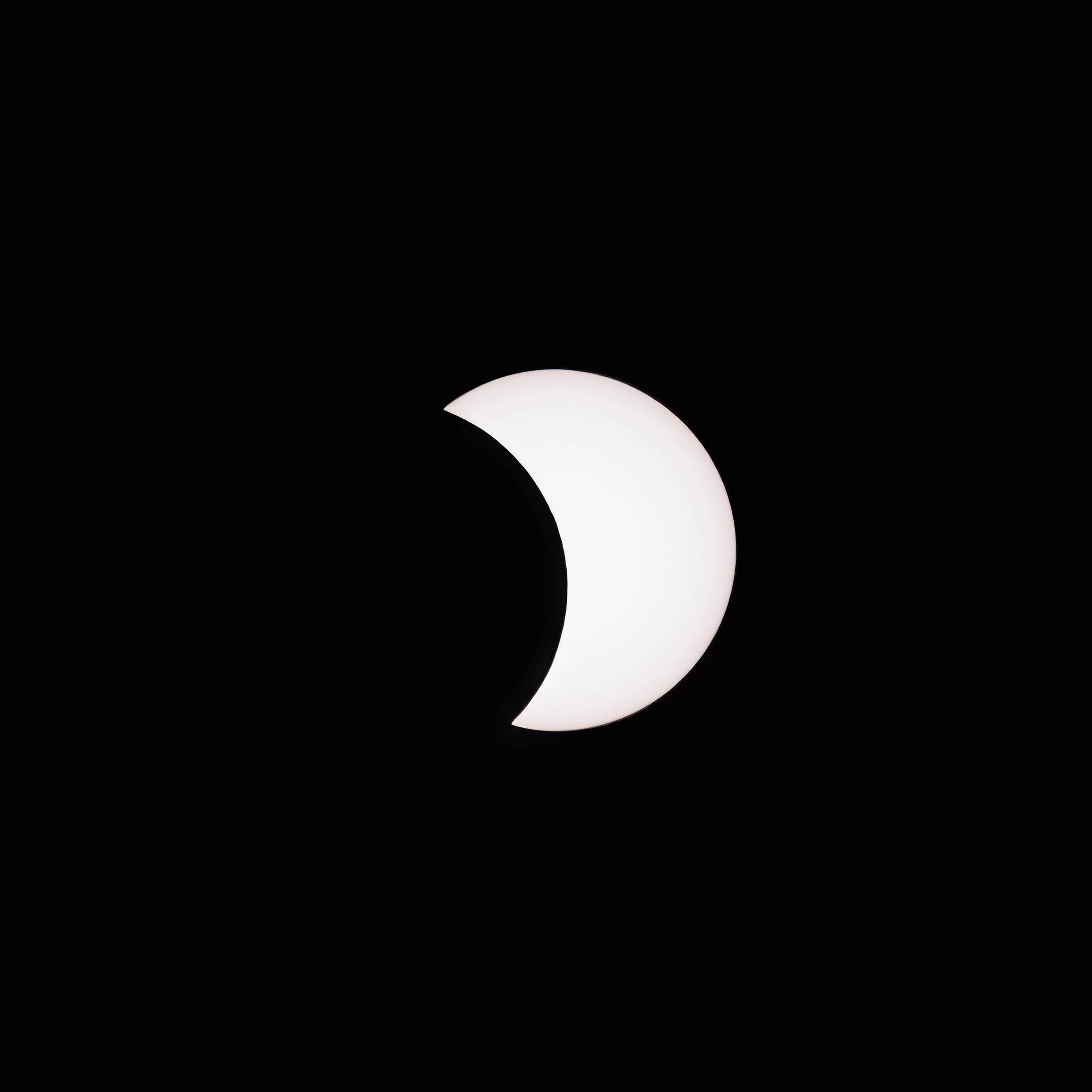
Before the darkness comes, there is this — the sun reduced to a luminous crescent, the moon's shadow already claiming more than half the sky. First Contact documents the early passage of the 2024 total solar eclipse over Du Quoin, Illinois, at the moment the eclipse has progressed far enough to transform the familiar disk of the sun into something strange and geometrically precise: a white crescent against absolute black, as clean and graphic as anything in nature produces. The composition is deliberately spare. The crescent floats at center, its edges impossibly sharp where the lunar limb bisects the solar disk, the surrounding darkness complete. There is no horizon, no landscape, no human reference — only the pure geometry of two celestial bodies in transit, one occluding the other with mathematical precision. The image asks the viewer to sit with that geometry, to feel the scale of what is happening without the usual visual anchors that tell us where we are. In the tradition of Hiroshi Sugimoto's long-exposure theater photographs — images that strip a subject to its essential form and ask what remains — First Contact finds in the partial eclipse a study in negative space and geometric reduction. The darkness is not absence but presence: the physical shadow of a world moving across the face of the sun.
Design & Styling With its pure black field and luminous white crescent, First Contact brings graphic precision and cosmic scale to any interior. The image works exceptionally well in contemporary, minimalist, and modernist spaces where negative space and geometric form are valued — a single strong image against a dark or neutral wall rather than competing in a gallery arrangement. Equally at home in residential, corporate, and hospitality environments where the subject matter — the 2024 total solar eclipse, a once-in-a-generation event — carries its own narrative weight. The stark black-and-white palette pairs naturally with dark wood, matte black frames, concrete, and brushed metal finishes.
Curated Pairings For the complete eclipse narrative: Pair with The Red Edge, The Diamond Ring, and The Corona as the complete Eclipse Series — four images documenting the full arc of totality over Du Quoin, Illinois on April 8, 2024.For a celestial/atmospheric wall: Pair with Where the Sky Breaks for two images where the sky itself becomes the subject — one cosmic, one terrestrial, both documenting the moment the ordinary becomes extraordinary.
Fine Art Presentation First Contact is available as a signed, limited edition fine art print. ChromaLuxe® Metal (gloss, semi-gloss, or matte) is the strongest choice for this image — the absolute black field and the luminous precision of the crescent edge reach their full impact on metal, which renders deep blacks and fine edge detail with a luminosity that paper cannot match. TruLife Acrylic on a low-glare substrate adds dimensionality to the stark composition. Framed and unframed paper prints are produced on archival paper, offering a softer, more intimate presentation for residential contexts. This image is part of the limited Eclipse Series — edition of 25 per size and substrate.
Custom and oversized prints available. Please contact the studio directly.
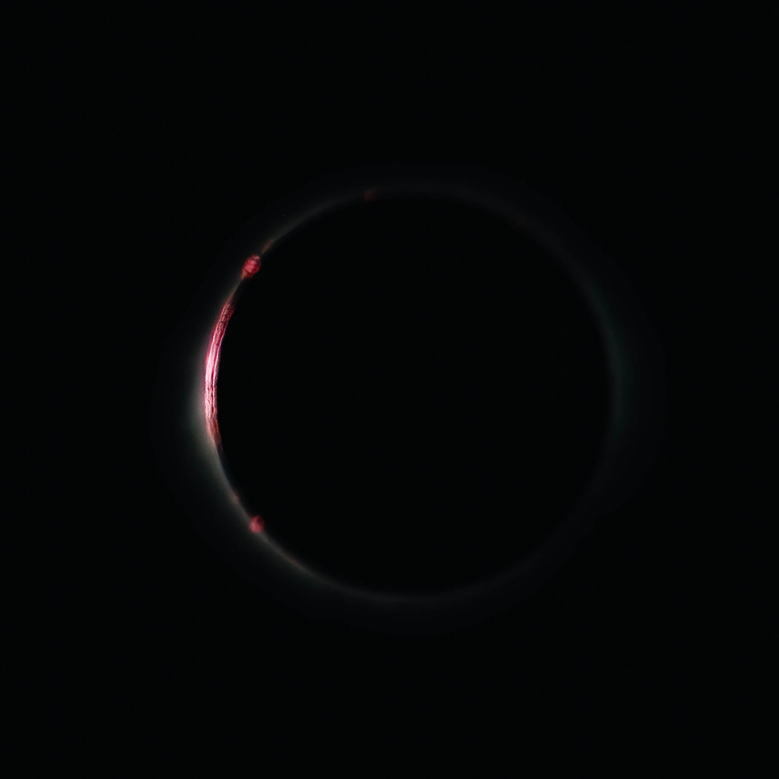
The Red Edge - What most eclipse photographs never show is this — the chromosphere. The thin, intensely hot layer of the solar atmosphere that lies just above the photosphere, visible for only seconds at the beginning and end of totality, blazing crimson against the lunar limb while the corona begins to emerge from the darkness surrounding it. The Red Edge captures this fleeting transition: the moon's silhouette nearly complete, a thin arc of vivid red hydrogen-alpha light tracing the edge of totality as multiple solar prominences reach outward from the solar surface into the surrounding darkness. The image is technically rare. The chromosphere and prominences are visible only in the seconds immediately before and after totality — the window is narrow, the exposure critical. Multiple prominences are visible along the lunar arc, their deep magenta-red rendered with detail that requires both the right moment and the right focal length. The faint blue-green ghost of the inner corona has already begun to emerge on the right side of the frame, placing this image precisely at the threshold between partial and total eclipse. In the tradition of documentary photographers who find beauty in scientific observation — the Bechers cataloging industrial forms with typological rigor, Adams finding the sublime in the measurable — The Red Edge treats the eclipse as both celestial event and fine art subject, finding in the chromosphere's brief appearance a color and form that no other natural phenomenon produces.
Design & Styling The deep crimson arc against absolute black gives The Red Edge a dramatic color presence unlike anything else in the catalog. The image commands a wall — it is not a background piece but a conversation-starting focal point, best placed where it will be encountered directly rather than peripherally. The magenta-red palette pairs unexpectedly well with warm interiors — deep burgundy, cognac leather, dark walnut — as well as with cool contemporary spaces where the red becomes a controlled accent against neutrals. Exceptionally strong in executive, hospitality, and high-end residential contexts where scientific achievement and visual drama are valued equally.
Curated Pairings For the complete eclipse narrative: Pair with First Contact, The Diamond Ring, and The Corona as the complete Eclipse Series. For a color and drama wall: Pair with Where the Sky Breaks for two images where the sky itself becomes the subject — one cosmic, one terrestrial, both documenting the moment the ordinary becomes extraordinary.
Fine Art Presentation The Red Edge is available as a signed, limited edition fine art print. ChromaLuxe® Metal (gloss, semi-gloss, or matte) is strongly recommended — the depth of the crimson chromosphere against the absolute black field, and the fine detail of the individual prominences, reach their full impact on metal. TruLife Acrylic on a low-glare substrate adds luminosity to the color field. Framed and unframed paper prints are produced on archival paper. Limited edition of 25 per size and substrate. Custom and oversized prints available. Please contact the studio directly.
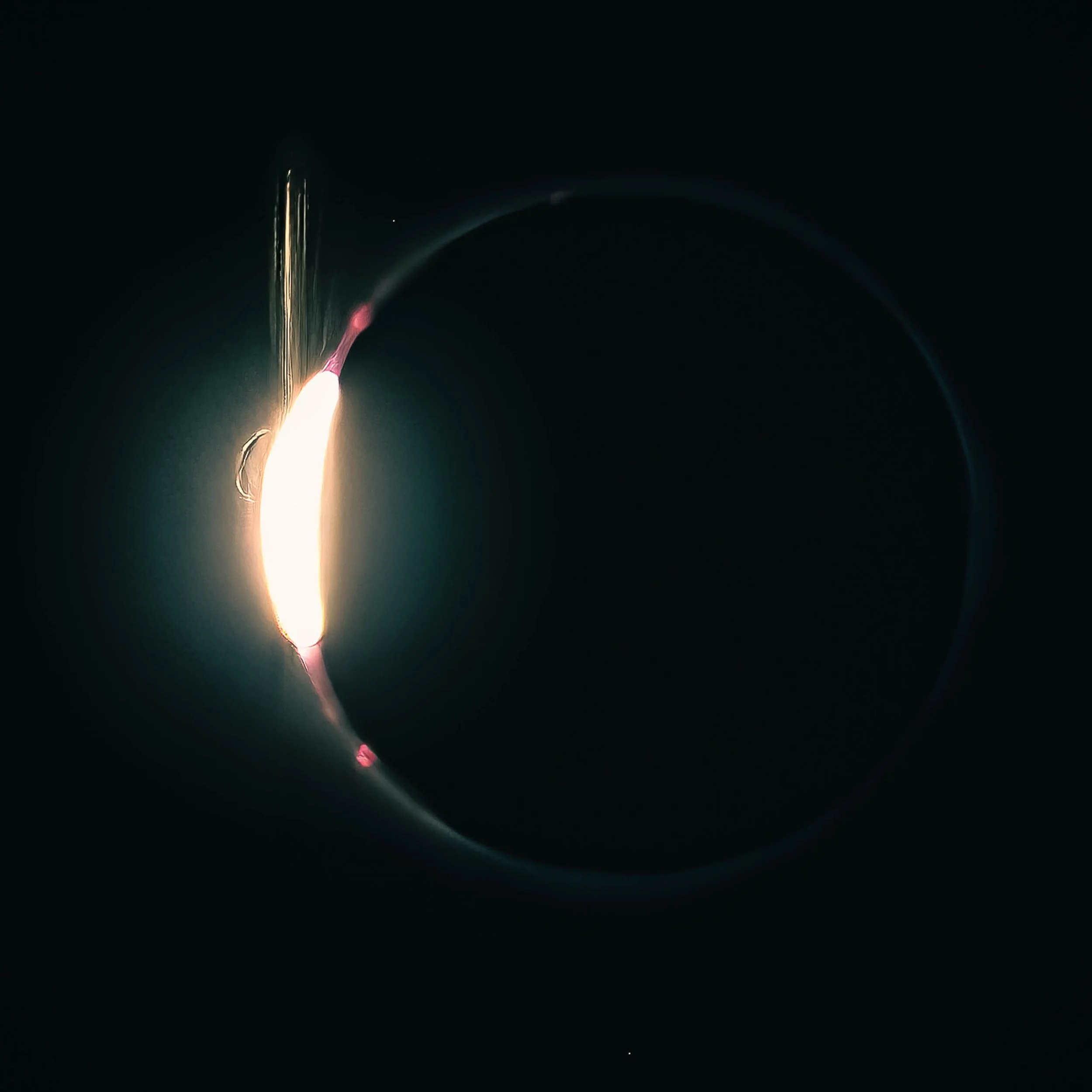
There is a moment — measured in seconds, never repeated in the same place twice in a human lifetime — when the last arc of sunlight collapses to a single brilliant point at the lunar limb and the corona becomes visible as a faint luminous ring surrounding the silhouetted moon. Astronomers call it the diamond ring effect. The Diamond Ring captures that moment over Du Quoin, Illinois on April 8, 2024: the brilliant white burst of the Baily's bead at upper left, the corona ghosting in blue-green around the full circumference of the lunar disk, and the vivid pink solar prominences visible along the limb in the seconds before the last light vanishes and totality begins.
The image holds extraordinary detail for a subject that allows almost no time for composition or second chances. The single surviving bead of sunlight flares with diffraction spikes, the prominences are rendered with genuine color and definition, and the corona ring — faint, asymmetrical, real — completes the frame. This is not a composite or a processed interpretation. It is a photograph of what was there, in the sky, for a few seconds, over southern Illinois, on a Tuesday afternoon in April.
The image earns comparison to the work of photographers who have documented celestial events with the same discipline they bring to landscape — finding in astronomical phenomena the same qualities of light, atmosphere, and transience that define the finest landscape work. The diamond ring is, ultimately, a light phenomenon: the most dramatic expression of what happens when light meets shadow at the precise moment of disappearance.
Design & Styling
The Diamond Ring is your most immediately legible eclipse image — most viewers recognize the phenomenon even if they cannot name it, and the combination of brilliant white burst, delicate corona ring, and deep black field gives the image exceptional visual impact at any scale. The image works as a singular statement piece in virtually any interior context — residential, corporate, hospitality, healthcare — and is the natural anchor for a complete Eclipse Series wall grouping. The cool blue-green of the corona against the warm burst of the diamond bead creates a subtle color tension that rewards sustained viewing. Pairs well with contemporary interiors, dark or neutral walls, and any space where astronomical or scientific subject matter resonates.
Curated Pairings
For the complete eclipse narrative: Pair with First Contact, The Red Edge, and The Corona as the complete Eclipse Series.
For a light phenomena wall: Pair with Where the Sky Breaks — two images where an astronomical event transforms the ordinary sky into something extraordinary, one terrestrial, one celestial.
Fine Art Presentation
The Diamond Ring is available as a signed, limited edition fine art print. ChromaLuxe® Metal (gloss, semi-gloss, or matte) is the definitive choice for this image — the flaring diffraction spikes of the diamond bead, the fine detail of the corona ring, and the absolute depth of the black field all demand the luminosity and contrast range that metal provides. TruLife Acrylic on a low-glare substrate. Framed and unframed paper prints on archival paper. Limited edition of 25 per size and substrate.
Custom and oversized prints available. Please contact the studio directly.
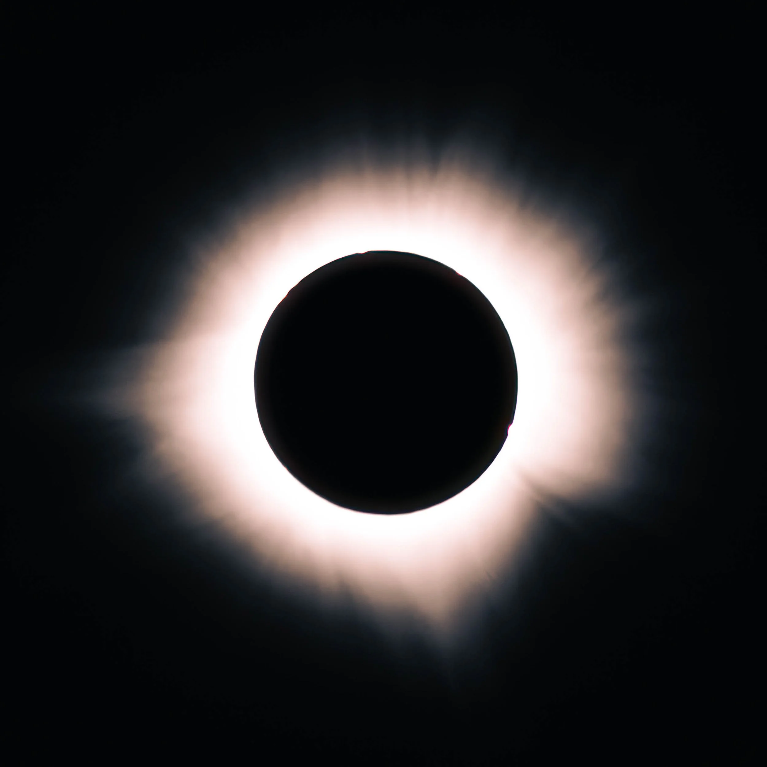
Full totality. The moon has completely occluded the sun, and what is revealed is the thing that cannot be seen any other way: the solar corona — the sun's outer atmosphere, extending millions of miles into space, rendered here as a luminous pearlescent crown radiating outward from the silhouetted lunar disk in all directions. The Corona documents this moment over Du Quoin, Illinois on April 8, 2024, in the two minutes and forty seconds when the moon's shadow made visible what is otherwise invisible — a structure of plasma and magnetic field that dwarfs everything in the solar system except the star it surrounds.
The composition centers the lunar disk in the frame, the corona radiating asymmetrically outward — two prominent streamers extending horizontally, the overall structure softly irregular in the way that plasma structures are, shaped by magnetic field lines rather than geometry. The surrounding darkness is not the darkness of night — it is the darkness of the moon's umbral shadow falling on the earth at midday, a qualitatively different black that those who have stood in it describe as unlike any other darkness they have experienced.
Drawing on the long-exposure traditions of Hiroshi Sugimoto — whose photographs of lightning and ocean horizons find in natural phenomena a stillness that transcends the moment of capture — The Corona seeks in the eclipse not spectacle but revelation: the ordinary star at the center of our solar system made briefly, beautifully strange by the accident of celestial geometry that makes our moon appear exactly the same size as the sun from the surface of the earth.
Design & Styling
The Corona is the quietest and most meditative of the four Eclipse Series images — the drama of the diamond ring and the chromosphere have passed, and what remains is pure luminous form against absolute black. The pearlescent white corona against deep black gives the image a timeless, almost painterly quality that sits differently than the other eclipse images — less confrontational, more contemplative. Well suited for healthcare, residential, hospitality, and any environment where restorative calm and visual depth are priorities. The image scales exceptionally well to large format — at 24x36 or larger, the corona's structural detail becomes genuinely immersive. Pairs naturally with warm neutrals, off-white walls, soft contemporary interiors, and any space where the subject matter — the solar corona, one of nature's most extraordinary phenomena — carries resonance.
Curated Pairings
For the complete eclipse narrative: Pair withFirst Contact, The Red Edge, and The Diamond Ring as the complete Eclipse Series — the full arc of totality over Du Quoin, Illinois on April 8, 2024.
For a light phenomena wall: Pair with Where the Sky Breaks — two images where an astronomical event transforms the ordinary sky into something extraordinary, one terrestrial, one celestial.
Fine Art Presentation
The Corona is available as a signed, limited edition fine art print. ChromaLuxe® Metal (gloss, semi-gloss, or matte) renders the pearlescent quality of the corona with exceptional luminosity — the subtle gradations from the bright inner corona to the faint outer streamers require the tonal range that metal provides. TruLife Acrylic on a low-glare substrate adds dimensionality to the radial structure. Framed and unframed paper prints on archival paper offer a softer, more atmospheric presentation that suits the contemplative quality of this image particularly well. Limited edition of 25 per size and substrate.
Custom and oversized prints available. Please contact the studio directly.

Some pictures are pure joy. Float Boat is a vibrant, atmospheric study of color and reflection centered on a floating boat installation, surrounded by layered water reflections and luminous seasonal color. Captured at the intersection of sculpture, landscape, and reflected light, the photograph becomes a cinematic composition of saturated blues, warm reds, golden highlights, and fluid mirrored texture.
The composition balances the solid geometry of the floating structure against constantly shifting reflected color and water movement, so the image works at once as landscape, abstraction, and public-art study. Rather than documenting the installation literally, it emphasizes the emotional energy of layered reflections and saturated color relationships.
Drawing on the painterly color sensibilities of David Hockney and the expressive visual rhythm of contemporary color photography, the image explores joy, movement, and the temporary suspension of ordinary space through reflection and atmosphere.
Design & Styling
With its luminous palette, reflective water textures, and contemporary color energy, Float Boat brings warmth, optimism, and movement to hospitality lobbies, creative offices, modern residences, and healthcare waiting areas. Its blues and reds hold a wall from across a room, and against a white or pale wall it becomes the color anchor.
Curated Pairings
To create a cohesive gallery wall around reflection, abstraction, and luminous color, consider these companion pieces:
For complementary color: Pair with Where Sisters Rise, where terracotta rock meets a saturated blue sky — the same blue-and-warm dialogue, in a landscape.
For atmospheric continuity: Complement with Children Dancing in Blue Light, which shares the same layered color transitions and immersive atmosphere.
For warm light on water: Pair with Eclipse Over Evergreen, where the lit windows of lakeside homes cast warm reflections across still water beneath a copper moon.
Fine Art Presentation
Available as a signed fine art print on ChromaLuxe® Metal (gloss, semi-gloss, or matte), Glossy Anti-Glare Acrylic (TruLife), canvas, wood, and archival paper (framed or unframed). Acrylic is the recommended presentation: its depth and luminosity suit layered reflections and saturated color. ChromaLuxe® Metal is the alternative for crisper, more graphic blues and reds, and canvas lends the painterly, Hockney-like read the image invites.
Note: Custom and oversized photographic prints are available. Please contact the studio directly to discuss custom framing, matting, or specialized museum glass options.
Iron Cathedral
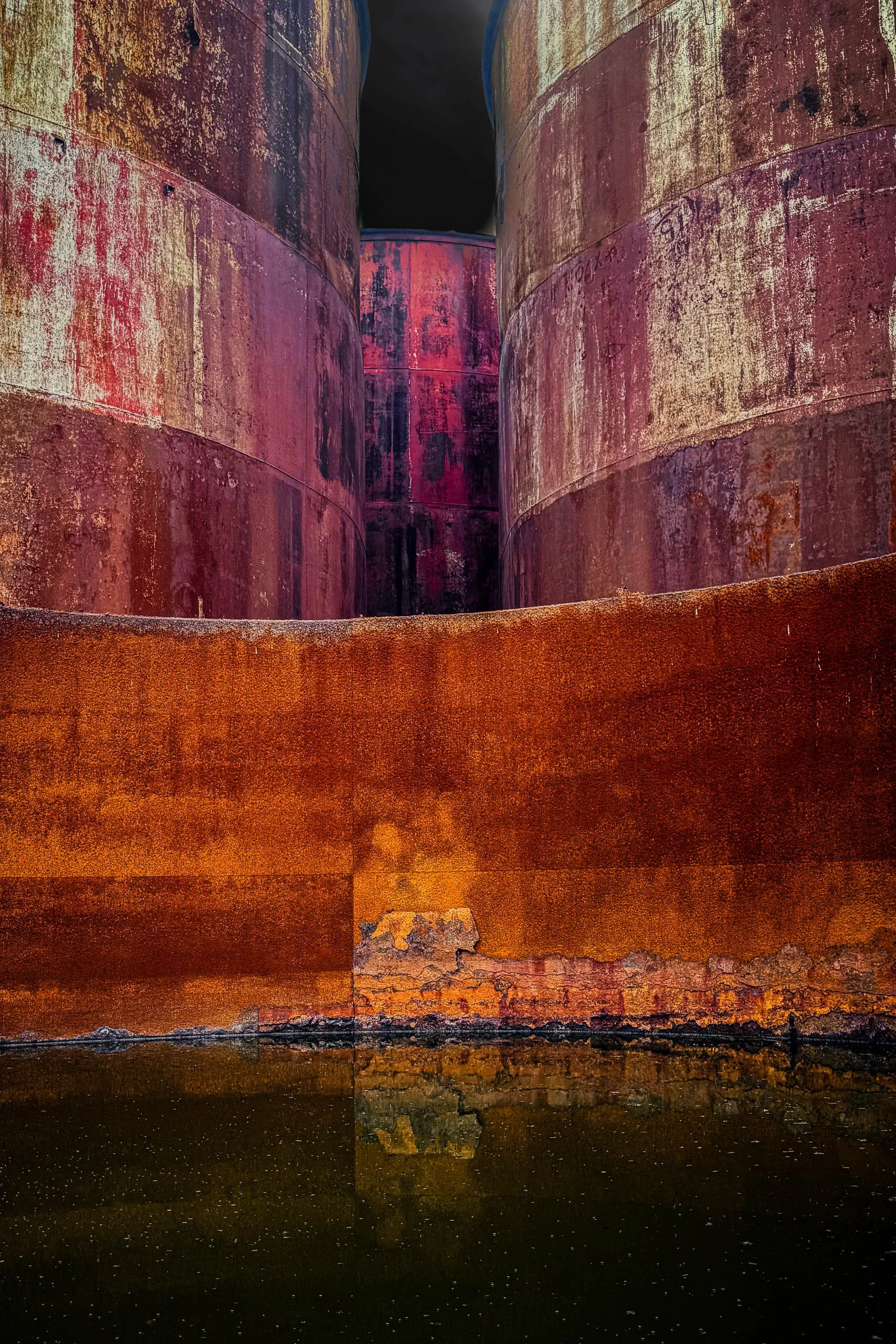
Two massive rusted steel tanks rise like sentinels on either side of a narrow passage, their weathered surfaces streaked with decades of oxidation — deep magenta and violet tones bleeding into pale, salt-worn steel at the top, giving way to solid bands of burnt orange and umber rust below. A third cylindrical form stands centered in the distance, glimpsed through the gap like an altar at the end of a nave, its surface catching the same rose and crimson patina as the walls that frame it.
The composition draws the eye straight down the corridor these structures create, the converging lines of the tanks' curves echoing the soaring verticals of a cathedral interior — hence the title. Still water at the base mirrors the rusted walls and the glow of orange above, doubling the sense of scale and stillness. What could easily read as industrial decay instead takes on a reverent, almost sacred quality: light falling into the passage like it's finding its way into a nave, and the corrosion itself becoming a kind of stained-glass palette — rose, violet, amber — applied by time rather than by hand.
Design & Styling
The rust, magenta, and violet of Iron Cathedral give an industrial subject unexpected richness for lofts, restaurants, breweries, design studios, and offices that like the look of weathered steel. On white or concrete-gray walls the color reads as painterly and bold.
Curated Pairings
To create a cohesive gallery wall around industrial texture and color, consider these companion pieces:
For industrial continuity: Pair with Steel Wave, extending the theme of abstract industrial texture and form.
For structure and reflection: Complement this piece with Reflections of Glass and Stone, extending the interplay between structure and reflection.
For warm rust and cool water: Pair with Still Water, Stone Standing, echoing the warm rust tones against cool, quiet reflection.
Fine Art Presentation
Available as a signed fine art print on ChromaLuxe® Metal (gloss, semi-gloss, or matte), Glossy Anti-Glare Acrylic (TruLife), canvas, wood, and archival paper (framed or unframed). ChromaLuxe® Metal is the recommended presentation: it renders the full saturated range of magenta, violet, and burnt orange and the fine rust texture across the steel. Acrylic is the alternative for extra depth in the color.
Note: Custom and oversized photographic prints are available. Please contact the studio directly to discuss custom framing, matting, or specialized museum glass options.
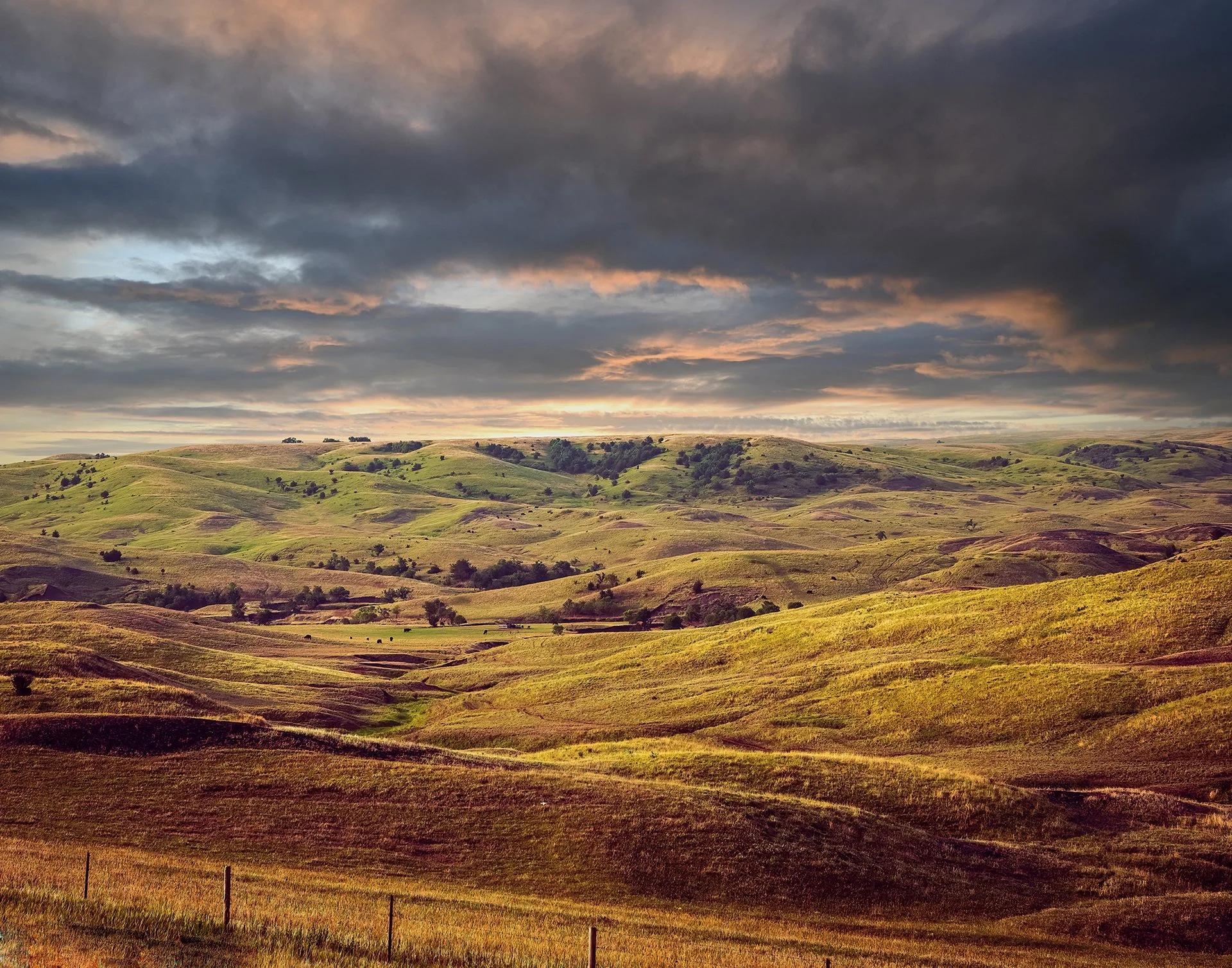
The Day the Prairie Paused is an atmospheric landscape photograph captured in the Flint Hills region of Kansas, exploring weather, stillness, and the expansive emotional rhythm of the American prairie. Layered cloud formations, restrained earth tones, and soft transitional light transform the rolling grasslands into a contemplative study of openness, silence, and suspended time. Drawing from the luminous color sensibilities of Ernst Haas and the restrained pacing of contemplative landscape photography, the image emphasizes atmosphere, distance, and the subtle emotional calm carried by the Great Plains beneath shifting weather.
The composition balances expansive sky against the quiet geometry of the prairie landscape, allowing negative space and layered atmospheric transitions to become central visual elements within the frame. Rather than focusing on dramatic spectacle, the photograph explores the emotional stillness that emerges when weather, land, and fading light briefly settle into visual equilibrium across the Flint Hills.
Prairie weather is mostly sky: the land is low and unbroken, so the clouds do the composing. On a day when the weather stalls, the whole horizon seems to hold still, and the image lets that pause stretch across the frame.
Design & Styling
Layered clouds and rolling grasslands make The Day the Prairie Paused a calm, wide-open piece for offices, lobbies, bedrooms, and living rooms, and for anyone with Kansas roots. Its restrained earth tones sit quietly in neutral rooms.
Curated Pairings
To create a cohesive gallery presentation around the prairie and weather, consider these companion pieces:
For prairie atmosphere: Pair with Stillness Over Flint Hills, extending the layered relationship between weather, open grassland, and contemplative light.
For suspended weather: Complement this piece with Waiting Out the Storm, sharing the same restrained atmospheric transitions and sense of suspended weather and horizon space.
For Kansas in warm light: Pair with Kansas Sunrise With Wind Turbines, another Kansas horizon, at sunrise.
Fine Art Presentation
Available as a signed fine art print on ChromaLuxe® Metal (gloss, semi-gloss, or matte), Glossy Anti-Glare Acrylic (TruLife), canvas, wood, and archival paper (framed or unframed). Framed archival paper is the recommended presentation: its matte surface suits the layered prairie textures and restrained tonal transitions. ChromaLuxe® Metal is the alternative for crisper cloud detail.
Note: Custom and oversized photographic prints are available. Please contact the studio directly to discuss custom framing, matting, or specialized museum glass options.
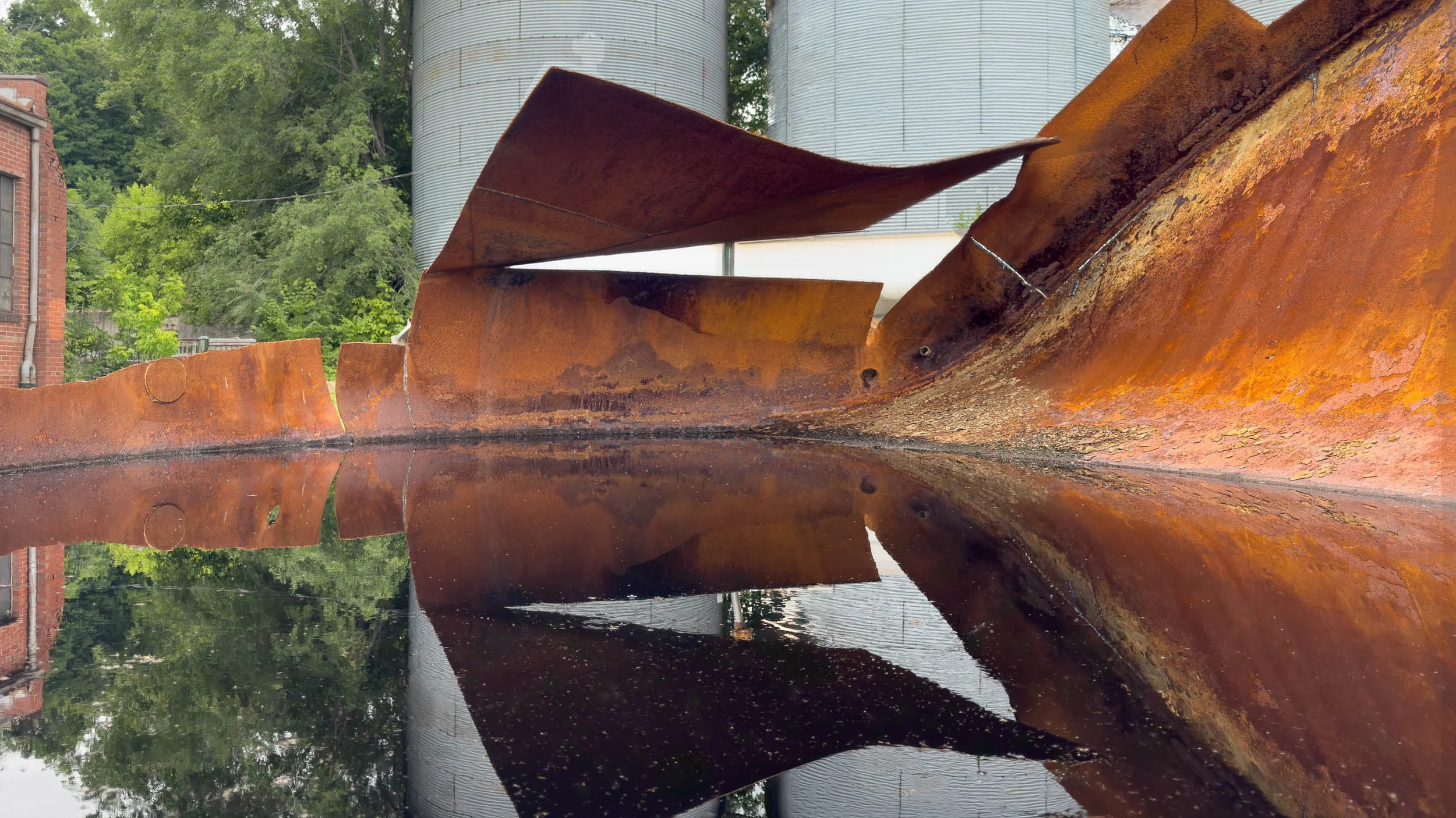
Steel Wave explores the unexpected beauty found within an industrial landscape after a summer rain. Photographed in New Haven, Missouri, the image centers on a rusted steel form whose folded shape rises above a pool of still water, creating a reflection that transforms the scene from documentation into abstraction. The weathered metal appears almost sculptural, its sweeping form suggesting movement, flight, and tension against the quiet surface below.
Drawing inspiration from Aaron Siskind's exploration of abstraction, Ernst Haas' appreciation for color and atmosphere, and Minor White's search for meaning within ordinary subjects, the photograph invites viewers to look beyond the identity of the object itself. Rust, water, reflection, and geometry become the true subjects, revealing relationships that might otherwise go unnoticed.
The composition balances sharp angles against circular forms, with the industrial silos providing structure and rhythm behind the folded steel. Reflections double the visual language of the image, creating a dialogue between solidity and illusion, permanence and transformation. Rather than focusing on industry itself, the photograph celebrates the ability of light, weather, and perspective to transform an overlooked corner of the world into something visually unexpected.
The result is an image that rewards close viewing. It asks viewers to slow down, explore texture and form, and discover beauty within a place most people would simply pass by.
Design & Styling
A folded rust-colored steel form mirrored in still water gives Steel Wave a sculptural, abstract quality for lofts, design studios, offices, restaurants, and modern homes. The warm rust against cool water suits gray and white walls.
Curated Pairings
To create a cohesive gallery wall around industrial form and reflection, consider these companion pieces:
For reflected structure: Complement this piece with Reflections of Glass and Stone, similarly transforming familiar structures into studies of shape, light, and perception.
For the same town: Pair with Iron Cathedral - New Haven, Missouri, more of New Haven, Missouri's rusted steel, in saturated color.
Fine Art Presentation
Available as a signed fine art print on ChromaLuxe® Metal (gloss, semi-gloss, or matte), Glossy Anti-Glare Acrylic (TruLife), canvas, wood, and archival paper (framed or unframed). ChromaLuxe® Metal is the recommended presentation: it holds the rich rust textures and the crisp reflective qualities of the water. Acrylic is the alternative for a deeper, more luminous surface.
Note: Custom and oversized photographic prints are available. Please contact the studio directly to discuss custom framing, matting, or specialized museum glass options.
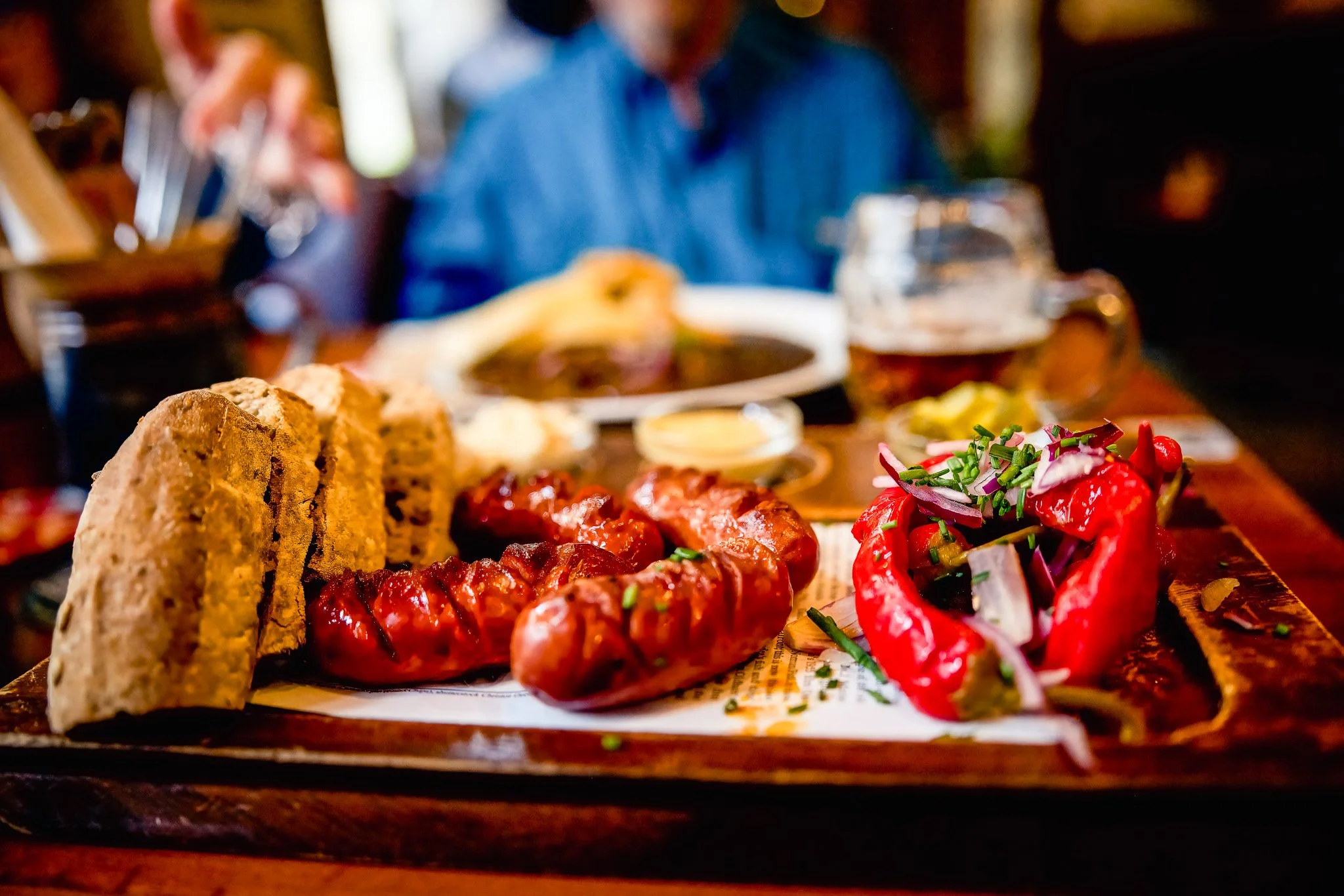
Every city tells you who it is at the table. Prague Lunch finds that story in a traditional Prague restaurant, where four scored, glossy sausages sit beside sliced dark bread and roasted red peppers heaped with red onion and chives, all under warm ambient light. The amber-red of the food glows against a deep blue blur behind it, a documentary-style travel photograph about place, culture, and the small rituals of everyday life.
The eye lands first on the glistening sausages, where the light catches every scored ridge, then moves left across the slices of bread and right to the bright red peppers. Everything sits on newsprint over a worn wooden tray, with a small dish of mustard catching the light behind. A shallow depth of field isolates the meal, while a diner in a blue jacket, a second plate, and a glass of beer dissolve into memory rather than documentation. The person introduces human presence without becoming the subject.
The image draws on the observational storytelling of Wim Wenders and the rich color sensibilities associated with Ernst Haas. Rather than functioning as food photography alone, it explores hospitality, conversation, and the experience of discovering a city through its tables, flavors, and traditions.
Design & Styling
With its warm palette, inviting atmosphere, and strong sense of place, Prague Lunch works especially well in restaurants, cafés, wine rooms, kitchens, and dining spaces, as well as contemporary residential interiors. Against warm wood paneling or a deep blue wall, the amber-red and blue read as a deliberate palette. It introduces warmth, color, and human connection while keeping a sophisticated documentary character.
Curated Pairings
To build a cohesive travel-and-hospitality wall, consider these companion pieces:
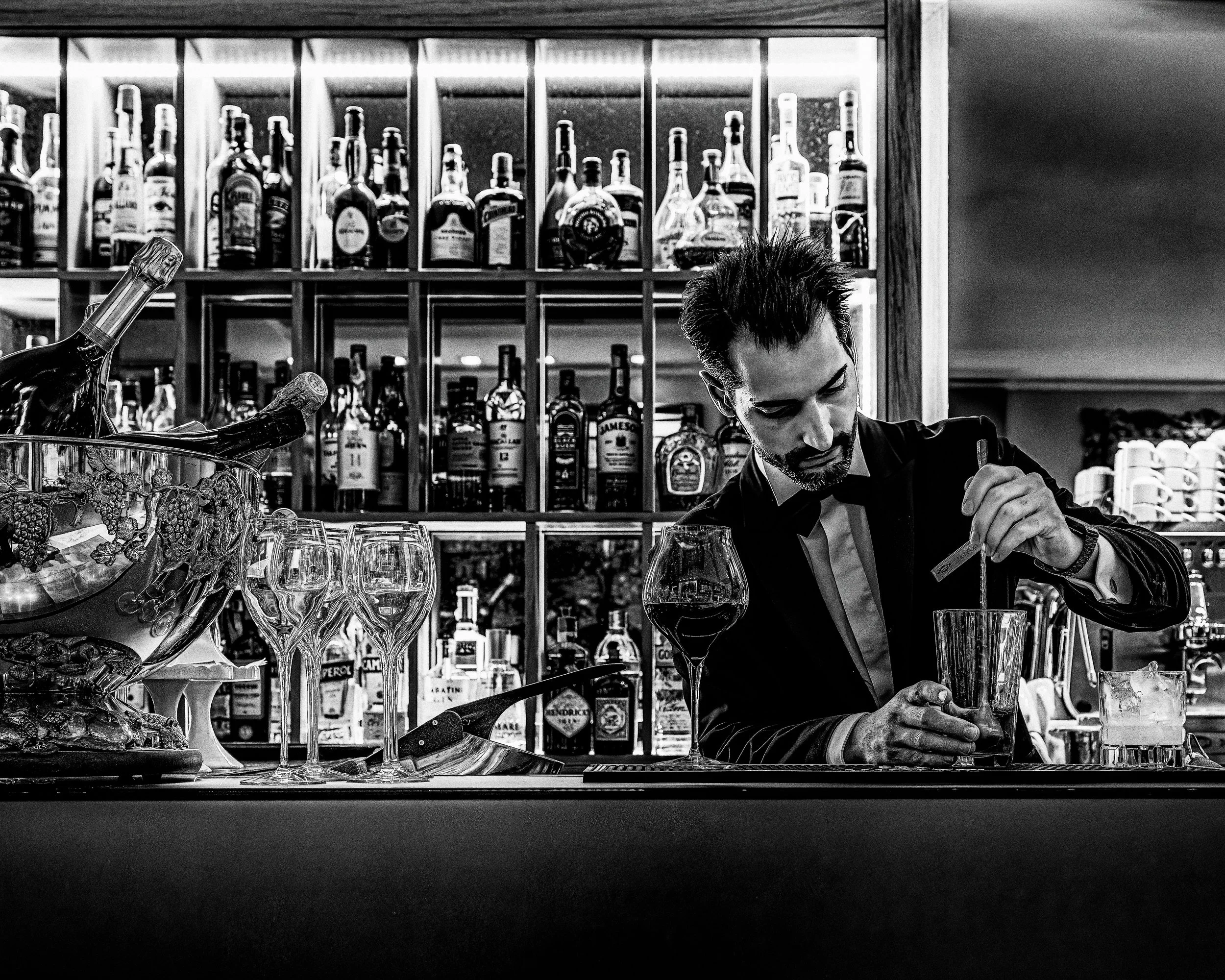
For complementary travel atmosphere: Pair with The Bartender's Measure (Color) to extend the visual narrative of gathering, hospitality, and shared experience.
For cultural continuity: Complement with Waiting for a Ride, which shares the same observational approach to place, memory, and everyday life found throughout the travel collection.
For the same city's tables: Pair with Before the Evening Rush, a Prague Art Nouveau dining room photographed shortly before service, when the tables are set and the room waits for the evening.
Fine Art Presentation
Available as a signed fine art print on ChromaLuxe® Metal (gloss, semi-gloss, or matte), Glossy Anti-Glare Acrylic (TruLife), canvas, wood, and archival paper (framed or unframed). Framed archival paper is the recommended presentation: its matte, tactile surface suits the warm documentary character and the shallow depth of field, and it sits naturally in a traditional dining room or wine room. Wood or canvas add rustic warmth for a café or kitchen, where the grain echoes the table, and ChromaLuxe® Metal is the contemporary alternative when you want the warm highlights and color relationships at full intensity.
Note: Custom and oversized photographic prints are available. Please contact the studio directly to discuss custom framing, matting, or specialized museum glass options.
Design Detail Studies: Capturing the textures, materials, and light play that define your project's unique personality.
Wind is the unseen hand in this frame — carrying pollen across a dark, reflective surface until it settles at the feet of three apricots, each caught mid-ripening under a warm, theatrical light. Behind them, silent and cool-lit in blue, a weathered stone face watches the whole exchange. It has seen this cycle before. It will see it again.
The composition moves left to right in a loose procession: stone, then fruit, then fruit, then fruit, each form doubled below in a glass-black reflection that turns the pollen scatter into something closer to sediment or starlight than dust. The eye is meant to travel the sequence slowly — this is not an image built for a single glance. The specular highlights on each apricot's skin, the fine grain of pollen caught in reflected light, the carved detail in the stone's eroded face: all of it rewards a second, closer look.
Color does real work here. The stone's cool blue-violet stands in deliberate opposition to the apricots' warm red, a chiaroscuro built the way the Dutch masters built theirs — Kalf, Zurbarán — single hard light, dark ground, glossy surfaces catching what little light there is. The pollen is the picture's quiet argument: proof that what looks fixed and permanent (the stone) and what looks fleeting and perishable (the fruit) are both, in their own way, products of the same wind.
Design & Styling
This piece anchors a room the way a strong still life should — with stillness, not spectacle. It reads beautifully in a formal dining room paired with dark wood and low, warm lighting; in a chef's kitchen or wine cellar where the food-adjacent subject matter feels intentional rather than decorative; or in a moody study or reading room where its slow-reveal quality has room to work. The deep black ground makes it a strong match for contemporary interiors with black or dark bronze fixtures, and the warm/cool color split gives a designer real flexibility to key off either half of the palette depending on the room.
Curated Pairings
For the companion piece — "Blowing Foul", a still life built on the same stone, paired here with a single weathered baseball rather than ripening fruit — permanence set against a different kind of wind.
For fruit and ripening continuity — "Before the Crush", a study of Chianti grapes at the edge of harvest, sharing this piece's interest in fruit as a marker of time passing.
For still-life tradition — "Still Life for Grandmother", another dark-ground still life working in the same quiet, close-looking register.
Fine Art Presentation
This image is available as a fine art print on archival paper or the new Canson BFK Rives fine art paper for a soft, painterly surface well suited to the piece's Dutch still-life quality; as ChromaLuxe® Metal (gloss, semi-gloss, or matte) print for a sleek, high-color presentation that intensifies the warm/cool contrast; or face-mounted on TruLife Acrylic for exceptional depth and a glass-like surface that echoes the reflective black ground in the image itself. Framed and unframed paper options are available on request.