
Fine Art Photography for Healthcare
Applications include:
patient rooms
waiting areas
restorative corridors
staff respite spaces
hospitality interiors
public gathering areas
Available presentation formats include:
museum-quality metal prints
framed fine art paper
acrylic presentations
large-scale installation artwork
Based in Missouri and Colorado, Robert N works with designers, architects, healthcare organizations, hospitality projects, and private collectors seeking artwork that supports calm, reflection, and a stronger sense of place.
"A Hospital's Contemporary Art Collection: Effects on Patient Mood, Stress, Comfort, and Expectations" — directly measures mood, stress, and comfort outcomes tied to hospital art collections.
PubMed: https://pubmed.ncbi.nlm.nih.gov/24782236/
Art for Healthcare, Hospitality & Wellness Interiors
To discuss healthcare installations, hospitality projects, licensing, or large-format artwork, please use the contact form or email directly for availability, print options, and project consultation.
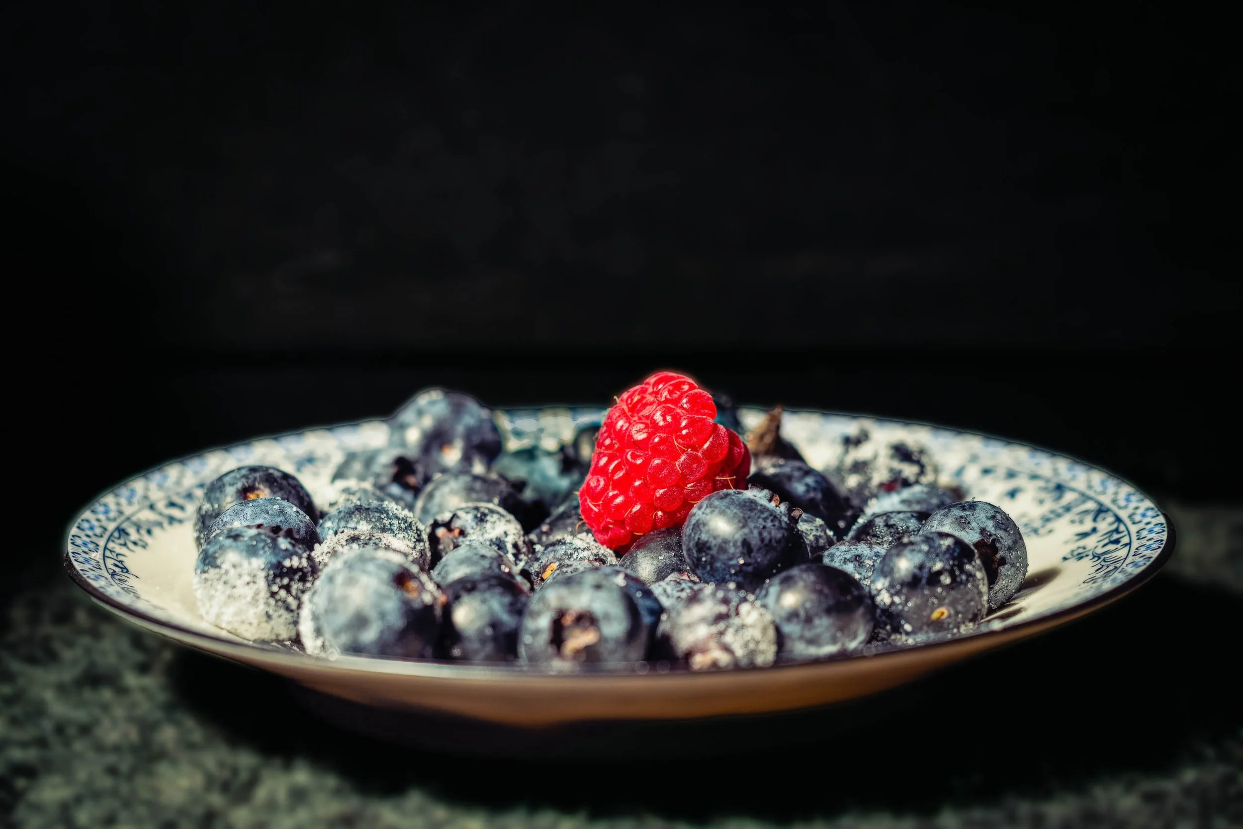
Still Life for Grandmother returns to the same inherited blue-and-white china as Breakfast With Grandmother, but in a completely different register — a single hard light source, a field of pure black, and a composition that owes more to Dutch still-life painting than to any breakfast table. The blueberries pile in low, dense shadow, their frosted bloom and star-shaped blossom scars picked out only where the light finds them directly. One raspberry breaks the field of blue-black with real authority, its individual drupelets and fine hairs rendered in crisp, deliberate detail.
The china itself all but disappears into pattern and reflection — a curve of silver trim catching the light along the rim, the blue design blurring into abstraction at the edges of focus. What's left is texture, weight, and a kind of quiet solemnity that the warmer, brighter version of this same china doesn't carry. The foreground surface, rough-hewn stone, grounds the whole composition in something older and more permanent than a breakfast table — closer to memory than to morning.
This is a deliberately restrained image: no landscape, no architecture, no wide gesture, just the specific, particular weight of an object that outlasts the person who owned it.
DESIGN & STYLING
Still Life for Grandmother suits spaces built around quiet contemplation rather than bright energy: formal dining rooms, entryways, reading rooms, and healthcare or hospice environments where a dark, dignified still life reads as restful rather than somber. Paired with warmer lighting, the deep blacks and jewel-toned blues hold real presence without becoming heavy-handed.
The low-key palette pairs naturally with dark wood, wrought iron, aged brass, and deep neutral walls — interiors that want gravity and history rather than brightness.
CURATED PAIRINGS
For the direct companion piece: Pair with Breakfast With Grandmother — same china, same year, an entirely different mood; together they make the case for how much light and background change what an object means.
For color harmony: Complement with Lavender Rhapsody — the same jewel-toned blues and purples, in a very different key.
For shared tonal restraint: Add The Long Watch to extend the same dark, quiet, deliberate mood into a different subject entirely.
FINE ART PRESENTATION
Still Life for Grandmother is available as a signed fine art photographic print in multiple presentation styles. ChromaLuxe® Metal (gloss, semi-gloss, or matte) suits this piece particularly well — true blacks and a glossy surface both reinforce the dramatic, high-contrast treatment. Acrylic adds even more depth to the blacks for a more contemporary presentation. Framed archival paper offers a softer, more traditional reading if the space calls for it, and Canvas Framed adds texture without fighting the image's own restraint.
Note: Custom and oversized photographic prints are available. Please contact the studio directly to discuss custom framing, matting, or specialized museum glass options.

Breakfast With Grandmother is built from the smallest possible cast of characters: a small mound of blueberries, one solitary raspberry, and the edge of a vintage blue-and-white porcelain cup and saucer, all held in soft, warm, low directional light. The focus falls precisely on the nearest blueberries — close enough to read the frosted bloom on their skin, the tiny star-shaped blossom scars, individual drops of condensation — while everything behind dissolves into a gentle wash of purple-grey shadow and out-of-focus china pattern.
The single raspberry does the quiet compositional work of the piece. Against a field of blue-black, its warmth pulls the eye first, then releases it into the detail of the berries beside it. The teacup, barely legible as anything but color and pattern, supplies the memory the title asks for — not through any literal narrative, but through the specific, particular kind of porcelain that shows up on grandmothers' breakfast tables and nowhere else quite the same way.
This is Robert Niemeier's quietest register: no landscape, no architecture, no distance — just texture, warmth, and a title that turns a simple bowl of fruit into something considerably more personal.
DESIGN & STYLING
Breakfast With Grandmother was built for exactly the kind of space that benefits from warmth without demanding attention: kitchens, breakfast nooks, dining rooms, and — notably — healthcare and senior living environments, where nostalgic, homelike imagery like this has real, documented value in memory care and reminiscence-focused settings. It reads as calm rather than sentimental, restorative rather than saccharine.
The tight macro crop and soft purple-to-warm palette also work well in smaller residential wall groupings, bathrooms, and hospitality settings looking for something intimate rather than monumental.
CURATED PAIRINGS
For color harmony: Pair with Lavender Rhapsody — the same jewel-toned blues and purples, carried from garden to table.
For a shared memory theme: Complement with Where Memory Waits — very different subjects, same quiet meditation on what objects carry forward.
For restorative stillness: Add The Garden's Quiet Anchor to extend the same soft, contemplative macro treatment.
FINE ART PRESENTATION
Breakfast With Grandmother is available as a signed fine art photographic print in multiple presentation styles. Framed and unframed archival paper prints suit this piece especially well — the softer, more tactile paper surface complements the warmth and intimacy of the subject better than a high-gloss finish would. Canvas Framed is a strong match for the same reason, adding texture without competing with the delicate out-of-focus china. ChromaLuxe® Metal (gloss, semi-gloss, or matte) and Acrylic are both available for a more contemporary, high-contrast presentation if that suits the space better.
Smaller and mid-range sizes are recommended for this piece — it's an intimate subject, and it holds its warmth best at a scale that invites a close look rather than a room-filling statement.
Note: Custom and oversized photographic prints are available. Please contact the studio directly to discuss custom framing, matting, or specialized museum glass options.
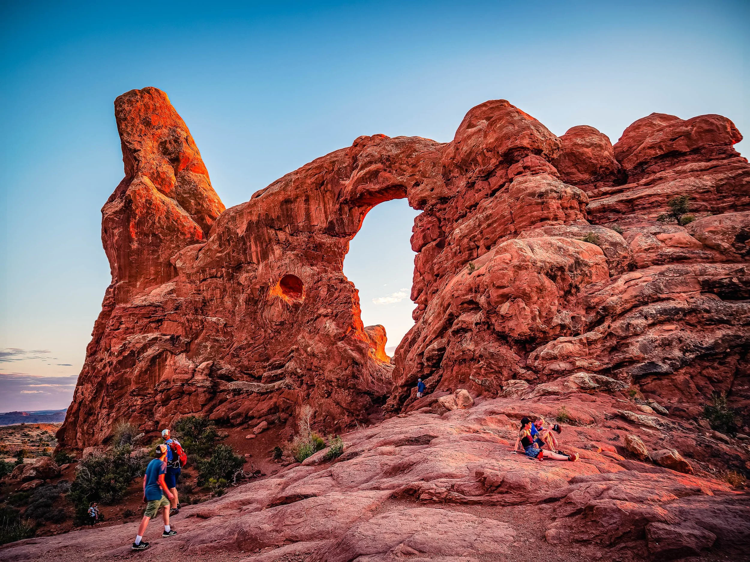
At the Edge of Wonder explores the relationship between human curiosity and the immense scale of the natural world. Photographed at sunset in Arches National Park, Utah, the image captures visitors gathering beneath a towering sandstone formation as the final light of day ignites the rock in shades of red, orange, and gold. Rather than presenting the landscape as an empty wilderness, the photograph embraces the presence of those drawn to experience it, transforming the scene into a reflection on exploration, discovery, and shared wonder.
The composition is built around the sweeping arch that spans the center of the frame, linking two massive rock structures carved by millions of years of erosion. Human figures scattered throughout the landscape provide a sense of scale while introducing multiple narratives within a single image. Some move through the scene, others pause to observe, and one rests quietly in the warm light. These individual moments create a visual dialogue between the fleeting nature of human experience and the enduring permanence of the landscape. Drawing inspiration from the color sensitivity of Ernst Haas and the cinematic sense of place found in the work of Wim Wenders, the photograph balances monumental form with intimate observation.
Color plays a central role in the image's emotional impact. The fiery sandstone glows against the cool blue evening sky, creating a natural complementary palette that heightens both atmosphere and depth. The transition from daylight to dusk becomes part of the story, emphasizing the brief window when landscape, light, and human presence align. The resulting photograph is less about a specific landmark and more about a universal experience—the feeling of standing before something larger than oneself and pausing long enough to appreciate it.
Design & Styling
With glowing red, orange, and gold sandstone and small visitors gathered beneath it, At the Edge of Wonder brings scale and a human way in to lobbies, offices, mountain and desert homes, and hospitality spaces. The warm rock holds a large wall well.
Curated Pairings
To create a cohesive gallery wall around the Southwest, consider these companion pieces:
For thematic continuity: Pair with The First Aperture, continuing the exploration of iconic natural formations and the experience of discovery in the American Southwest.
For visual contrast: Complement with Enduring Silence, a quieter, more contemplative interpretation of monumental landscapes that keeps a strong sense of scale.
For sculptural form: Pair with Where Sisters Rise, extending the dialogue between stone, light, and desert geology in the same red-rock and blue-sky palette.
Fine Art Presentation
Available as a signed fine art print on ChromaLuxe® Metal (gloss, semi-gloss, or matte), Glossy Anti-Glare Acrylic (TruLife), canvas, wood, and archival paper (framed or unframed). ChromaLuxe® Metal is the recommended presentation: it holds the luminous red, orange, and gold of the sunset sandstone and its fine texture. Acrylic is the alternative for extra depth in the evening color, and canvas for a warmer, more tactile Southwestern read.
Note: Custom and oversized photographic prints are available. Please contact the studio directly to discuss custom framing, matting, or specialized museum glass options.
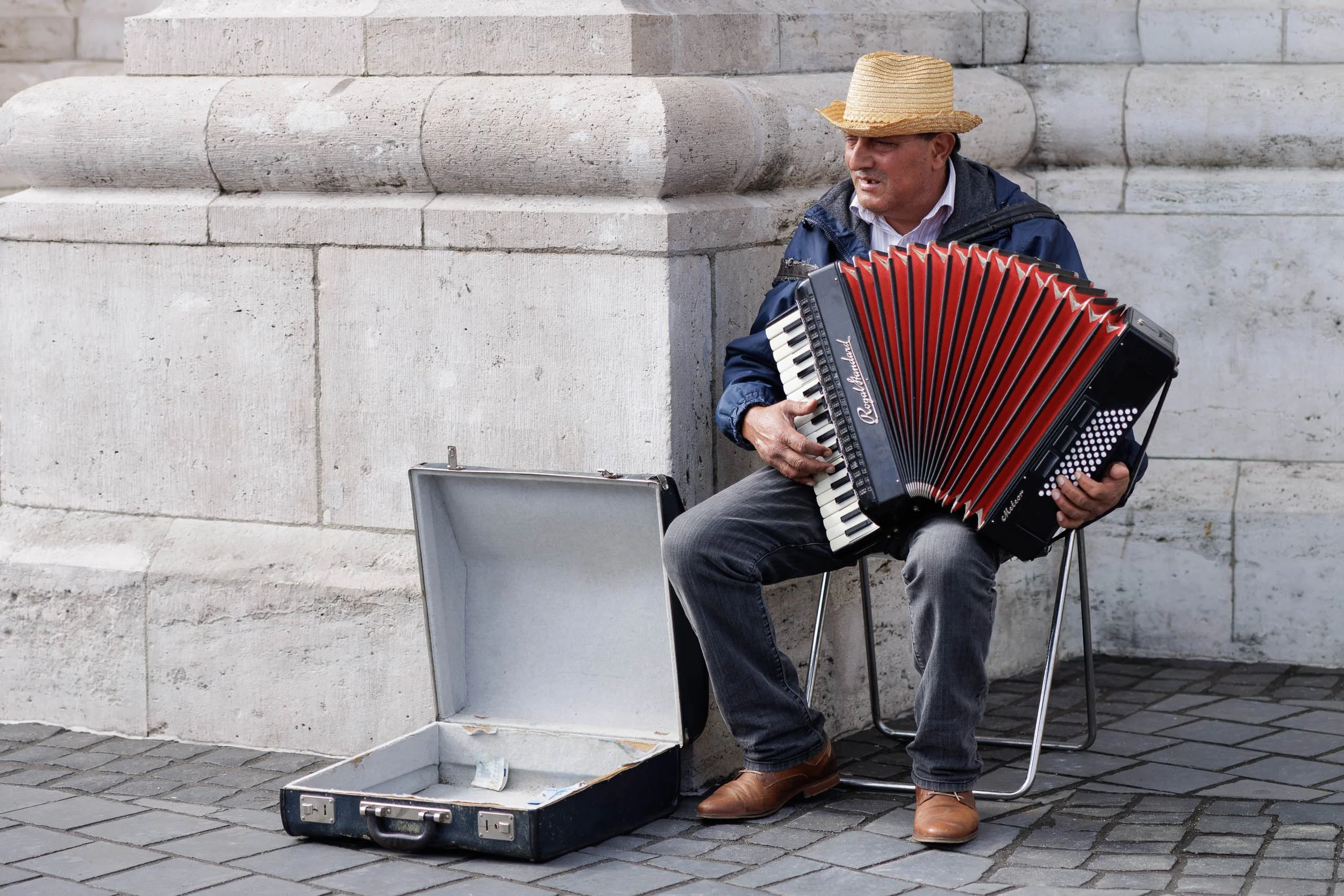
The Musician of Buda explores the relationship between individual expression and the enduring presence of place. Photographed in Budapest's historic Castle District, the image captures a street musician seated beneath centuries-old stone architecture, his vivid red accordion bringing warmth, color, and life to a quiet corner of the city. The scene reflects a moment that is both ordinary and memorable—a musician at work, surrounded by the history and permanence of the built environment.
Rather than focusing solely on the performer, the photograph considers the dialogue between human presence and architecture. The massive stone walls and monumental forms speak to generations of history, while the musician introduces a temporary yet deeply human element. His music exists only in the moment, transforming the space around him and creating a connection between place and passerby. The open instrument case at his feet hints at both livelihood and invitation, adding another layer to the narrative.
The restrained palette of pale stone, muted pavement, and soft afternoon light allows the red accordion to become the visual center of the composition. Drawing inspiration from documentary and street photography traditions, the image celebrates the small moments that give character and meaning to historic cities. It is a study of music, resilience, and the ways people leave their mark on places that have endured far longer than any individual life.
Design & Styling
With its balance of architectural structure and human presence, The Musician of Buda works particularly well in music rooms, studies, libraries, hospitality environments, offices, healthcare settings, and residential interiors. The photograph introduces warmth, narrative, and cultural character while maintaining a calm and timeless visual presence.
Curated Pairings
For human presence: Pair with The Bartender's Measure to explore the lives of individuals whose work and presence help define the atmosphere of a place.
For European storytelling: Complement this piece with Waiting for a Ride, where everyday life similarly unfolds through observation, gesture, and quiet narrative.
For urban character: Pair with Among the Names to create a collection focused on memory, culture, and the people who bring historic cities to life.
Fine Art Presentation
Available as a signed fine art print in ChromaLuxe® Metal (gloss, semi-gloss, or matte), framed paper, framed canvas, and acrylic presentation formats. ChromaLuxe® Metal and Framed Fine Art Paper are particularly well suited to preserving the subtle textures of the stone architecture, the richness of the accordion's color, and the quiet atmosphere of the scene.
Note: Custom and oversized photographic prints are available. Please contact the studio directly to discuss custom framing, matting, or specialized museum glass options.
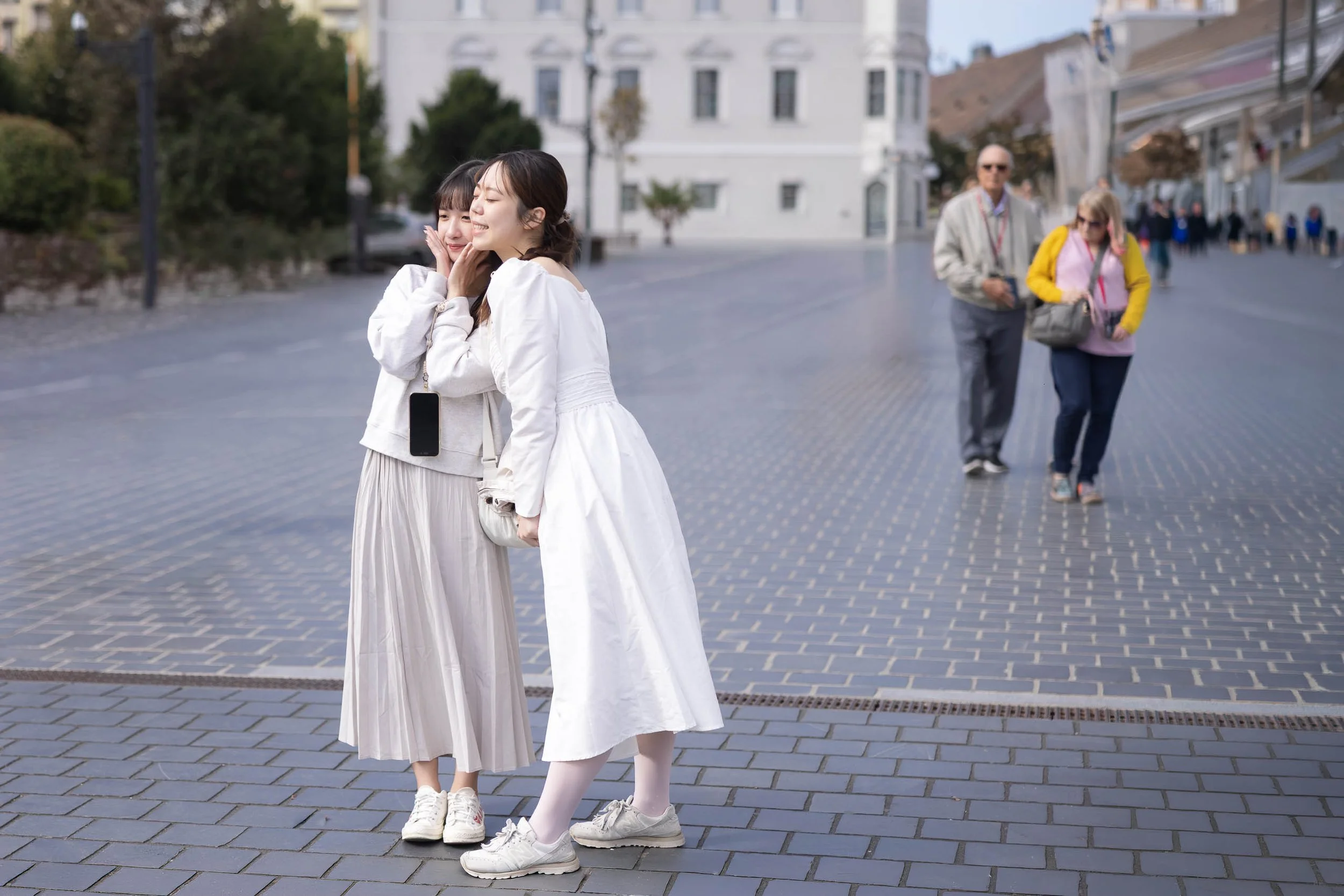
A Shared Moment explores the quiet connections that unfold within public spaces and the fleeting interactions that often define our memories of a place. Photographed in Budapest, Hungary, the image captures two friends sharing a private moment within the openness of a city square. Their relaxed posture and natural expressions create an intimate focal point while the surrounding environment quietly continues around them.
Rather than emphasizing the architecture or scale of the city, the photograph focuses on human presence and emotional resonance. The two women occupy a small portion of the expansive plaza, yet their interaction immediately anchors the scene. Behind them, an older couple moves through the background, introducing a second layer of life that expands the narrative beyond the foreground subjects. The resulting composition becomes a study of connection, observation, and the overlapping experiences that coexist within shared public spaces.
The restrained palette of soft whites, cool gray paving stones, and muted urban tones reinforces the photograph's contemplative atmosphere. Drawing inspiration from the observational traditions of street photography and the quiet narratives found in everyday life, the image celebrates a brief moment that might otherwise pass unnoticed.
Design & Styling
Two friends in an easy, private moment give A Shared Moment a warm human center for living rooms, dining rooms, cafés, hotel corridors, and offices. Its soft depth of field and unforced gesture make it a welcoming piece rather than a statement.
Curated Pairings
To build a wall around quiet human connection in public places, consider these companion pieces:
For human connection: Pair with Waiting, continuing the exploration of quiet moments and individual presence within public environments.
For narrative atmosphere: Complement this piece with Waiting for a Ride, where everyday life similarly unfolds through gesture, anticipation, and observation.
For European storytelling: Pair with The Bartender's Measure (Noir), a collection centered on human experience, place, and visual narrative.
Fine Art Presentation
Available as a signed fine art print on ChromaLuxe® Metal (gloss, semi-gloss, or matte), Glossy Anti-Glare Acrylic (TruLife), canvas, wood, and archival paper (framed or unframed). Framed archival paper is the recommended presentation: its matte, tactile surface suits the soft depth of field and the quiet tonal transitions. ChromaLuxe® Metal is the alternative for a slightly crisper, more luminous city square.
Note: Custom and oversized photographic prints are available. Please contact the studio directly to discuss custom framing, matting, or specialized museum glass options.
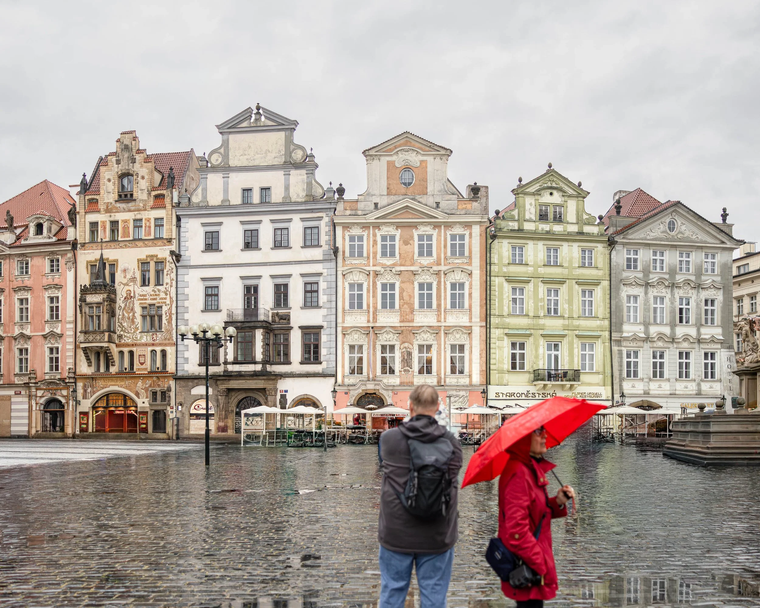
A Pause in the Rain explores the quiet moments that exist between destinations. Photographed on a rainy afternoon in Prague's Old Town Square, the image captures two figures occupying the same space yet inhabiting different experiences. One stands still, facing the historic facades of the city. The other moves through the scene beneath a bright red umbrella, adding a fleeting note of color against the subdued tones of stone, sky, and rain.
The nearly empty square transforms a normally crowded location into a place of contemplation. Rain softens the edges of the city and dampens the noise of daily life, allowing architecture, weather, and human presence to share equal importance. The figures remain slightly anonymous, encouraging viewers to project their own stories onto the scene rather than focusing on specific individuals.
The composition balances permanence and transience. The historic buildings have witnessed centuries of change, while the two figures represent a brief moment that will disappear almost as quickly as it arrived. Reflections in the wet cobblestones reinforce this dialogue between memory and impermanence, creating a visual rhythm that moves the eye through the square.
Influenced by the observational sensibilities of Wim Wenders and the atmospheric use of color associated with Ernst Haas, A Pause in the Rain is ultimately a photograph about presence—about the brief moments when weather, place, and human experience align to create something quietly memorable.
Design & Styling
With its restrained color palette, architectural character, and subtle human narrative, A Pause in the Rain works particularly well in executive offices, hospitality environments, libraries, cultural institutions, residential interiors, and contemporary commercial spaces.
The image introduces a sense of calm observation while maintaining enough visual tension to encourage repeated viewing. It pairs especially well with interiors that emphasize reflection, travel, history, and thoughtful design.
Curated Pairings
To create a cohesive gallery wall, consider pairing A Pause in the Rain with:
The Weight of Names — continues the exploration of memory, history, and human presence within Prague.
Before the City Wakes— extends the theme of solitude and atmosphere in historic European spaces.
Where Memory Waits— complements the image through its quiet reflection on remembrance, passage, and place.
Fine Art Presentation
Available as a signed fine art print in ChromaLuxe® Metal (gloss, semi-gloss, or matte), framed paper, framed canvas, and acrylic presentation formats.
Recommended Presentation: ChromaLuxe® Metal. This presentation preserves the subtle reflections in the rain-soaked cobblestones while maintaining detail throughout the architecture and sky.
Larger presentation sizes are particularly effective, allowing viewers to appreciate both the architectural detail and the relationship between the two figures within the expansive square.
Note: Custom and oversized photographic prints are available. Please contact the studio directly to discuss custom framing, matting, or specialized museum glass options.
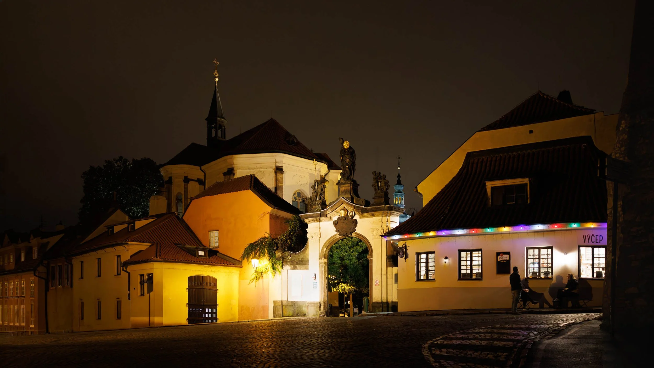
Last Call in Prague explores the quieter hours of the city, when the crowds have faded and only a handful of conversations remain beneath the glow of historic architecture. Photographed on a warm evening near Prague Castle, the image captures three figures gathered outside a neighborhood pub while centuries of history surround them.
The composition is built upon contrasts. Warm interior light spills from the tavern windows into the darkness of the street. Ancient stonework and baroque architecture stand unchanged while everyday life unfolds beneath them. The curved roadway guides the eye through the scene, connecting the illuminated pub, the ornate gateway, and the church rising above the rooftops beyond.
Although Prague is celebrated for its landmarks, the photograph focuses on something more personal. The figures gathered outside the pub become the emotional center of the image, transforming the architecture from backdrop into lived experience. Their presence reminds us that cities are remembered not only through monuments and history, but through conversations, friendships, and the simple rituals of everyday life.
The restrained palette of amber light, deep shadows, and subtle architectural detail creates an atmosphere of intimacy and discovery. Rather than documenting a famous destination, Last Call in Prague reflects on the moments that remain after the sightseeing ends and the city returns to itself.
Drawing inspiration from the observational urban photography of Wim Wenders and the cinematic use of light found throughout European street photography, the image explores memory, place, and the enduring relationship between people and the cities they inhabit.
Design & Styling
Warm pub light spilling onto a street beneath the Prague Castle skyline gives Last Call in Prague an unhurried, convivial mood for bars, restaurants, dining rooms, and home bars. It suits dark wood, brass, and warm neutral walls.
Curated Pairings
To create a cohesive gallery wall around Prague in the evening, consider these companion pieces:
For Prague in solitude: Pair with Before the City Wakes, exploring the city through solitude, atmosphere, and early morning anticipation.
For architecture, light, and people: Complement with Under the Crossing — Prague, continuing the relationship between architecture, light, and human presence within Prague's historic streets.
For mystery and discovery: Pair with Around the Corner, the quieter side of Prague through mystery, atmosphere, and discovery.
Fine Art Presentation
Available as a signed fine art print on ChromaLuxe® Metal (gloss, semi-gloss, or matte), Glossy Anti-Glare Acrylic (TruLife), canvas, wood, and archival paper (framed or unframed). Framed canvas is the recommended presentation: its warmth and texture suit a convivial evening scene and a bar or dining room. ChromaLuxe® Metal is the alternative for the warm interior light at full glow, and framed archival paper for a more traditional reading of the castle architecture.
Note: Custom and oversized photographic prints are available. Please contact the studio directly to discuss custom framing, matting, or specialized museum glass options.
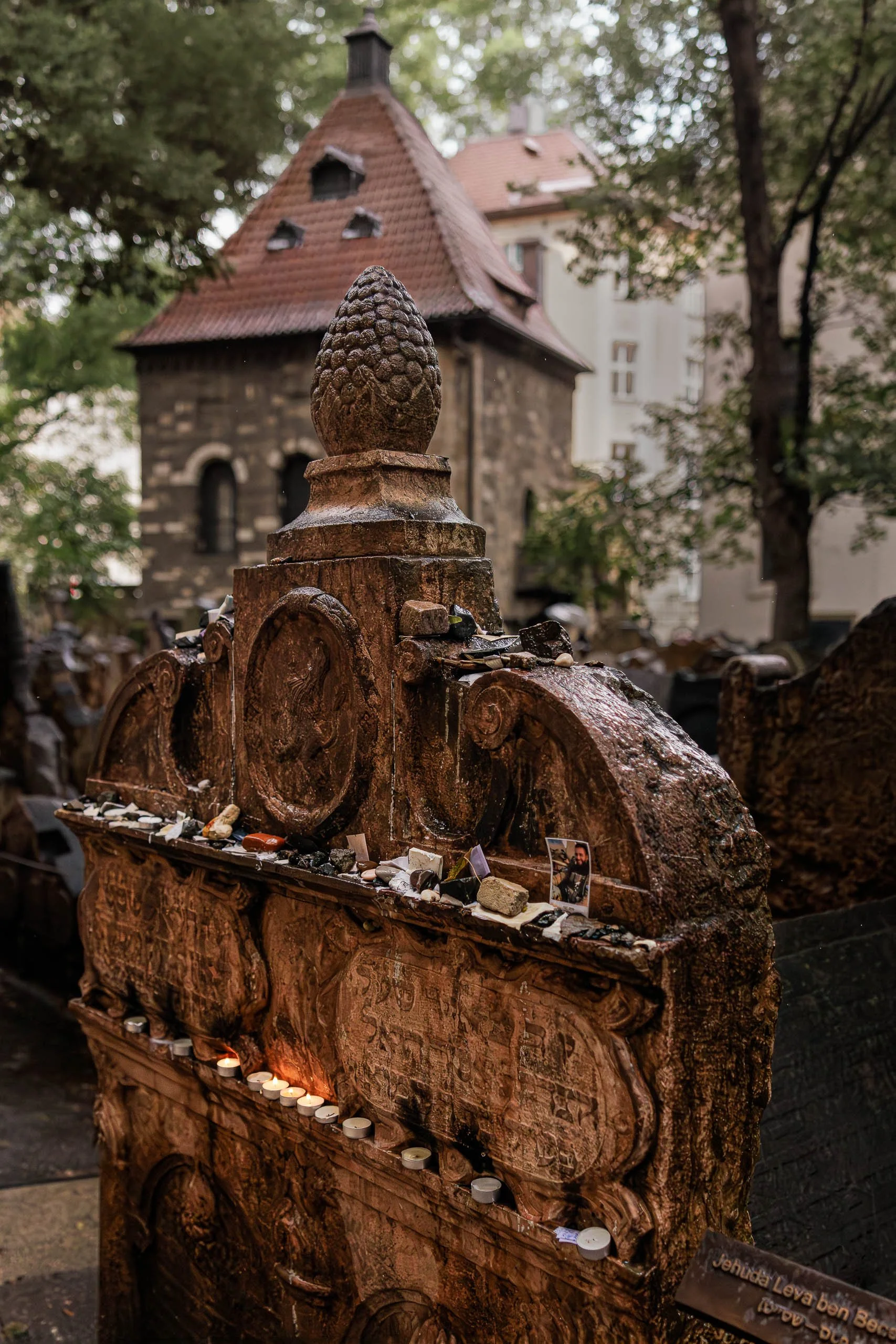
The Stones They Leave Behind explores the enduring act of remembrance and the quiet rituals through which memory is carried forward. Photographed in Prague's historic Jewish Cemetery after rain, the image centers on a weathered tombstone covered with stones, photographs, and candles left by visitors who continue to return, remember, and honor lives long past.
The composition is built around evidence of human presence rather than people themselves. The monument occupies the foreground with a sense of permanence and gravity, while the offerings reveal a continuing relationship between the living and the dead. Each stone, photograph, and candle represents an individual act of remembrance, transforming the tombstone from a historical artifact into a living place of memory.
The rain-softened light contributes to the atmosphere of reflection. Wet stone surfaces reveal centuries of texture and wear, while the small flames of the candles introduce warmth into an otherwise subdued scene. Beyond the monument, the cemetery chapel and surrounding tombstones provide context without distraction, reminding viewers that this single memorial exists within a much larger landscape shaped by history, faith, and time.
Influenced by the contemplative traditions of Josef Sudek and the observational sensibilities of Wim Wenders, The Stones They Leave Behind is less concerned with documenting a specific location than with exploring the universal human desire to remember. The photograph reflects on the ways memory survives through ritual, repetition, and small gestures of care passed from one generation to the next.
Design & Styling
With its rich textures, restrained palette, and contemplative subject matter, The Stones They Leave Behind works particularly well in libraries, studies, healthcare environments, hospitality settings, executive offices, and thoughtfully designed residential interiors.
The image introduces depth, history, and quiet reflection while maintaining a strong visual presence. Its combination of architecture, ritual, and human narrative makes it especially effective in spaces intended to encourage contemplation and meaningful conversation.
Curated Pairings
To create a cohesive gallery wall, consider pairing The Stones They Leave Behind with:
The Weight of Names — explores memory through the encounter between an individual and the collective record of history.
Where Memory Waits — continues the Prague narrative through themes of remembrance, passage, and human presence.
Before the City Wakes — complements the image through atmosphere, quiet observation, and the experience of place.
Fine Art Presentation
Available as a signed fine art print in ChromaLuxe® Metal (gloss, semi-gloss, or matte), framed paper, framed canvas, and acrylic presentation formats.
Recommended Presentation: ChromaLuxe® Metal. This presentation preserves the subtle shadow detail, wet stone textures, and candlelight while maintaining the contemplative mood of the image.
Larger presentation sizes are particularly effective, allowing viewers to discover the individual offerings, photographs, and stones that give the image its emotional resonance.
Note: Custom and oversized photographic prints are available. Please contact the studio directly to discuss custom framing, matting, or specialized museum glass options.
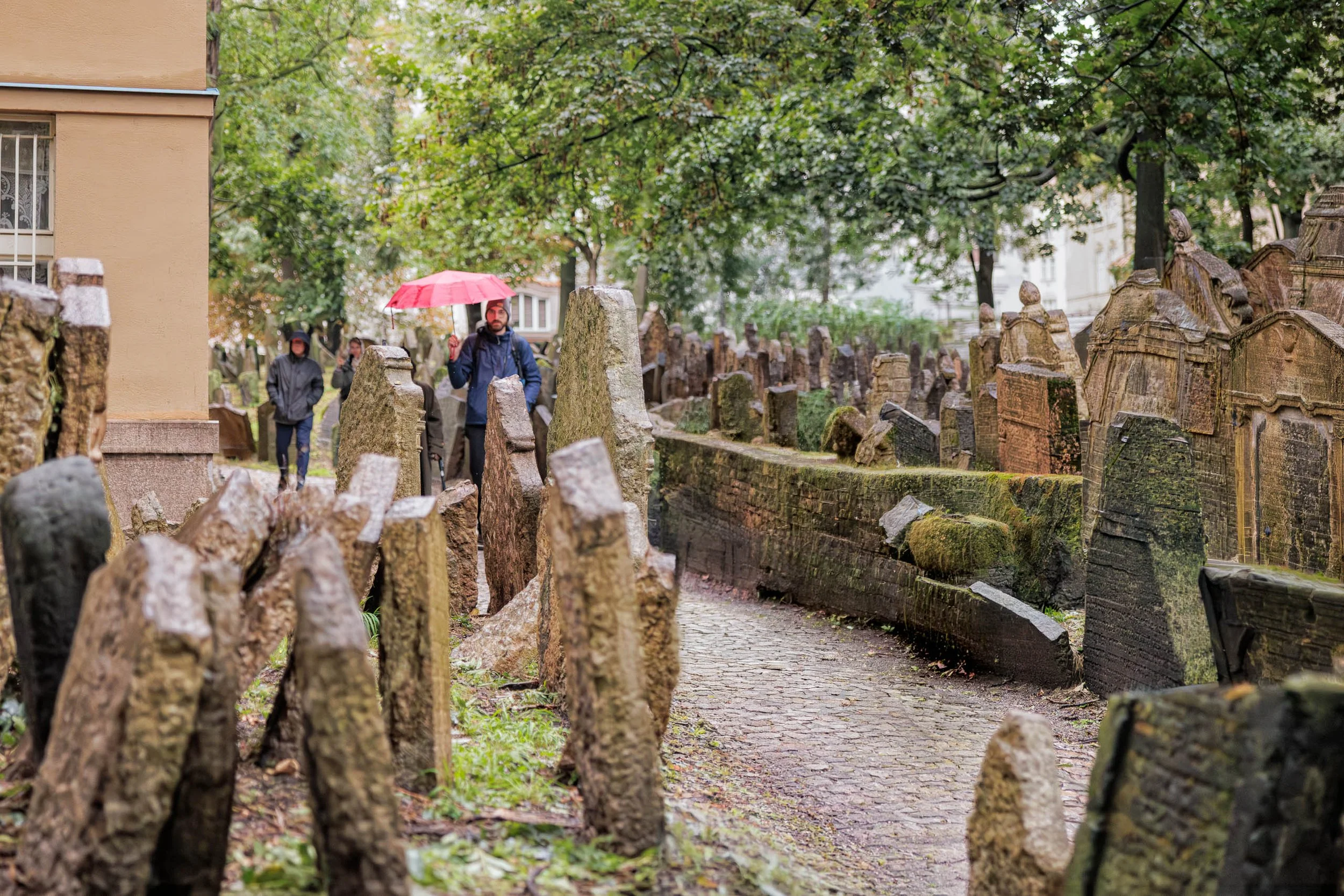
Where Memory Waits explores the relationship between the living and the traces they inherit from those who came before. Photographed in Prague's historic Jewish Cemetery on a rainy afternoon, the image captures a visitor carrying a red umbrella as he moves through a narrow pathway surrounded by centuries-old tombstones.
The composition balances movement against permanence. The visitor continues forward through the scene while the leaning stones remain fixed in place, bearing witness to generations of history. The red umbrella provides a point of human presence within a landscape shaped by memory, creating a visual connection between contemporary life and the stories preserved within the cemetery.
The photograph is filled with subtle contrasts. The weathered stones speak of endurance and time, while the visitor's brief passage suggests the temporary nature of individual experience. Moss-covered surfaces, soft rain light, and the winding pathway create an atmosphere of quiet reflection rather than solemnity. The image invites viewers to consider how places preserve memory and how we move through environments shaped by lives we never knew.
Influenced by the observational sensibilities of Wim Wenders and the color-driven atmosphere of Ernst Haas, Where Memory Waits is less about documenting a historic site than about exploring the universal experience of encountering history within everyday life. It is a photograph about remembrance, passage, and the enduring dialogue between past and present.
Design & Styling
With its layered composition, atmospheric color palette, and narrative sense of place, Where Memory Waits works particularly well in libraries, executive offices, hospitality environments, healthcare spaces, studies, and thoughtfully designed residential interiors.
The image introduces visual depth and quiet contemplation while maintaining a strong sense of human presence. Its combination of history, atmosphere, and storytelling makes it especially effective in spaces intended to encourage reflection and conversation.
Curated Pairings
To create a cohesive gallery wall, consider pairing Where Memory Waits with:
The Weight of Names — continues the exploration of memory, history, and individual reflection.
Golem Watches Over Her — extends the Prague narrative through themes of history, culture, and human presence.
Before the City Wakes — complements the image through its atmosphere of quiet observation and discovery.
Fine Art Presentation
Available as a signed fine art print in ChromaLuxe® Metal (gloss, semi-gloss, or matte), framed paper, framed canvas, and acrylic presentation formats.
Recommended Presentation: ChromaLuxe® Metal. This presentation preserves the subtle textures of the stonework, the atmosphere of the rain-softened light, and the richness of the red umbrella while maintaining detail throughout the scene.
Larger presentation sizes are particularly effective, allowing viewers to experience the layered depth of the cemetery and the relationship between the visitor and the surrounding landscape of memory.
Note: Custom and oversized photographic prints are available. Please contact the studio directly to discuss custom framing, matting, or specialized museum glass options.

Modern Gladiators explores the tension between the individual and the relentless movement of contemporary life. Photographed at dusk in Rome, the image captures a solitary figure standing at the edge of a busy intersection while streams of traffic sweep around him in luminous ribbons of light.
The composition balances stillness against motion. The pedestrian remains grounded and contemplative while the city races past in every direction. Long exposure transforms ordinary traffic into flowing bands of energy, turning the intersection into a modern arena where daily life unfolds as a quiet act of endurance and navigation.
The title draws a connection between contemporary urban life and Rome's ancient history. Where gladiators once entered the arena to face uncertainty, today's city dwellers move through environments defined by speed, complexity, and constant motion. The photograph suggests that courage is often found not in grand gestures but in ordinary moments of persistence.
Influenced by the observational sensibilities of Wim Wenders and the color-driven atmosphere of Ernst Haas, Modern Gladiators is less about Rome as a destination and more about the universal experience of finding one's place within the flow of modern life.
With its dynamic light trails, strong architectural structure, and contemporary urban narrative, Modern Gladiators works particularly well in executive offices, hospitality environments, technology spaces, modern residential interiors, and corporate collections.
The image introduces movement and energy while maintaining a thoughtful human presence, making it especially effective in spaces designed to inspire creativity, reflection, and engagement.
To create a cohesive gallery wall, consider pairing Modern Gladiators with:
Waiting for a Ride — continues the theme of human presence within the urban environment.
Night Watch at the Colosseum (Monotone) — extends the Roman narrative while exploring solitude and observation.
The Bartender's Measure — complements the image through its study of ritual, character, and everyday experience.
Among Strange Flowers — adds a quieter contemplative counterpart centered on observation and discovery.
Under the Crossing — balances the energy of the city with architectural atmosphere and reflection.
Available as a signed fine art print in ChromaLuxe® Metal (gloss, semi-gloss, or matte), framed paper, framed canvas, and acrylic presentation formats.
Recommended Presentation: ChromaLuxe® Metal. This presentation preserves the luminous quality of the light trails while maintaining detail in the shadows and architectural elements throughout the scene.
Larger presentation sizes are particularly effective, allowing the viewer to experience the contrast between the still figure and the flowing movement of the city.
Note: Custom and oversized photographic prints are available. Please contact the studio directly to discuss custom framing, matting, or specialized museum glass options.
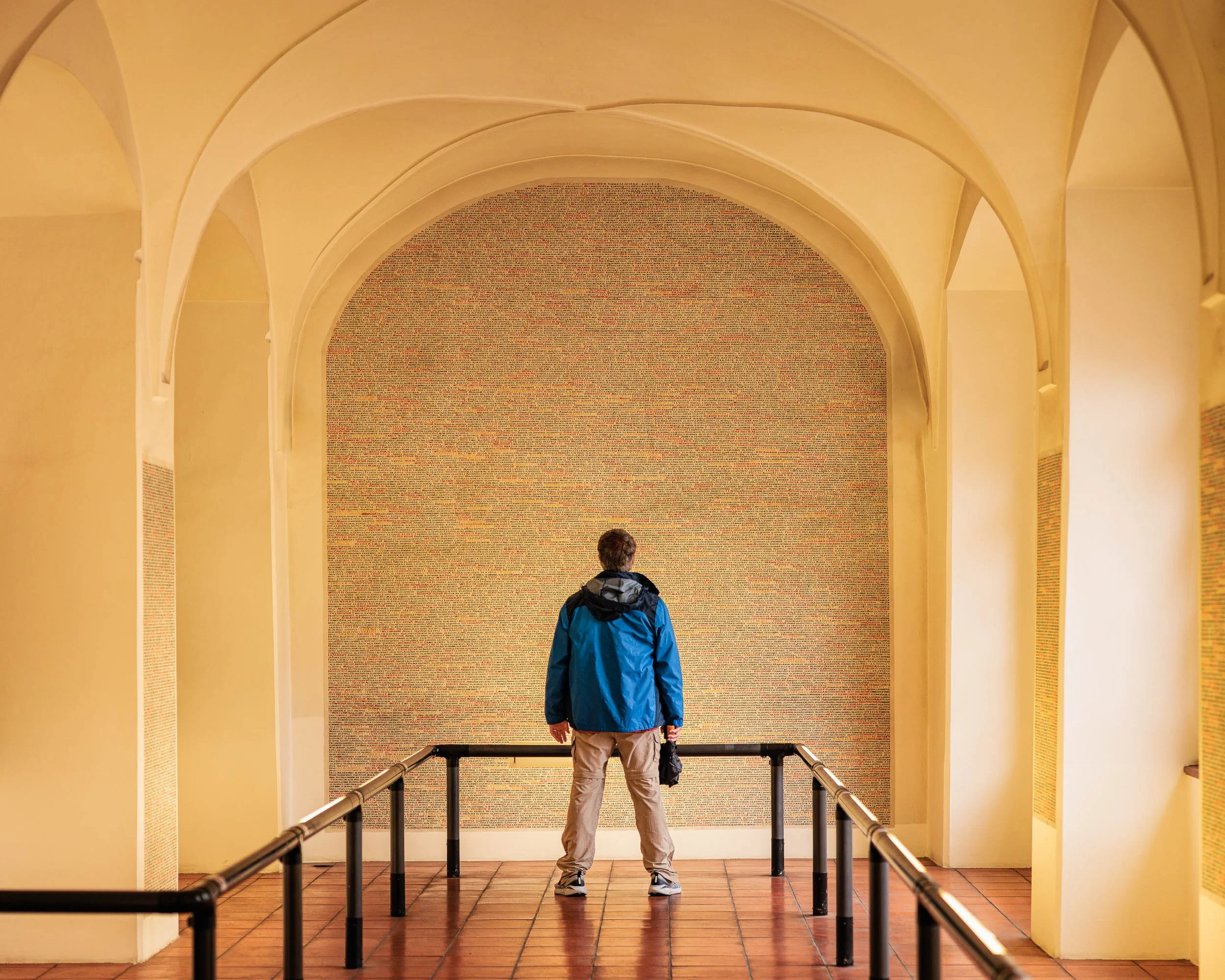
The Weight of Names explores the relationship between individual experience and collective memory. Photographed in Prague, the image captures a solitary visitor standing before a vast wall of names, creating a moment of reflection on history, remembrance, and the enduring impact of human lives across generations.
The composition balances a single human presence against the scale of something far larger. The visitor occupies only a small portion of the frame, yet becomes its emotional center. Surrounded by soaring arches, converging railings, and a seemingly endless field of names, he stands as a reminder of how individuals encounter history—not through grand events, but through quiet moments of observation and contemplation.
The architecture reinforces this sense of reflection. Repeating forms guide the viewer inward while the warm tones of the space create an atmosphere of permanence and dignity. Against this restrained palette, the visitor's blue jacket becomes a subtle point of focus, emphasizing both presence and vulnerability. The image invites viewers to consider how memory is preserved and how the stories of countless lives continue to shape the present.
Influenced by the contemplative visual language of Wim Wenders and the humanistic traditions of European photography, The Weight of Names is less about documenting a specific location than about exploring the universal experience of standing before something larger than oneself. The photograph asks viewers to slow down, reflect, and consider the relationship between personal experience and collective remembrance.
Design & Styling
With its strong architectural structure, restrained color palette, and contemplative narrative, The Weight of Names works particularly well in executive offices, libraries, educational institutions, healthcare environments, professional waiting areas, and thoughtfully designed residential interiors.
The image introduces a sense of reflection and quiet presence while maintaining a clean architectural aesthetic. Its combination of human narrative and formal design makes it especially effective in spaces intended to encourage thought, learning, creativity, and meaningful conversation.
Curated Pairings
To create a cohesive gallery wall, consider pairing The Weight of Names with:
Among the Names — continues the exploration of memory, history, and personal reflection.
Shoes on the Danube — extends the theme of remembrance through place and historical presence.
Golem Watches Over Her — complements the Prague narrative while exploring the relationship between people, history, and cultural memory.
Fine Art Presentation
Available as a signed fine art print in ChromaLuxe® Metal (gloss, semi-gloss, or matte), framed paper, framed canvas, and acrylic presentation formats.
Recommended Presentation: ChromaLuxe® Metal. This presentation preserves the subtle tonal transitions, architectural detail, and restrained color palette that could compete with the contemplative nature of the image.
Larger presentation sizes are particularly effective, allowing viewers to fully experience the relationship between the solitary figure and the scale of the surrounding architecture.
Note: Custom and oversized photographic prints are available. Please contact the studio directly to discuss custom framing, matting, or specialized museum glass options.
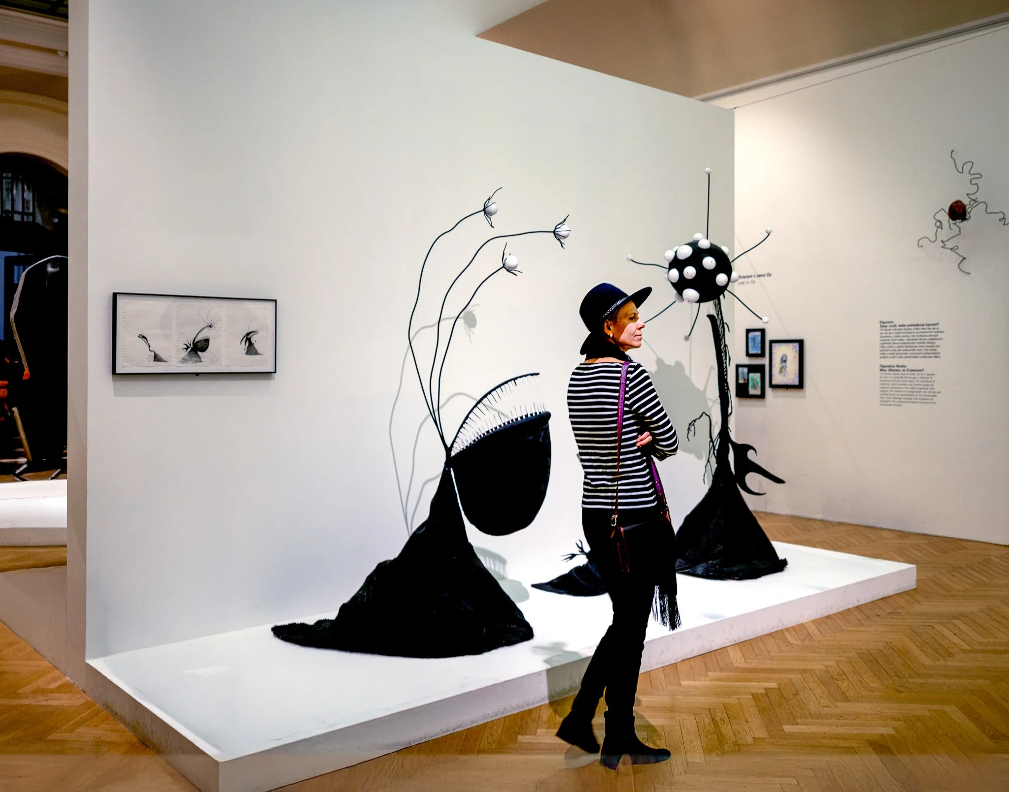
Among Strange Flowers explores curiosity, observation, and the quiet relationship between people and art. Photographed inside a Prague gallery, the image captures a solitary visitor pausing among a collection of whimsical sculptural forms that appear to grow from the gallery floor like strange botanical specimens.
The photograph balances human presence against an imaginative environment. The visitor's striped clothing echoes the monochromatic forms of the installation, creating a visual connection between observer and artwork. Surrounded by oversized flowers, abstract seedpods, and organic shapes, she appears momentarily suspended between the familiar and the fantastical. Rather than documenting the exhibition itself, the image focuses on a fleeting moment of engagement—an encounter between imagination and observation.
The restrained palette and spacious composition allow the sculptural forms to breathe while emphasizing the visitor's role within the scene. The result is both playful and contemplative, inviting viewers to consider the ways art transforms ordinary spaces into places of discovery.
Drawing inspiration from the observational photography of Wim Wenders and the human-centered storytelling found in contemporary documentary work, Among Strange Flowers celebrates the simple act of wandering, noticing, and wondering.
Design & Styling
The whimsy of sculptural forms that appear to grow from a gallery floor makes Among Strange Flowers a natural fit for design studios, creative offices, galleries, and modern homes with an art-minded owner. The solitary visitor gives the scene human scale.
Curated Pairings
To build a wall around galleries, looking, and human presence, consider these companion pieces:
For observation in a gallery: Pair with Shared Attention, exploring connection and observation within a gallery setting.
For quiet contemplation: Complement with Waiting, continuing the theme of quiet contemplation and human experience.
For people in public space: Add Modern Gladiators, a contemporary study of people interacting within public spaces.
Fine Art Presentation
Available as a signed fine art print on ChromaLuxe® Metal (gloss, semi-gloss, or matte), Glossy Anti-Glare Acrylic (TruLife), canvas, wood, and archival paper (framed or unframed). Acrylic is the recommended presentation: its depth and clarity suit the imaginative sculptural forms and the tonal relationships of a gallery interior. Framed archival paper is the alternative for a quieter, more traditional gallery-print read.
Note: Custom and oversized photographic prints are available. Please contact the studio directly to discuss custom framing, matting, or specialized museum glass options.
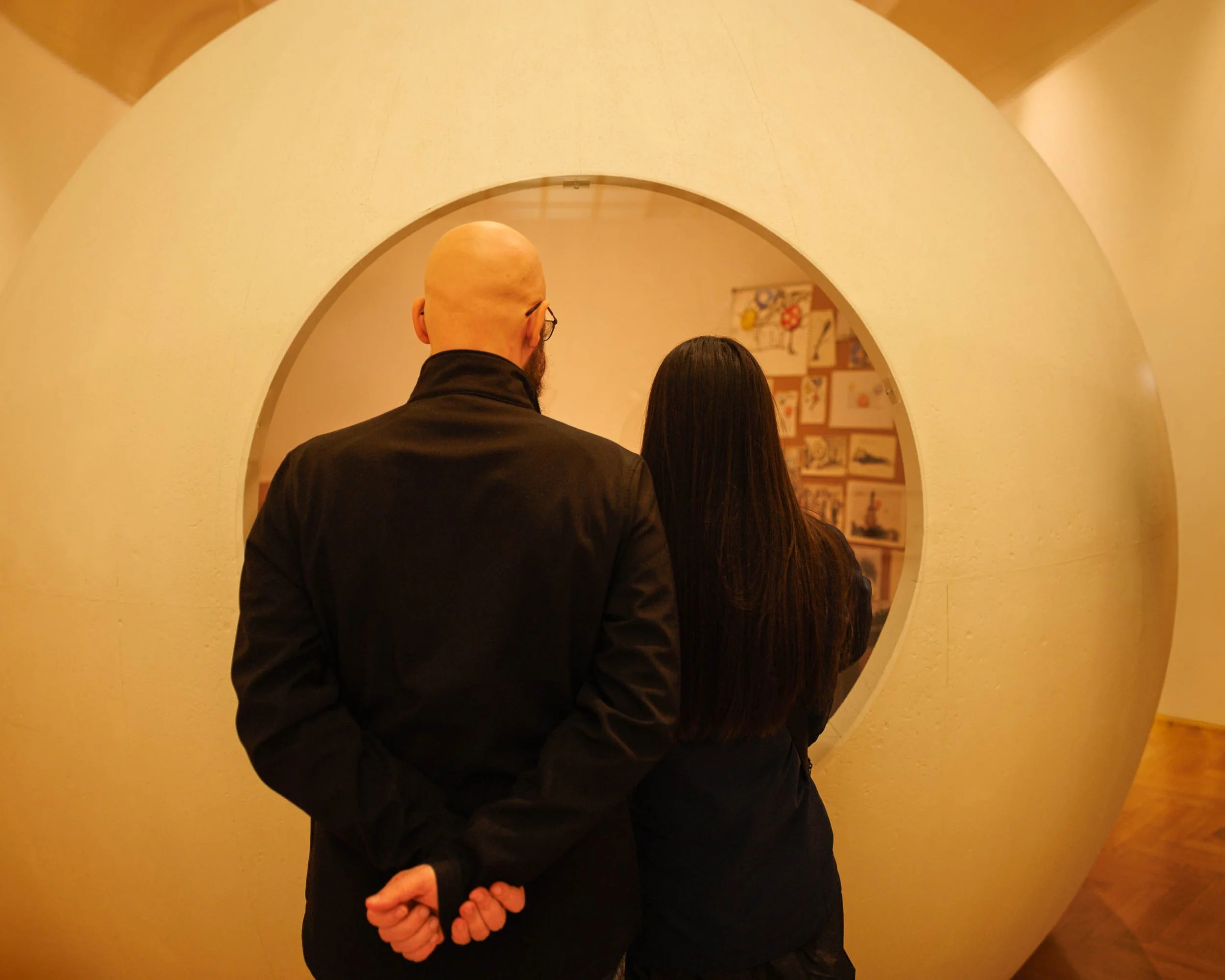
Shared Attention is a study of observation, connection, and the quiet moments that unfold within cultural spaces. Photographed in a Prague gallery, the image captures two visitors standing before an exhibition, framed by a large circular architectural opening that transforms an ordinary act of looking into a carefully composed visual narrative.
The photograph is built around a simple human gesture. Standing side by side, the figures direct their attention toward artwork beyond the circular frame. Their anonymity invites viewers to step into the scene themselves, transforming the image from a portrait of specific individuals into a reflection on shared curiosity and discovery. The circular structure creates a frame within a frame, guiding the eye toward both the viewers and the objects of their attention while emphasizing the relationship between people, art, and space.
The warm tones of the gallery environment reinforce a sense of intimacy and contemplation. Rather than focusing on the artwork itself, the photograph explores the act of engagement—the moment when two people pause together to observe, interpret, and experience something beyond themselves.
Drawing inspiration from the observational sensibilities of Wim Wenders and the quiet humanism found in much of contemporary documentary photography, Shared Attention reflects on the universal experience of looking, learning, and connecting through art.
Design & Styling
Two visitors framed by a large circular opening turn an ordinary act of looking into a composition, so Shared Attention suits galleries, design and creative offices, and modern homes with an art-minded owner. The geometry is graphic enough for a clean, contemporary wall.
Curated Pairings
To build a wall around galleries and looking together, consider these companion pieces:
For solitude and anticipation: Pair with Waiting, exploring solitude, reflection, and quiet anticipation.
For remembrance and individual experience: Complement with Among the Names - Monotone, examining remembrance and individual experience within a shared historical space.
For people in public space: Add Modern Gladiators, a contemporary study of people interacting within public environments.
Fine Art Presentation
Available as a signed fine art print on ChromaLuxe® Metal (gloss, semi-gloss, or matte), Glossy Anti-Glare Acrylic (TruLife), canvas, wood, and archival paper (framed or unframed). Acrylic is the recommended presentation: its clarity suits the architectural geometry and the warm gallery light. Framed archival paper is the alternative for a quieter, more traditional gallery-print read.
Note: Custom and oversized photographic prints are available. Please contact the studio directly to discuss custom framing, matting, or specialized museum glass options.
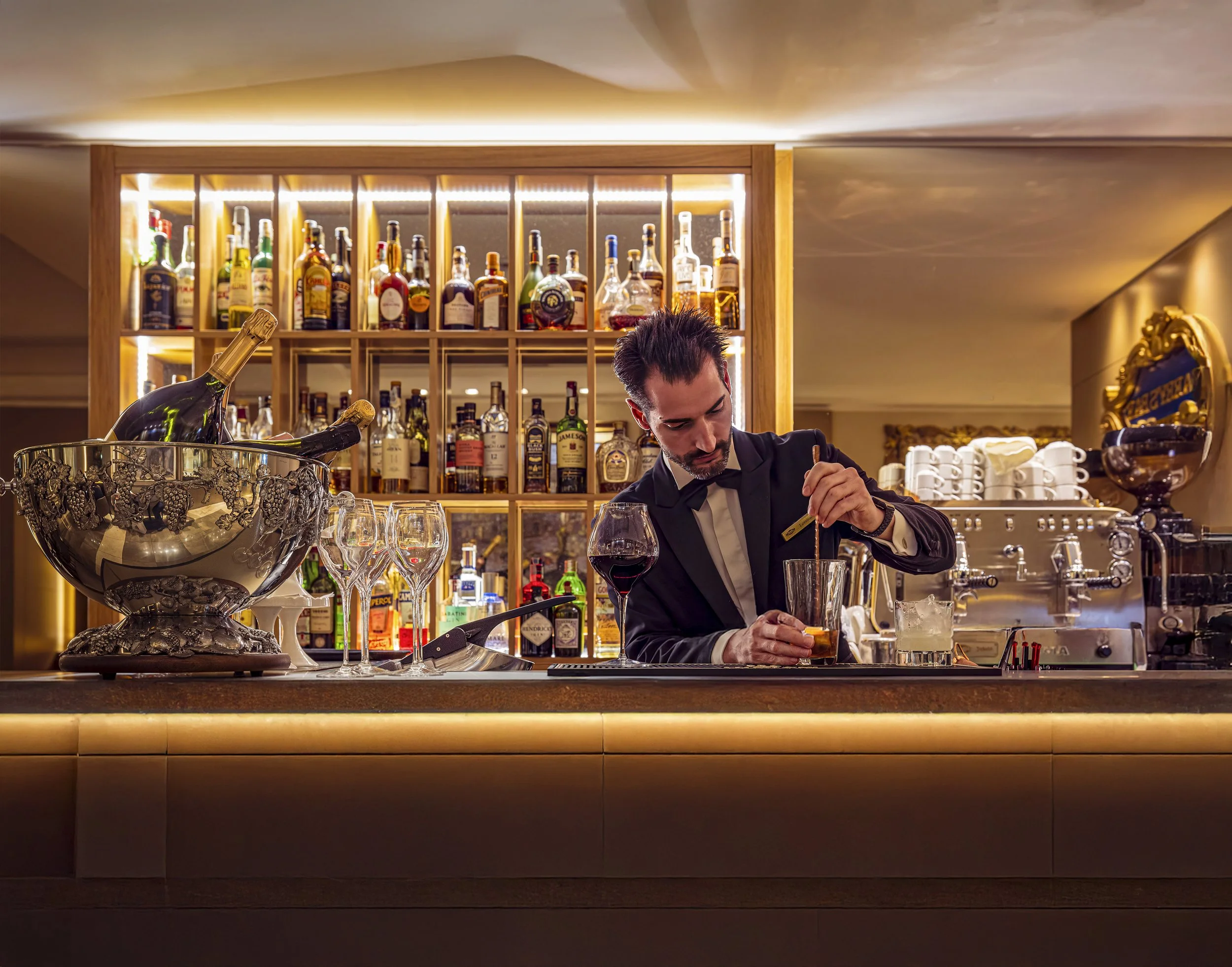
The Bartender's Measure (Color) is a documentary-style photograph exploring ritual, craftsmanship, and the quiet choreography of hospitality. Captured within the warm interior of a traditional European bar, the image focuses on the precise moment a bartender measures a pour, transforming an everyday action into a study of gesture, concentration, and human connection. Rich amber tones, reflected light, and layered interior details create an atmosphere that feels both intimate and timeless.
Drawing from the observational storytelling traditions of Wim Wenders and the luminous color sensibilities associated with Ernst Haas, the photograph celebrates the beauty found within ordinary moments. Rather than focusing on spectacle or nightlife, the image explores the quieter side of hospitality—the measured movements, practiced skill, and small rituals that transform service into craft.
The shallow depth of field and carefully layered composition allow the viewer to become an observer rather than a participant, creating a sense of presence and narrative without fully revealing the story. The result is an image centered on atmosphere, gesture, and the enduring human desire to gather, converse, and connect.
Design & Styling
With its warm amber palette, intimate lighting, and narrative atmosphere, The Bartender's Measure (Color) belongs in restaurants, cocktail bars, wine rooms, lounges, and boutique hotels, and in home bars and dining rooms that want warmth and craft. Against deep wood or a dark green wall, the amber reads as glowing light.
Curated Pairings
To create a cohesive gallery wall around hospitality and gathering, consider these companion pieces:
For complementary hospitality atmosphere: Pair with Prague Lunch, to extend the visual narrative of food, drink, and shared cultural experience.
For narrative continuity: Complement this piece with Passing Through Prague, which shares the same observational approach to everyday moments in richly atmospheric places.
For another bartender at work: Pair with Behind the Bandana, a St. Louis bartender bent over her work, her hands and hair rendered as pure movement.
Fine Art Presentation
Available as a signed fine art print on ChromaLuxe® Metal (gloss, semi-gloss, or matte), Glossy Anti-Glare Acrylic (TruLife), canvas, wood, and archival paper (framed or unframed). ChromaLuxe® Metal is the recommended presentation for the color version: it holds the amber highlights and the reflected light in the glass at full warmth. Framed canvas is a softer alternative for a home bar or dining room. For the same moment in a quieter register, the Noir version prints best on archival paper.
Note: Custom and oversized photographic prints are available. Please contact the studio directly to discuss custom framing, matting, or specialized museum glass options.
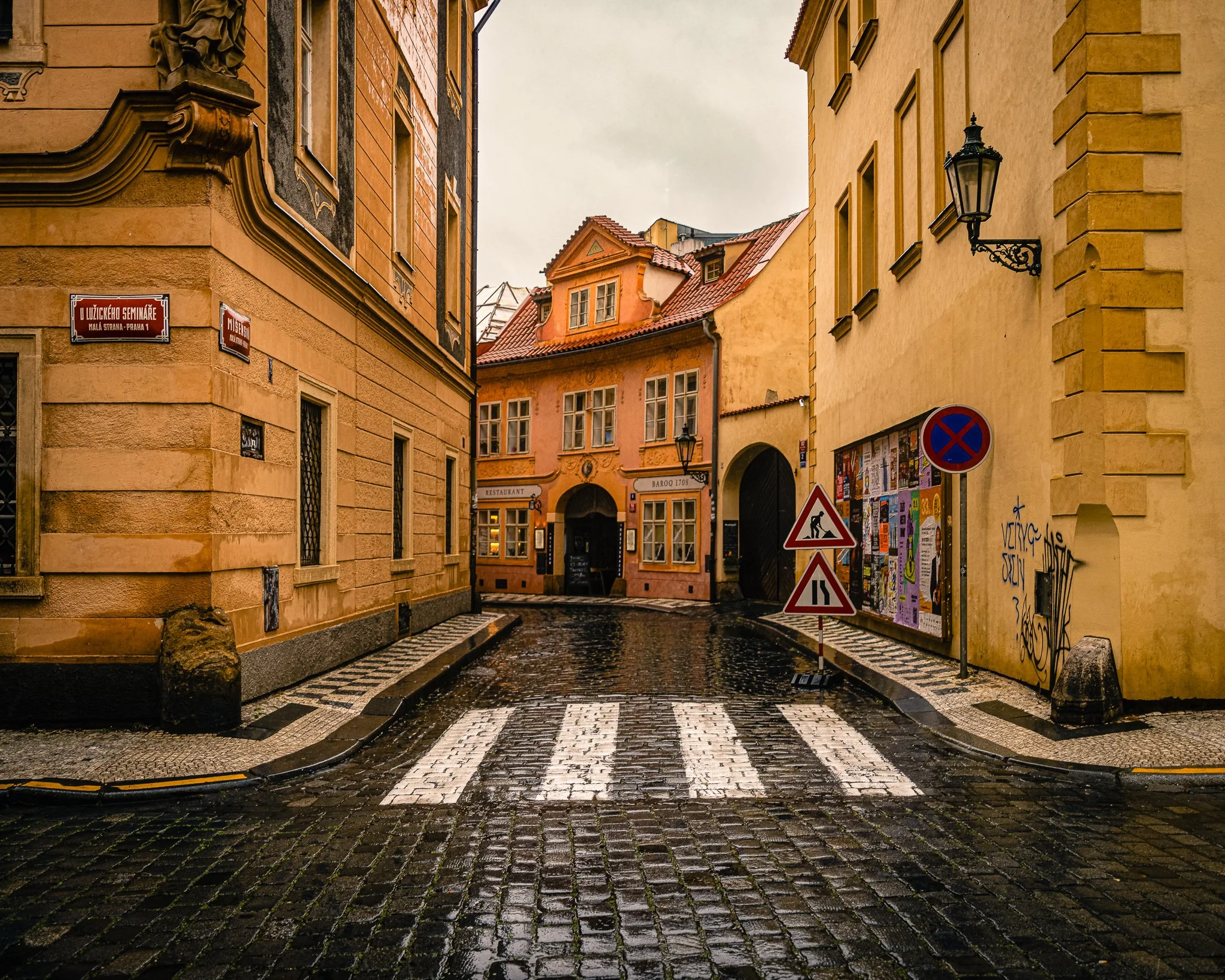
After the Rain, Prague is an atmospheric study of place, memory, and the quiet beauty that emerges when a city pauses between storms. Captured in Prague's historic Malá Strana district, the photograph follows a rain-darkened cobblestone street as it curves gently toward a cluster of warm pastel buildings glowing beneath an overcast sky. The wet pavement reflects the muted light of the afternoon, transforming an ordinary street corner into a scene defined by texture, rhythm, and atmosphere.
Rather than focusing on Prague's famous landmarks, the image explores the quieter character of the city—the narrow streets, weathered facades, and subtle architectural details that reveal themselves only when the crowds have disappeared. The composition balances strong geometric lines with organic reflections, creating a sense of movement while maintaining the stillness that often follows rain.
Drawing inspiration from the cinematic use of color found in the work of Ernst Haas and the observational sensibility of European street photography, the photograph invites viewers to experience Prague not as a destination, but as a place to wander slowly and attentively.
Design & Styling
With its warm architectural palette, reflective cobblestones, and understated atmosphere, After the Rain, Prague works particularly well in hospitality environments, executive offices, urban residential interiors, and travel-inspired spaces. The image provides visual interest without overwhelming a room, making it especially suitable for settings that benefit from a sense of calm, sophistication, and place.
Curated Pairings
To create a cohesive gallery wall, consider these companion pieces:
Before the City Wakes — shares the same Prague setting, rain-soaked atmosphere, and sense of quiet discovery.
Prague Streetcar #12 — complements the architectural character and urban rhythm found throughout the city.
The Bartender's Measure — extends the European narrative and observational approach into a more intimate human setting.
Fine Art Presentation
Available as a signed fine art print in ChromaLuxe® Metal (gloss, semi-gloss, or matte), framed paper, framed canvas, and acrylic presentation formats. ChromaLuxe® Metal presentation is recommended to preserve the rich detail of the cobblestones and the subtle tonal transitions within the architecture and sky.
Note: Custom and oversized photographic prints are available. Please contact the studio directly to discuss custom framing, matting, or specialized museum glass options.
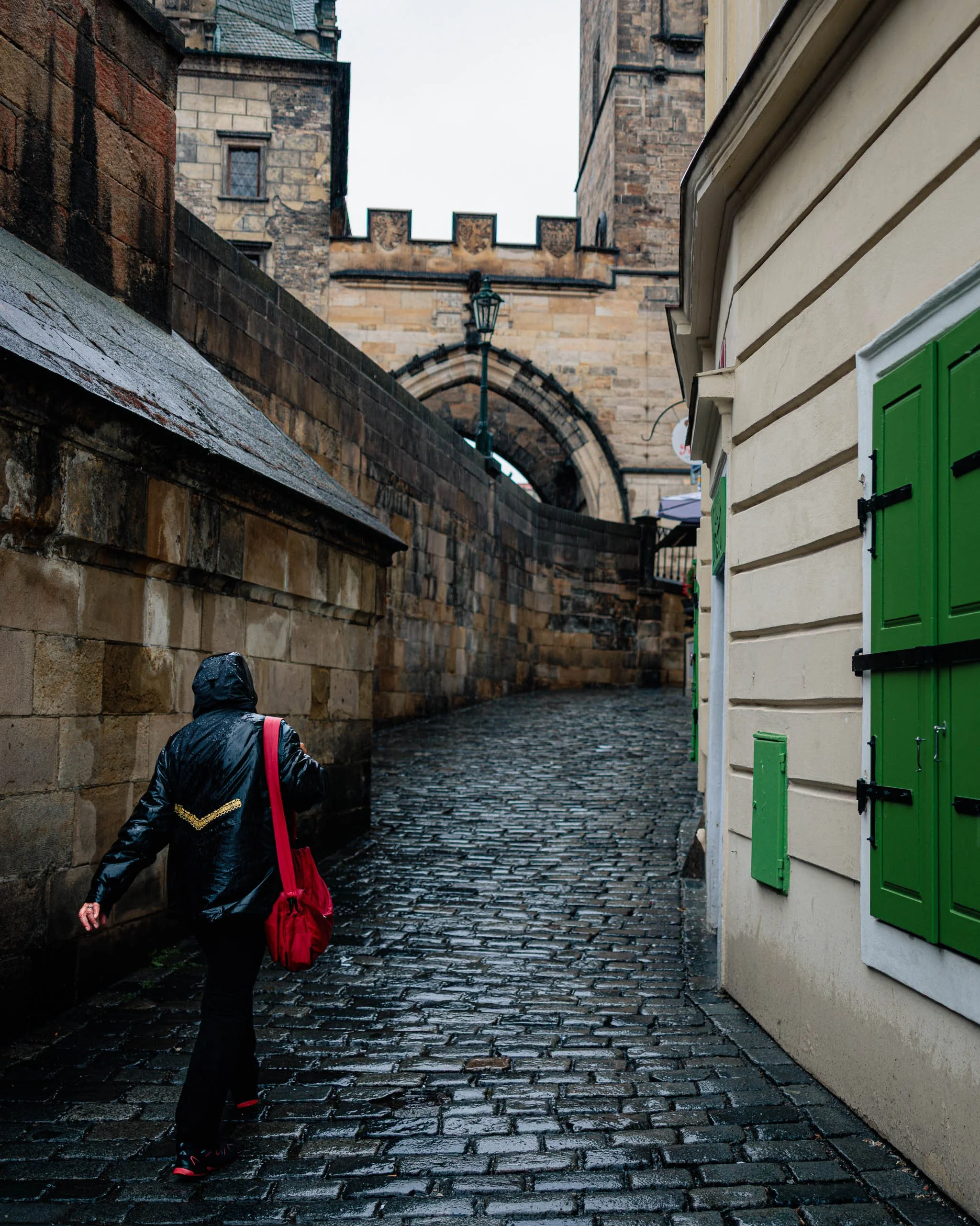
Waiting for the Morning is a study of solitude, weather, and quiet determination. Captured on a rain-soaked morning in Prague, the photograph follows a lone figure moving through a narrow cobblestone passage beneath the city's historic stone architecture. The wet pavement reflects the muted light of an overcast sky while a vivid red bag introduces a single note of color within an otherwise restrained palette.
The image explores the experience of moving through a city before the day fully begins. The curving walls, worn stone, and distant archway create a sense of destination and anticipation, while the solitary figure provides both scale and narrative. Rather than documenting a specific location, the photograph focuses on the universal feeling of pressing forward through uncertain weather toward an unseen destination.
Influenced by the cinematic storytelling of Wim Wenders and the observational humanism of European street photography, Waiting for the Morning transforms an ordinary rainy walk into a quiet meditation on resilience, movement, and discovery.
Rain on cobblestone turns a passage into a mirror, and a single vivid red bag turns a stranger into the point of the picture. Everything else is quiet stone and gray light, so the color does all the talking.
Design & Styling
A lone figure, a rain-soaked passage, and one vivid red bag give Waiting for the Morning a quiet drama for living rooms, studios, hotel corridors, and offices. Against soft neutrals, the red note becomes the point of the room.
Curated Pairings
To create a cohesive gallery wall around Prague in the rain, consider these companion pieces:
For the same rain-soaked atmosphere: Pair with Before the City Wakes, sharing the rain-soaked Prague atmosphere and a sense of quiet anticipation.
For the city in wet weather: Complement with Streetcar #12, extending the urban narrative through another view of the city in wet weather.
For architecture and reflection: Pair with What the Arch Carries, complementing the architectural mood and reflective qualities of Prague in the rain.
For solitude: Add Waiting, echoing the theme of solitude and human presence.
Fine Art Presentation
Available as a signed fine art print on ChromaLuxe® Metal (gloss, semi-gloss, or matte), Glossy Anti-Glare Acrylic (TruLife), canvas, wood, and archival paper (framed or unframed). ChromaLuxe® Metal is the recommended presentation: it holds the reflections in the cobblestones and keeps the single red bag pure against the muted stone and weather. Framed archival paper is the alternative for a softer, more atmospheric wet-morning read.
Note: Custom and oversized photographic prints are available. Please contact the studio directly to discuss custom framing, matting, or specialized museum glass options.
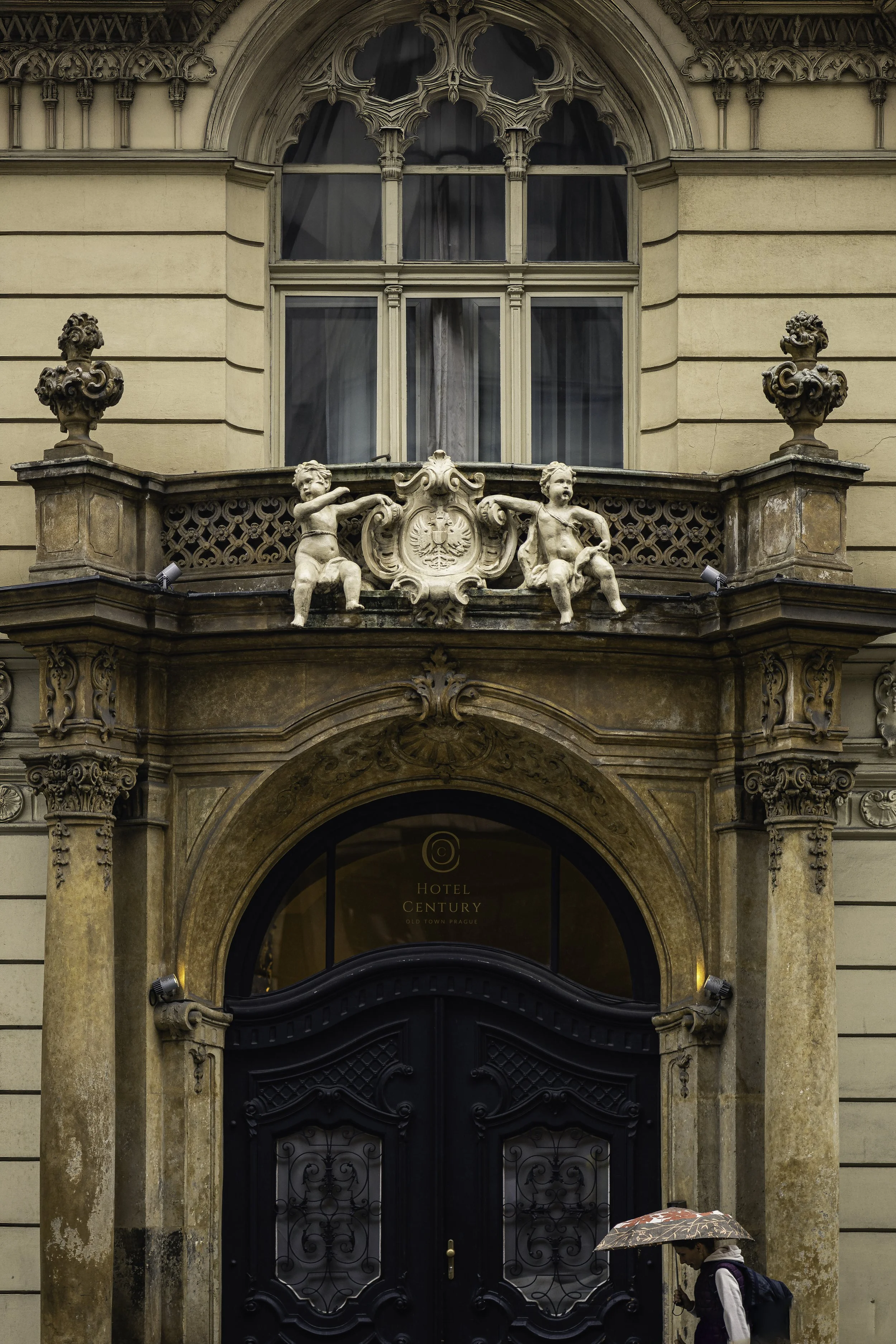
Passing Through Prague is a contemplative travel photograph exploring the relationship between human scale, historic architecture, and the fleeting moments that unfold within a centuries-old city. Captured in Prague's Old Town during a light rain, the image centers on an ornate Baroque doorway framed by weathered stonework, sculptural details, and a solitary pedestrian carrying an umbrella beneath the arch. The juxtaposition of monumental architecture and everyday movement transforms the scene from architectural documentation into a meditation on passage, memory, and place.
Drawing from the observational storytelling traditions of Wim Wenders and the restrained color sensibilities of Ernst Haas, the photograph balances historical permanence against the temporary presence of a passing figure. The architecture remains unchanged through generations, while the individual disappears moments later, leaving only the atmosphere of the encounter behind.
Rather than focusing solely on the building itself, the image explores the quiet stories that unfold within historic cities—moments where architecture, weather, and human presence briefly align to create something both personal and universal.
The doorway is a stage set built centuries ago, and the pedestrian with an umbrella is the modern city moving through it without a glance. Light rain softens the stone and darkens the cobblestones, so the picture holds warmth and melancholy in equal measure.
Design & Styling
The Baroque doorway, weathered stone, and a solitary pedestrian with an umbrella make Passing Through Prague a quiet travel piece for entryways, living rooms, studies, and hotel corridors. Its warm stone tones suit natural and neutral interiors.
Curated Pairings
To create a cohesive gallery presentation around Prague and travel, consider these companion pieces:
For complementary urban atmosphere: Pair with Prague Lunch, extending the visual narrative of everyday life, culture, and quiet discovery within Prague.
For historical continuity: Complement with Waiting for a Ride, which shares the same contemplative pacing and emphasis on fleeting human moments within enduring architecture.
For another wet Prague street: Pair with Streetcar #12, a red streetcar curving through wet cobblestone streets framed by historic façades.
Fine Art Presentation
Available as a signed fine art print on ChromaLuxe® Metal (gloss, semi-gloss, or matte), Glossy Anti-Glare Acrylic (TruLife), canvas, wood, and archival paper (framed or unframed). Framed archival paper is the recommended presentation: its matte surface suits weathered stone, warm tonal transitions, and a rainy Old Town street. ChromaLuxe® Metal is the alternative for crisper architectural and sculptural detail.
Note: Custom and oversized photographic prints are available. Please contact the studio directly to discuss custom framing, matting, or specialized museum glass options.
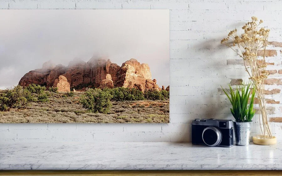
Selected works shown in healthcare, hospitality, and restorative interior contexts.
An Eye for the Subtle
The imagery is intentionally restrained — designed to support calmer, less visually stressful environments within healthcare, hospitality, and wellness settings.
Unlike mass-produced decorative artwork, these photographs are created as visually restorative pieces intended to support a more restorative experience of space.
Fine Art Photography for Healthcare & Wellness Spaces
Quiet, restorative photographic artwork created for healthcare, hospitality, senior living, and wellness spaces.
Healthcare environments shape emotional experience long before a conversation begins. The artwork placed within those spaces can help create moments of calm, reflection, and visual breathing room for patients, families, visitors, and staff. "Evidence-based art in the hospital" — a systematic review of artwork's effect on patient calm/reflection.
I create fine art photography suited for restorative interiors, informed by twenty years of clinical practice as a physical therapist, a background in healthcare marketing, and an ongoing interest in evidence-based design and healing environments.
The work emphasizes:
quiet landscapes
restorative natural forms
balanced architectural compositions
contemplative spaces
restrained use of color and light
Research in evidence-based design has explored how nature imagery and restorative visual environments may support emotional calm, stress reduction, and improved patient experience in healthcare settings. . (Link to Study)
Applications include:
patient rooms
waiting areas
restorative corridors
staff respite spaces
hospitality interiors
public gathering areas

The Breath Before Flight is a portrait of anticipation: before a balloon rises, it is nothing but color, cable, and held breath. Looking straight up from beneath the envelope at the Albuquerque International Balloon Fiesta, the image lets bands of coral red, orange, violet, and indigo glow like stained glass against a cerulean sky scattered with high, cotton-white clouds.
The eye lands first on the red band at the center of the envelope, then follows the suspension cables as they fan downward to the polished steel burner frame in the lower right, where the image comes back down to earth. The envelope's seams and the cables cut the sky into fine lines, while the open blue at lower left gives the frame room to breathe. Along the upper left, a frayed edge of fabric catches the low, warm light — a reminder that this is working equipment, not a picture-book balloon.
No figure appears, yet the frame belongs in Human Presence: the burner, carabiners, and rigging are the pilot's station, the hardware of an act of trust. This is Ernst Haas territory — color as the subject itself — with Saul Leiter's instinct for the partial view, a familiar subject seen from the angle where almost no one stands.
Design & Styling
With its saturated palette and upward energy, The Breath Before Flight works as a statement piece in hospitality lobbies, resort and boutique hotel corridors, restaurants, and Southwest-inspired interiors. It also suits creative offices, family rooms, and aviation-minded spaces that want optimism rather than quiet contemplation. On a white or warm neutral wall, the coral and blue become the room's color anchor.
Curated Pairings
To build a wall around Balloon Fiesta color and the view upward, consider these companion pieces:
For the same vantage: Pair with Old Glory Rising, also photographed looking straight up beneath an envelope at the same event — a symmetrical, patriotic mandala set against this piece's off-center rig and cables.
For the same glow: Pair with Balloon Glow, Dawn Patrol, where the same translucent nylon becomes a light source — seen up close in daylight here, and as a row of lanterns before sunrise there.
For a deliberate contrast: Complement with Between Signals, where a communications tower's struts, dishes, and cables cross a deep blue twilight sky beneath a crescent moon — another look upward at human engineering reaching into the blue, cool and nocturnal where this one is warm and bright.
Fine Art Presentation
Available as a signed fine art print on ChromaLuxe® Metal (gloss, semi-gloss, or matte), Glossy Anti-Glare Acrylic (TruLife), framed canvas, and archival paper. ChromaLuxe® Metal is the recommended presentation: the dye-sublimation process holds the saturated coral-to-violet bands and the fine cable lines with crisp, clean edges. Glossy Anti-Glare Acrylic (TruLife) is the alternative for a piece hung in a bright lobby or restaurant, where its depth intensifies the backlit glow of the fabric.