
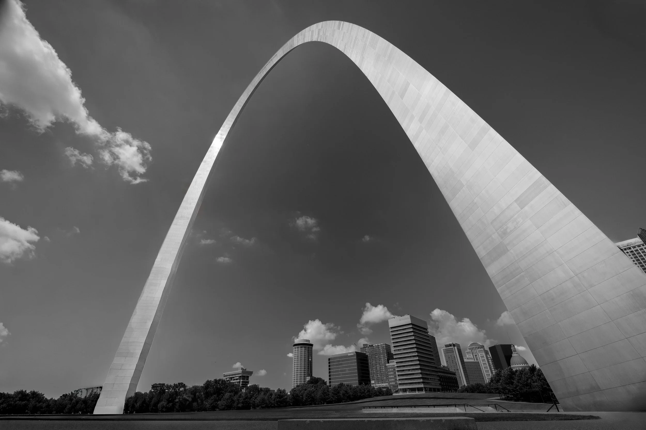
Architecture of Atmosphere
Fine Art Photography for Architects & Designers
A Study of Form, Light, and Regional Identity
Architecture is not only structure. It is light, scale, rhythm, material, and silence.
My architectural work focuses on how buildings and designed spaces feel after the first impression has passed. These images are quiet, disciplined studies of form, shadow, weather, and regional identity, created for architects, developers, designers, and collectors who want artwork that supports the character of a space rather than competes with it.
The work is especially suited for offices, lobbies, hospitality spaces, healthcare environments, senior living communities, and residential interiors where calm, permanence, and visual restraint matter.
In Architectural settings, subtlety is strength.
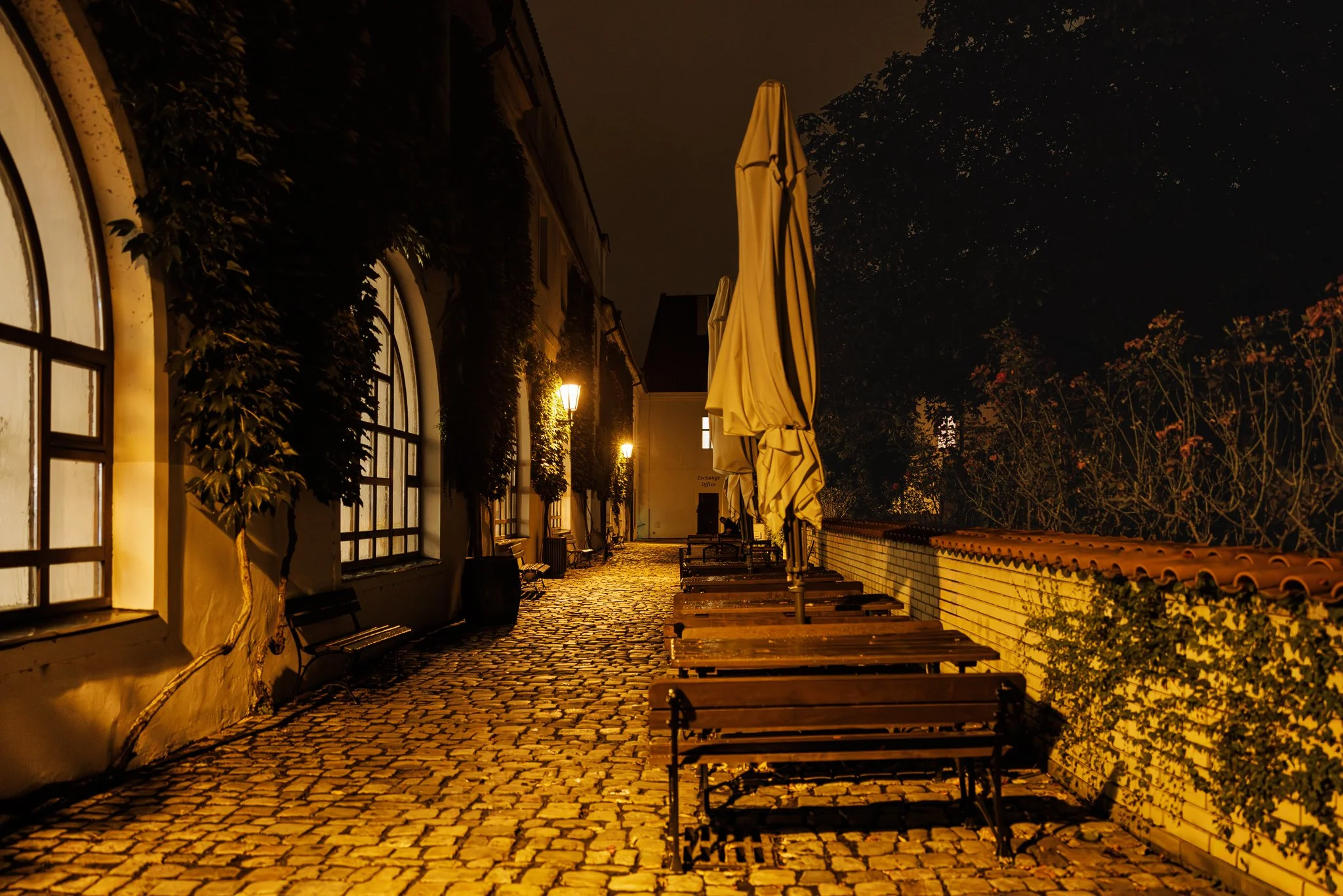
The Fine Art of the Built Environment
My commercial architectural work and my fine art practice share the same foundation — a belief that built structures, when photographed with patience and restraint, reveal something beyond their function.
Iron Cathedral — a series documenting rusted storage tanks in New Haven, Missouri — is the clearest expression of that belief. Shot from within the structure at ground level, looking up through the gap between two massive tanks toward a dark sky, the image finds the sacred in the industrial. It draws on the typological tradition of Bernd and Hilla Becher, who spent decades documenting water towers and blast furnaces with the same documentary rigor that I bring to architectural subjects across Missouri and Colorado.
For architects and developers looking for large-format fine art that speaks to the character of a built environment — industrial, civic, residential, or commercial — the Built Environment collection and American Places offer work that understands structure from the inside out.

High in the Cathedral Basilica of St. Louis, a small cross crowns the cupola above the baldachin — and it is, quite literally, where the light comes from. Everything else in this dense, overwhelming field of mosaic saints, stained glass, and gilded ornament radiates outward from that single point: Peter, John, Andrew, and James rendered in luminous tesserae under the half-dome; St. Ambrosius and a Star of David set into the surrounding arch; the inscription "God Will Provide a Lamb" curving along the right pier. All of it dense, all of it simultaneous — and all of it organized, finally, around one small, quietly lit cross.
Rendered in black and white, the mosaic's gold and color give way to a wide, carefully held tonal range: the illuminated saints and cross hold real highlight detail without blowing out, while the deep stone piers at the frame's edge fall into true, textured shadow. The photograph doesn't simplify this space's overwhelming richness — it couldn't, and shouldn't. Instead, it finds the one true point of light the architecture itself provides, and lets everything else arrange itself around it.
Design & Styling
The density and reverence of this piece make it especially well suited to religious and institutional settings — chapels, meditation spaces, Catholic health system administrative halls, and donor-facing areas where imagery can reinforce mission and identity. It also holds its own in classical, contemplative residential interiors and libraries.
Curated Pairings
For same-building continuity — "Christ Has Not Risen", another black and white interior study from the Cathedral Basilica of St. Louis.
For same-building continuity — "Sanctuary of Light", a full nave-to-altar view of the same cathedral in color.
For church interior continuity — "The Gothic Sentinel", a Prague church interior sharing this piece's reverence for sacred architectural space.
Fine Art Presentation
Given the wide tonal range and fine mosaic detail, this piece is especially well suited to an archival paper print for a classic, painterly rendering, or ChromaLuxe® Metal (gloss, semi-gloss, or matte) print for added depth in the highlight-to-shadow transition. Framed and unframed options available on request.
Note: Custom and oversized photographic prints are available. Please contact the studio directly to discuss custom framing, matting, or specialized museum glass options.
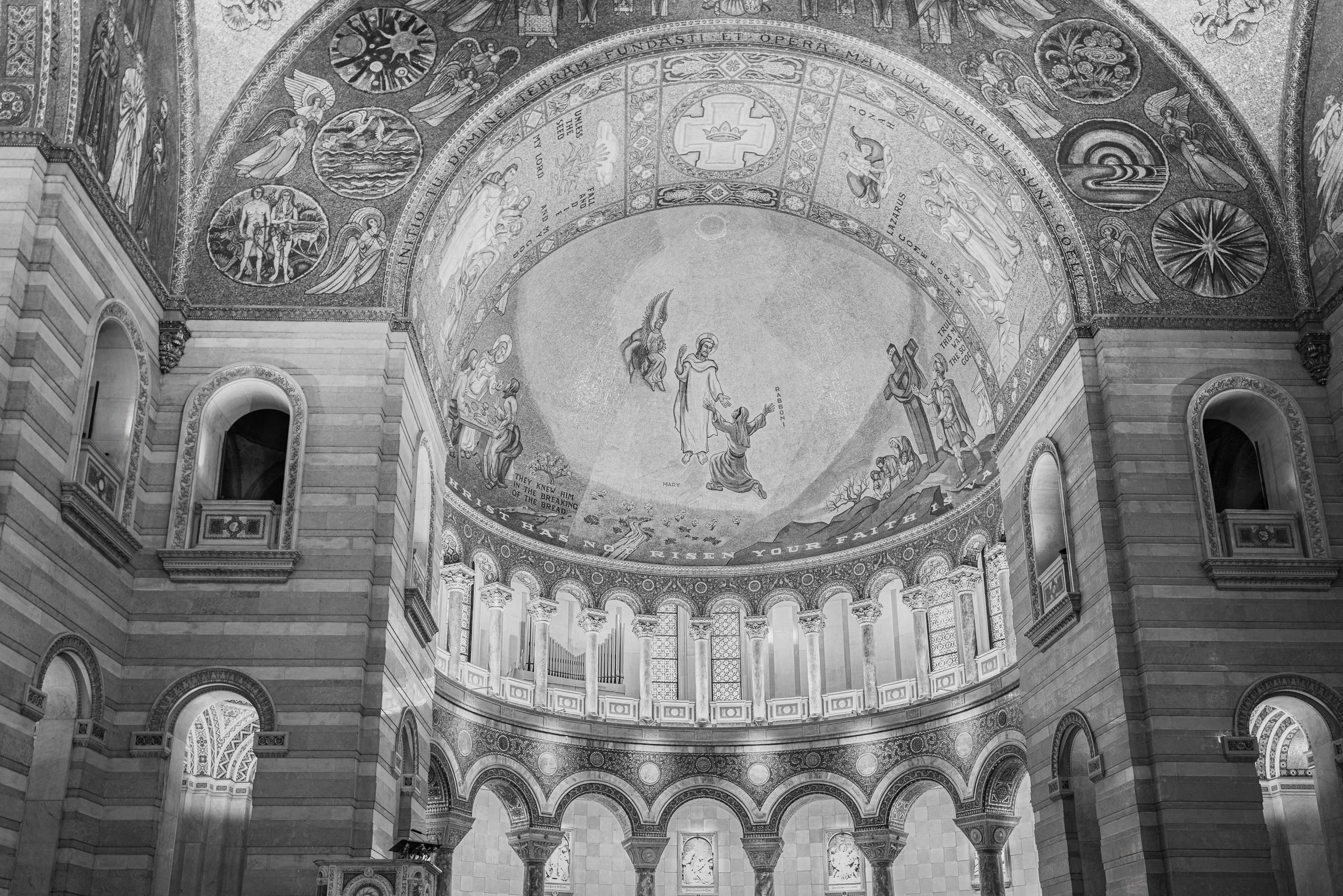
Beneath the great dome of the Cathedral Basilica of St. Louis, a mosaic depicts the Gospel's first resurrection scene — Mary Magdalene reaching toward the risen Christ at the empty tomb, an angel hovering above, the word "RABBONI" inscribed at the moment of recognition. Below, an inscription drawn from First Corinthians runs the curve of the dome: "...CHRIST HAS NOT...RISEN YOUR FAITH IS..." — the theological stakes of the scene, spelled out in tile.
Rendered in black and white, the mosaic's original color and gold leaf give way to a rich range of gray that emphasizes pattern, texture, and form — the countless individual tesserae, the carved stone archway framing the scene, the organ pipes and colonnade anchoring the space below. The composition looks up and slightly off-axis rather than straight on, giving the dome real depth and drawing the eye through a considered path: from the architecture at the frame's edges, up through the surrounding mosaic saints and symbols, to the central resurrection scene itself.
This is one of St. Louis's great interior spaces, photographed with the same patient attention given to any of the West's cathedral-scale landscapes — architecture as sacred space, and sacred space as architecture.
Design & Styling
The rich black-and-white tonal range and formal architectural composition suit spaces with a contemplative or classical sensibility — libraries, studies, entryways, and any interior where a piece with genuine gravity and craft is welcome. Its St. Louis subject matter also makes it a natural fit for collectors with a connection to the city or its architectural history.
Curated Pairings
For same-building continuity — "Sanctuary of Light", another interior study of the Cathedral Basilica of St. Louis.
For church interior continuity — "The Gothic Sentinel", a Prague church interior sharing this piece's reverence for sacred architectural space.
For religious architecture continuity — "Standing Grace - Southfork", a Colorado Catholic church treated with the same formal attention.
Fine Art Presentation
Given the fine mosaic detail and black-and-white tonal range, this piece is especially well suited to an archival paper print for a classic, painterly rendering, or ChromaLuxe® Metal (gloss, semi-gloss, or matte) print for added depth and a more contemporary presentation. Framed and unframed options available on request.
Note: Custom and oversized photographic prints are available. Please contact the studio directly to discuss custom framing, matting, or specialized museum glass options.
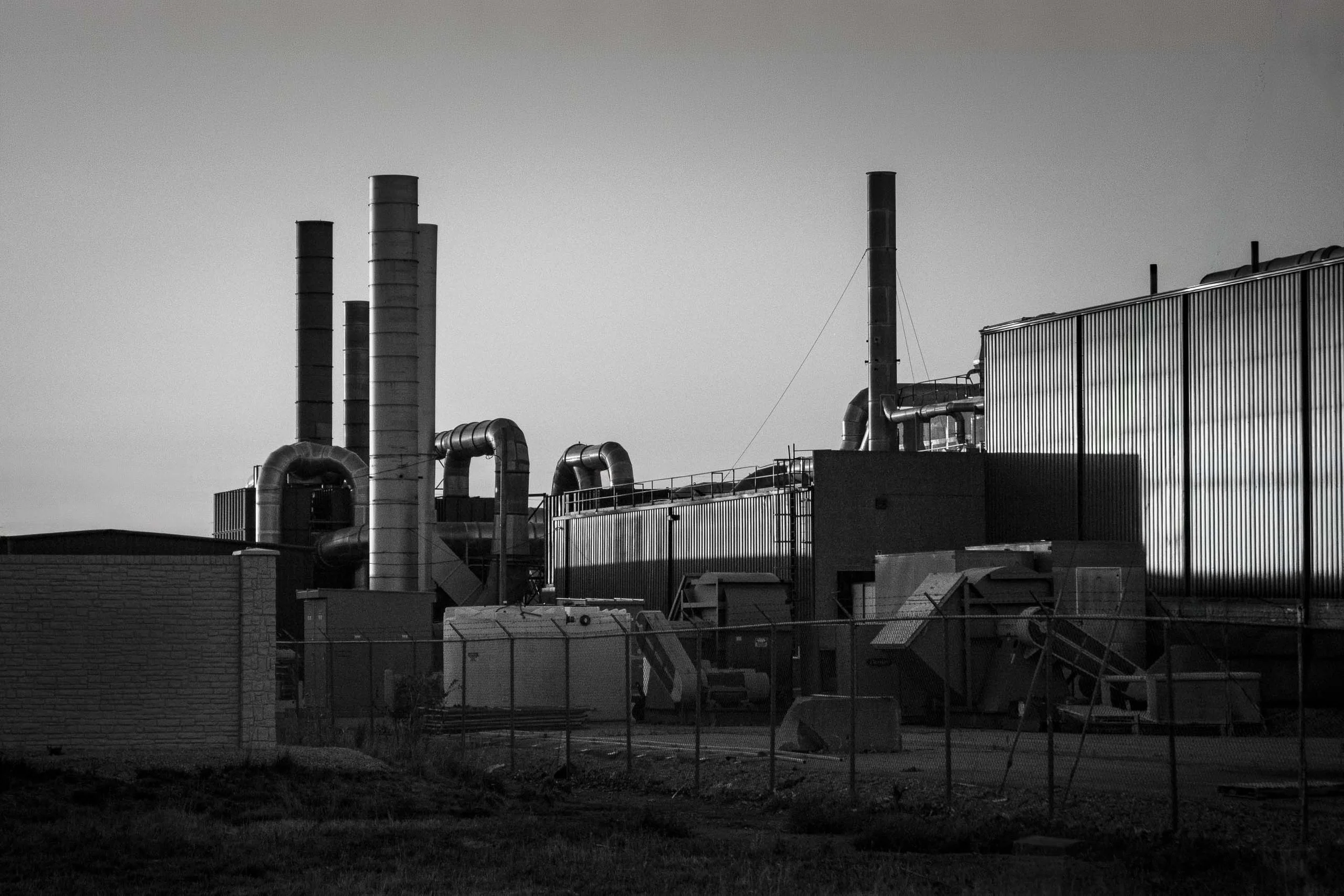
An industrial facility at dusk, photographed plainly and without romanticizing what's in front of the camera. A cluster of four smokestacks anchors the left side of the frame; a solitary stack stands apart near center, separated by open sky; looping ductwork and a massive corrugated building fill out the right. A chain-link fence runs the width of the foreground, marking the boundary between viewer and site.
This is industrial infrastructure treated as form rather than documentation — repetition, utility, and the architecture we normally look past, rendered in a deadpan black-and-white register closer to the New Topographics tradition than to romanticized industrial photography. Nothing here is idealized or cleaned up. The subject isn't made beautiful; structure itself becomes the visual language.
The eye moves in a considered progression across the frame: stack, stack, stack, stack, curved ductwork, the solitary central stack, and finally the corrugated wall's alternating bright and dark verticals, lit by the day's last raking light. That light does the real work — strong blacks hold without destroying detail, and the corrugated siding's rhythm on the right echoes the stack cluster on the left, tying the whole composition together.
Design & Styling
The unsentimental, documentary black-and-white treatment suits modern architectural interiors, industrial-style lofts, and any space where an honest, unembellished record of built structure fits the design language better than a more dramatic or idealized image. Its graphic, repetitive geometry also reads well at large scale in office or commercial settings.
Curated Pairings
For industrial architecture continuity — "Iron Cathedral", another piece finding structural presence in industrial form.
For structural rhythm continuity — "Steel Echoes", sharing this piece's interest in repetition within industrial architecture.
For mechanical texture continuity — "Teeth of Time", a close study of weathered machinery in the same unembellished register.
Fine Art Presentation
Given the strong tonal range and fine structural detail, this piece is especially well suited to an archival paper print for a classic, matte silver-gelatin quality, or ChromaLuxe® Metal (gloss, semi-gloss, or matte) print to emphasize the raw steel and corrugated textures with added depth. Framed and unframed options available on request.
Note: Custom and oversized photographic prints are available. Please contact the studio directly to discuss custom framing, matting, or specialized museum glass options.

Counting the Violet Hour is a color study built on contrast — the Prague Metronome's warm, rust-orange needle rising in a sharp diagonal against a deep, saturated violet-blue sky over Letná Park. The 75-foot kinetic sculpture, installed in 1991 on the plinth where a monumental statue of Stalin once stood, becomes here less a landmark than a graphic color relationship: one warm line cutting through a cool, atmospheric dusk.
The low, wide-open sky carries most of the frame's emotional weight, its violet tone deepened well past a neutral overcast gray into something closer to true blue hour. Against that saturated backdrop, the needle's orange holds its own as a single, deliberate accent — a color pairing built on genuine complementary contrast rather than a documentary record of the scene's natural light.
This piece is a color companion to "A Measure of Change," the black-and-white treatment of the same sculpture, offering a very different mood from the same subject and vantage point — dramatic and graphic in monochrome, atmospheric and saturated in color.
Design & Styling
With its bold complementary color palette and strong graphic silhouette, Counting the Violet Hour works well in modern offices, design studios, and residential spaces built around a confident, saturated color story. Its dramatic diagonal composition also suits a tall or narrow wall where the eye can travel the length of the needle.
Curated Pairings
To create a cohesive gallery wall, consider these companion pieces:
For the monochrome companion: Pair with A Measure of Change, the black-and-white treatment of this same sculpture and site.
For color and atmosphere: Complement with Where the Evening Waited, extending the study of saturated dusk color in a European setting.
For graphic contrast: Pair with Blue Interval, extending the study of bold color and clean geometric form.
Fine Art Presentation
Available as a signed fine art print in ChromaLuxe® Metal (gloss, semi-gloss, or matte), framed paper, framed canvas, and acrylic presentation formats. The saturated violet sky and warm needle both benefit from ChromaLuxe® Metal or Acrylic, which hold rich, deep color well and give the complementary contrast real punch.
Note: Custom and oversized photographic prints are available. Please contact the studio directly to discuss custom framing, matting, or specialized museum glass options.
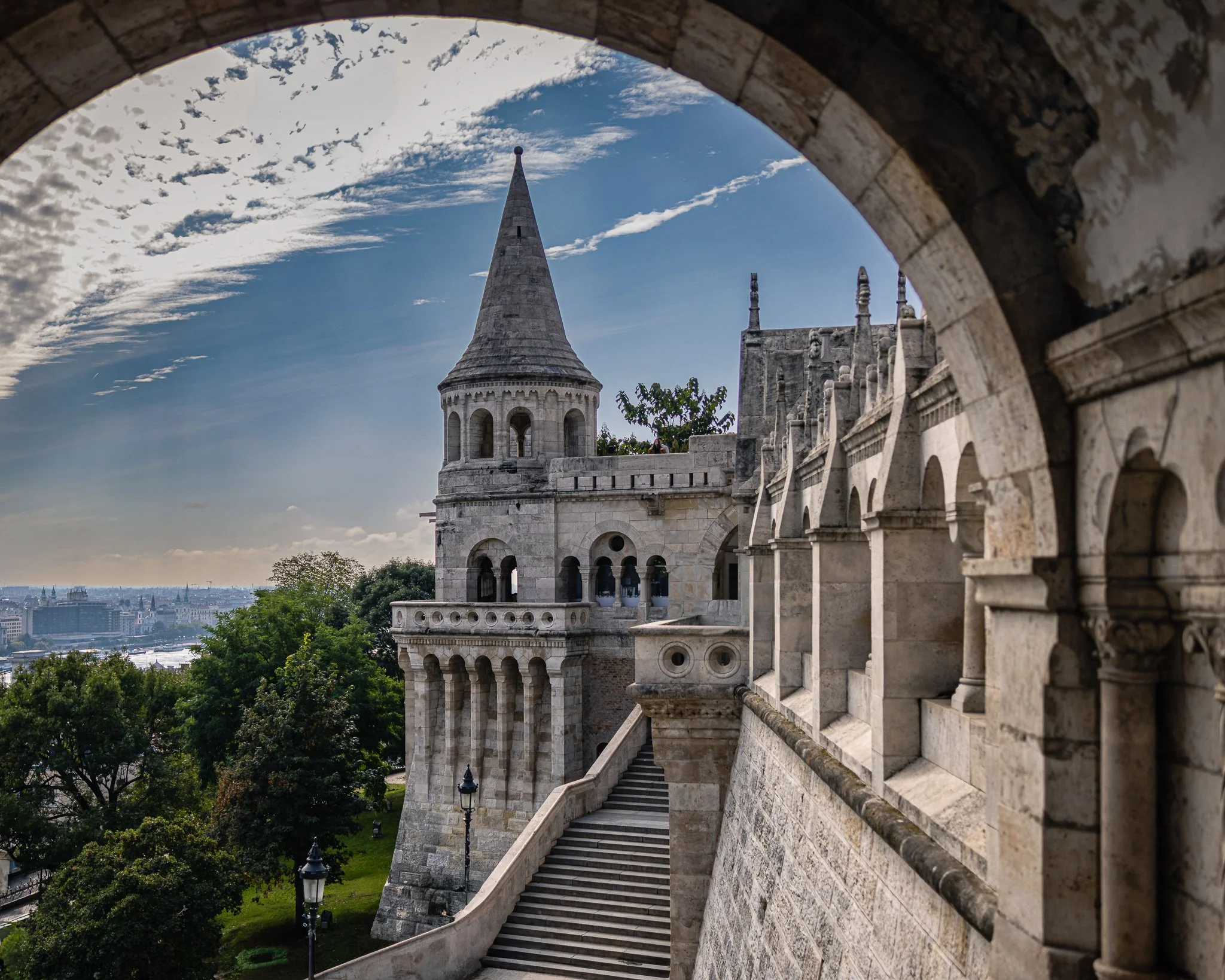
Through the Arch explores the relationship between architecture, perspective, and discovery within one of Budapest's most iconic historic spaces. Photographed at Fisherman's Bastion in Buda, the image uses a weathered stone archway as a natural frame, guiding the viewer toward a soaring tower, ascending stairway, and layered architectural forms beyond. The composition transforms a familiar landmark into a study of passage, inviting viewers to experience the space as a journey rather than a destination.
The photograph is built upon a series of visual transitions. The dark stone arch creates a sense of enclosure and anticipation, while the illuminated architecture beyond gradually reveals itself through layers of arches, stairways, and towers. The eye moves naturally through the scene, following the ascending staircase toward the central tower before drifting outward into the cityscape beyond. This progression creates a sense of movement and discovery that echoes the experience of walking through historic European cities.
Drawing inspiration from the atmospheric architectural studies of Wim Wenders and the color sensitivity of Ernst Haas, the image emphasizes mood, structure, and the passage of light across stone. The interplay between shadow and illumination allows the architecture to feel both monumental and inviting. Rather than functioning solely as a documentary record of place, the photograph explores how architecture shapes emotional experience through scale, rhythm, and perspective.
The result is a contemplative image that balances grandeur with intimacy. Through the Arch reflects the enduring appeal of historic architecture and the quiet moments of wonder that emerge when light, form, and viewpoint align.
Design & Styling
With its layered architectural forms, neutral stone palette, and strong sense of depth, Through the Arch works particularly well in executive offices, hospitality environments, libraries, healthcare spaces, studies, and contemporary residential interiors. The image introduces sophistication, history, and visual structure while maintaining a calm and contemplative atmosphere.
Curated Pairings
To create a cohesive gallery wall, consider these companion pieces from the European Texture & Light collection:
For architectural dialogue: Pair with Gateway of Time to continue the exploration of historic European architecture, passageways, and layered spatial experience.
For visual rhythm: Pair with Study in Yellow and Blue #4 to contrast monumental architecture with geometric simplicity, color relationships, and formal design.
For a travel-inspired collection: Pair with Inside the Hour to connect iconic European landmarks through themes of history, craftsmanship, and enduring place.
Fine Art Presentation
Available as a signed fine art print in ChromaLuxe® Metal (gloss, semi-gloss, or matte), framed paper, framed canvas, and acrylic presentation formats. ChromaLuxe® Metal and Low-Glare Acrylic are particularly well suited to preserving the image's stone textures, architectural depth, and luminous sky detail.
Note: Custom and oversized photographic prints are available. Please contact the studio directly to discuss custom framing, matting, or specialized museum glass options.

Transfiguration captures the Episcopal Chapel of the Transfiguration exactly as it was designed to be experienced — its rustic log gate framing the jagged, snow-capped Cathedral Group of the Grand Tetons like a window built by nature and carpentry working together. A mother and her two daughters walk the path toward the chapel door, small against the scale of the peaks beyond, giving the frame both narrative and a true sense of size.
Built in 1925, the chapel's altar window has always looked out on the Tetons rather than away from them — a deliberate choice by its builders to let the mountains themselves become part of the sanctuary. This image stands at the entrance gate, looking through toward that same idea from the outside: architecture in quiet conversation with the landscape it was built to honor.
Design & Styling
With its warm log tones, dramatic peaks, and genuine human presence, Transfiguration works well in mountain residences, lodges, offices, and spaces celebrating the American West's blend of faith, architecture, and landscape. Its narrative quality also makes it a strong fit for family-oriented spaces and hospitality settings.
Curated Pairings
To build a wall exploring the American West's chapels and quiet architecture, consider these companion pieces:
For a shared regional register: Pair with Enduring Forms, another Southwest church study built around quiet architectural presence.
For a shared theme: Complement with Standing Grace - Southfork, sharing this piece's focus on small chapels set against big Western landscapes.
For a shared location: Round out the wall with The Ferry at Menor's Landing, another Grand Teton piece from the same trip.
Fine Art Presentation
Available as a signed fine art print in ChromaLuxe® Metal (gloss, semi-gloss, or matte), framed paper, framed canvas, and acrylic presentation formats. To preserve the fine detail in the log structure and the texture of the distant peaks, ChromaLuxe® Metal or Acrylic presentation is recommended.
Note: Custom and oversized photographic prints are available. Please contact the studio directly to discuss custom framing, matting, or specialized museum glass options.
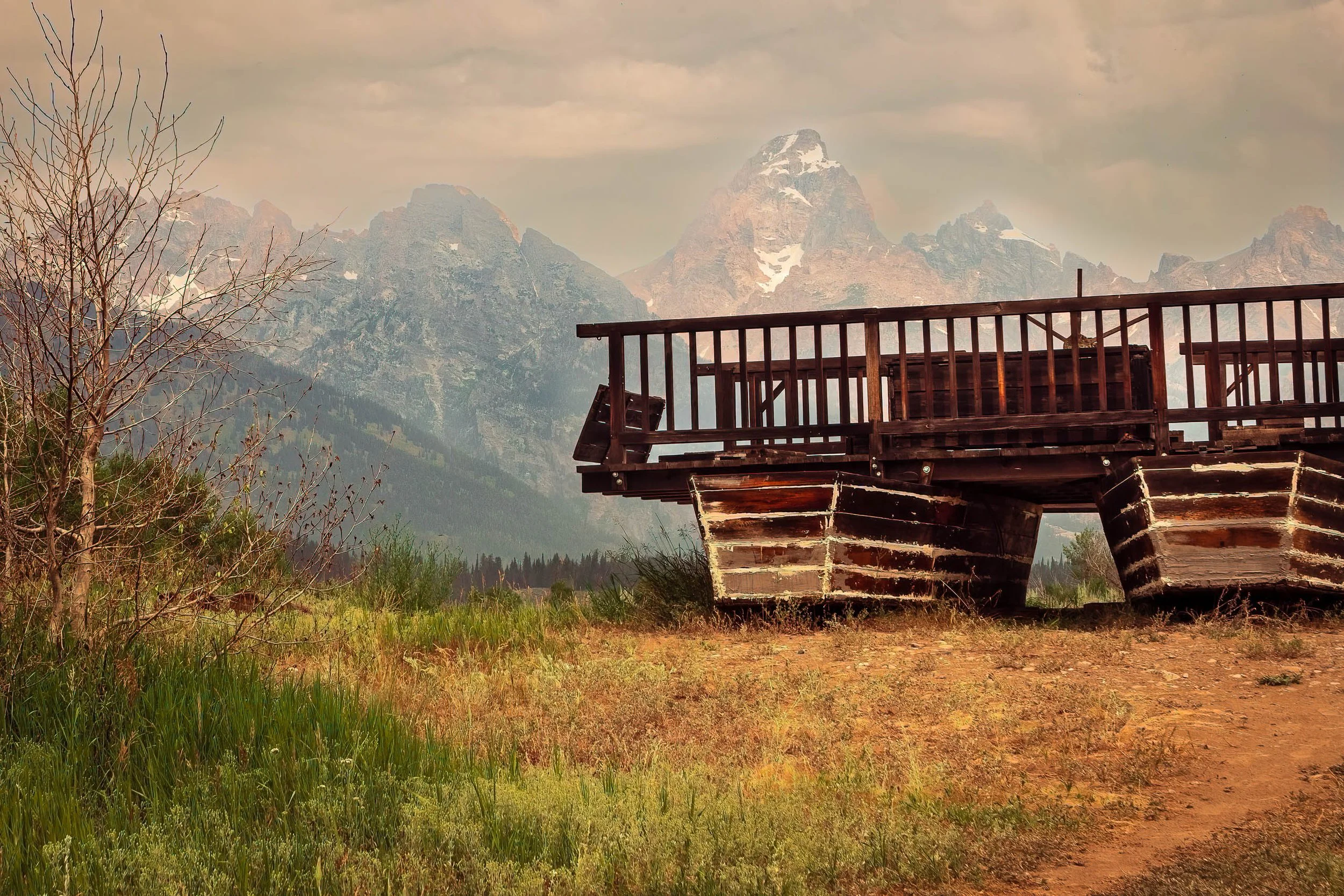
The Ferry at Menor's Landing frames a piece of quiet ingenuity against one of America's most photographed skylines. This is a replica of Bill Menor's 1894 "reaction ferry" — a wagon platform mounted on two pontoon hulls, angled against the current of the Snake River to carry travelers across without any motor at all, using nothing but physics and a cable system. Today it rests near the original homestead site, weathered and still, while the Cathedral Group of the Grand Tetons rises through hazy afternoon light behind it.
A bare, wind-worn tree stands in the foreground, framing the composition against golden late-summer grasses. It's a scene built on contrast — the small, human-scale ingenuity of the ferry against the immense, ancient geology of the peaks beyond, both part of the same quietly remarkable place.
Menor's original ferry was the only crossing point on the Snake River in this part of Jackson Hole for nearly a decade, vital to the area's earliest settlers. The site later played an unlikely role in history: a 1923 meeting held at the adjacent cabin set in motion the effort that would eventually create Grand Teton National Park itself.
Design & Styling
With its warm, weathered tones and rich sense of place, The Ferry at Menor's Landing works well in offices, lodges, mountain residences, and spaces celebrating the American West's history of ingenuity and homesteading. Its Built Environment subject matter pairs naturally with architectural and industrial pieces from the same collection.
Curated Pairings
To build a wall exploring weathered structures and the American West, consider these companion pieces:
For weathered form: Pair with Teeth of Time, another study of rustic, time-worn mechanical and structural detail.
For Western homestead history: Complement with Shelter Beneath a Restless Sky (Monotone), sharing this piece's Americana sensibility and dramatic sky.
For built form against landscape: Round out the wall with Held Against the Sky, another panoramic study of structure set against an expansive natural backdrop.
Fine Art Presentation
Available as a signed fine art print in ChromaLuxe® Metal (gloss, semi-gloss, or matte), framed paper, framed canvas, and acrylic presentation formats. To preserve the warm tonal range of the weathered wood against the hazy mountain light, ChromaLuxe® Metal or Acrylic presentation is recommended.
Note: Custom and oversized photographic prints are available. Please contact the studio directly to discuss custom framing, matting, or specialized museum glass options.
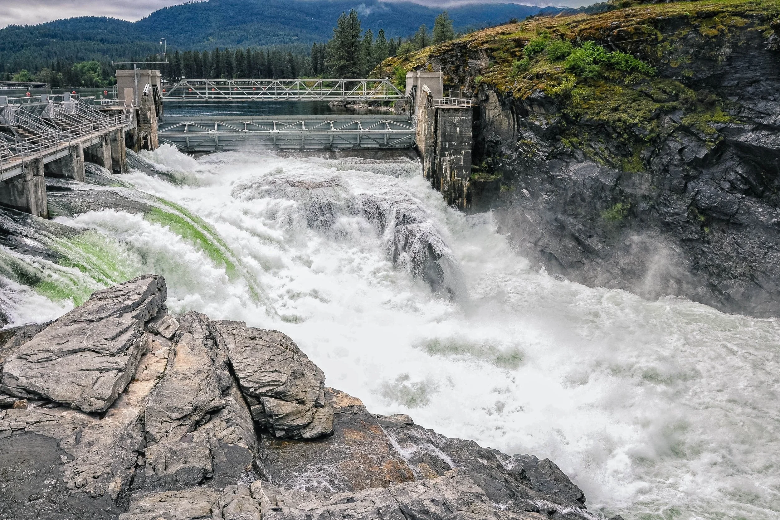
Controlled Release captures the moment engineered restraint gives way to raw force. A hydroelectric dam's spillway gate opens above a rocky gorge, sending a massive torrent of white water crashing through the channel below — mist rising, foam churning, the structure itself dwarfed by the volume it's built to control. A striking streak of green cuts through the whitewater on the left, an unexplained, unrepeatable detail that grounds the image in a specific, real moment rather than a generic scene of falling water.
The composition layers a jagged foreground rock, the explosive churn of the release itself, the steel-and-concrete structure spanning the gorge, and a forested mountain backdrop rising into low cloud. It's a study in contrast — the deliberate geometry of human engineering set against the chaotic, overwhelming power of the water it was built to manage.
Design & Styling
With its dramatic scale and industrial subject, Controlled Release makes a strong statement piece for corporate offices, engineering firms, industrial or energy-sector spaces, and modern residential settings looking for bold, high-impact art with genuine narrative weight.
Curated Pairings
To build a wall exploring human structures and their relationship to scale and force, consider these companion pieces:
For structural echo: Pair with Held Against the Sky, another panoramic study of built form set against an expansive natural backdrop.
For industrial resonance: Complement with Iron Cathedral, which finds a similar monumental quality in industrial materials and structure.
For a shared theme of time and engineering: Round out the wall with Teeth of Time, exploring weathered mechanical and structural forms.
Fine Art Presentation
Available as a signed fine art print in ChromaLuxe® Metal (gloss, semi-gloss, or matte), framed paper, framed canvas, and acrylic presentation formats. To capture the full tonal range of the whitewater and the fine texture of the surrounding rock, ChromaLuxe® Metal or Acrylic presentation is recommended.
Note: Custom and oversized photographic prints are available. Please contact the studio directly to discuss custom framing, matting, or specialized museum glass options.
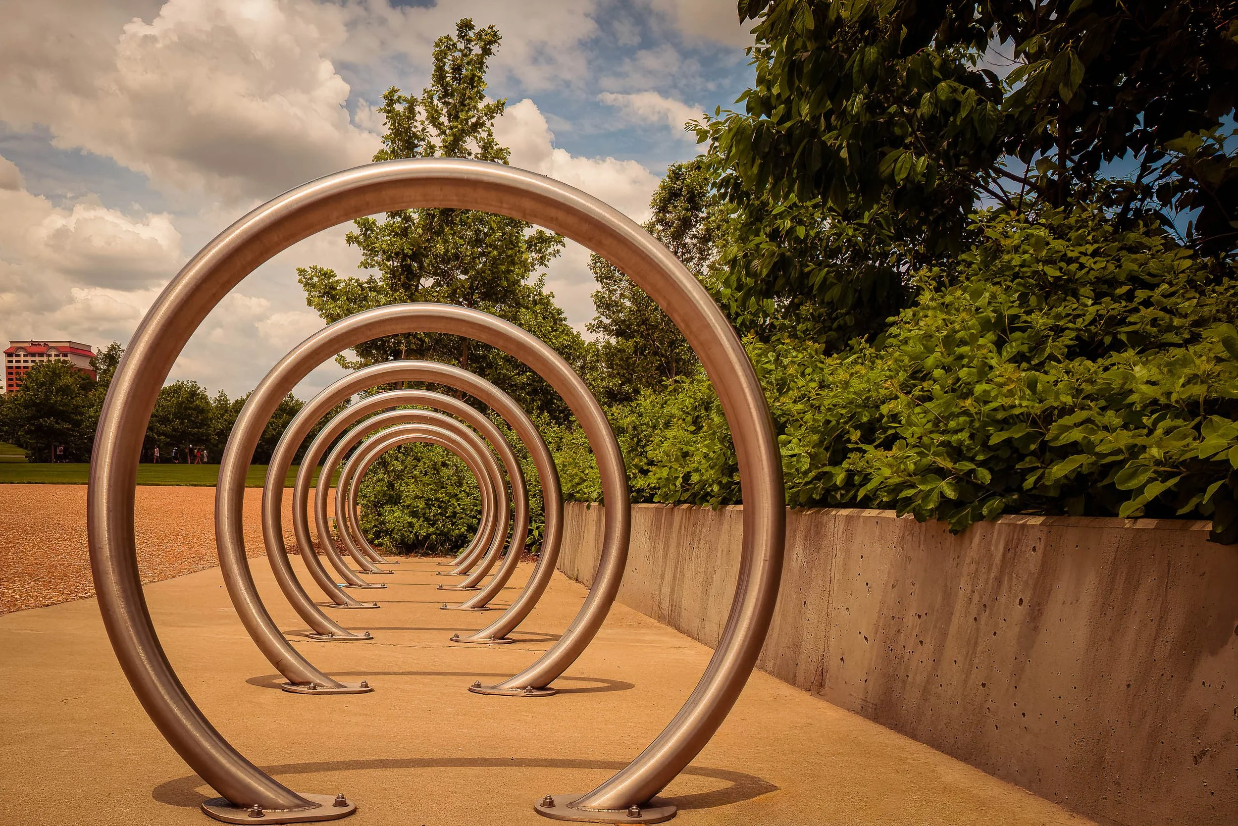
Steel Echoes finds a quiet piece of public infrastructure — a run of stainless steel bike-rack rings — and turns it into a study of repetition and depth. Photographed low and close to the first ring, the composition uses the receding circles like a series of apertures, each one framing a smaller, softer version of the same green park beyond. The effect reads almost architectural: a tunnel built not of stone but of brushed steel and daylight.
The late-day light does real work here, warming the concrete path to a rich ochre while keeping the sky a cool, cloud-stacked blue — two temperatures meeting at the horizon just past the final ring. Each loop catches the light a little differently depending on its angle to the sun, so the sequence reads less like flat repetition and more like a series of related, individually lit gestures.
In the same spirit as Steel Wave's industrial minimalism, and drawing on Aaron Siskind's eye for abstraction hidden in plain civic objects, Steel Echoes treats an ordinary piece of municipal design as worthy of the same attention as any landscape — proof that geometry and light don't need a dramatic subject, just the right angle on an ordinary one.
DESIGN & STYLING
Steel Echoes suits contemporary and minimalist interiors built around geometry and repetition rather than literal subject matter — offices, tech company lobbies, design studios, modern residences, and any space where clean lines and quiet rhythm do more work than color or drama. The warm-cool palette (ochre path, blue sky, brushed steel) gives it real flexibility as a neutral-leaning accent piece.
The strong linear perspective also suits long hallways or narrow walls particularly well, where the receding rings create a sense of depth even in a tight space.
CURATED PAIRINGS
For material and mood: Pair with Steel Wave — both find abstraction in industrial steel, one through rust and reflection, one through repetition and light.
For repetition and pattern: Complement with A Break in the Pattern — a very different setting, same interest in rhythm and geometric repetition.
For public art in a garden setting: Add Glass and Gesture, another St. Louis-area piece finding art in public architecture.
FINE ART PRESENTATION
Steel Echoes is available as a signed fine art photographic print in multiple presentation styles. ChromaLuxe® Metal (gloss, semi-gloss, or matte) is the natural match — printing a photograph of polished steel onto a metal substrate doubles down on the subject's own material, and the format's brightness and sharpness suit the clean geometric lines especially well. Acrylic offers a similar high-contrast pop with added depth. Framed archival paper and Canvas Framed are both available for a softer, more traditional presentation if the space calls for it.
Note: Custom and oversized photographic prints are available. Please contact the studio directly to discuss custom framing, matting, or specialized museum glass options.
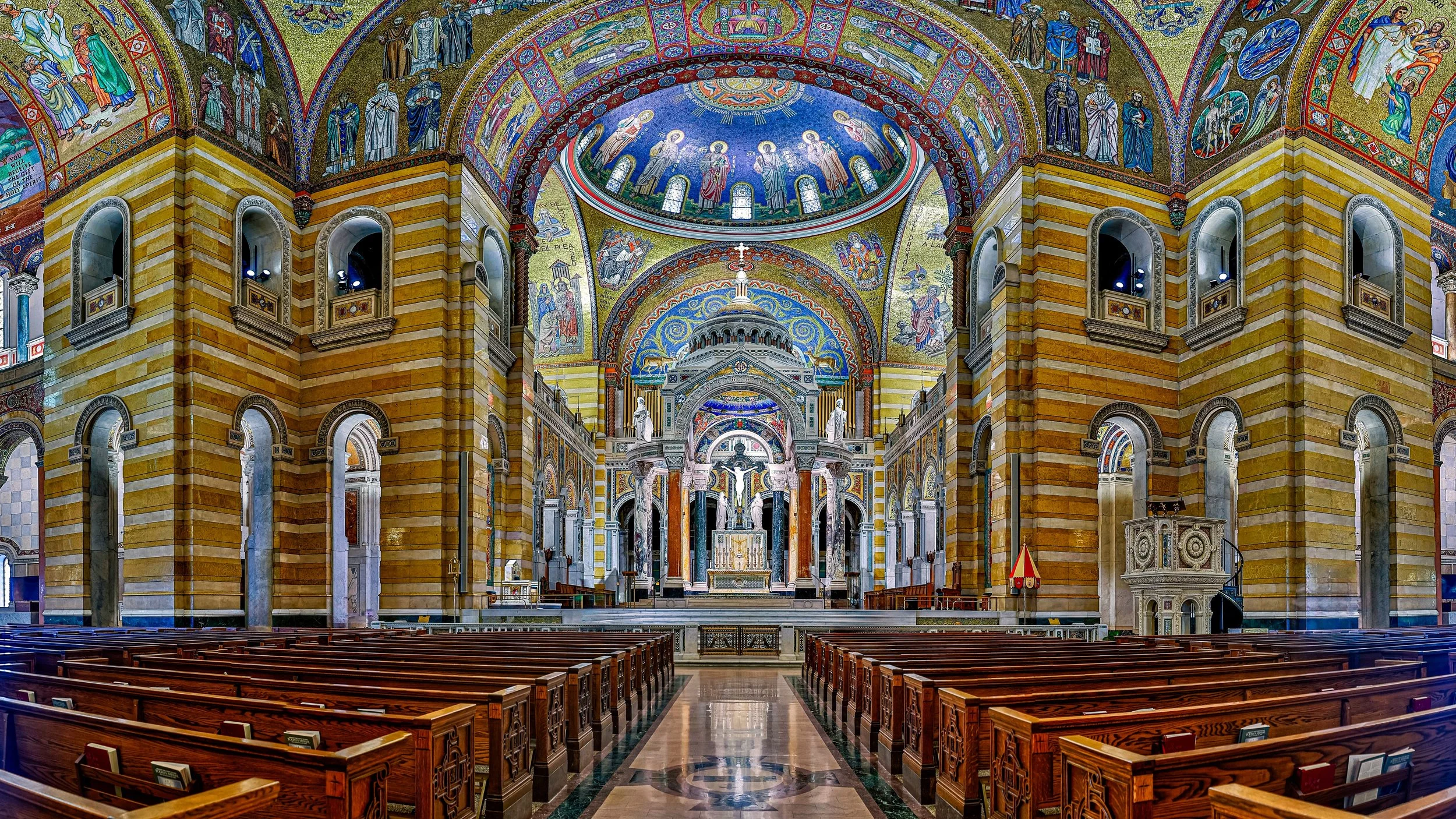
Sanctuary of Light is a study of illumination, craftsmanship, and the enduring power of sacred space. Photographed within the Cathedral Basilica of St. Louis, the image captures the remarkable interplay of light across one of the world's most celebrated mosaic interiors. Rich color, intricate detail, and luminous architectural forms transform the space into an experience of contemplation and wonder. Drawing inspiration from the architectural photography of Frederick H. Evans and the reverence for light found throughout sacred art traditions, the photograph explores how architecture can elevate ordinary experience into something transcendent.
The composition balances the grandeur of the basilica's soaring architecture with the intimate details of its mosaic surfaces, allowing light itself to become the central subject. Layers of color and ornamentation guide the viewer through the image, revealing the extraordinary craftsmanship embedded within the structure while maintaining a sense of stillness and visual harmony. Rather than focusing solely on architecture, the photograph seeks to capture the emotional atmosphere created when light, space, and devotion converge.
The mosaics of the Cathedral Basilica are one of the largest collections of mosaic art in the world, and standing inside them the light seems to come from the walls themselves. The photograph gives that surface the time it needs.
Design & Styling
The color and mosaic detail of the Cathedral Basilica of St. Louis make Sanctuary of Light a rich piece for hospitality lobbies, libraries, professional offices, sacred and cultural spaces, and St. Louis homes. It can carry a large wall and reward a long look.
Curated Pairings
To create a cohesive gallery wall around light and sacred architecture, consider these companion pieces:
For sacred architecture in the landscape: Pair with Standing Grace - Southfork, extending themes of faith, community, and the role of sacred architecture within the landscape.
For historic craftsmanship: Complement this piece with Old Friends, Windows and Glass, sharing an appreciation for historic craftsmanship, luminous light, and the passage of time.
For Gothic interiors: Pair with The Gothic Sentinel, another richly decorated sacred interior, in Prague.
Fine Art Presentation
Available as a signed fine art print on ChromaLuxe® Metal (gloss, semi-gloss, or matte), Glossy Anti-Glare Acrylic (TruLife), canvas, wood, and archival paper (framed or unframed). Acrylic is the recommended presentation: its depth and luminosity carry the mosaic's color and the interplay of light across gold and glass. ChromaLuxe® Metal is the alternative for crisper detail.
Note: Custom and oversized photographic prints are available. Please contact the studio directly to discuss custom framing, matting, or specialized museum glass options.
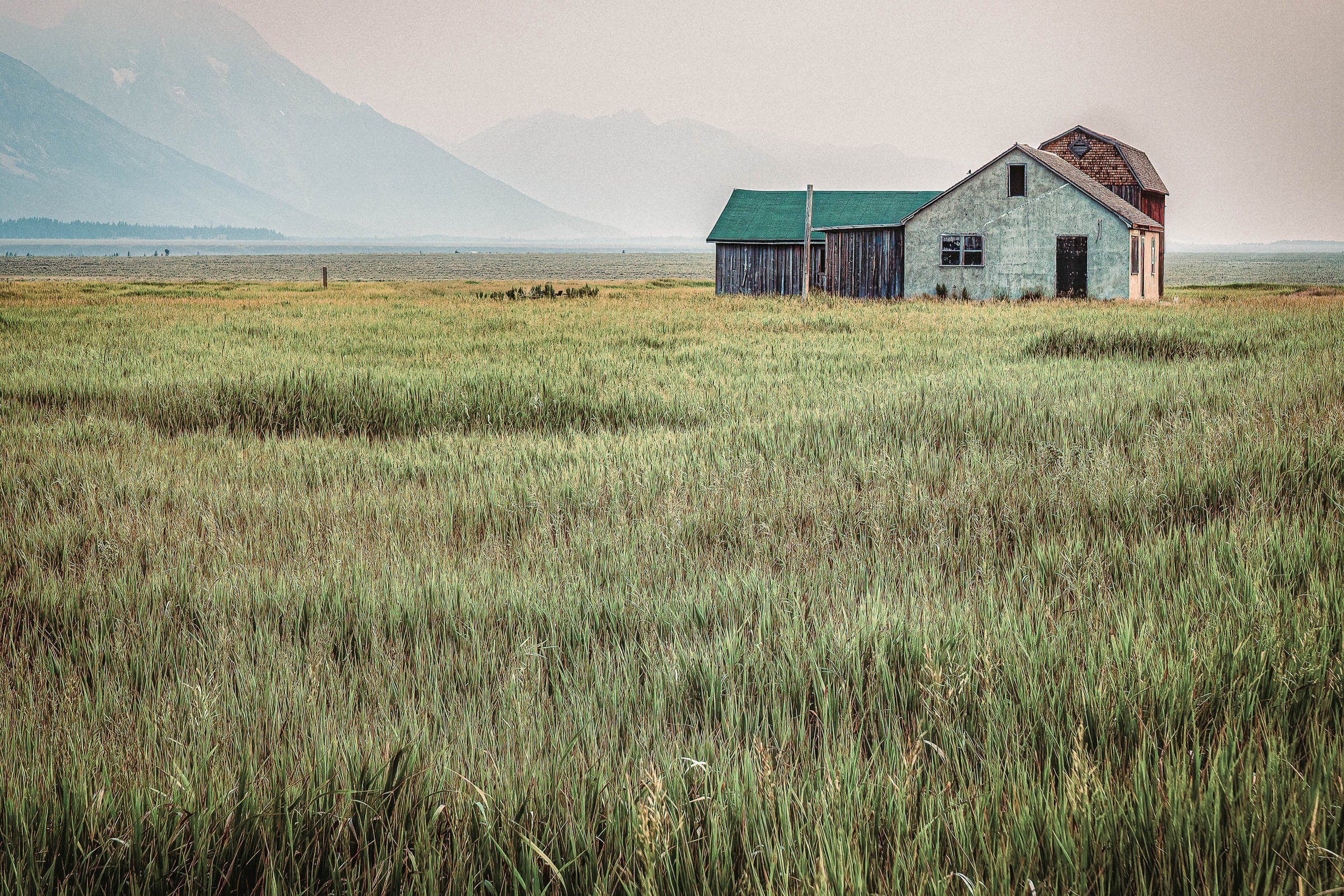
Between Us, the Field is a study of distance, memory, and the quiet relationship between landscape and home. Photographed at dawn at Mormon Row beneath the Grand Tetons, the image centers on the historic Pink House standing beyond an open field while mist and smoke veil the mountains beyond. The obscured peaks shift attention away from grandeur and toward the subtle emotional weight of the scene itself. Drawing inspiration from the restrained atmosphere and rural sensibility of Andrew Wyeth, the photograph explores the beauty found in solitude, simplicity, and the spaces that separate us from the places we long to reach.
The composition balances the modest architecture of the house against the expansive foreground field, allowing absence to become as important as presence. The veiled mountains linger as a suggestion rather than a destination, creating an atmosphere of quiet uncertainty and reflection. Rather than celebrating the iconic drama often associated with the Tetons, the image embraces stillness, muted color, and the emotional resonance of an ordinary structure standing patiently within an extraordinary landscape.
The result is a photograph rooted in the language of rural America—one that invites viewers to slow down and consider themes of belonging, memory, and the passage of time.
Design & Styling
With its subdued palette, atmospheric layering, and contemplative character, Between Us, the Field suits residences, hospitality spaces, executive offices, and quiet rooms that want calm, reflection, and emotional depth. The muted tones sit well with natural linen, weathered wood, and warm neutral walls, and the veiled mountains give a large room depth without drama.
Curated Pairings
To create a cohesive gallery wall around rural memory and atmosphere, consider these companion pieces:
For complementary rural atmosphere: Pair with Where the Plains Remember, to extend themes of homestead architecture, memory, and the enduring relationship between people and landscape.
For tonal harmony: Complement this piece with A Place Where Weather Waits, which shares the same subdued palette, contemplative pacing, and emotional sense of place.
For the same range in smoke: Pair with Where the Smoke Settles, photographed from the Snake River Overlook in Grand Teton National Park, where smoke veils the same mountains.
Fine Art Presentation
Available as a signed fine art print on ChromaLuxe® Metal (gloss, semi-gloss, or matte), Glossy Anti-Glare Acrylic (TruLife), canvas, wood, and archival paper (framed or unframed). Framed archival paper is the recommended presentation: its softly textured surface suits the muted, painterly, Wyeth-like character and the atmospheric haze. ChromaLuxe® Metal is the alternative for greater depth and clarity in the house and the veiled peaks, and canvas adds a warm, tactile read for a ranch or lodge setting.
Note: Custom and oversized photographic prints are available. Please contact the studio directly to discuss custom framing, matting, or specialized museum glass options.
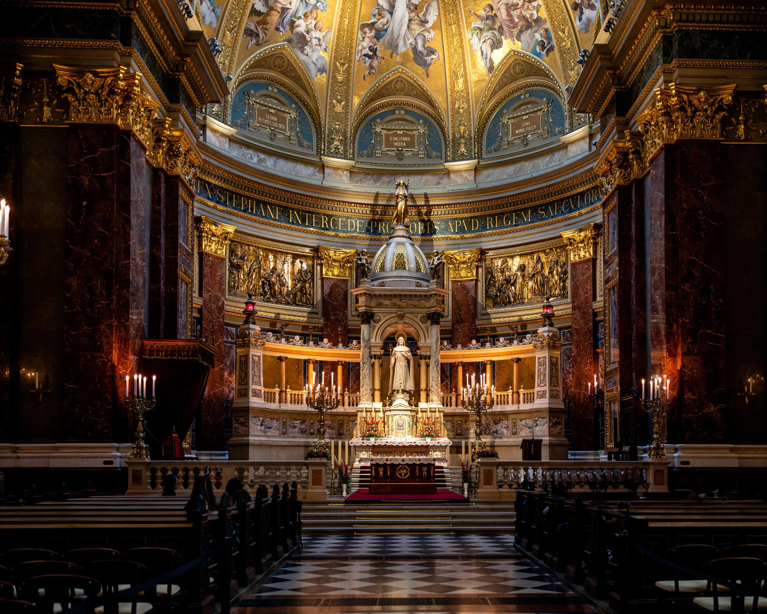
The Gothic Sentinel is a study of craftsmanship, devotion, and the enduring presence of sacred architecture. Photographed within one of Prague's richly decorated historic churches, the image reveals a world shaped by centuries of artistic ambition, faith, and extraordinary architectural vision. Ornate details, soaring vertical forms, and luminous interior light transform the space into something both monumental and intimate. Drawing inspiration from the architectural studies of Frederick H. Evans and the reverence for light found throughout European sacred architecture, the photograph explores how buildings can become vessels for memory, culture, and contemplation.
The composition balances intricate decorative detail against the powerful structural geometry of the Gothic interior. Arches rise toward shadowed ceilings while layers of ornament, color, and craftsmanship reveal themselves gradually throughout the frame. Light moves across carved surfaces and gilded details, creating a visual rhythm that guides the viewer through the image. Rather than serving as a simple architectural record, the photograph seeks to capture the atmosphere created when light, history, and human aspiration converge within a sacred space.
The result is a photograph that celebrates both the artistic achievements of Gothic architecture and the enduring ability of great spaces to inspire reflection, wonder, and stillness.
Design & Styling
The soaring vertical forms and ornate detail of The Gothic Sentinel suit hospitality lobbies, libraries, executive offices, dining rooms, and homes that welcome sacred architecture and European travel. It gives a tall wall depth and richness.
Curated Pairings
To create a cohesive gallery wall around sacred European architecture, consider these companion pieces:
For historic Prague: Pair with Before the City Wakes, extending themes of historic Prague, timeless architecture, and atmospheric storytelling.
For luminous interiors: Complement this piece with Sanctuary of Light, sharing the same reverence for sacred architecture and the transformative role of light within monumental spaces.
For time and craft: Pair with Inside the Hour, another Prague interior that turns centuries of craft into a single, rewarding image.
Fine Art Presentation
Available as a signed fine art print on ChromaLuxe® Metal (gloss, semi-gloss, or matte), Glossy Anti-Glare Acrylic (TruLife), canvas, wood, and archival paper (framed or unframed). Acrylic is the recommended presentation: its depth suits the intricate detail, luminous color, and sense of depth within the interior. ChromaLuxe® Metal is the alternative for crisper ornament.
Note: Custom and oversized photographic prints are available. Please contact the studio directly to discuss custom framing, matting, or specialized museum glass options.
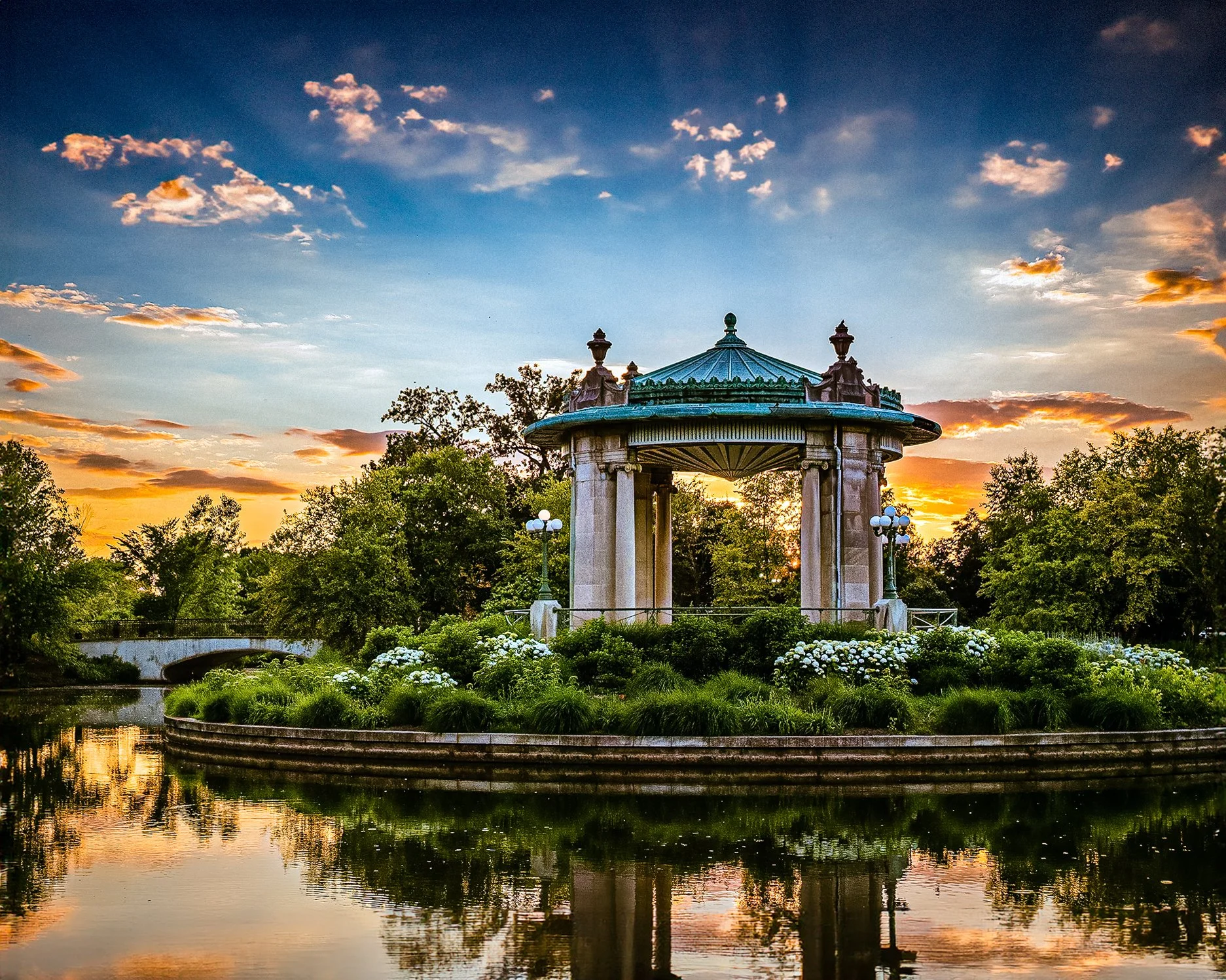
Evening at the Pavilion is a study of light, architecture, and the quiet elegance of one of St. Louis' most beloved landmarks. Photographed at dusk in Forest Park, the image centers on the Nathan Frank Bandstand as evening light settles across the landscape and the structure begins to glow against the deepening sky. Reflections, architectural detail, and carefully balanced color create a scene that feels both timeless and contemporary. Drawing inspiration from the luminous color sensibilities of Ernst Haas and the atmospheric storytelling of Edward Hopper, the photograph explores the emotional character of public spaces during the transitional moments between day and night.
The composition balances the graceful architecture of the bandstand against the surrounding landscape and sky, allowing light itself to become a defining element of the image. The structure serves as both gathering place and visual anchor, representing the cultural and civic history woven throughout Forest Park. Rather than emphasizing activity, the photograph focuses on atmosphere and anticipation—the quiet interval when a familiar place takes on a different character as daylight fades.
The result is a photograph that celebrates the relationship between architecture, community, and the enduring beauty of urban public spaces.
Design & Styling
The glow of the Nathan Frank Bandstand at dusk makes Evening at the Pavilion a natural fit for St. Louis homes, law and financial offices, hospitality spaces, and civic buildings. Its rich evening color reads well on deep blue, charcoal, or warm neutral walls.
Curated Pairings
To create a cohesive gallery wall around St. Louis architecture at dusk, consider these companion pieces:
For sacred and civic architecture: Pair with Sanctuary of Light, two distinct expressions of architectural beauty, one civic and one sacred.
For urban design and light: Complement this piece with Reflections of Glass and Stone, sharing the same appreciation for urban design, light, and the evolving character of St. Louis architecture.
For another St. Louis evening: Pair with As the Glow Ends, the Climatron glowing against the night sky at the Missouri Botanical Garden.
Fine Art Presentation
Available as a signed fine art print on ChromaLuxe® Metal (gloss, semi-gloss, or matte), Glossy Anti-Glare Acrylic (TruLife), canvas, wood, and archival paper (framed or unframed). Acrylic is the recommended presentation: its luminosity and depth suit the rich evening color and the reflections on the water. ChromaLuxe® Metal is the alternative for crisper architectural detail.
Note: Custom and oversized photographic prints are available. Please contact the studio directly to discuss custom framing, matting, or specialized museum glass options.

Old Friends is a study of memory, light, and the quiet relationship between architecture and landscape. Photographed in Tivoli, Italy, the image looks through historic window glass toward the renowned gardens beyond, where reflections, age-worn imperfections, and softened detail transform the scene into something resembling an Impressionist painting. The vintage glass becomes both subject and lens, filtering the landscape through time and allowing the photograph to explore how memory often softens and reshapes what we see. Drawing inspiration from the atmospheric interiors of Frederick H. Evans and the luminous garden studies of the Impressionists, the image embraces subtle color, texture, and visual ambiguity.
The composition balances the structure of the historic window against the organic forms of the gardens beyond, allowing the glass itself to become an active participant in the image. Distortions, reflections, and imperfections create layers of visual depth that blur the boundary between interior and exterior, observation and recollection. Rather than documenting a specific view, the photograph invites viewers into an experience of quiet contemplation, where architecture, landscape, and memory merge into a single atmosphere.
Design & Styling
Viewing a garden through old window glass gives Old Friends a painterly, remembered quality that suits dining rooms, bedrooms, studies, boutique hotels, and Italian-inspired homes. The imperfections in the glass are its charm, and it sits well with linen, plaster, and warm wood.
Curated Pairings
To create a cohesive gallery wall around European light and memory, consider these companion pieces:
For European atmosphere: Pair with Before the City Wakes, extending themes of timeless architecture, atmosphere, and the emotional experience of historic places.
For quiet observation: Complement this piece with Waiting, sharing the same quiet pacing, observational quality, and reflective sense of place.
For historic craftsmanship: Pair with Sanctuary of Light, a shared appreciation for historic craftsmanship and the passage of time in architectural detail.
Fine Art Presentation
Available as a signed fine art print on ChromaLuxe® Metal (gloss, semi-gloss, or matte), Glossy Anti-Glare Acrylic (TruLife), canvas, wood, and archival paper (framed or unframed). Framed canvas is the recommended presentation: its soft texture suits the painterly, impressionist quality of the view through old glass. Framed archival paper is the alternative for a quieter, more tactile read, and acrylic for extra luminous depth.
Note: Custom and oversized photographic prints are available. Please contact the studio directly to discuss custom framing, matting, or specialized museum glass options.
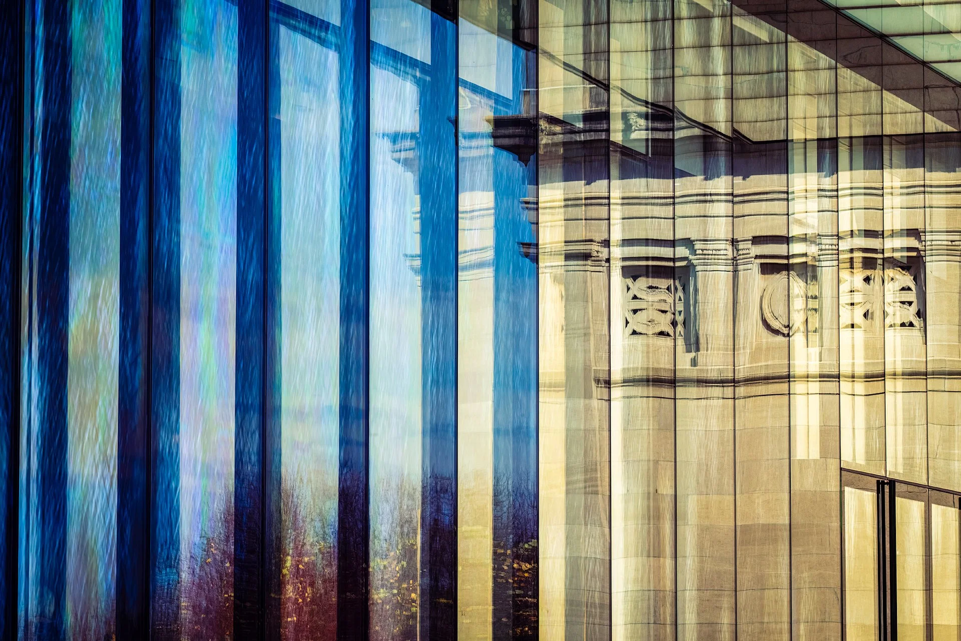
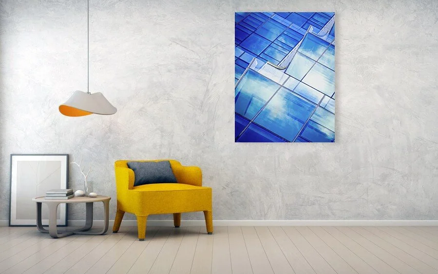
These images are designed to live within contemporary environments—corporate, civic, healthcare, and hospitality—without competing with the architecture itself.
Regional Identity: My portfolio is deeply rooted in the varied landscapes of the Midwest and the Mountain West. From the limestone bluffs of the Missouri River and the urban textures of Saint Louis to the high-altitude light and expansive forms of the Colorado Rockies, I provide a localized sense of place for regional projects.
Grand Scale: High-resolution processing ensures that subtle details and highlights remain controlled even at oversized architectural dimensions.
Bespoke Ratios: Custom cropping is available to align perfectly with specific elevations and spatial rhythms.
A wide, symmetrical panorama down the central nave of the Cathedral Basilica of St. Louis, framed by two massive corner piers rising into the mosaic-covered arches above. Rows of dark wood pews lead the eye down a polished marble aisle toward the altar and crucifix, with the great dome and its mosaic saints visible beyond — the whole architectural sequence held in a single, monumental frame.
Stitched from multiple exposures to capture the full breadth of the space, this black and white panorama treats the nave itself as the subject — not a single ornamental detail, but the entire architectural rhythm: pier, arch, pew, aisle, dome, altar, repeated in near-perfect symmetry on both sides of the frame. The tonal range holds real detail throughout, from the deep shadow within the corner piers to the luminous mosaic work overhead.
This is one of several studies from the Cathedral Basilica of St. Louis, each finding a different formal relationship within the same extraordinary space — this one, the widest and most architecturally complete view of them all.
Design & Styling
The scale and symmetry of this panorama make it a natural fit for large-format placement — a wide wall in an entryway, office, or gallery space where its full width can register. Its black and white treatment and reverent subject also suit religious and institutional settings, chapels, and classical residential interiors.
Curated Pairings
For same-building continuity — "Sanctuary of Light", a color view of the same nave and altar.
For same-building continuity — "Christ Has Not Risen", a black and white study of the resurrection mosaic in the same cathedral's dome.
For same-building continuity — "Where the Light Finds the Cross", another black and white interior study from the Cathedral Basilica of St. Louis.
Fine Art Presentation
Given the panoramic format and wide tonal range, this piece is especially well suited to ChromaLuxe® Metal (gloss, semi-gloss, or matte) print at large scale, which will hold fine detail across the full width, or an archival paper print for a softer, classical rendering. Framed and unframed options available on request.