
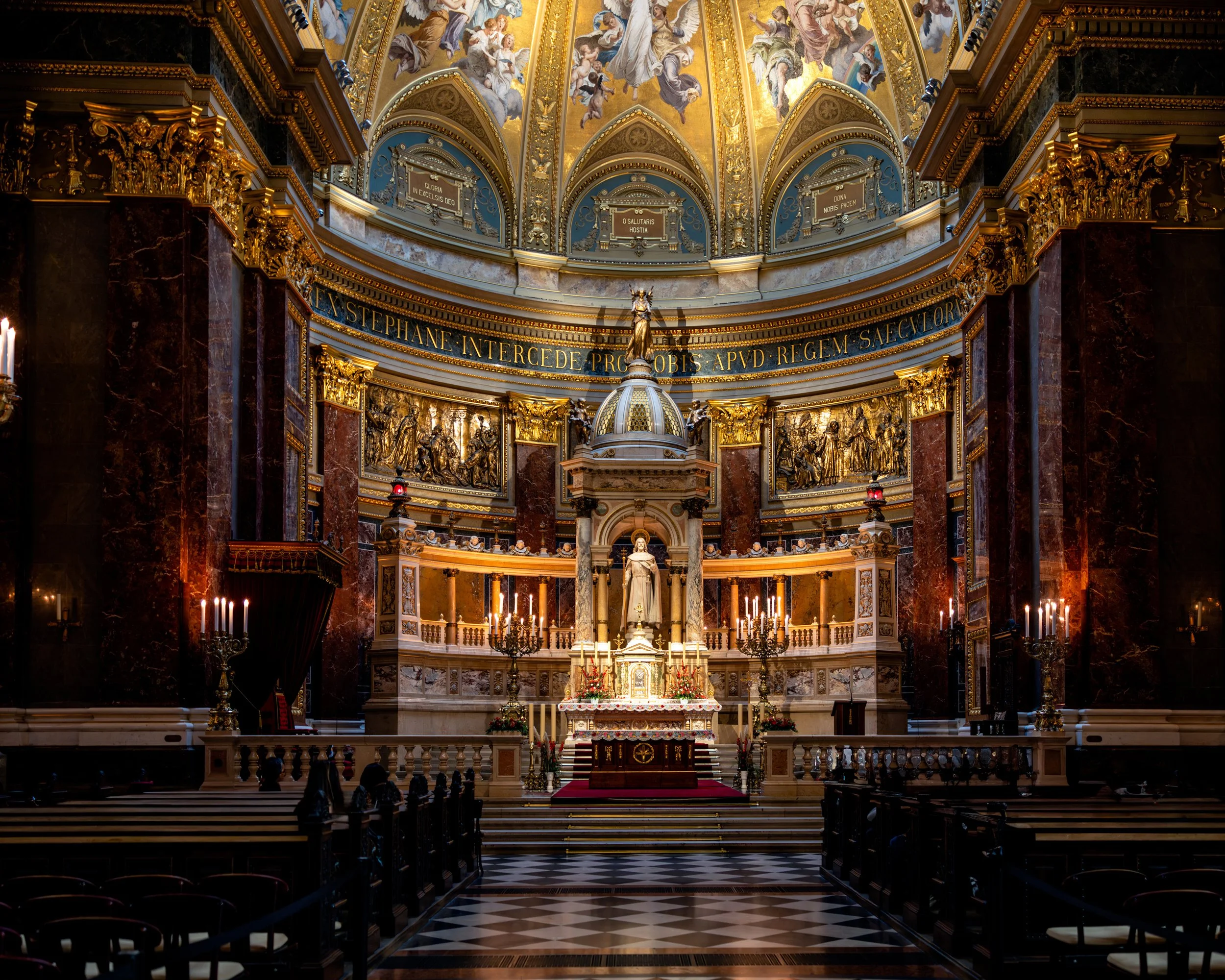
Photographing the Spaces We Inhabit
Built Environment Photography
Architecture shapes emotion long before we consciously recognize it.
The spaces we move through — hospitals, hotels, corporate environments, cultural institutions, and public architecture — influence how we feel, think, recover, and connect. My work within the built environment focuses on photographing those emotional relationships between structure, light, atmosphere, and human presence.
Rather than approaching architecture as purely documentary photography, I create cinematic and atmospheric images that explore how light, texture, scale, and silence interact within designed spaces. Many of these photographs exist somewhere between architectural study and emotional landscape, emphasizing not only the structure itself, but the experience of inhabiting it.
Influenced by the cinematic urban pacing of Wim Wenders, the painterly color sensibilities of Ernst Haas, and the quiet restraint of contemporary fine art photography, the work often focuses on:
layered architectural light
reflective surfaces
atmospheric transitions
historic textures
solitude within public space
the emotional resonance of modern and historic environments
The collection includes:
European architectural studies
contemporary urban reflections
museums and public spaces
night architecture
minimalist structural abstractions
atmospheric city imagery
human presence within designed environments
“What really constitutes an architectural atmosphere is this singular density and mood, this feeling of presence, well-being, harmony, beauty... under whose spell I experience what I otherwise would not experience in precisely this way.”
Design Philosophy
“Space, light and order. Those are the things that men need just as much as they need bread or a place to sleep.
”
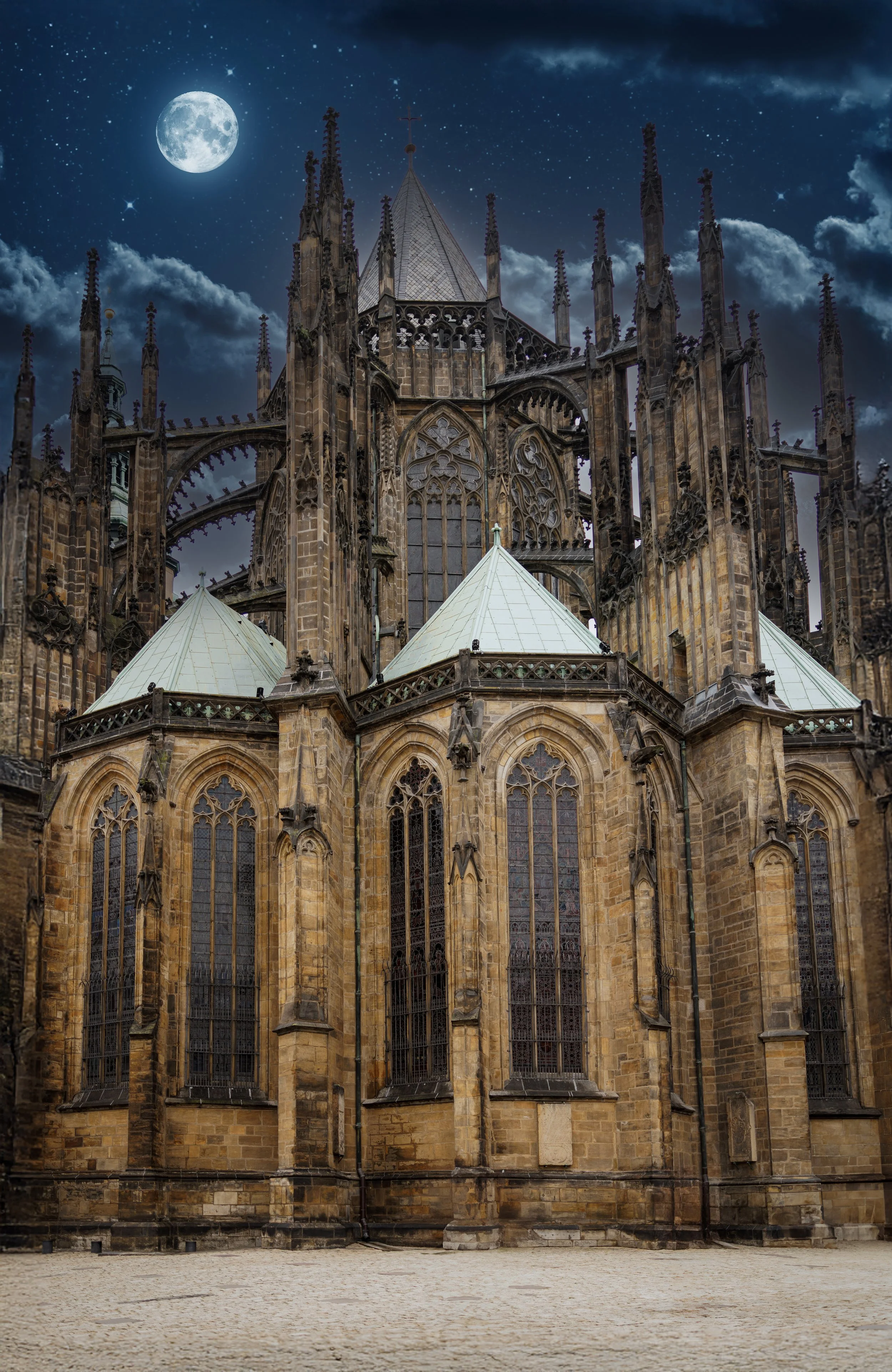
The built environment is never static.
Light changes architecture.
Weather changes architecture.
Human presence changes architecture.
Memory changes architecture.
My goal is to create images that allow viewers to emotionally enter a space rather than simply observe it.
These photographs are not intended merely as records of buildings or locations, but as studies of atmosphere, perception, and emotional experience within the spaces we create around ourselves.
Available works include museum-quality presentation options in:
satin and semi-matte metal
framed archival paper
low-glare acrylic
framed canvas
Custom sizing, healthcare and hospitality consultation, and large-format installation inquiries are welcome.
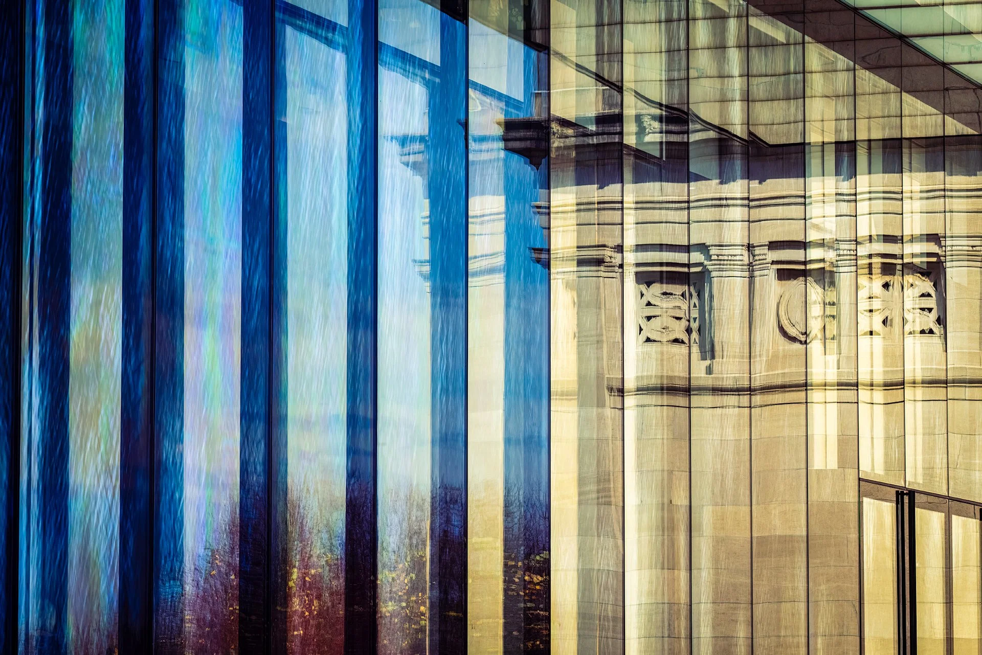
Healthcare Section - Evidence Based Design
My background in healthcare and physical therapy strongly influences the way I photograph built environments.
Research in Evidence-Based Design has shown that visual environments can influence stress reduction, emotional regulation, cognitive restoration, and overall patient experience. (Reference) Rather than producing visually aggressive or purely decorative imagery, I focus on creating photographs where calm, permanence, and visual restraint are essential to the experience of the space.
These works are especially well suited for:
healthcare systems
behavioral health environments
hospitality interiors
executive offices
wellness-focused architecture
contemporary residential spaces
restorative public environments
Many pieces are intentionally designed around:
restrained color palettes
contemplative pacing
layered atmospheric depth
soft transitions of light and shadow
emotional openness
cinematic stillness
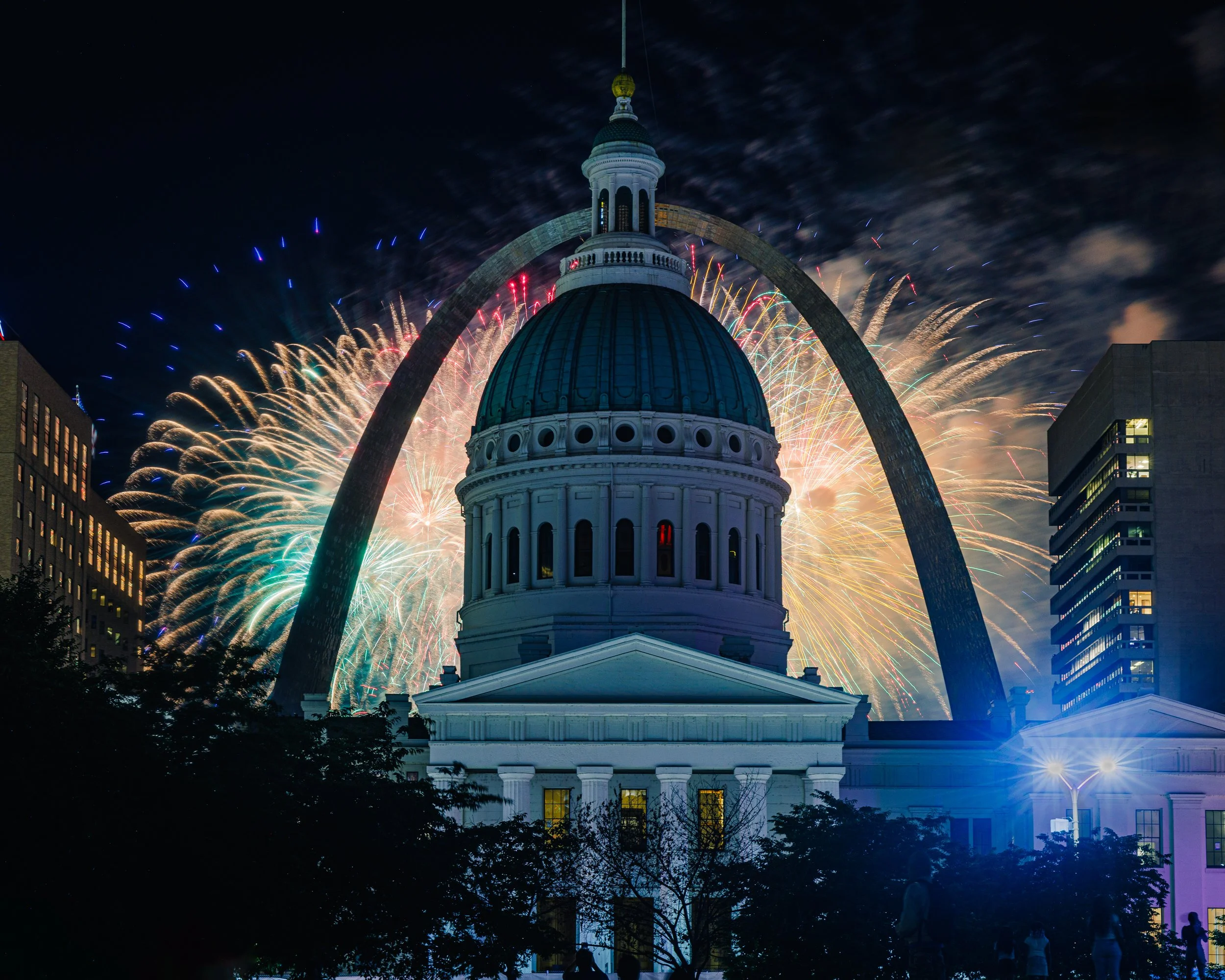
Architects, Collectors, designers, healthcare organizations, and hospitality groups interested in licensing or large-scale presentation may contact me directly for portfolio consultation and project collaboration.
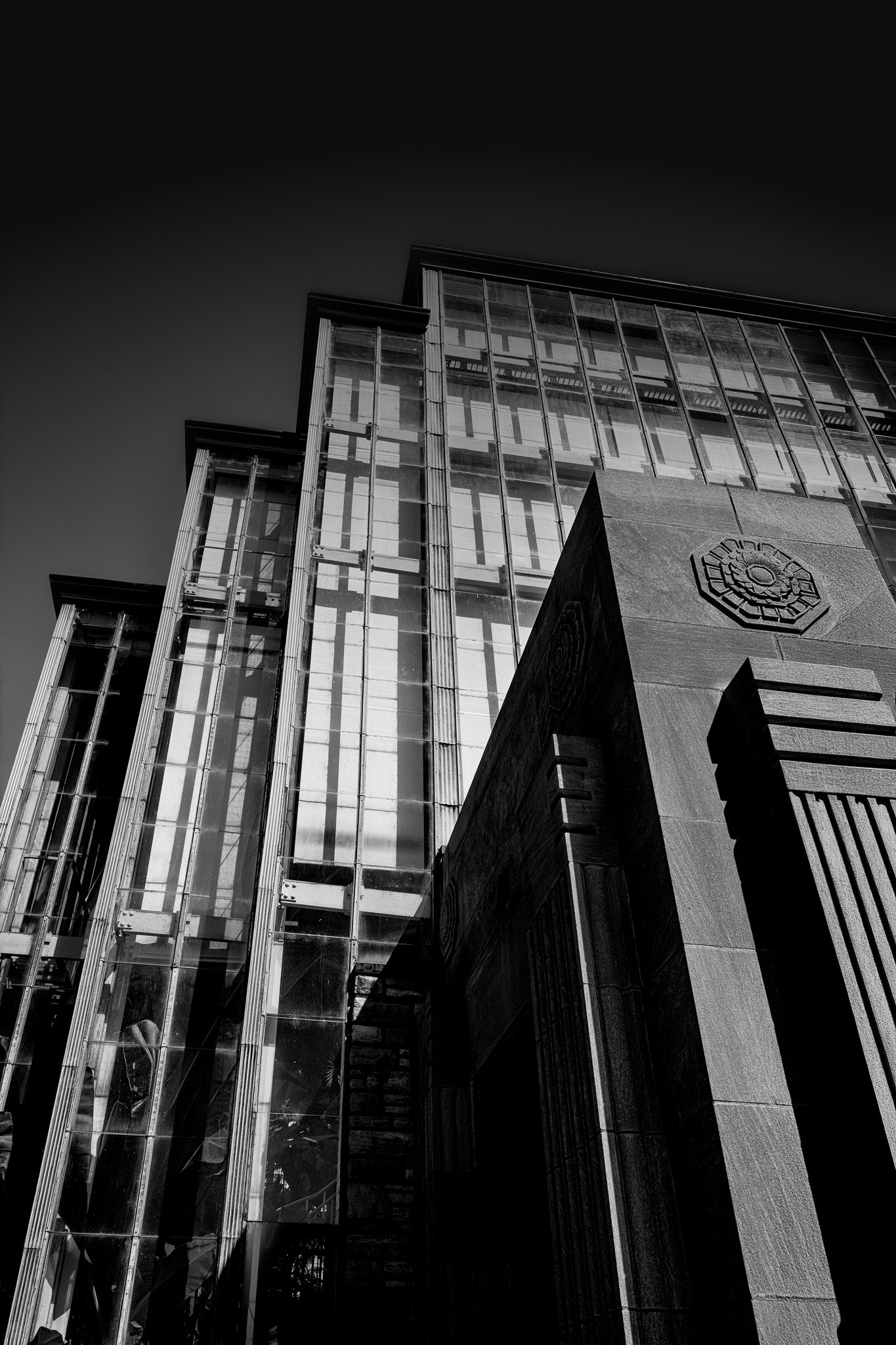
Silver-gray glass and illuminated stone rise against a charcoal sky at the Jewel Box in Forest Park, St. Louis. Seen from below, four stepped rooflines establish an ascending rhythm, while the carved stone entrance gives the foreground weight and texture.
The monochrome photograph brings transparency and solidity into the same frame. Through the glass, repeated structural panels create a layered pattern of light and shadow. Beside them, the entrance’s ornament and projecting stonework become sculptural forms. The upward viewpoint reveals the building through its geometry, making an arrival at a familiar landmark an invitation to look more closely.
Design & Styling
This vertical architectural study suits contemporary living spaces, architectural offices, and hospitality interiors. Its monochrome palette connects naturally with stone, concrete, metal, and neutral furnishings. The stepped silhouette reads across a room, while the glass framework and carved detail reward closer attention.
Curated Pairings
Vertical Interval — An upward architectural view whose repeated structures complement the Jewel Box’s rhythm of ascent.
Within the Nave — A monochrome St. Louis companion, contrasting this sunlit exterior with the quiet scale and shadows of a cathedral interior.
Steel Echoes — Repeating steel circles offer a curved, colorful counterpoint to the Jewel Box’s angular glass and stone.
Fine Art Presentation
Framed archival paper is a strong choice for the photograph’s tonal transitions and stone texture. ChromaLuxe® Metal, available in gloss, semi-gloss, or matte, emphasizes the clean structural lines and contrast. Acrylic offers additional visual depth in the layered glass facade.
Note: Custom and oversized photographic prints are available. Please contact the studio directly to discuss custom framing, matting, or specialized museum glass options.
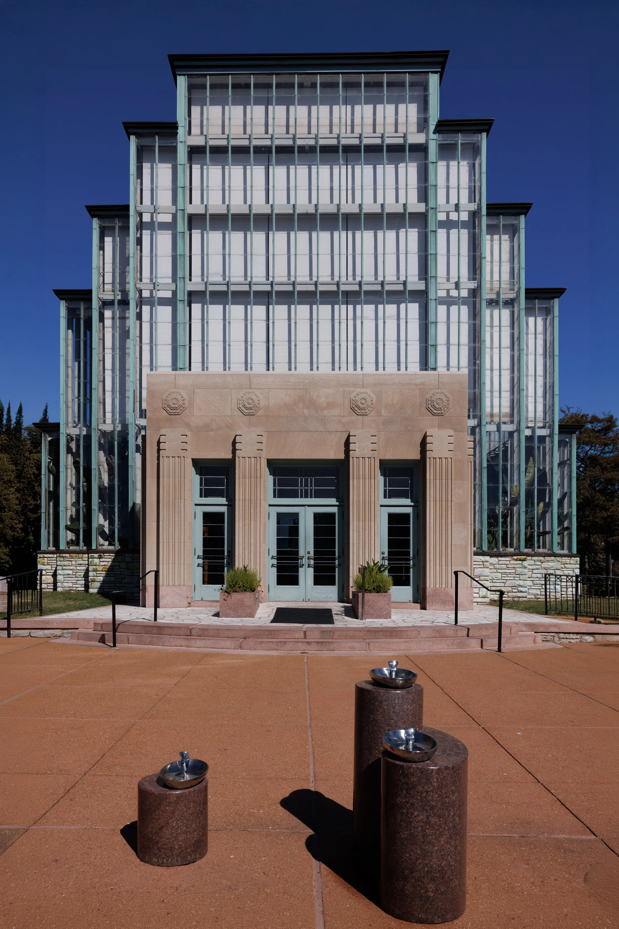
Deep blue sky and terracotta pavement frame the Jewel Box entrance in Forest Park, St. Louis. The stepped glass façade rises above pale stone columns and blue-green doors, while three drinking fountains occupy the foreground. Their polished bowls catch the daylight, introducing rounded forms beneath the building’s repeated vertical lines.
The fountains are part of the portrait. Their different heights establish a smaller rhythm in front of the rising roofline, and their substantial stone bases cast distinct shadows across the pavement. They bring the scale of the photograph back to an everyday encounter: approaching the doors, pausing for water, spending time in the park.
No visitors appear, but the entrance remains a place built for people. Doors, steps, handrails, planters, and fountains describe how the landmark is used as well as how it looks. At the Jewel Box Entrance brings those ordinary details into a formal daylight view of a familiar St. Louis building.
Design & Styling
The vertical composition suits an entryway, an office, or a narrower wall where the building’s upward rhythm can register. Deep blue, blue-green, warm stone, and terracotta connect naturally with wood furniture, cream walls, and restrained earth tones.
The photograph offers a recognizable local subject for St. Louis homes, hospitality spaces, and architecture or design offices. For someone with memories of the Jewel Box, the direct view of its doors and approach provides a personal connection to the place.
Curated Pairings
For another view of the same landmark: Pair with Held in Glass. Its cooler pond reflection complements this close daylight portrait of the entrance and drinking fountains.
For Forest Park architecture: Pair with Evening at the Pavilion. The bandstand’s open curves and evening light contrast with the Jewel Box’s upright glass grid and sunlit stonework.
For glass, geometry, and blue: Complement with Blue Interval. Its reflected clouds and repeated window patterns extend the architectural rhythm into a more abstract view.
For a deliberate architectural comparison: Pair with El Santuario de Chimayó. Both compositions approach a centered entrance through a prominent foreground feature, setting warm building materials against deep blue sky; glass and stone here contrast with the church’s adobe forms.
Fine Art Presentation
Gallery Metal offers a clean presentation for the façade’s fine lines, carved stone, and foreground textures. ChromaLuxe® Metal in gloss, semi-gloss, or matte provides an alternative for emphasizing the blue sky and warm pavement.
Framed archival paper suits a quieter presentation, with a warm white mat and a simple frame that supports the architectural geometry. TruLife Acrylic offers additional visual depth, while canvas gives the fine detail a softer treatment.
The full composition, including all three drinking fountains, is preserved in standard vertical 2:3 proportions.
Note: Custom and oversized photographic prints are available. Please contact the studio directly to discuss custom framing, matting, or specialized museum glass options.
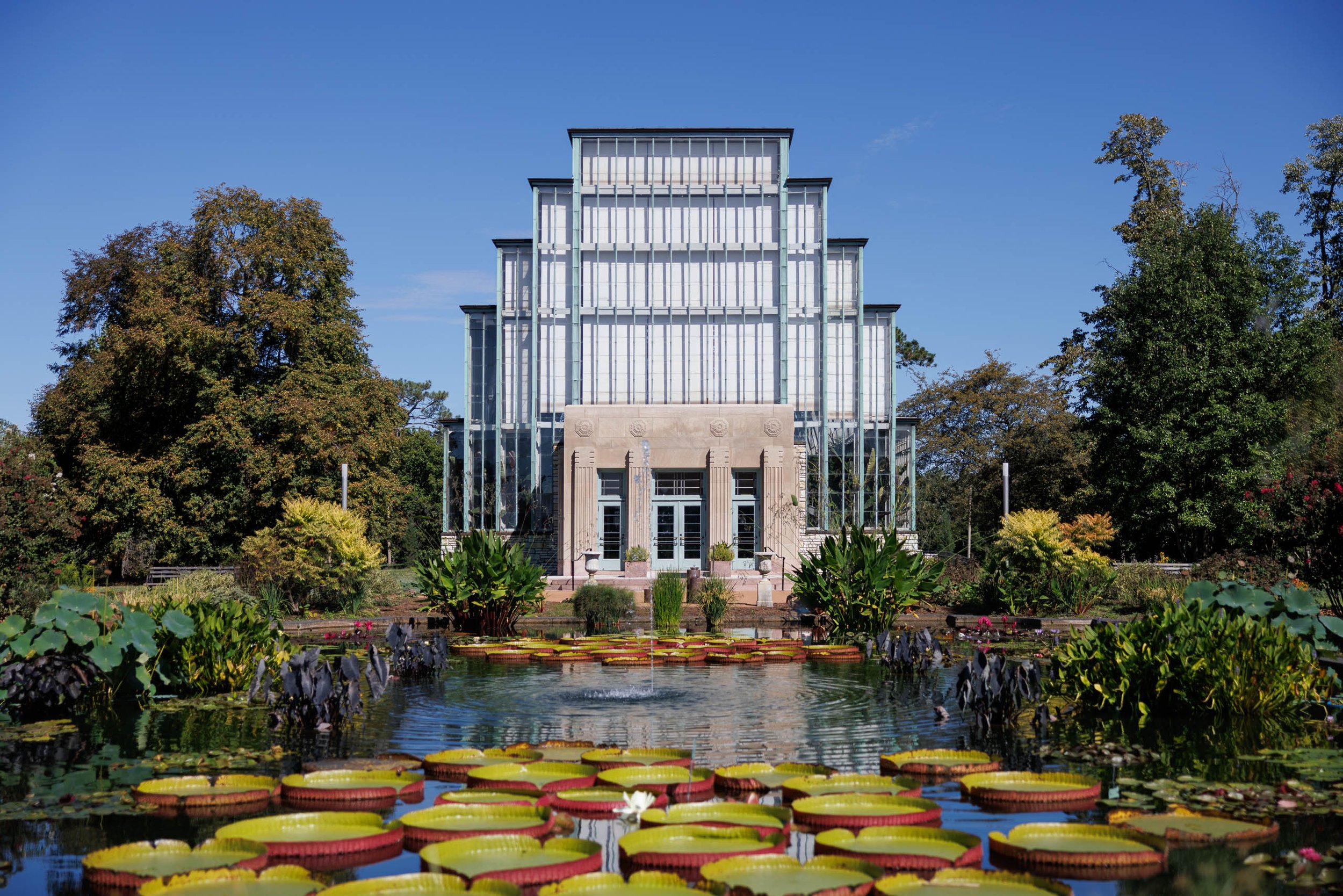
Blue sky and garden green surround the Jewel Box in this daylight photograph from Forest Park in St. Louis. The glass conservatory rises between mature trees, while broad lily pads with deep red rims spread across the foreground pond. A small fountain sends ripples through the reflected façade, connecting the building’s straight lines with the movement of water.
The centered entrance anchors the composition. Repeated glass panels climb toward the stepped roofline, while the planting opens around a clear stretch of water leading toward the doors. Near the viewer, rounded leaves and white water lilies introduce a different rhythm: overlapping, irregular, and close enough to reveal the garden’s changing textures.
The Jewel Box Garden holds the landmark within its surroundings. It offers a daylight view for those who remember the conservatory through garden visits, Forest Park walks, or celebrations connected to this familiar St. Louis place.
Design & Styling
The horizontal composition suits a wall above a sofa, console, or office credenza. Blue, green, pale stone, and burgundy-red accents work comfortably with warm neutrals, natural wood, and interiors that connect architecture with the outdoors.
For St. Louis homes, hospitality spaces, and professional offices, the recognizable building gives the photograph a local connection. The garden and fountain broaden its appeal to viewers drawn to conservatories, water gardens, and botanical subjects.
Curated Pairings
For Forest Park in different light: Pair with Evening at the Pavilion. Both photographs place Forest Park architecture beside water, with the pavilion’s evening glow offering a contrast to this garden’s clear daylight.
For another interpretation of the Jewel Box: Pair with Held in Glass. Its cooler light and emphasis on reflection complement the wider garden setting and red-rimmed lily pads here.
For architectural rhythm: Complement with Blue Interval. Reflected sky and repeated glass lines connect the two photographs, moving from a recognizable garden landmark to a closer architectural abstraction.
Fine Art Presentation
ChromaLuxe® Metal is the recommended presentation for the building’s defined glass lines and the contrasting green and burgundy tones of the lily pads. Gloss, semi-gloss, and matte finishes offer different surface treatments for the intended setting.
TruLife Acrylic is an alternative for emphasizing depth in the water and reflected architecture. Framed archival paper gives the scene a quieter presentation, especially with a warm white mat and a simple wood or dark frame. Canvas softens the fine architectural detail, while wood introduces a warmer surface character.
The complete horizontal composition is preserved in standard 3:2 proportions.
Note: Custom and oversized photographic prints are available. Please contact the studio directly to discuss custom framing, matting, or specialized museum glass options.
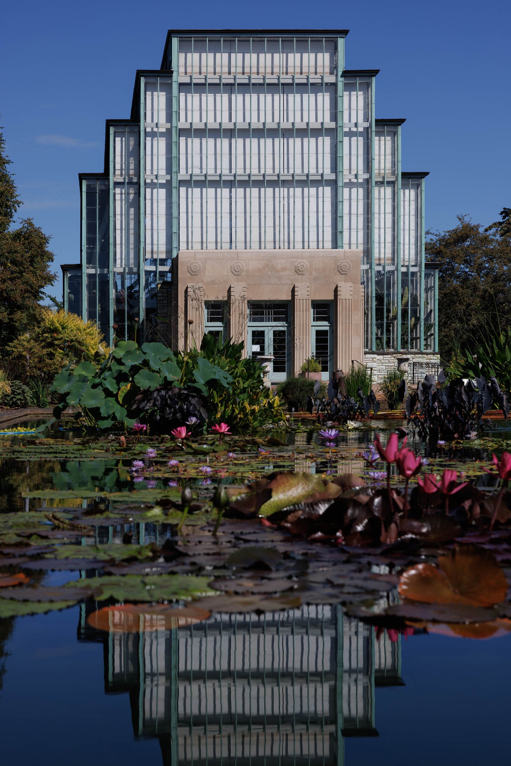
Blue sky and garden green surround the Jewel Box in this daylight photograph from Forest Park in St. Louis. Its stepped glass façade rises above a pond of lily pads and pink blossoms, then appears again in the darker water below. Pale glass, warm stone, and deep foliage give the familiar landmark a distinct presence within its garden.
The building establishes the composition’s order: repeated vertical lines, a centered entrance, and a roofline that climbs toward the middle. Across the pond, broad leaves and scattered flowers interrupt that geometry. The reflection brings the two together, carrying the architecture into the garden without losing its recognizable shape.
For those who know the Jewel Box through visits, celebrations, or everyday walks in Forest Park, this photograph offers a clear daylight view of a place tied to personal memories.
Design & Styling
The vertical composition suits an entryway, a reading corner, or a narrower wall in a professional office. Blue, green, and warm stone tones work naturally with cream walls, wood furniture, and restrained blue accents, while the pink flowers provide a small point of contrasting color.
Jewel Box Reflections also suits St. Louis hospitality spaces and architecture or design offices seeking a recognizable local subject. For someone with a personal connection to the conservatory, it offers a place-specific gift with both architectural detail and garden character.
Curated Pairings
For the same place in different light: Pair with Held in Glass. Its cooler evening interpretation creates a direct comparison with the blue sky, flowers, and defined daylight of Jewel Box Reflections.
For a Forest Park pairing: Pair with Evening at the Pavilion. Two Forest Park structures connect through water reflections, with the pavilion’s evening glow complementing the Jewel Box’s daylight clarity.
For glass and reflected sky: Complement with Blue Interval. Its closer, more abstract treatment of glass architecture echoes the façade’s repeated lines while changing the scale of the view.
Fine Art Presentation
ChromaLuxe® Metal in gloss, semi-gloss, or matte suits the defined architectural lines and blue-green palette. TruLife Acrylic offers an alternative presentation emphasizing the depth of the water and reflection. Framed archival paper provides a quieter treatment, particularly with a warm white mat and a simple frame that echoes the building’s geometry.
Canvas softens the fine architectural detail, while wood introduces a warmer material character. The full vertical composition is maintained in standard 2:3 proportions.
Note: Custom and oversized photographic prints are available. Please contact the studio directly to discuss custom framing, matting, or specialized museum glass options.
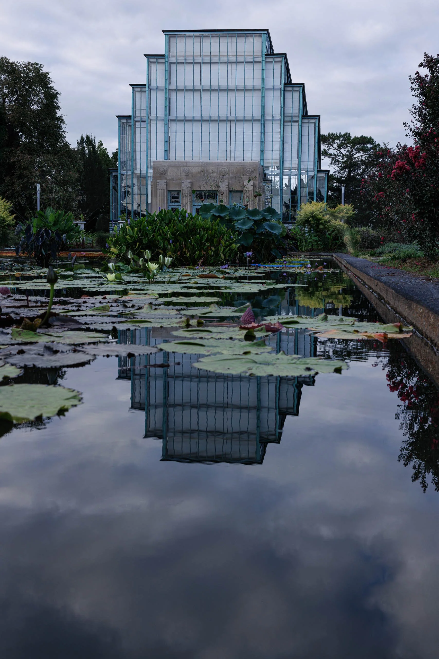
Held in Glass finds the Jewel Box, Forest Park’s, Art Deco glass conservatory, doubled almost perfectly in the still surface of its reflecting pool at blue hour, a dense foreground of lily pads and a single white water lily blossom breaking the symmetry below.
The stepped-pyramid glass structure rises center-frame, its vertical mullions catching the last cool light of dusk, while the pool beneath mirrors the whole building back into the water — look closely and the reflection holds real color, not just silhouette. The overcast sky sits flat and even above, giving the scene a quiet, held-breath calm rather than any drama.
Forest Park’s Jewel Box is one of the most recognizable buildings in St. Louis, and this particular vantage — the reflecting pool, straight on — is close to the view most visitors come away with. What sets this apart is the blue-hour timing and the density of the lily pads pressed right up to the lens, continuing the same interest in still-water doubling found in pieces like The Silent Assembly, here turned toward architecture instead of landscape.
Design & Styling
With its cool, restrained palette and unmistakable architectural subject, Held in Glass suits hospitality lobbies, hotel and resort interiors, architecture and design firm offices, and healthcare or senior-living settings where a calm, non-jarring image is preferred. The Jewel Box is also one of St. Louis's most popular wedding venues, making this a natural anniversary gift or keepsake for couples married there.
Curated Pairings
For shared place: Pair with Evening at the Pavilion, photographed in the same St. Louis park system at a similarly soft evening hour.
For shared formal device: Complement with Blue Interval, which shares the same interest in St. Louis glass architecture rendered in a cool, abstracted register.
For shared formal treatment: Pair with The Silent Assembly, which uses the identical device of a still, mirror-calm water surface doubling the scene above it.
Fine Art Presentation
Available as a signed, numbered limited edition print (edition of 15) in Gallery Metal, ChromaLuxe® Metal, TruLife Acrylic, archival paper, canvas, and wood presentation formats. The glass structure and its water reflection suit TruLife (Low-Glare) Acrylic particularly well, giving both the architecture and the pool real depth and luminosity; ChromaLuxe® Metal is a strong alternate, its cool sheen echoing the blue-hour palette and the building's own glass surfaces.
Note: Custom and oversized photographic prints are available. Please contact the studio directly to discuss custom framing, matting, or specialized museum glass options.

Twin adobe bell towers rise in perfect symmetry at El Santuario de Chimayó, one of the most visited pilgrimage sites in the American Southwest. A brick path leads straight from a millstone-set stone cross, flanked by living trees, to the church's raw wood lintel and weathered ladder — the same threshold generations of pilgrims have crossed seeking the site's "holy dirt," believed since the early 19th century to carry healing power.
The composition is deliberately formal rather than a discovered detail — frontal, symmetrical, monumental. The trees on either side frame the towers like a second architecture of their own, funneling the eye down the path to the memorial cross and up into the deep blue sky above. A single figure stands in the shadowed doorway, giving the towers human scale without becoming the subject themselves.
This sits closer to Paul Strand's formal architectural portraiture than his usual off-angle church studies — a rare moment of pure frontal symmetry in a body of work built mostly on quieter, tilted framing. Ansel Adams' tonal discipline is the more relevant reference for the range held between deep blue sky and the shadowed archway below.
Design & Styling
The warm adobe tones and deep blue sky give this real architectural presence and instant recognizability in Southwestern and contemporary interiors alike — a strong fit for spaces wanting a genuine New Mexico landmark rather than a generic desert scene.
Curated Pairings
For the same pilgrimage tradition: Pair with Walk to the Crosses, another New Mexico church built from generations of devotion.
For twin-tower continuity: Complement with Twin Towers, Trampas, sharing this piece's paired-tower symmetry.
For a stone counterpart on the same historic road: Pair with Shrine at Ohkay Owingeh, a lava-rock Gothic chapel on the same Santa Fe–Taos corridor.
Fine Art Presentation
Available as a signed fine art print on archival paper (framed or unframed), ChromaLuxe® Metal (gloss, semi-gloss, or matte), framed canvas, and acrylic. Metal holds the deep blue sky and warm adobe contrast especially well; for acrylic, TruLife low-glare acrylic is recommended.
Note: Custom and oversized photographic prints are available. Please contact the studio directly to discuss custom framing, matting, or specialized museum glass options.
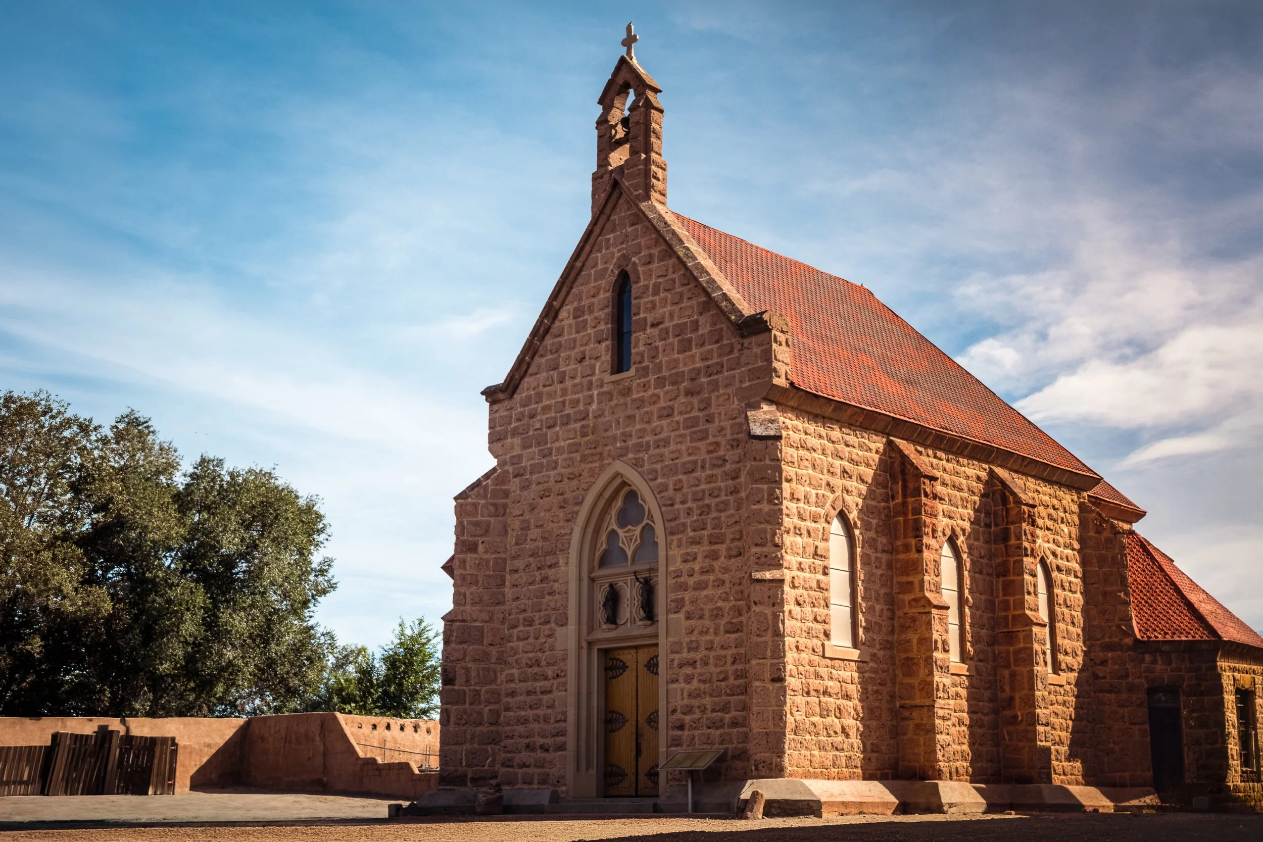
Lava rock rises in true French Gothic form at the Shrine of Our Lady of Lourdes, standing directly across the plaza from the main church at Ohkay Owingeh Pueblo, on the road between Santa Fe and Taos. Built in 1889 by Father Camilo Seux, a French priest who spent his own inheritance on its construction, the shrine was designed by Antoine and Projectus Mouly — the same architects behind the Santa Fe Cathedral and the Loretto Chapel — making it one of the only buildings of its kind in Pueblo country: a European Gothic form built entirely of volcanic rock rather than adobe.
Photography inside wasn't permitted, which shaped this piece into an exterior study by necessity rather than choice — the roofline, the bell tower and its cross, the rhythm of lancet windows along the nave, all caught under a low sun against a deep blue sky. What the camera couldn't reach inside, it found instead in the building's own form.
This is Paul Strand territory — the same commitment to monumental, high-contrast architectural directness that defines his New Mexico church work, applied here to a building whose material and French design set it apart from every other church in the region, Pueblo or otherwise.
Design & Styling
The warm volcanic stone and deep blue sky give this real architectural presence in Southwestern and contemporary interiors alike — a strong fit for spaces wanting weight and material specificity rather than a generic desert-church look.
Curated Pairings
For the same devotional stone tradition, different material: Pair with Twin Towers, Trampas, an adobe counterpart on the High Road to Taos.
For New Mexico mission architecture continuity: Complement with Enduring Forms, San Francisco de Asís in Ranchos de Taos.
Fine Art Presentation
Available as a signed fine art print on archival paper (framed or unframed), ChromaLuxe® Metal (gloss, semi-gloss, or matte), framed canvas, and acrylic. Metal holds the deep blue sky and warm stone contrast especially well; for acrylic, TruLife low-glare acrylic is recommended.
Note: Custom and oversized photographic prints are available. Please contact the studio directly to discuss custom framing, matting, or specialized museum glass options.

Faith built by hand, one carved beam at a time. This is San José de Gracia in Las Trampas, on the High Road to Taos — twin adobe bell towers rising against a saturated New Mexico sky, each capped with a wooden cross and a lattice bell opening carved and assembled without a single power tool. Two and a half centuries of sun, wind, and re-plastering have softened every edge, but the hand-adzed roof beams and carved balcony corbels still hold the precision of the people who built this.
The low camera angle turns a modest village church into something monumental — the two towers framing the frame's top corners, the carved balcony and lintel pulling the eye straight down to the wooden doors below. Nothing here is staged or discovered; it's a direct, confident study of craftsmanship, tight enough to hold the corbels, the baluster turning, the worn carved lintel above the door, rather than stepping back for the whole facade.
This sits in the tradition Paul Strand built his New Mexico work on — hand-built religious architecture photographed with monumental, high-contrast directness. Ansel Adams' tonal discipline is the secondary reference, in the clean separation between deep adobe shadow and open sky.
Design & Styling
The deep blue sky and warm adobe tones give this real graphic presence in Southwestern, contemporary, and hospitality interiors alike — a strong fit for spaces wanting architectural weight and a sense of craft rather than pure landscape.
Curated Pairings
For the same High Road corridor: Pair with Where the Bells Remain, photographed in the same village.
For the same devotional hand-built tradition: Complement with Walk to the Crosses, another New Mexico mission church assembled from devotion rather than architecture alone.
For a third leg of the New Mexico mission church grouping: Pair with Enduring Forms, San Francisco de Asís in Ranchos de Taos.
Fine Art Presentation
Available as a signed fine art print on archival paper (framed or unframed), ChromaLuxe® Metal (gloss, semi-gloss, or matte), framed canvas, and acrylic. Metal holds the deep blue sky and warm adobe contrast especially well; for acrylic, TruLife low-glare acrylic is recommended.
Note: Custom and oversized photographic prints are available. Please contact the studio directly to discuss custom framing, matting, or specialized museum glass options.
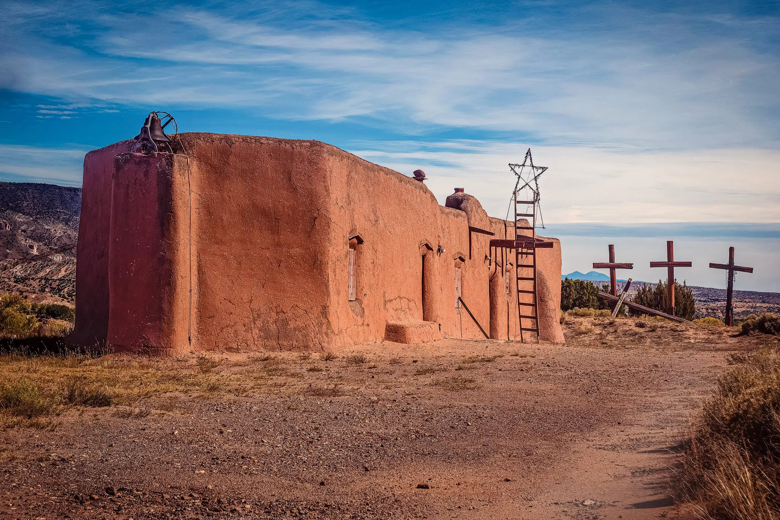
Faith accumulates like sediment. A hundred-year-old adobe church stands against a deep New Mexico sky near Abiquiú — bell, wrought-iron star, and a weathered ladder crowding its roofline, three wooden crosses standing loose in the grass beyond it. Nothing here was designed as a single composition; it was built up over generations, one devotional object added to the next.
The frame is built as a walk. The foreground gravel and dirt path pull the eye in from the bottom, along the building's diagonal roofline, past the ladder and star, and out to the crosses on the rise beyond — the same physical approach a visitor would actually make on foot, from empty ground to entrance to memorial. The camera-left wall, deep in shadow, holds real texture and cracking rather than falling to black, giving the adobe its full tonal range against the saturated blue sky.
This is Ghost Ranch country — O'Keeffe's palette of red earth and hard blue sky is unmistakable in the striated badlands behind the church, rendered here with a light touch so they stay in their place as setting rather than subject. The devotional density of bell, star, ladder, and crosses owes something to Ansel Adams' commitment to full tonal detail in architectural subjects, holding shadow and highlight together rather than letting either collapse.
Design & Styling
The warm adobe tones and graphic sky make this a strong fit for Southwestern and contemporary interiors, chapels and meditation spaces, hospitality lobbies with a regional identity, and offices or homes built around a sense of place rather than abstraction.
Curated Pairings
For the same devotional architecture: Pair with Enduring Forms, another New Mexico mission church built from the same adobe tradition.
For the same region: Complement with Where the Bells Remain, continuing the theme of small New Mexico churches along the High Road.
For a quieter counterpoint: Pair with Beneath Watchful Wings, sharing the same warm earth-and-sky palette.
Fine Art Presentation
Available as a signed fine art print on archival paper (framed or unframed), ChromaLuxe® Metal (gloss, semi-gloss, or matte), framed canvas, and acrylic. Metal or a satin presentation holds the deep blue sky and warm shadow-side texture especially well; for acrylic, TruLife low-glare acrylic is recommended.
Note: Custom and oversized photographic prints are available. Please contact the studio directly to discuss custom framing, matting, or specialized museum glass options.

A wide, symmetrical panorama down the central nave of the Cathedral Basilica of St. Louis, framed by two massive corner piers rising into the mosaic-covered arches above. Rows of dark wood pews lead the eye down a polished marble aisle toward the altar and crucifix, with the great dome and its mosaic saints visible beyond — the whole architectural sequence held in a single, monumental frame.
Stitched from multiple exposures to capture the full breadth of the space, this black and white panorama treats the nave itself as the subject — not a single ornamental detail, but the entire architectural rhythm: pier, arch, pew, aisle, dome, altar, repeated in near-perfect symmetry on both sides of the frame. The tonal range holds real detail throughout, from the deep shadow within the corner piers to the luminous mosaic work overhead.
This is one of several studies from the Cathedral Basilica of St. Louis, each finding a different formal relationship within the same extraordinary space — this one, the widest and most architecturally complete view of them all.
Design & Styling
The scale and symmetry of this panorama make it a natural fit for large-format placement — a wide wall in an entryway, office, or gallery space where its full width can register. Its black and white treatment and reverent subject also suit religious and institutional settings, chapels, and classical residential interiors.
Curated Pairings
For same-building continuity — "Sanctuary of Light", a color view of the same nave and altar.
For same-building continuity — "Christ Has Not Risen", a black and white study of the resurrection mosaic in the same cathedral's dome.
For same-building continuity — "Where the Light Finds the Cross", another black and white interior study from the Cathedral Basilica of St. Louis.
Fine Art Presentation
Given the panoramic format and wide tonal range, this piece is especially well suited to ChromaLuxe® Metal (gloss, semi-gloss, or matte) print at large scale, which will hold fine detail across the full width, or an archival paper print for a softer, classical rendering. Framed and unframed options available on request.
Note: Custom and oversized photographic prints are available. Please contact the studio directly to discuss custom framing, matting, or specialized museum glass options.

High in the Cathedral Basilica of St. Louis, a small cross crowns the cupola above the baldachin — and it is, quite literally, where the light comes from. Everything else in this dense, overwhelming field of mosaic saints, stained glass, and gilded ornament radiates outward from that single point: Peter, John, Andrew, and James rendered in luminous tesserae under the half-dome; St. Ambrosius and a Star of David set into the surrounding arch; the inscription "God Will Provide a Lamb" curving along the right pier. All of it dense, all of it simultaneous — and all of it organized, finally, around one small, quietly lit cross.
Rendered in black and white, the mosaic's gold and color give way to a wide, carefully held tonal range: the illuminated saints and cross hold real highlight detail without blowing out, while the deep stone piers at the frame's edge fall into true, textured shadow. The photograph doesn't simplify this space's overwhelming richness — it couldn't, and shouldn't. Instead, it finds the one true point of light the architecture itself provides, and lets everything else arrange itself around it.
Design & Styling
The density and reverence of this piece make it especially well suited to religious and institutional settings — chapels, meditation spaces, Catholic health system administrative halls, and donor-facing areas where imagery can reinforce mission and identity. It also holds its own in classical, contemplative residential interiors and libraries.
Curated Pairings
For same-building continuity — "Christ Has Not Risen", another black and white interior study from the Cathedral Basilica of St. Louis.
For same-building continuity — "Sanctuary of Light", a full nave-to-altar view of the same cathedral in color.
For church interior continuity — "The Gothic Sentinel", a Prague church interior sharing this piece's reverence for sacred architectural space.
Fine Art Presentation
Given the wide tonal range and fine mosaic detail, this piece is especially well suited to an archival paper print for a classic, painterly rendering, or ChromaLuxe® Metal (gloss, semi-gloss, or matte) print for added depth in the highlight-to-shadow transition. Framed and unframed options available on request.
Note: Custom and oversized photographic prints are available. Please contact the studio directly to discuss custom framing, matting, or specialized museum glass options.
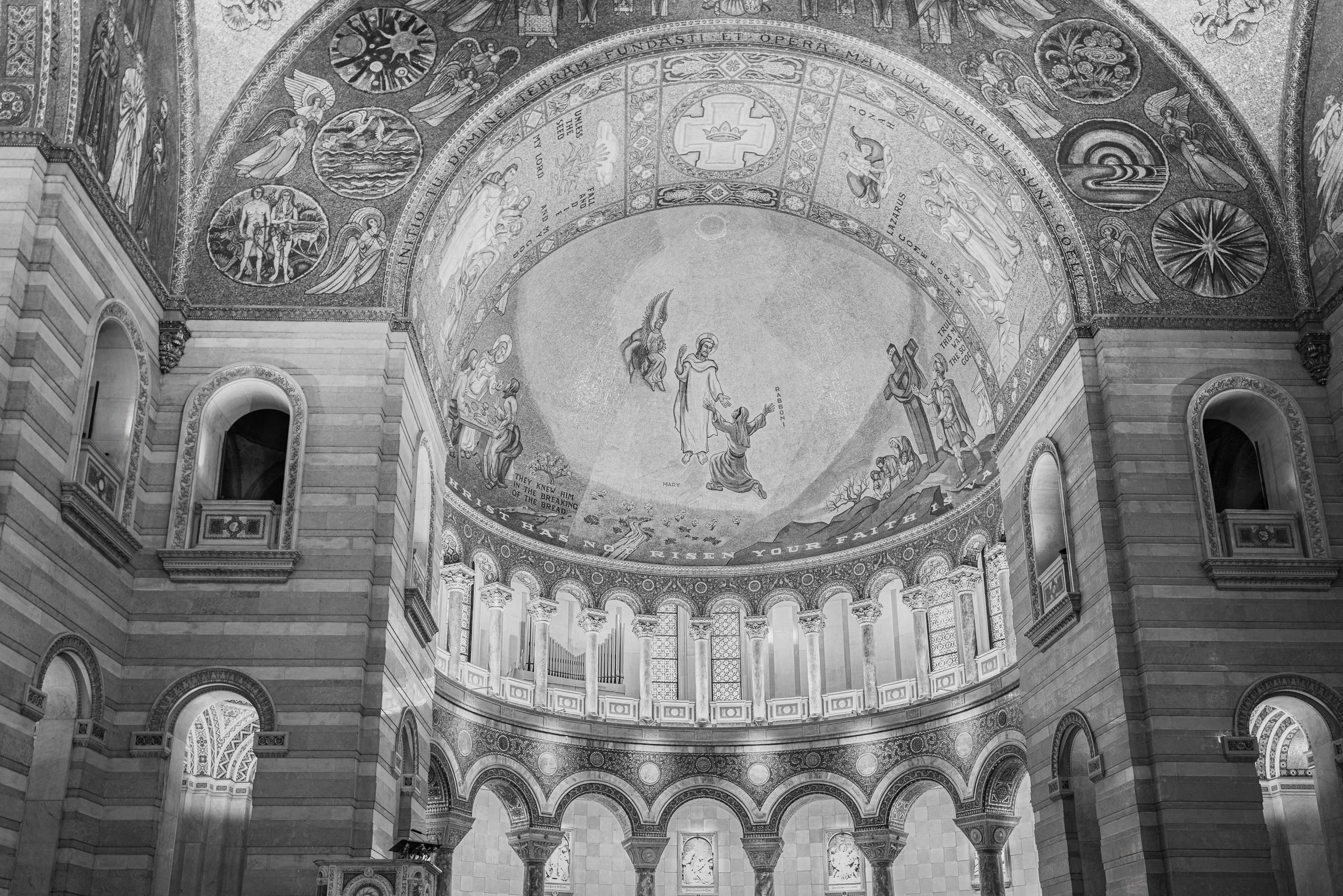
Beneath the great dome of the Cathedral Basilica of St. Louis, a mosaic depicts the Gospel's first resurrection scene — Mary Magdalene reaching toward the risen Christ at the empty tomb, an angel hovering above, the word "RABBONI" inscribed at the moment of recognition. Below, an inscription drawn from First Corinthians runs the curve of the dome: "...CHRIST HAS NOT...RISEN YOUR FAITH IS..." — the theological stakes of the scene, spelled out in tile.
Rendered in black and white, the mosaic's original color and gold leaf give way to a rich range of gray that emphasizes pattern, texture, and form — the countless individual tesserae, the carved stone archway framing the scene, the organ pipes and colonnade anchoring the space below. The composition looks up and slightly off-axis rather than straight on, giving the dome real depth and drawing the eye through a considered path: from the architecture at the frame's edges, up through the surrounding mosaic saints and symbols, to the central resurrection scene itself.
This is one of St. Louis's great interior spaces, photographed with the same patient attention given to any of the West's cathedral-scale landscapes — architecture as sacred space, and sacred space as architecture.
Design & Styling
The rich black-and-white tonal range and formal architectural composition suit spaces with a contemplative or classical sensibility — libraries, studies, entryways, and any interior where a piece with genuine gravity and craft is welcome. Its St. Louis subject matter also makes it a natural fit for collectors with a connection to the city or its architectural history.
Curated Pairings
For same-building continuity — "Sanctuary of Light", another interior study of the Cathedral Basilica of St. Louis.
For church interior continuity — "The Gothic Sentinel", a Prague church interior sharing this piece's reverence for sacred architectural space.
For religious architecture continuity — "Standing Grace - Southfork", a Colorado Catholic church treated with the same formal attention.
Fine Art Presentation
Given the fine mosaic detail and black-and-white tonal range, this piece is especially well suited to an archival paper print for a classic, painterly rendering, or ChromaLuxe® Metal (gloss, semi-gloss, or matte) print for added depth and a more contemporary presentation. Framed and unframed options available on request.
Note: Custom and oversized photographic prints are available. Please contact the studio directly to discuss custom framing, matting, or specialized museum glass options.

Counting the Violet Hour is a color study built on contrast — the Prague Metronome's warm, rust-orange needle rising in a sharp diagonal against a deep, saturated violet-blue sky over Letná Park. The 75-foot kinetic sculpture, installed in 1991 on the plinth where a monumental statue of Stalin once stood, becomes here less a landmark than a graphic color relationship: one warm line cutting through a cool, atmospheric dusk.
The low, wide-open sky carries most of the frame's emotional weight, its violet tone deepened well past a neutral overcast gray into something closer to true blue hour. Against that saturated backdrop, the needle's orange holds its own as a single, deliberate accent — a color pairing built on genuine complementary contrast rather than a documentary record of the scene's natural light.
This piece is a color companion to "A Measure of Change," the black-and-white treatment of the same sculpture, offering a very different mood from the same subject and vantage point — dramatic and graphic in monochrome, atmospheric and saturated in color.
Design & Styling
With its bold complementary color palette and strong graphic silhouette, Counting the Violet Hour works well in modern offices, design studios, and residential spaces built around a confident, saturated color story. Its dramatic diagonal composition also suits a tall or narrow wall where the eye can travel the length of the needle.
Curated Pairings
To create a cohesive gallery wall, consider these companion pieces:
For the monochrome companion: Pair with A Measure of Change, the black-and-white treatment of this same sculpture and site.
For color and atmosphere: Complement with Where the Evening Waited, extending the study of saturated dusk color in a European setting.
For graphic contrast: Pair with Blue Interval, extending the study of bold color and clean geometric form.
Fine Art Presentation
Available as a signed fine art print in ChromaLuxe® Metal (gloss, semi-gloss, or matte), framed paper, framed canvas, and acrylic presentation formats. The saturated violet sky and warm needle both benefit from ChromaLuxe® Metal or Acrylic, which hold rich, deep color well and give the complementary contrast real punch.
Note: Custom and oversized photographic prints are available. Please contact the studio directly to discuss custom framing, matting, or specialized museum glass options.
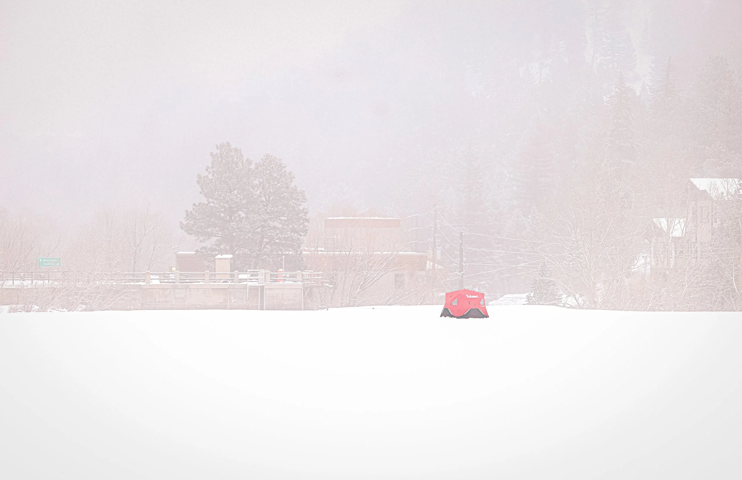
Where Winter Waited, I Fished is a contemplative winter landscape exploring isolation, endurance, and the quiet tension between visibility and obscurity. Captured during an active snowstorm on the frozen surface of Evergreen Lake, the photograph centers on a solitary red ice fisherman’s tent standing against a near-monochromatic field of snow, ice, and atmosphere. Beyond the dam, the faint silhouette of a distant building emerges softly through the storm, adding subtle depth and narrative presence while remaining partially concealed within the shifting winter haze. Drawing from the restrained pacing of minimalist landscape photography and the atmospheric quiet of cinematic winter imagery, the composition emphasizes negative space, softened contrast, and emotional stillness.
The image balances the vivid presence of the red shelter against the subdued tonal environment, allowing the composition to function simultaneously as landscape study and emotional narrative. Rather than relying on dramatic spectacle, the photograph explores the psychological calm and quiet endurance created through isolation, muted visibility, and the sparse geometry of winter space.
A red tent in a snowstorm is a lesson in figure and ground: one saturated color against a field that has almost none. The eye lands on it at once and stays there.
Design & Styling
A lone red tent in a near-monochrome snowstorm gives Where Winter Waited, I Fished a single, confident note of color for dens, lodges, offices, and Colorado homes. Against pale walls the red becomes the room's point.
Curated Pairings
To create a cohesive gallery presentation around winter isolation, consider these companion pieces:
For atmospheric tension: Pair with Waiting Out the Storm, extending the visual dialogue between isolation, weather, and contemplative stillness.
For softened restraint: Complement this piece with Quiet Crossing, sharing the same softened contrast, restrained geometry, and meditative pacing.
For the same lake: Pair with Where Winter Waited, Evergreen Lake in quiet snow, before or after the storm.
Fine Art Presentation
Available as a signed fine art print on ChromaLuxe® Metal (gloss, semi-gloss, or matte), Glossy Anti-Glare Acrylic (TruLife), canvas, wood, and archival paper (framed or unframed). ChromaLuxe® Metal is the recommended presentation: it keeps the red of the tent pure against the near-monochromatic snow and holds the soft tonal gradients. Framed archival paper is the alternative for a quieter read of the snowfall.
Note: Custom and oversized photographic prints are available. Please contact the studio directly to discuss custom framing, matting, or specialized museum glass options.
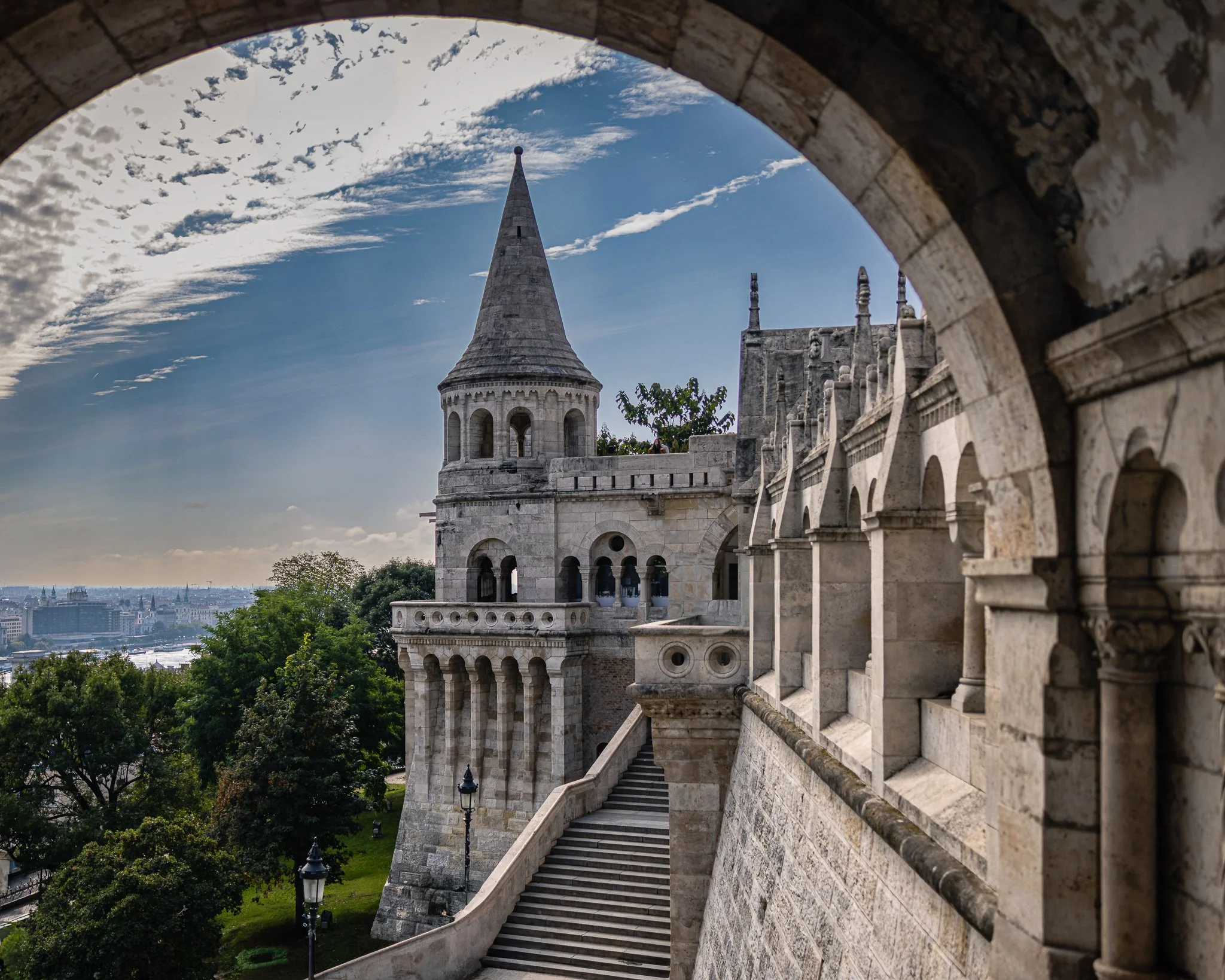
Through the Arch explores the relationship between architecture, perspective, and discovery within one of Budapest's most iconic historic spaces. Photographed at Fisherman's Bastion in Buda, the image uses a weathered stone archway as a natural frame, guiding the viewer toward a soaring tower, ascending stairway, and layered architectural forms beyond. The composition transforms a familiar landmark into a study of passage, inviting viewers to experience the space as a journey rather than a destination.
The photograph is built upon a series of visual transitions. The dark stone arch creates a sense of enclosure and anticipation, while the illuminated architecture beyond gradually reveals itself through layers of arches, stairways, and towers. The eye moves naturally through the scene, following the ascending staircase toward the central tower before drifting outward into the cityscape beyond. This progression creates a sense of movement and discovery that echoes the experience of walking through historic European cities.
Drawing inspiration from the atmospheric architectural studies of Wim Wenders and the color sensitivity of Ernst Haas, the image emphasizes mood, structure, and the passage of light across stone. The interplay between shadow and illumination allows the architecture to feel both monumental and inviting. Rather than functioning solely as a documentary record of place, the photograph explores how architecture shapes emotional experience through scale, rhythm, and perspective.
The result is a contemplative image that balances grandeur with intimacy. Through the Arch reflects the enduring appeal of historic architecture and the quiet moments of wonder that emerge when light, form, and viewpoint align.
Design & Styling
With its layered architectural forms, neutral stone palette, and strong sense of depth, Through the Arch works particularly well in executive offices, hospitality environments, libraries, healthcare spaces, studies, and contemporary residential interiors. The image introduces sophistication, history, and visual structure while maintaining a calm and contemplative atmosphere.
Curated Pairings
To create a cohesive gallery wall, consider these companion pieces from the European Texture & Light collection:
For architectural dialogue: Pair with Gateway of Time to continue the exploration of historic European architecture, passageways, and layered spatial experience.
For visual rhythm: Pair with Study in Yellow and Blue #4 to contrast monumental architecture with geometric simplicity, color relationships, and formal design.
For a travel-inspired collection: Pair with Inside the Hour to connect iconic European landmarks through themes of history, craftsmanship, and enduring place.
Fine Art Presentation
Available as a signed fine art print in ChromaLuxe® Metal (gloss, semi-gloss, or matte), framed paper, framed canvas, and acrylic presentation formats. ChromaLuxe® Metal and Low-Glare Acrylic are particularly well suited to preserving the image's stone textures, architectural depth, and luminous sky detail.
Note: Custom and oversized photographic prints are available. Please contact the studio directly to discuss custom framing, matting, or specialized museum glass options.

Transfiguration captures the Episcopal Chapel of the Transfiguration exactly as it was designed to be experienced — its rustic log gate framing the jagged, snow-capped Cathedral Group of the Grand Tetons like a window built by nature and carpentry working together. A mother and her two daughters walk the path toward the chapel door, small against the scale of the peaks beyond, giving the frame both narrative and a true sense of size.
Built in 1925, the chapel's altar window has always looked out on the Tetons rather than away from them — a deliberate choice by its builders to let the mountains themselves become part of the sanctuary. This image stands at the entrance gate, looking through toward that same idea from the outside: architecture in quiet conversation with the landscape it was built to honor.
Design & Styling
With its warm log tones, dramatic peaks, and genuine human presence, Transfiguration works well in mountain residences, lodges, offices, and spaces celebrating the American West's blend of faith, architecture, and landscape. Its narrative quality also makes it a strong fit for family-oriented spaces and hospitality settings.
Curated Pairings
To build a wall exploring the American West's chapels and quiet architecture, consider these companion pieces:
For a shared regional register: Pair with Enduring Forms, another Southwest church study built around quiet architectural presence.
For a shared theme: Complement with Standing Grace - Southfork, sharing this piece's focus on small chapels set against big Western landscapes.
For a shared location: Round out the wall with The Ferry at Menor's Landing, another Grand Teton piece from the same trip.
Fine Art Presentation
Available as a signed fine art print in ChromaLuxe® Metal (gloss, semi-gloss, or matte), framed paper, framed canvas, and acrylic presentation formats. To preserve the fine detail in the log structure and the texture of the distant peaks, ChromaLuxe® Metal or Acrylic presentation is recommended.
Note: Custom and oversized photographic prints are available. Please contact the studio directly to discuss custom framing, matting, or specialized museum glass options.
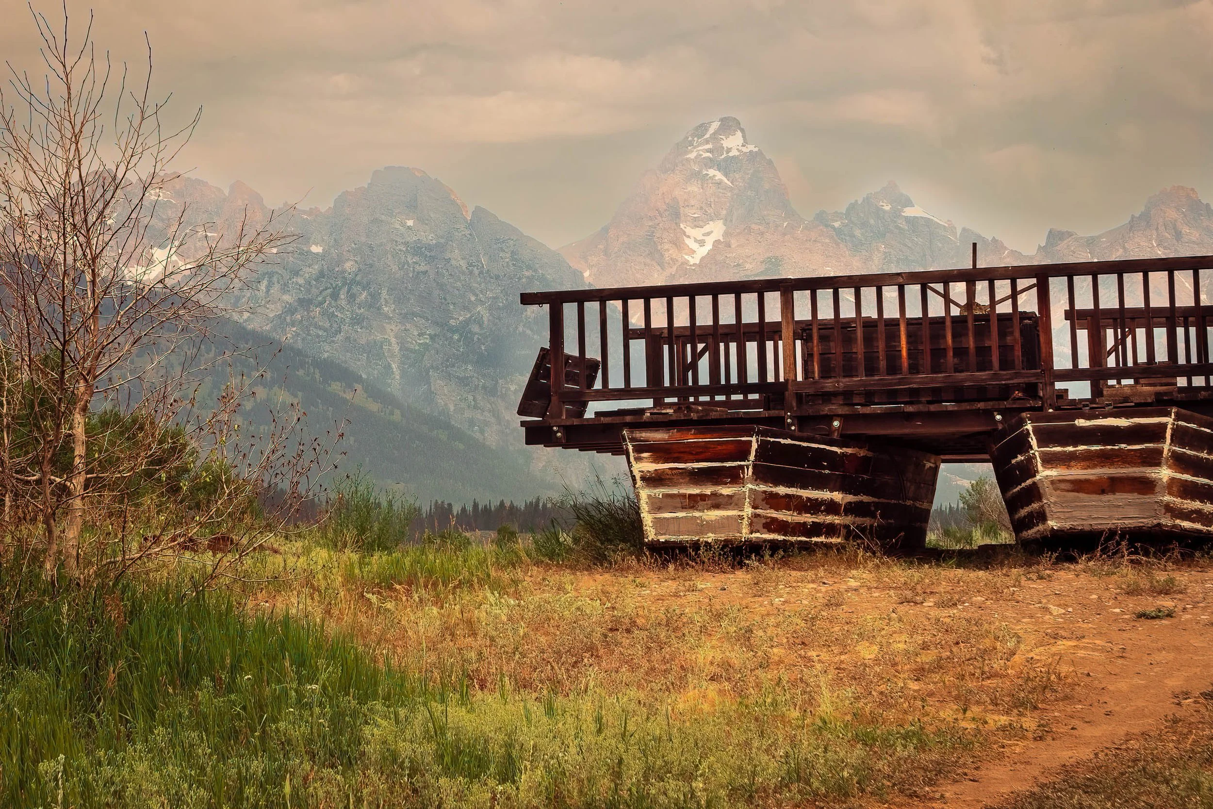
The Ferry at Menor's Landing frames a piece of quiet ingenuity against one of America's most photographed skylines. This is a replica of Bill Menor's 1894 "reaction ferry" — a wagon platform mounted on two pontoon hulls, angled against the current of the Snake River to carry travelers across without any motor at all, using nothing but physics and a cable system. Today it rests near the original homestead site, weathered and still, while the Cathedral Group of the Grand Tetons rises through hazy afternoon light behind it.
A bare, wind-worn tree stands in the foreground, framing the composition against golden late-summer grasses. It's a scene built on contrast — the small, human-scale ingenuity of the ferry against the immense, ancient geology of the peaks beyond, both part of the same quietly remarkable place.
Menor's original ferry was the only crossing point on the Snake River in this part of Jackson Hole for nearly a decade, vital to the area's earliest settlers. The site later played an unlikely role in history: a 1923 meeting held at the adjacent cabin set in motion the effort that would eventually create Grand Teton National Park itself.
Design & Styling
With its warm, weathered tones and rich sense of place, The Ferry at Menor's Landing works well in offices, lodges, mountain residences, and spaces celebrating the American West's history of ingenuity and homesteading. Its Built Environment subject matter pairs naturally with architectural and industrial pieces from the same collection.
Curated Pairings
To build a wall exploring weathered structures and the American West, consider these companion pieces:
For weathered form: Pair with Teeth of Time, another study of rustic, time-worn mechanical and structural detail.
For Western homestead history: Complement with Shelter Beneath a Restless Sky (Monotone), sharing this piece's Americana sensibility and dramatic sky.
For built form against landscape: Round out the wall with Held Against the Sky, another panoramic study of structure set against an expansive natural backdrop.
Fine Art Presentation
Available as a signed fine art print in ChromaLuxe® Metal (gloss, semi-gloss, or matte), framed paper, framed canvas, and acrylic presentation formats. To preserve the warm tonal range of the weathered wood against the hazy mountain light, ChromaLuxe® Metal or Acrylic presentation is recommended.
Note: Custom and oversized photographic prints are available. Please contact the studio directly to discuss custom framing, matting, or specialized museum glass options.
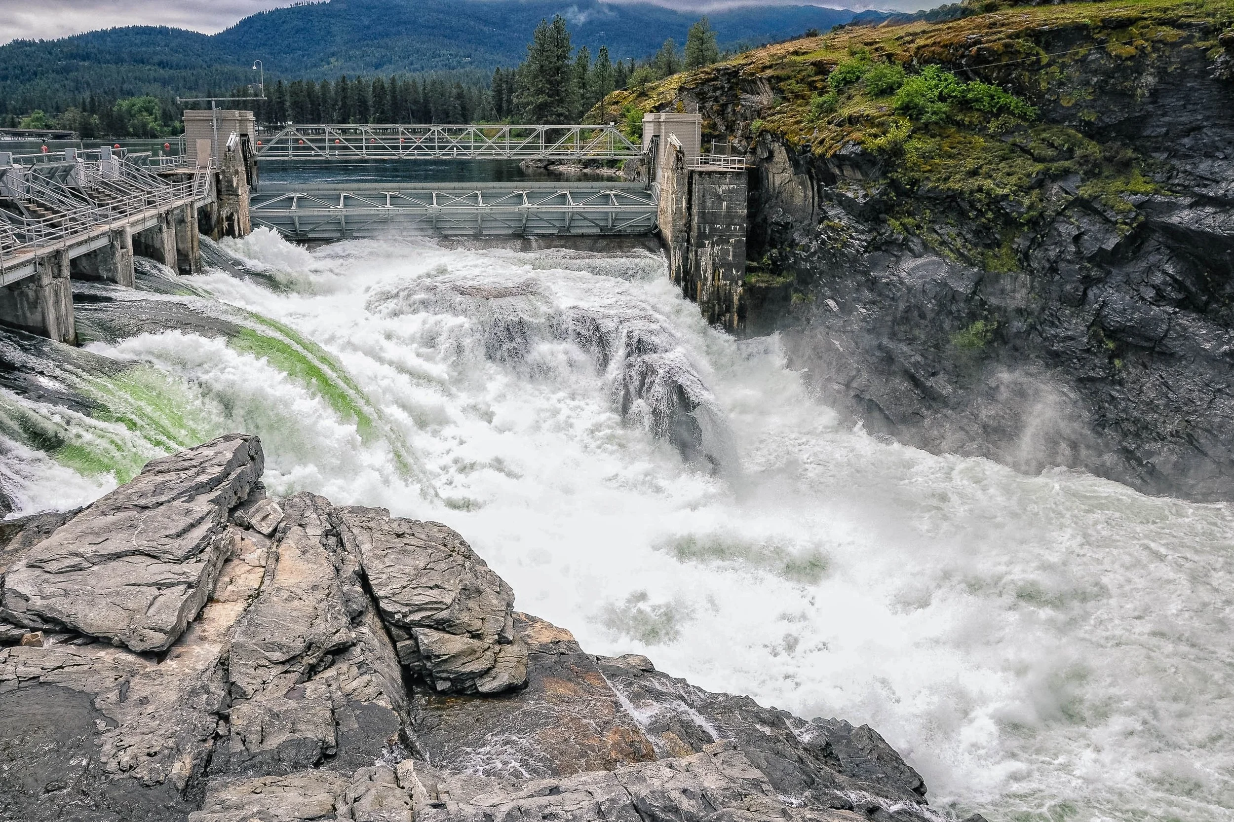
Controlled Release captures the moment engineered restraint gives way to raw force. A hydroelectric dam's spillway gate opens above a rocky gorge, sending a massive torrent of white water crashing through the channel below — mist rising, foam churning, the structure itself dwarfed by the volume it's built to control. A striking streak of green cuts through the whitewater on the left, an unexplained, unrepeatable detail that grounds the image in a specific, real moment rather than a generic scene of falling water.
The composition layers a jagged foreground rock, the explosive churn of the release itself, the steel-and-concrete structure spanning the gorge, and a forested mountain backdrop rising into low cloud. It's a study in contrast — the deliberate geometry of human engineering set against the chaotic, overwhelming power of the water it was built to manage.
Design & Styling
With its dramatic scale and industrial subject, Controlled Release makes a strong statement piece for corporate offices, engineering firms, industrial or energy-sector spaces, and modern residential settings looking for bold, high-impact art with genuine narrative weight.
Curated Pairings
To build a wall exploring human structures and their relationship to scale and force, consider these companion pieces:
For structural echo: Pair with Held Against the Sky, another panoramic study of built form set against an expansive natural backdrop.
For industrial resonance: Complement with Iron Cathedral, which finds a similar monumental quality in industrial materials and structure.
For a shared theme of time and engineering: Round out the wall with Teeth of Time, exploring weathered mechanical and structural forms.
Fine Art Presentation
Available as a signed fine art print in ChromaLuxe® Metal (gloss, semi-gloss, or matte), framed paper, framed canvas, and acrylic presentation formats. To capture the full tonal range of the whitewater and the fine texture of the surrounding rock, ChromaLuxe® Metal or Acrylic presentation is recommended.
Note: Custom and oversized photographic prints are available. Please contact the studio directly to discuss custom framing, matting, or specialized museum glass options.

Held Against the Sky is a study in scale, stillness, and the quiet authority of open sky. Photographed on a high mountain hillside in Colorado, the image centers on a solitary cabin set low against a vast blue expanse, its dark form dwarfed by a single towering cumulus cloud drifting overhead. Drawing inspiration from Ansel Adams' disciplined command of scale and Josef Sudek's patient, restrained approach to light, the photograph explores the tension between human presence and the immensity of the landscape that surrounds it.
The composition balances the small, grounded geometry of the cabin against the soft architecture of the cloud and the deepening gradient of sky above it. A faint line of fence posts traces up the hillside, the only other trace of human hand in an otherwise wild meadow. Rather than emphasizing the drama of mountain weather, the image favors restraint — a sky that deepens toward indigo at its zenith, grass rendered in quiet textural detail, and a dwelling that holds its ground without asserting itself. The result is a photograph less about the cabin than about the vast, patient quiet that surrounds it.
The image reflects the qualities that draw people to the Colorado high country — a place where elevation, weather, and solitude combine to produce moments of genuine visual and emotional quiet.
Design & Styling
A single cabin under a towering cloud gives Held Against the Sky a wide-open calm for mountain homes, lodges, offices, and waiting rooms. Against pale or warm walls, the blue reads as a field of air around a small, dark form.
Curated Pairings
To create a cohesive gallery wall around Colorado and open sky, consider these companion pieces:
For solitary structure and weather: Pair with Where the Homestead Waits, extending themes of solitary structure, weather, and quiet Colorado landscape.
For restrained palette: Complement this piece with Enduring Shelter, sharing the same restrained palette, structural stillness, and visual patience.
For Colorado weather: Pair with A Place Where Weather Waits, another Colorado structure standing patiently beneath changing weather.
Fine Art Presentation
Available as a signed fine art print on ChromaLuxe® Metal (gloss, semi-gloss, or matte), Glossy Anti-Glare Acrylic (TruLife), canvas, wood, and archival paper (framed or unframed). ChromaLuxe® Metal is the recommended presentation: it holds the smooth blue gradient of the sky and the fine detail in the grass and cloud. Canvas is the alternative for a softer, more painterly mountain light.
Note: Custom and oversized photographic prints are available. Please contact the studio directly to discuss custom framing, matting, or specialized museum glass options.
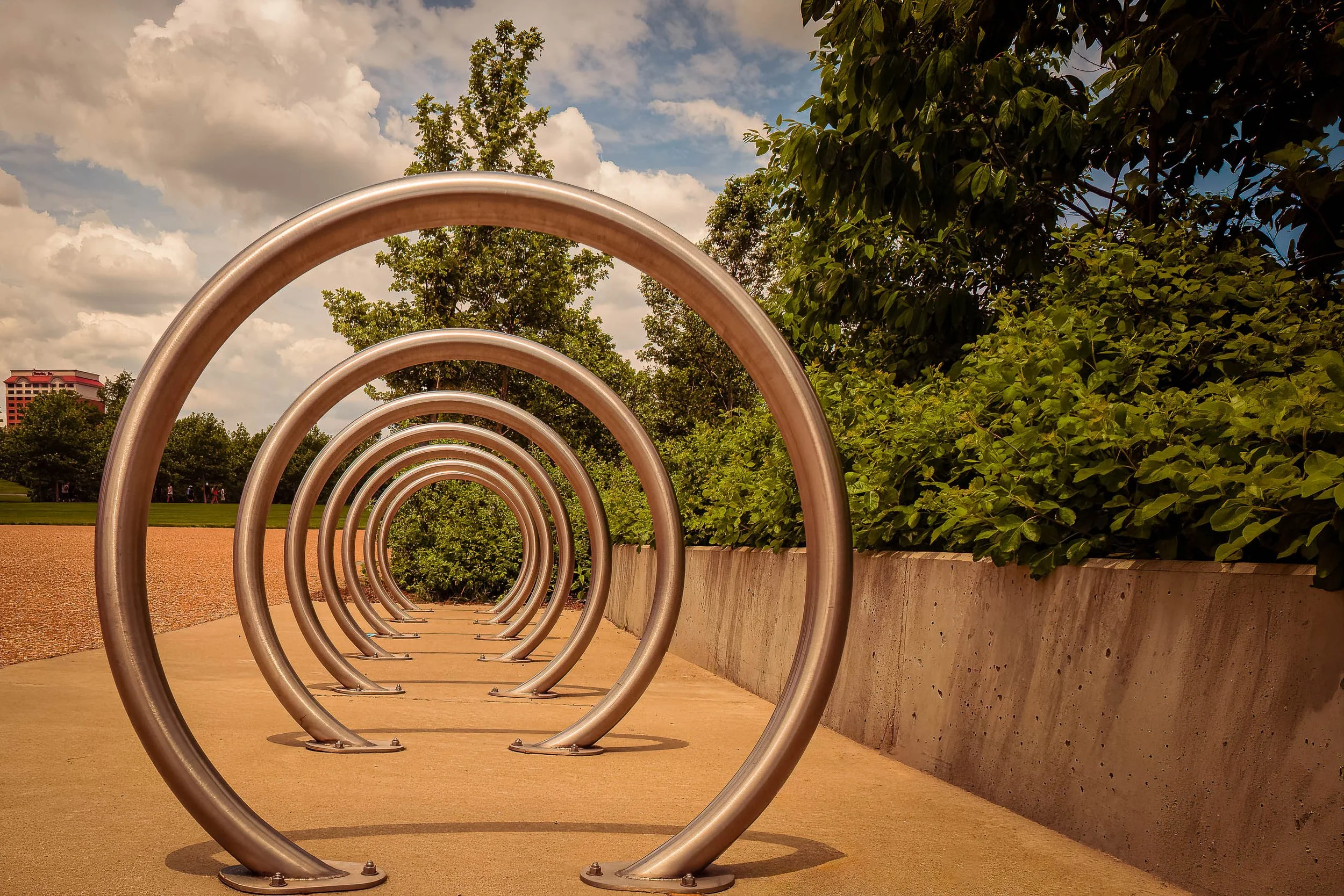
Steel Echoes finds a quiet piece of public infrastructure — a run of stainless steel bike-rack rings — and turns it into a study of repetition and depth. Photographed low and close to the first ring, the composition uses the receding circles like a series of apertures, each one framing a smaller, softer version of the same green park beyond. The effect reads almost architectural: a tunnel built not of stone but of brushed steel and daylight.
The late-day light does real work here, warming the concrete path to a rich ochre while keeping the sky a cool, cloud-stacked blue — two temperatures meeting at the horizon just past the final ring. Each loop catches the light a little differently depending on its angle to the sun, so the sequence reads less like flat repetition and more like a series of related, individually lit gestures.
In the same spirit as Steel Wave's industrial minimalism, and drawing on Aaron Siskind's eye for abstraction hidden in plain civic objects, Steel Echoes treats an ordinary piece of municipal design as worthy of the same attention as any landscape — proof that geometry and light don't need a dramatic subject, just the right angle on an ordinary one.
DESIGN & STYLING
Steel Echoes suits contemporary and minimalist interiors built around geometry and repetition rather than literal subject matter — offices, tech company lobbies, design studios, modern residences, and any space where clean lines and quiet rhythm do more work than color or drama. The warm-cool palette (ochre path, blue sky, brushed steel) gives it real flexibility as a neutral-leaning accent piece.
The strong linear perspective also suits long hallways or narrow walls particularly well, where the receding rings create a sense of depth even in a tight space.
CURATED PAIRINGS
For material and mood: Pair with Steel Wave — both find abstraction in industrial steel, one through rust and reflection, one through repetition and light.
For repetition and pattern: Complement with A Break in the Pattern — a very different setting, same interest in rhythm and geometric repetition.
For public art in a garden setting: Add Glass and Gesture, another St. Louis-area piece finding art in public architecture.
FINE ART PRESENTATION
Steel Echoes is available as a signed fine art photographic print in multiple presentation styles. ChromaLuxe® Metal (gloss, semi-gloss, or matte) is the natural match — printing a photograph of polished steel onto a metal substrate doubles down on the subject's own material, and the format's brightness and sharpness suit the clean geometric lines especially well. Acrylic offers a similar high-contrast pop with added depth. Framed archival paper and Canvas Framed are both available for a softer, more traditional presentation if the space calls for it.
Note: Custom and oversized photographic prints are available. Please contact the studio directly to discuss custom framing, matting, or specialized museum glass options.
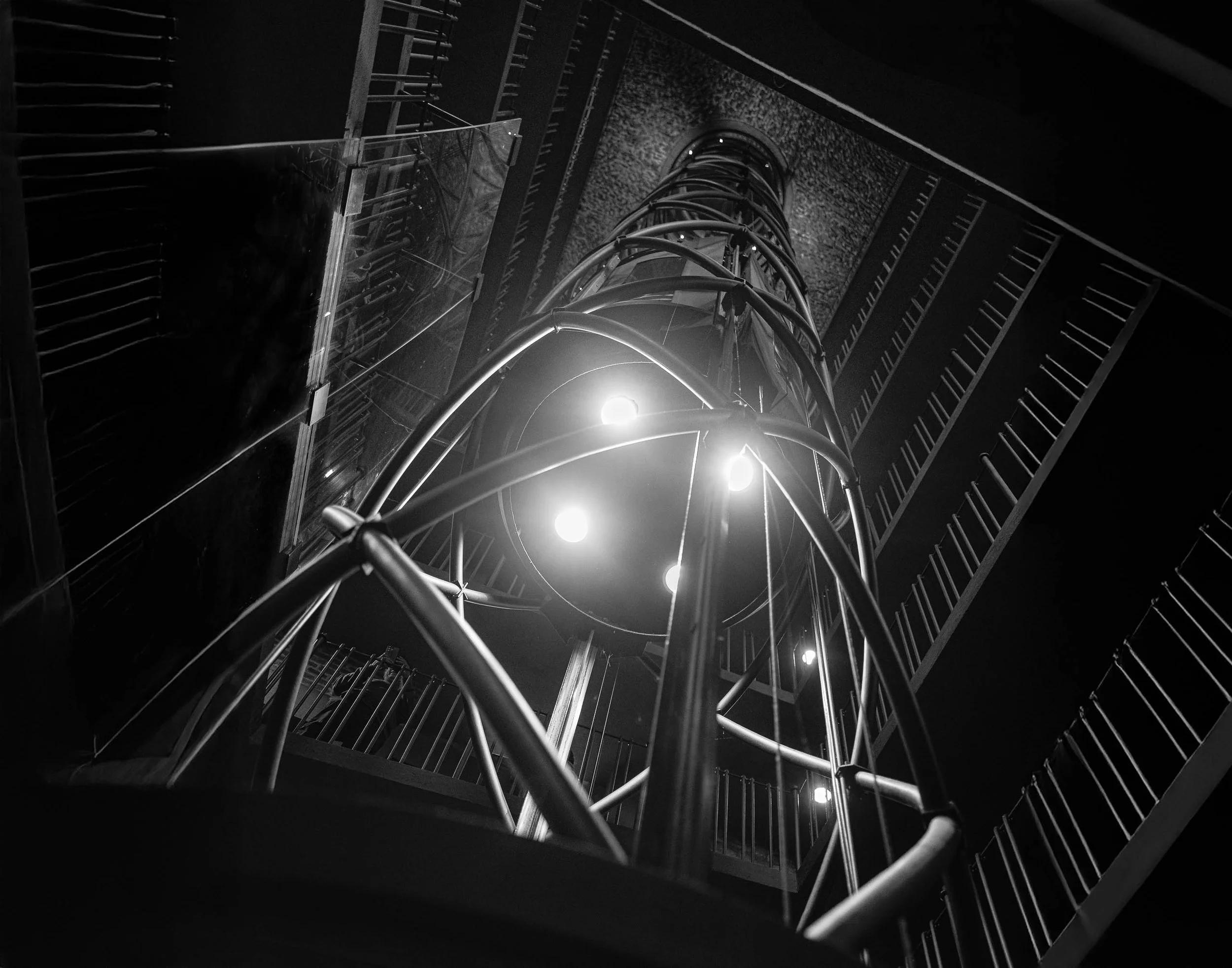
Vertical Interval explores the relationship between movement, structure, and light within one of Prague's most unexpected architectural spaces. Photographed inside the elevator shaft of the Old Town Hall Clock Tower, the image transforms a functional interior into an abstract study of geometry and ascent. Curving steel rails, layered staircases, and the illuminated elevator cab converge toward a distant opening overhead, creating a visual journey from darkness into light.
The composition is built around repetition and rhythm. Circular forms echo throughout the frame while the surrounding stairways create a series of angular counterpoints. The upward perspective removes the viewer from ordinary scale and orientation, encouraging a more contemplative reading of the scene. What begins as a document of architecture gradually becomes an exploration of space itself.
The photograph reflects an ongoing interest in the ways built environments shape perception and experience. The elevator, suspended between floors, becomes a metaphor for transition and possibility. Light emerges from the center of the frame while shadows define the boundaries, creating a tension between certainty and mystery.
Influenced by the modernist sensibilities of photographers such as Berenice Abbott and the observational approach of Wim Wenders, Vertical Interval invites viewers to consider architecture not merely as structure, but as a framework through which movement, memory, and imagination unfold.
Design & Styling
With its strong geometric forms, monochromatic palette, and contemporary architectural character, Vertical Interval works particularly well in modern residential interiors, executive offices, healthcare environments, hospitality spaces, technology firms, and contemporary corporate collections.
The image introduces sophistication and visual energy without overwhelming a space. Its abstract quality allows it to function both as a conversation piece and as a contemplative architectural study.
Curated Pairings
To create a cohesive gallery wall, consider pairing Vertical Interval with:
Reflections of Glass and Stone — continues the exploration of modern architecture and layered visual space.
The Weight of Names — balances architectural structure with human narrative and memory.
White Curved Structure — complements the image through its emphasis on geometry, form, and modernist design.
Fine Art Presentation
Available as a signed fine art print in framed paper, ChromaLuxe® Metal (gloss, semi-gloss, or matte), framed canvas, and acrylic presentation formats.
Recommended Presentation: Framed Fine Art Paper. Archival paper preserves the deep blacks, luminous highlights, and subtle tonal transitions that define the image. A black frame paired with a Crescent Soft Cream mat creates a museum-quality presentation.
ChromaLuxe® Metal is also highly effective for contemporary interiors, emphasizing the image's modern architectural character while maintaining excellent tonal separation.
Larger presentation sizes are particularly impactful, allowing viewers to experience the intricate network of lines, curves, and light throughout the composition.
Note: Custom and oversized photographic prints are available. Please contact the studio directly to discuss custom framing, matting, or specialized museum glass options.
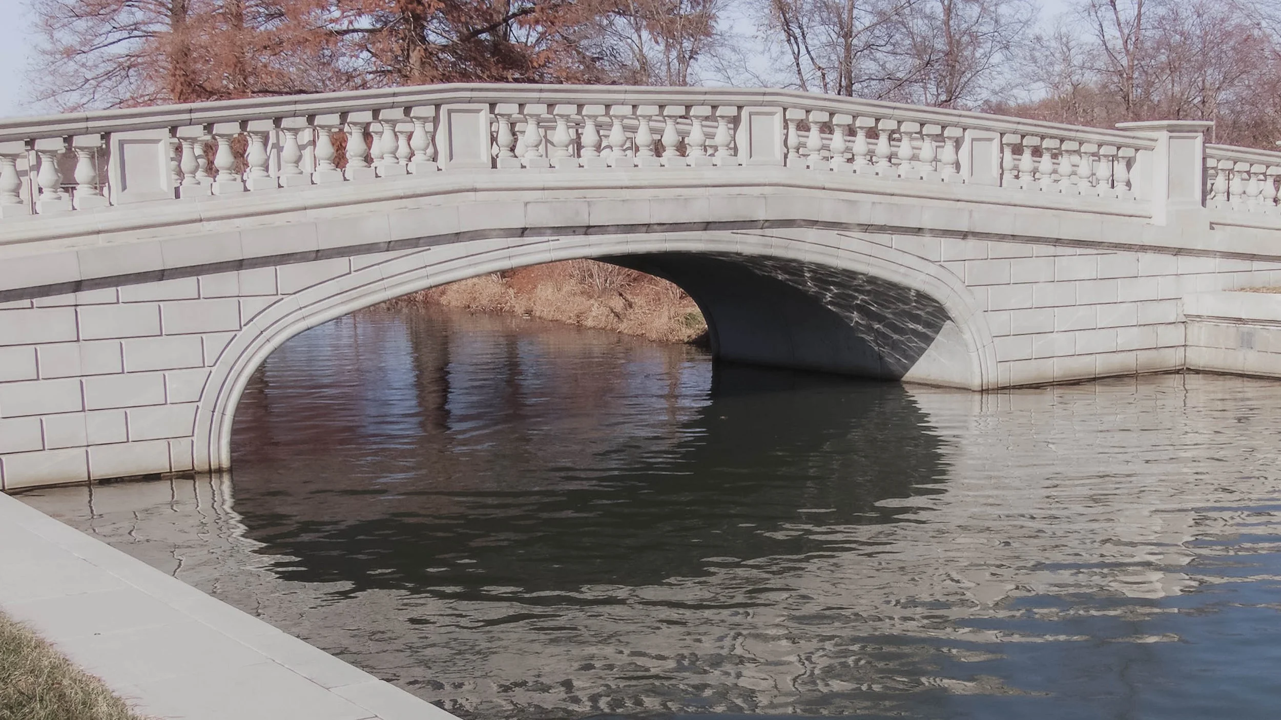
Quiet Crossing is a contemplative architectural landscape exploring symmetry, reflection, and the calming geometry of classical design. Captured beneath soft winter light, the photograph features a pale stone bridge arching quietly across still water, where muted reflections and restrained tonal transitions transform the scene into a study of balance, structure, and visual stillness. Drawing from the quiet formalism of modern architectural photography and the restrained pacing of minimalist landscape imagery, the composition emphasizes calm repetition, softened contrast, and restorative atmosphere.
The image balances the graceful curvature of the bridge against the subtle movement of reflected water, allowing the composition to function as both architectural study and meditative landscape. Rather than focusing on dramatic light or spectacle, the photograph explores the quiet emotional rhythm created through symmetry, reflection, and negative space.
A stone bridge over still water doubles itself: the arch and its reflection form a near-complete circle, which is the geometry that gives classical bridges their calm. Low, even winter light keeps the surface quiet and lets the symmetry do the work.
Design & Styling
A pale stone bridge over still water in soft winter light gives Quiet Crossing a calm, symmetrical presence for spas, waiting rooms, bedrooms, offices, and any space that benefits from stillness. Its restrained palette sits well with white, gray, and natural materials.
Curated Pairings
To create a cohesive gallery presentation around reflection and quiet geometry, consider these companion pieces:
For architectural rhythm: Pair with Reflections of Glass and Stone, extending the visual dialogue between structure, reflection, and quiet abstraction.
For atmospheric harmony: Complement this piece with Waiting Out the Storm, sharing the same restrained pacing and contemplative tonal atmosphere.
For winter and water: Pair with Where Winter Waited, a bridge into a snow-softened winter scene at Evergreen Lake.
Fine Art Presentation
Available as a signed fine art print on ChromaLuxe® Metal (gloss, semi-gloss, or matte), Glossy Anti-Glare Acrylic (TruLife), canvas, wood, and archival paper (framed or unframed). Framed archival paper is the recommended presentation: its matte surface suits the subtle tonal transitions, soft architectural detail, and muted reflections. Acrylic is the alternative for a deeper, more luminous water surface.
Note: Custom and oversized photographic prints are available. Please contact the studio directly to discuss custom framing, matting, or specialized museum glass options.
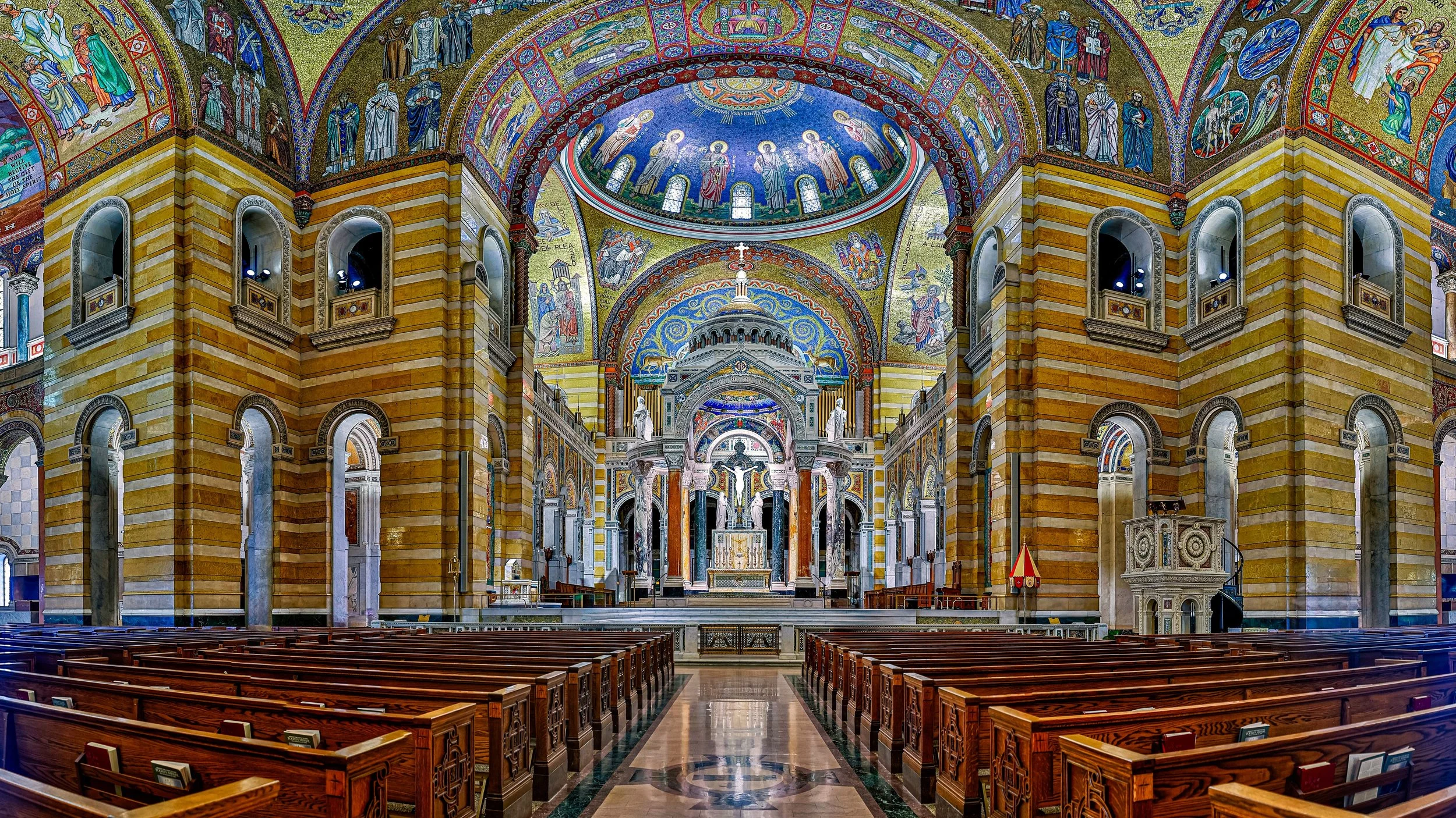
Sanctuary of Light is a study of illumination, craftsmanship, and the enduring power of sacred space. Photographed within the Cathedral Basilica of St. Louis, the image captures the remarkable interplay of light across one of the world's most celebrated mosaic interiors. Rich color, intricate detail, and luminous architectural forms transform the space into an experience of contemplation and wonder. Drawing inspiration from the architectural photography of Frederick H. Evans and the reverence for light found throughout sacred art traditions, the photograph explores how architecture can elevate ordinary experience into something transcendent.
The composition balances the grandeur of the basilica's soaring architecture with the intimate details of its mosaic surfaces, allowing light itself to become the central subject. Layers of color and ornamentation guide the viewer through the image, revealing the extraordinary craftsmanship embedded within the structure while maintaining a sense of stillness and visual harmony. Rather than focusing solely on architecture, the photograph seeks to capture the emotional atmosphere created when light, space, and devotion converge.
The mosaics of the Cathedral Basilica are one of the largest collections of mosaic art in the world, and standing inside them the light seems to come from the walls themselves. The photograph gives that surface the time it needs.
Design & Styling
The color and mosaic detail of the Cathedral Basilica of St. Louis make Sanctuary of Light a rich piece for hospitality lobbies, libraries, professional offices, sacred and cultural spaces, and St. Louis homes. It can carry a large wall and reward a long look.
Curated Pairings
To create a cohesive gallery wall around light and sacred architecture, consider these companion pieces:
For sacred architecture in the landscape: Pair with Standing Grace - Southfork, extending themes of faith, community, and the role of sacred architecture within the landscape.
For historic craftsmanship: Complement this piece with Old Friends, Windows and Glass, sharing an appreciation for historic craftsmanship, luminous light, and the passage of time.
For Gothic interiors: Pair with The Gothic Sentinel, another richly decorated sacred interior, in Prague.
Fine Art Presentation
Available as a signed fine art print on ChromaLuxe® Metal (gloss, semi-gloss, or matte), Glossy Anti-Glare Acrylic (TruLife), canvas, wood, and archival paper (framed or unframed). Acrylic is the recommended presentation: its depth and luminosity carry the mosaic's color and the interplay of light across gold and glass. ChromaLuxe® Metal is the alternative for crisper detail.
Note: Custom and oversized photographic prints are available. Please contact the studio directly to discuss custom framing, matting, or specialized museum glass options.
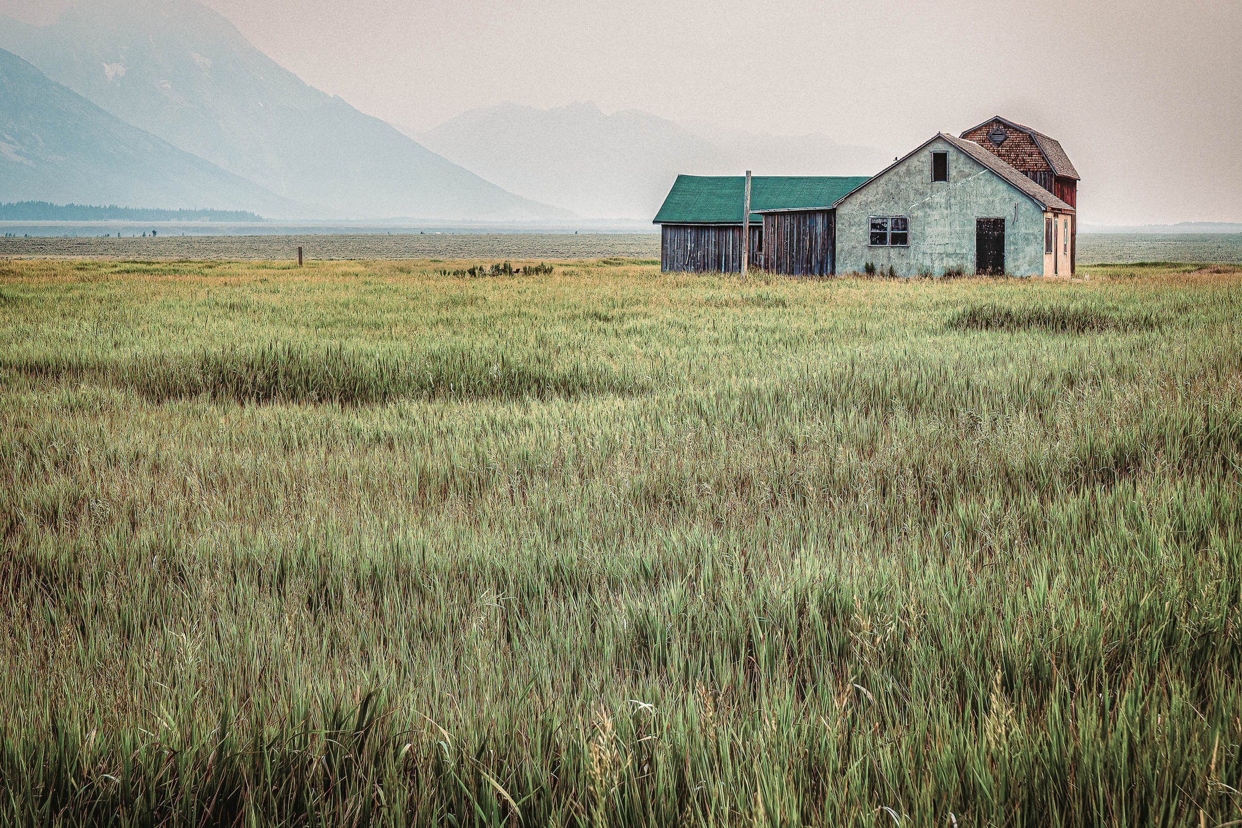
Between Us, the Field is a study of distance, memory, and the quiet relationship between landscape and home. Photographed at dawn at Mormon Row beneath the Grand Tetons, the image centers on the historic Pink House standing beyond an open field while mist and smoke veil the mountains beyond. The obscured peaks shift attention away from grandeur and toward the subtle emotional weight of the scene itself. Drawing inspiration from the restrained atmosphere and rural sensibility of Andrew Wyeth, the photograph explores the beauty found in solitude, simplicity, and the spaces that separate us from the places we long to reach.
The composition balances the modest architecture of the house against the expansive foreground field, allowing absence to become as important as presence. The veiled mountains linger as a suggestion rather than a destination, creating an atmosphere of quiet uncertainty and reflection. Rather than celebrating the iconic drama often associated with the Tetons, the image embraces stillness, muted color, and the emotional resonance of an ordinary structure standing patiently within an extraordinary landscape.
The result is a photograph rooted in the language of rural America—one that invites viewers to slow down and consider themes of belonging, memory, and the passage of time.
Design & Styling
With its subdued palette, atmospheric layering, and contemplative character, Between Us, the Field suits residences, hospitality spaces, executive offices, and quiet rooms that want calm, reflection, and emotional depth. The muted tones sit well with natural linen, weathered wood, and warm neutral walls, and the veiled mountains give a large room depth without drama.
Curated Pairings
To create a cohesive gallery wall around rural memory and atmosphere, consider these companion pieces:
For complementary rural atmosphere: Pair with Where the Plains Remember, to extend themes of homestead architecture, memory, and the enduring relationship between people and landscape.
For tonal harmony: Complement this piece with A Place Where Weather Waits, which shares the same subdued palette, contemplative pacing, and emotional sense of place.
For the same range in smoke: Pair with Where the Smoke Settles, photographed from the Snake River Overlook in Grand Teton National Park, where smoke veils the same mountains.
Fine Art Presentation
Available as a signed fine art print on ChromaLuxe® Metal (gloss, semi-gloss, or matte), Glossy Anti-Glare Acrylic (TruLife), canvas, wood, and archival paper (framed or unframed). Framed archival paper is the recommended presentation: its softly textured surface suits the muted, painterly, Wyeth-like character and the atmospheric haze. ChromaLuxe® Metal is the alternative for greater depth and clarity in the house and the veiled peaks, and canvas adds a warm, tactile read for a ranch or lodge setting.
Note: Custom and oversized photographic prints are available. Please contact the studio directly to discuss custom framing, matting, or specialized museum glass options.
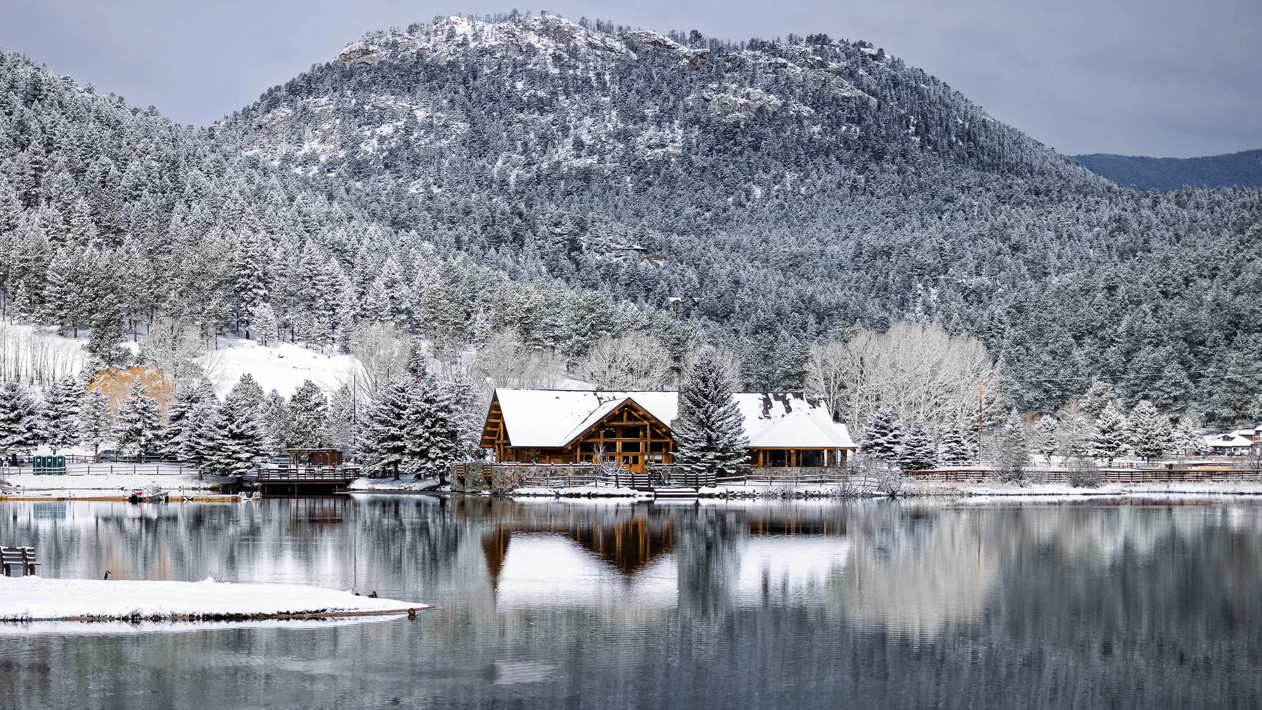
Where Winter Waited is a study of stillness, atmosphere, and the quiet beauty of a landscape transformed by snow. Photographed at Evergreen Lake in Evergreen, Colorado, the image centers on a bridge extending into a winter scene softened by fresh snowfall and muted light. Snow-covered trees, reflective water, and the gentle geometry of the bridge create a composition that feels suspended in time. Drawing inspiration from the contemplative landscapes of Hiroshi Sugimoto and the disciplined simplicity of Andrew Wyeth, the photograph explores the restorative power of silence and the subtle beauty found within winter's restraint.
The composition balances the strong linear form of the bridge against the soft textures of snow, water, and forest. The bridge serves as both visual pathway and symbolic invitation, drawing viewers into a landscape where sound seems muted and movement has slowed. Rather than emphasizing the drama often associated with winter storms, the image focuses on calm, reflection, and the quiet interval that follows. The result is a photograph that celebrates winter not as a season of hardship, but as a season of stillness and renewal.
The image reflects the qualities that have long drawn people to Evergreen Lake—a place where landscape, weather, and time come together to create moments of remarkable visual and emotional quiet.
Design & Styling
A bridge into a snow-softened scene gives Where Winter Waited a quiet, restful presence for bedrooms, spas, waiting rooms, offices, and Colorado homes. Its muted light suits white, gray, and natural wood.
Curated Pairings
To create a cohesive gallery wall around winter stillness, consider these companion pieces:
For Colorado atmosphere: Pair with Before the Road Disappears, extending themes of weather, landscape, and contemplative travel through the Rocky Mountain West.
For quiet restraint: Complement this piece with Enduring Silence, sharing the same atmospheric restraint, visual quiet, and emotional stillness.
For the same lake, another winter: Pair with Where Winter Waited, I Fished, the same Evergreen Lake in a snowstorm, with a lone red tent.
Fine Art Presentation
Available as a signed fine art print on ChromaLuxe® Metal (gloss, semi-gloss, or matte), Glossy Anti-Glare Acrylic (TruLife), canvas, wood, and archival paper (framed or unframed). Framed archival paper is the recommended presentation: its matte surface suits the delicate tonal transitions and soft snow textures. Acrylic is the alternative for a deeper, more luminous water.
Note: Custom and oversized photographic prints are available. Please contact the studio directly to discuss custom framing, matting, or specialized museum glass options.
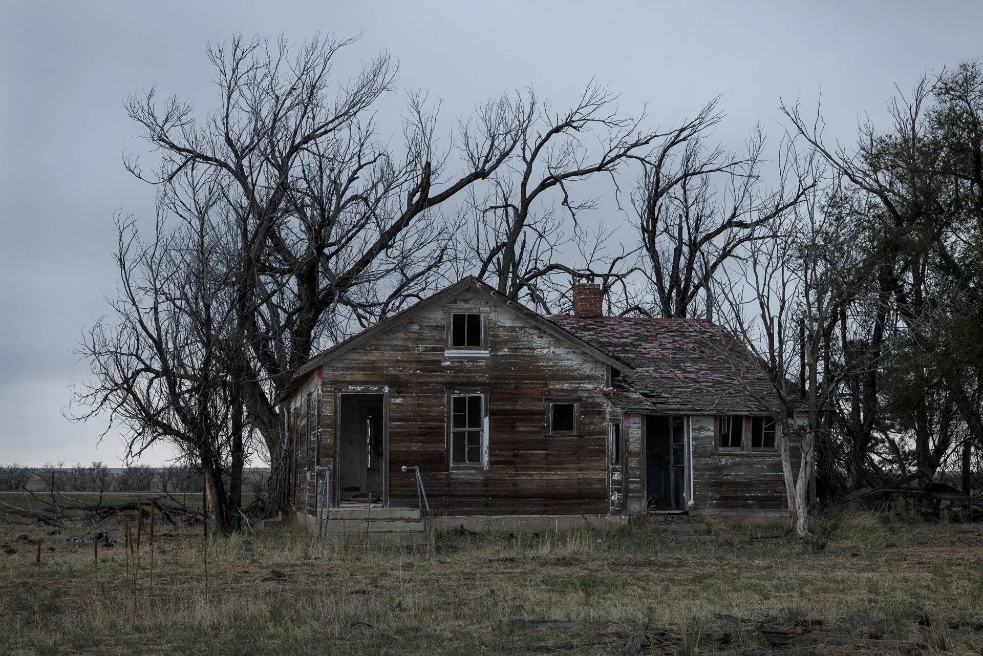
What Remains is a study of memory, endurance, and the quiet persistence of the American rural landscape. Photographed near Lowland, Colorado, the image centers on an abandoned homestead standing beneath towering winter trees whose bare branches stretch across the sky like silent witnesses to another era. Muted tones, weathered textures, and subdued light transform the scene into a meditation on time, loss, and the enduring presence of places long after the people who inhabited them have moved on. Drawing inspiration from the documentary sensitivity of Dorothea Lange and the emotional restraint of Andrew Wyeth, the photograph explores the stories that remain embedded within forgotten corners of the American West.
The composition balances the fragile geometry of the aging homestead against the powerful organic forms of the surrounding trees, creating a visual dialogue between permanence and decline. The looming branches frame the structure while emphasizing its vulnerability, yet the building remains standing—weathered, altered, but still present. Rather than focusing solely on abandonment, the image reflects on resilience and continuity, revealing how landscapes can preserve memory through architecture, atmosphere, and the passage of time.
Bare branches make a good frame for abandonment. They let the sky through, they make the house look small and patient, and they remind the eye that the trees have outlasted the people.
Design & Styling
An abandoned homestead beneath towering winter trees gives What Remains a hushed, painterly gravity for studies, lodges, farmhouse-style homes, and Midwest hospitality spaces. Its muted tones suit natural wood, stone, and neutral textiles.
Curated Pairings
To create a cohesive gallery wall around rural memory, consider these companion pieces:
For homestead life: Pair with Where the Plains Remember, extending themes of homestead life, agricultural heritage, and the relationship between people and landscape.
For weathered resilience: Complement this piece with Hanging On, Creede, Colorado, sharing the same weathered textures, sense of resilience, and contemplative pacing.
For the same subject: Pair with Where the Homestead Waits, another abandoned homestead near Lowland, Colorado, seen in its own light.
Fine Art Presentation
Available as a signed fine art print on ChromaLuxe® Metal (gloss, semi-gloss, or matte), Glossy Anti-Glare Acrylic (TruLife), canvas, wood, and archival paper (framed or unframed). Framed archival paper is the recommended presentation: its matte surface suits the subtle tonal transitions and painterly winter atmosphere. Wood is the alternative where the grain can echo the bare branches and weathered boards.
Note: Custom and oversized photographic prints are available. Please contact the studio directly to discuss custom framing, matting, or specialized museum glass options.
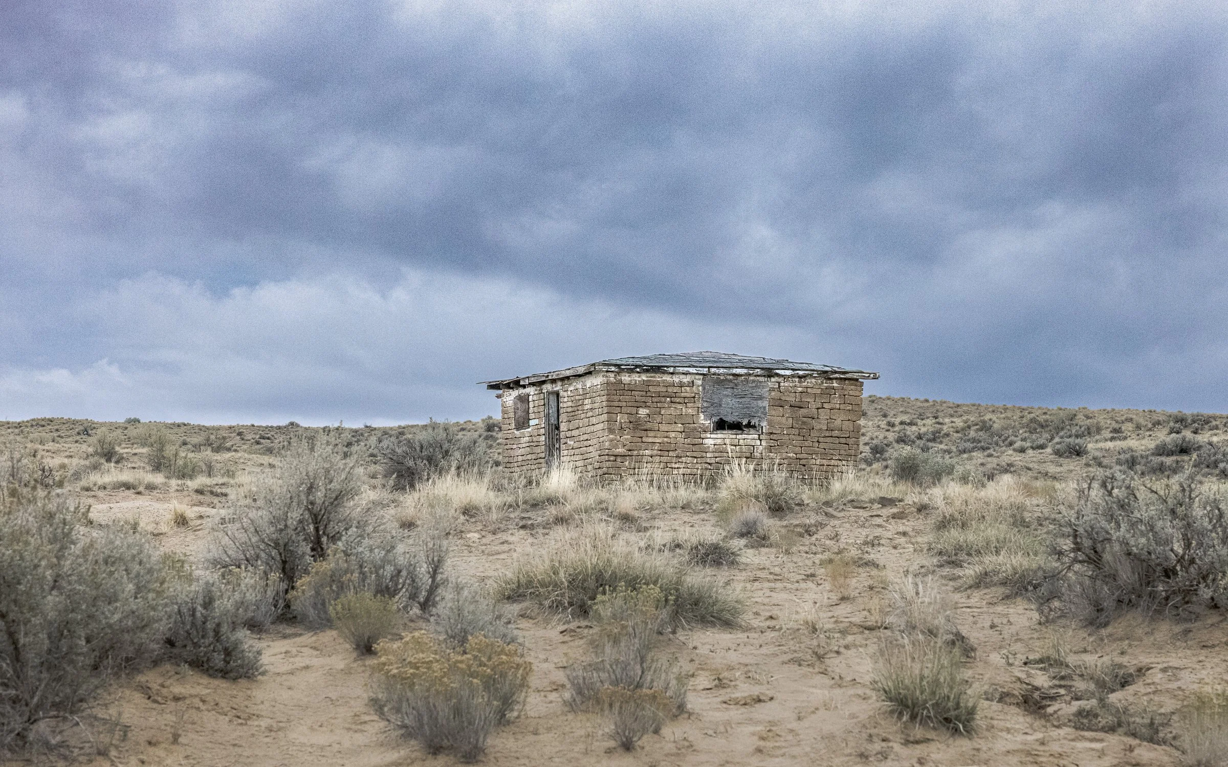
Enduring Shelter is a study of resilience, history, and the enduring relationship between people and landscape. Photographed near Chaco Canyon in northwestern New Mexico, the image centers on an ancient dwelling that has withstood centuries of weather, changing cultures, and the relentless passage of time. Weathered stone walls emerge from the desert landscape as both architecture and artifact, carrying the quiet presence of those who once lived within them. Drawing inspiration from the formal clarity of Ansel Adams and the contemplative spirit often found in the landscapes of the American Southwest, the photograph explores the enduring human desire to create shelter, community, and connection to place.
The composition balances the geometric forms of the structure against the vastness of the surrounding desert, emphasizing both permanence and fragility. Sunlight reveals textures shaped by generations of wind and weather, while the surrounding landscape places the dwelling within a broader story measured not in years, but in centuries. Rather than focusing on abandonment, the image reflects on continuity. The structure remains as evidence of ingenuity, adaptation, and a lasting relationship between people and the land they inhabited.
The result is a photograph that invites reflection on history, endurance, and the remarkable ability of place to preserve memory long after individual lives have passed from view.
Design & Styling
The weathered stone walls and earth tones of Enduring Shelter suit libraries, studies, lodges, Southwestern homes, and offices with an interest in history and place. Its muted palette sits comfortably beside adobe, timber, and leather.
Curated Pairings
To create a cohesive gallery wall around shelter and endurance, consider these companion pieces:
For shelter and resilience: Pair with Shelter Beneath a Restless Sky (Color), exploring shelter, resilience, and the relationship between architecture and the American landscape.
For timelessness: Complement with Enduring Silence, sharing the same sense of timelessness, atmospheric restraint, and reverence for the Southwest.
For a solitary structure: Pair with Held Against the Sky, a single cabin dwarfed by open sky, another study of a structure standing alone in its landscape.
Fine Art Presentation
Available as a signed fine art print on ChromaLuxe® Metal (gloss, semi-gloss, or matte), Glossy Anti-Glare Acrylic (TruLife), canvas, wood, and archival paper (framed or unframed). Framed archival paper is the recommended presentation: its matte surface preserves the subtle textures of stone and the earth-toned palette. ChromaLuxe® Metal is the alternative for crisper masonry detail.
Note: Custom and oversized photographic prints are available. Please contact the studio directly to discuss custom framing, matting, or specialized museum glass options.
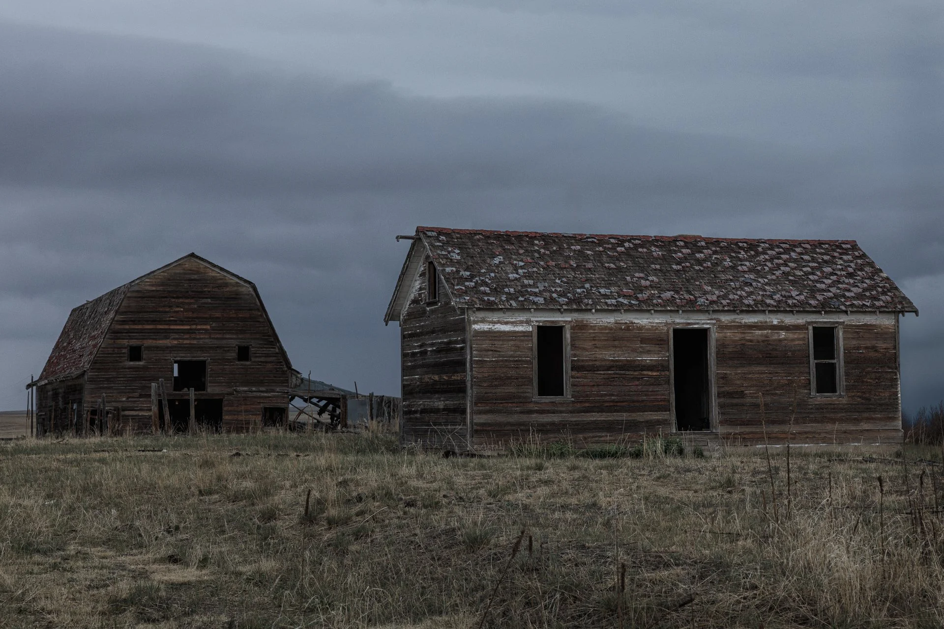
Where the Homestead Waits is a study of memory, resilience, and the enduring presence of the rural American West. Photographed near Lowland, Colorado, the image centers on an abandoned homestead standing quietly within the landscape that once sustained it. Weathered walls, open fields, and the subtle evidence of time combine to create a scene that feels both deeply personal and universally familiar. Inspired by the documentary sensitivity of Dorothea Lange, the photograph explores the lives, labor, and aspirations that shaped countless rural communities throughout the American West.
The composition balances the simplicity of the homestead against the openness of the surrounding landscape, allowing the structure to become both subject and symbol. The building stands alone, yet remains connected to the land through the marks of weather, use, and history. Rather than emphasizing abandonment, the image reflects on endurance and continuity. The homestead remains as a quiet witness to generations of work, change, and perseverance, preserving a sense of place long after its original purpose has passed.
The result is a photograph rooted in the visual traditions of American documentary photography while embracing the contemplative atmosphere of contemporary fine art. It invites viewers to reflect on themes of home, memory, and the enduring relationship between people and the landscapes they leave behind.
Design & Styling
An abandoned homestead standing quietly in the landscape that once sustained it gives Where the Homestead Waits a documentary calm for studies, lodges, farmhouse-style homes, and offices. Its muted palette suits natural materials and plain walls.
Curated Pairings
To create a cohesive gallery wall around rural memory, consider these companion pieces:
For abandonment and resilience: Pair with What Remains, extending themes of abandonment, resilience, and the emotional landscape of rural America.
For agricultural heritage: Complement this piece with Where the Plains Remember, sharing the same focus on agricultural heritage, memory, and the American heartland.
For a structure alone: Pair with Held Against the Sky, a single cabin under open Colorado sky.
Fine Art Presentation
Available as a signed fine art print on ChromaLuxe® Metal (gloss, semi-gloss, or matte), Glossy Anti-Glare Acrylic (TruLife), canvas, wood, and archival paper (framed or unframed). Framed archival paper is the recommended presentation: its matte surface suits the weathered textures and the documentary character of the image. Wood is the alternative where the grain can echo the weathered walls.
Note: Custom and oversized photographic prints are available. Please contact the studio directly to discuss custom framing, matting, or specialized museum glass options.
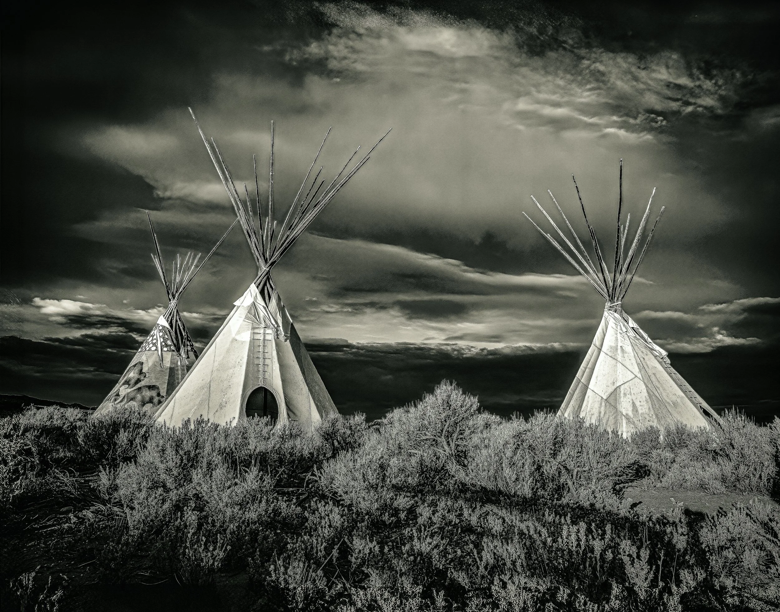
Shelter Beneath a Restless Sky - Edward Curtis Homage is a monochrome study of resilience, landscape, and the enduring cultural presence of the American West. Photographed beneath a gathering storm, three tipis stand against a darkening sky as shifting weather transforms the surrounding landscape into a scene of tension, quiet strength, and contemplation. Inspired by the visual traditions established by Edward Curtis, the photograph embraces dramatic tonal contrast, atmospheric skies, and a timeless black-and-white presentation that emphasizes form, texture, and mood over color.
The composition balances the geometric simplicity of the tipis against the weight and movement of the approaching storm clouds, creating a visual dialogue between shelter and exposure, permanence and change. Rather than documenting a specific moment in history, the image seeks to evoke a broader sense of connection to landscape, memory, and the enduring relationship between people and place. The result is both atmospheric and symbolic, inviting viewers to consider themes of resilience, protection, and survival within an ever-changing environment.
Design & Styling
Three tipis against a darkening sky give Shelter Beneath a Restless Sky - Edward Curtis Homage a historic, weather-driven gravity for lodges, libraries, Western homes, and offices. The monochrome keeps it timeless and lets it sit against wood, stone, or plain walls.
Curated Pairings
To create a cohesive gallery wall around the American West and weather, consider these companion pieces:
For the color counterpart: Pair with Shelter Beneath a Restless Sky (Color), the same tipis and storm sky in color: a study in two readings of one moment.
For isolation and weather: Complement with Enduring Silence, extending themes of weather, isolation, and the relationship between landscape and human presence.
For enduring place: Pair with Held in Shadow, sharing the same contemplative pacing, restrained visual language, and enduring place.
Fine Art Presentation
Available as a signed fine art print on ChromaLuxe® Metal (gloss, semi-gloss, or matte), Glossy Anti-Glare Acrylic (TruLife), canvas, wood, and archival paper (framed or unframed). Framed archival paper is the recommended presentation: its matte surface preserves the rich tonal range and dramatic sky in a way that recalls the historic monochrome tradition the piece draws on. ChromaLuxe® Metal is the alternative for a sharper, more graphic read.
Note: Custom and oversized photographic prints are available. Please contact the studio directly to discuss custom framing, matting, or specialized museum glass options.
“I’m interested not only in how spaces look, but in how they feel to inhabit.”
The day lets go slowly here, and Held in Afterglow is the hour when the garden is still warm but the light has already gone soft. At the end of the evening, the glass stays lit while the sky cools above it.
The Jewel Box rises at the center of the frame, a stepped glass front that holds the last of the daylight. The eye starts at the lit facade, drops to the single thread of the fountain, and then moves out across the water through the ring of giant Victoria lily pads. Their copper rims lead back toward the building. The sky grades from a clear blue overhead to peach at the horizon, so the building is the brightest thing in a quiet frame.
The picture sits between Ernst Haas's feeling for color as atmosphere and Wim Wenders's patience with architecture left alone at the edge of the day. Nothing is announced. The architecture, the water and the sky share the same low light.
Design & Styling: Held in Afterglow suits hotel lobbies, boutique hospitality spaces and executive suites, where cool blues and warm peach set a calm, unhurried mood. In healthcare settings such as waiting rooms, infusion suites and patient corridors, the symmetry and soft light give the eye somewhere restful to land. At home it works over a console in an entry, a dining room or a quiet reading space, especially with plaster, pale oak or sage and brass.
Curated Pairings:
Blue Interval: Another St. Louis glass building, where drifting clouds dissolve into a mirrored facade and architecture becomes color and sky, the abstract counterpart to the Jewel Box held in the same cool blues.
The Garden's Glow: A macro of a single fire-lit blossom against deep shadow, the saturated, close-up answer to the soft peach light in Held in Afterglow.
Held Arch: A monochrome wide-angle study of the Gateway Arch rising over downtown St. Louis, the city's other great monument, in black and white where Held in Afterglow is all color.
Fine Art Presentation: Printed to order on Chromaluxe metal for the clearest glow in the glass and sky, or on TruLife acrylic with a low-glare or anti-glare surface where the room has windows. Framed and unframed paper prints are made on Photo Rag. Each print is made to order and signed.