
The Geometry of Silence
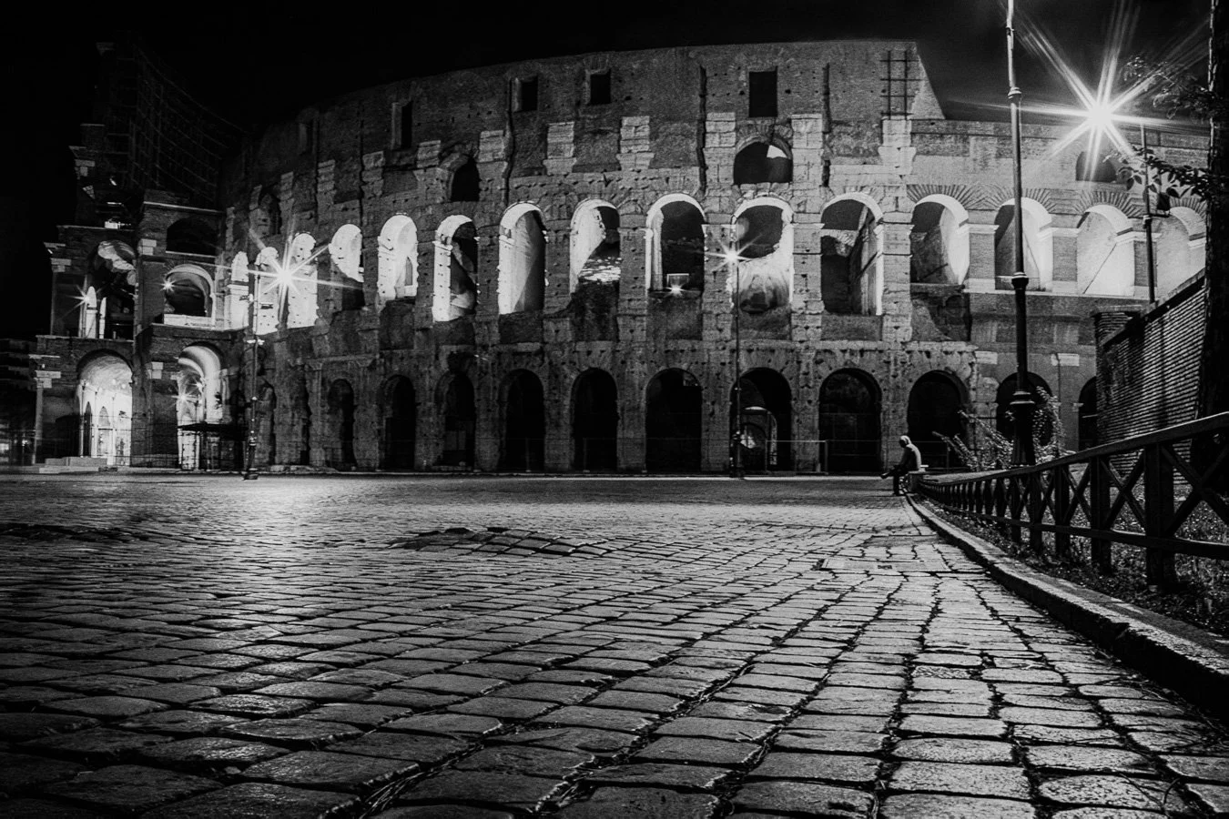
Waiting for a Ride - Night Watch
Edward Hopper and the Art of the Wait
There is a specific kind of light that exists only when we are still. It’s the light that cuts across a sidewalk while you wait for a taxi, or the heavy shadow that falls across an ancient archway as the sun begins to dip. In the world of art, no one captured this better than Edward Hopper.
The Hopper Influence: Light as a Character
When I photographed Waiting for a Ride in front of the Colosseum, I wasn’t just thinking about the history of Rome. I was thinking about Hopper’s "Nighthawks" and his ability to make a quiet moment feel monumental.In this piece, I applied several "Hopper-esque" principles:Raking Light: I waited for the sun to reach an angle where the shadows of the Colosseum’s arches became as structural as the stone itself. In Hopper’s work, shadows aren't just the absence of light; they are characters in the story.The Solitary Narrative: Hopper was famous for capturing people in "the in-between." By focusing on the figure waiting for a ride against the backdrop of history, the image becomes less about a tourist site and more about the universal experience of the traveler.Architectural Rhythm: Hopper loved the repetition of windows and doors. In my work, I look for those same rhythmic patterns in the stone and steel of the modern world.
The Satin Finish: Preserving the "Glow"
Because Hopper’s style relies so heavily on the "temperature" of light, I often recommend Satin Metal or Low-Glare Acrylic for these types of shots.High-gloss finishes can distract the eye with random room reflections. A Satin finish, however, allows the deep blacks of the shadows and the luminous glow of the highlights to stand out with that cinematic, "painted" quality that defines American Realism.
Do you prefer the quiet solitude of the city or the open expanses of the field?"
Introducing Edward Hopper Architect of Light and Shadow
Discover how Edward Hopper's use of light and solitude inspires the cinematic street photography of Robert N. A deep dive into "Waiting for a Ride" at the Colosseum.
1. The Aesthetic: "The Great American Solitude"
Hopper was the master of urban isolation. He didn't paint the bustling city; he painted the quiet intervals between the bustle.
The "Wait": Hopper’s subjects are often caught in a moment of transition—sitting in a diner, staring out a window, or waiting for a ride. This is the direct spiritual ancestor to my Waiting for a Ride piece at the Colosseum.
Cinematic Light: Hopper used light like a theater director. He favored "raking light"—long, harsh shadows that define the shape of a building or a room. This is the "high-contrast" style I’ve tried to mastered.
2. The Technique: Simplified Geometry
Hopper had a way of stripping away unnecessary detail to focus on mass and light.
Clean Lines: He loved the rhythmic repetition of windows, storefronts, and rooftops. He used these to create a sense of order and tension.
Atmospheric Color: While he used color, it was often used to emphasize the "temperature" of a scene—the cool blue of a shadow vs. the hot, synthetic yellow of an interior light.
3. The Philosophy: The Voyager’s Gaze
Hopper’s work often feels like it is being viewed by a stranger passing by. There is a sense of being an observer, not a participant. This "voyage" perspective is a hallmark of my photography, especially in your Open Road series.
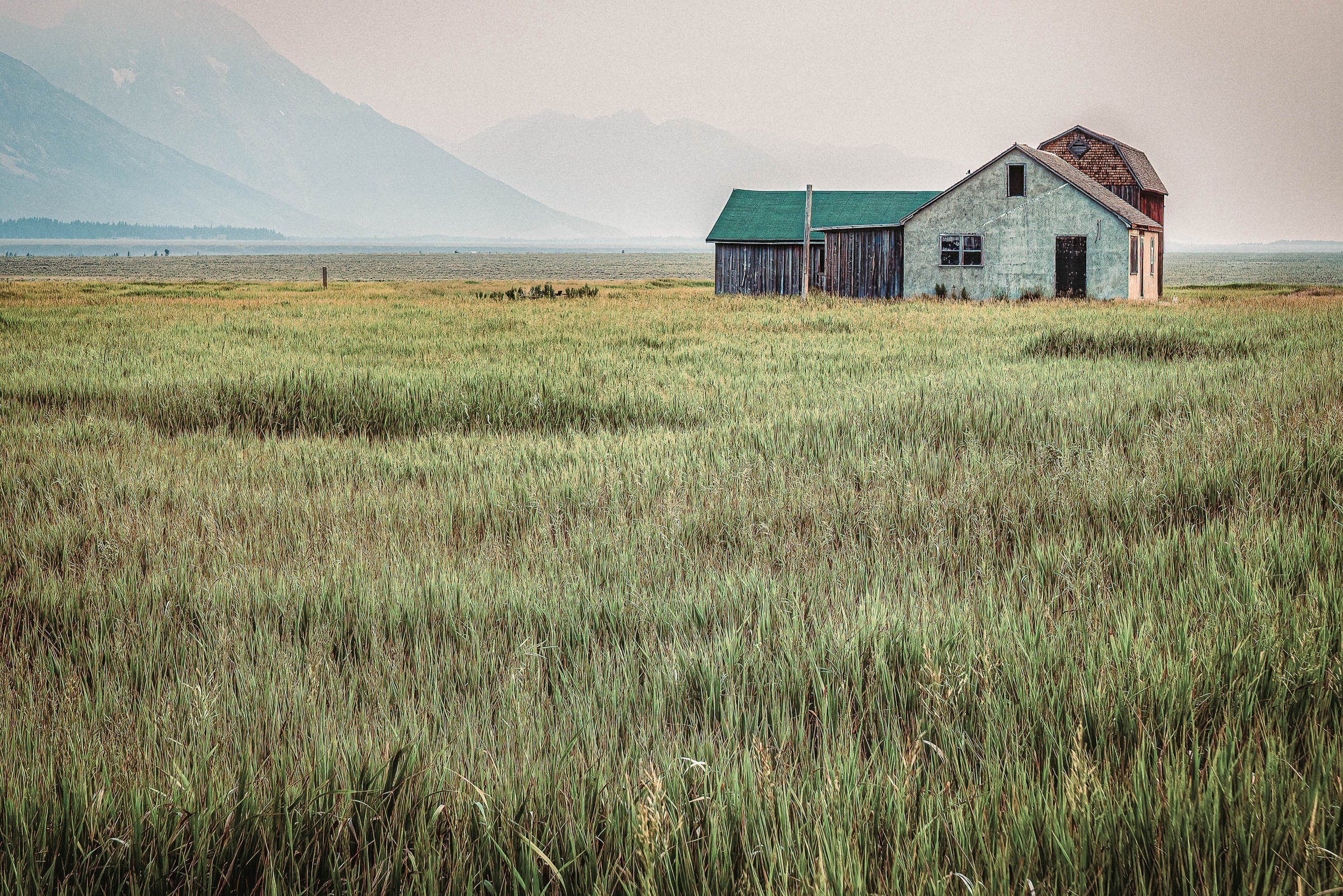
The Bone Structure of the Land
The Weight of the Horizon: Wyeth often used vast, "empty" spaces to create a sense of longing or distance. In this composition, the field isn't just grass—it's the physical representation of the time and space between the viewer and history.
Echoes of Andrew Wyeth in "Between Us, the Field"
There is a specific kind of silence found in the American landscape—a silence that feels heavy, intentional, and ancient. When I stood before the Pink House on Mormon Row in the Grand Tetons, I wasn’t just looking at a historic structure; I was looking at what the painter Andrew Wyeth called "the bone structure" of the world.
The Wyeth Connection
Andrew Wyeth, one of the most influential American artists of the 20th century, had a profound way of stripping away the "noise" of a scene to find its emotional core. He famously preferred the muted tones of autumn and winter, focusing on earth, sky, and weathered wood.
In my piece, Between Us, the Field, I leaned into several Wyeth-inspired principles:
The Weight of the Horizon: Wyeth often used vast, "empty" spaces to create a sense of longing or distance. In this composition, the field isn't just grass—it's the physical representation of the time and space between the viewer and history.
Textural Narrative: Much like Wyeth’s "dry brush" technique, I used a high-contrast tonal range to emphasize the grain of the wood on the Pink House and the rhythmic texture of the prairie. I wanted you to feel the wind-burn on the siding.
Desaturated Emotion: By pulling back on the vibrant "postcard" colors of the Tetons and focusing on a more "painterly" palette, the house becomes a solitary character in a larger, atmospheric story.
Why Matte Matters
Because this work is so heavily influenced by the tradition of tempera and watercolor painting, the presentation is critical. This is why I primarily offer this piece in a Matte or Satin finish.
A high-gloss finish would act as a barrier, reflecting the room around you. A Matte Fine Art Paper or Satin Canvas, however, absorbs the light, allowing you to look into the field rather than at the surface. It preserves that "quiet" quality that Wyeth spent his life perfecting.
Introducing Andrew Wyeth "The Magic of the Commonplace"
It All Begins Here - with Andrew Wyeth
Wyeth didn't look for the spectacular; he looked for the overlooked. He once said, "I prefer winter and fall, when you feel the bone structure of the landscape—the loneliness of it."
The Palette: He favored earth tones—ochre, bone white, muddy browns, and slate grays. This aligns perfectly with your preference for Satin and Matte finishes, which handle these subtle tonal shifts better than high gloss.
The "Bone Structure": Like your Enduring Forms, Wyeth focused on the underlying geometry of a hill or the structural ribs of a barn.
2. The Technique: Egg Tempera and Dry Brush
To understand his look, you have to look at his medium.
Egg Tempera: This was his primary medium. It dries almost instantly, requiring thousands of tiny, rhythmic strokes. This created a rhythmic texture that feels vibrating and alive, even in a still image.
Dry Brush: He used a brush with very little moisture to create "scratchy," high-detail textures (like dead grass or weathered wood). This is the "painterly" detail you often seek in your post-processing.
3. The Philosophy: Emotional Realism
Wyeth was often called a "Realist," but he considered himself an Abstractionist.
Isolation: He often placed a single object or person in a vast, atmospheric field (much like your Between Us, the Field).
The "Hidden" Narrative: His paintings feel like a movie frame where something just happened or is about to happen. There is a tension in the silence—a "waiting" quality that mirrors your Waiting for a Ride.
4. Key Works to Study for Photography
"Christina's World" (1948): The ultimate study in perspective and the "weight" of a field.
"Wind from the Sea" (1947): A masterclass in atmospheric depth using a simple window and sheer curtains.
"The Helga Pictures": A series that shows how he obsessed over a single subject for years, finding new light and angles—much like how you return to the Mormon Row barns.

What should I print on?
A Blog Post is a brilliant move for a few reasons. It gives you a permanent, linkable resource that boosts your SEO, and it allows you to speak in a more personal, "behind-the-lens" voice. Plus, it’s a perfect thing to share on social media or in a newsletter before a big fair like the Belleville Main Street Fete or a Missouri botanical garden show.
Here is a draft for your inaugural post. It’s written to feel like a conversation with a collector, emphasizing quality and choice.
Blog Post Draft: Choosing the Right "Voice" for Your Walls
Subtitle: A Guide to Our 2026 Fine Art Presentations
When a moment is captured—whether it’s the rhythmic shadow of a Roman arch or the quiet, painterly stillness of a Teton field—the story doesn't end with the shutter click. The final part of the journey is choosing how that light lives in your home.
In my studio, I believe the material the art is printed on acts as the "voice" of the image. Some stories need to speak with the sleek, modern clarity of metal; others require the warm, textured whisper of canvas. To help you find the perfect match for your space, here is a look at the premium options we’ve curated for 2026.
1. The Modern Master: Metal (Dye-Sublimation)
For the collector seeking a sleek, high-definition look without the bulk of a traditional frame.
The Technology: We use a high-heat infusion process where dyes are pressed directly into the metal surface, creating a permanent, scratch-resistant bond.
The Choices:
Satin/Matte Finish: Our most popular choice. It virtually eliminates reflections, making it perfect for rooms with many windows. It preserves a "painterly" softness while maintaining the metal’s inner glow.
High Gloss Finish: Reserved for those who want maximum "pop." It offers the deepest blacks and highest contrast, creating a 3D effect that looks almost liquid.
The Benefit: No glass required. It is waterproof, incredibly lightweight, and arrives ready to hang with a "floating" bracket that pushes the art off the wall for a gallery feel.
2. The Luxury Standard: Acrylic (Face-Mounted)
For the collector who wants the absolute pinnacle of depth and clarity.
The Technology: Your photograph is printed on archival paper and "face-mounted" behind a thick, polished sheet of acrylic. This creates a lens-like effect that pulls the viewer into the image.
The Choices:
Low-Glare (Non-Reflective) Acrylic: The museum choice. It offers the depth of acrylic without the "mirror" effect. It is the best way to see every detail of the work regardless of room lighting.
Standard Gloss Acrylic: Provides the most intense color saturation and a brilliant, high-fashion shine that commands attention in any space.
The Benefit: It is the most substantial and "expensive" looking medium. It protects the print from UV light and becomes a structural part of the architecture.
3. The Timeless Classic: Canvas & Framed Canvas
For the collector who prefers a warm, textural, and traditional aesthetic.
The Technology: We use heavy-weight, archival-grade canvas with a protective UV coating to ensure your art never fades or cracks over time.
The Choices:
Gallery Wrap (Unframed): The image wraps around the sides of the wooden stretcher bars. It’s a clean, minimalist look that fits any decor.
Float Frame Canvas: The canvas is set inside a high-quality wood frame with a small "gap" between the art and the frame. This makes the art appear to be floating and adds a level of sophistication and "finish" to the piece.
The Benefit: Completely glare-free. The natural texture of the canvas mimics the feel of a classic painting—ideal for our more "painterly" and atmospheric compositions.
Summary of Choice: Finding the Right Fit
RequirementMetal (Satin)Acrylic (Low Glare)Canvas (Framed)Room LightingWorks in any lightBest for all lightZero glare issuesVisual DepthHighMaximum (3D Feel)Soft & PainterlyDurabilityHighest (Waterproof)High (UV Protection)ModerateAestheticSleek / ModernLuxury / ImpactClassic / Warm
Our Quality Promise
"We don't just sell images; we provide a curated art experience. Every piece is printed using the highest archival standards available in 2026, ensuring that the light, shadow, and emotion captured in the field are preserved on your wall for generations."