
European Texture & Light
A Closer Look
Explore the finer details of each photograph by hovering over an image to reveal subtle focus and texture, or click to expand the work into a distraction-free viewing environment. This immersive view allows each study of European Texture & Light to be experienced at its full scale and proportion.
Search for a specific photograph, series, or browse the curated collections. Looking for a particular format? Search by Square or 1:1, Landscape or 3:2, or Panorama or 16:9.
European Texture & Light: Travel Photography Abroad
Cities reveal themselves slowly. Beyond the famous landmarks and familiar views are quieter moments shaped by weather, history, architecture, and the subtle character of everyday life.
The photographs in this collection explore those moments, seeking atmosphere and meaning within the streets, rivers, cafés, galleries, and public spaces of Europe.
Created in cities including Prague, Rome, Budapest, and beyond, these images focus on the relationship between place and experience. Rain-softened streets, changing weather, historic architecture, reflections, and fleeting human encounters become opportunities to explore the emotional qualities that make each location unique. Rather than documenting destinations, the photographs seek to capture how a place feels.
Light plays a central role throughout the collection. Morning fog, approaching storms, evening glow, reflections on wet pavement, and shifting shadows transform familiar scenes into something more personal and evocative. History is often present as well, not as a subject alone, but as a quiet influence woven into the textures of stone, glass, water, and architecture.
Influenced by the atmospheric photography of Wim Wenders and the color sensibilities of Ernst Haas, these images balance observation and interpretation. They are photographs about discovery, memory, and the experience of moving through places where centuries of history remain visible within contemporary life.
Designed for collectors, hospitality environments, healthcare spaces, offices, and residential interiors, these photographs bring a sense of atmosphere, cultural richness, and visual depth while inviting viewers to slow down and linger within the scene.
“The real voyage of discovery consists not in seeking new landscapes, but in having new eyes.”

City of Light is a luminous study of grandeur, memory, and the golden atmosphere that settles over Paris at dusk. Photographed from the gilded railing of the Pont Alexandre III as the sun dropped behind the rooftops of the 7th arrondissement, the image frames one of the bridge's bronze Fames — her hand extended toward the Seine — against the distant silhouette of the Eiffel Tower rising through a sky of amber and rose. A passing bateau mouche threads beneath a neighboring bridge, its lights already on against the fading blue.
The composition moves in a slow diagonal from the sculpted bronze hand in the near foreground, along the curve of the river, to the tower itself, using the statue's gesture as a compositional anchor that draws the eye outward into the city beyond. Layered depth — foreground sculpture, mid-ground bridge and embankment, distant tower and spire — gives the frame a cinematic sense of scale, while the breaking clouds overhead soften the transition between architecture and sky. Warm highlights on the gilding echo the color of the clouds, tying the man-made and the atmospheric together into a single unified palette.
Drawing from the luminous color sensibilities of Ernst Haas and the quiet architectural stillness of Edward Hopper, the photograph treats one of the world's most photographed monuments not as a postcard subject but as a study in fading light and civic grandeur. Rather than centering the tower itself, the image lets a smaller, overlooked detail — a single gilded hand on a century-old bridge — carry the emotional weight of the scene.
Design & Styling
With its warm gold-and-rose palette, sculptural foreground detail, and unmistakable sense of place, City of Light works especially well in hospitality environments, boutique hotels, executive offices, restaurants, and residential interiors seeking a refined, well-traveled presence. The image introduces romance and civic grandeur while remaining restrained enough for formal commercial spaces.
Curated Pairings
To create a cohesive gallery wall, consider these companion pieces from the European Texture and Light collection:
For tonal harmony: Pair with Evening at the Pavilion, continuing the study of golden-hour light, water, and architecture as the day fades.
For narrative contrast: Complement with Passing Through Prague, extending the exploration of European travel, historic architecture, and the small human gestures that animate grand spaces.
For the same late-day gold: Pair with Where Light Still Climbs, the late-day Roman gold rising along the arches of the Colosseum, another grand landmark at the hour when the light turns.
Fine Art Presentation
Available as a signed fine art print on ChromaLuxe® Metal (gloss, semi-gloss, or matte), Glossy Anti-Glare Acrylic (TruLife), canvas, wood, and archival paper (framed or unframed). ChromaLuxe® Metal is the recommended presentation: it preserves the gilded highlights and the layered gradient of the evening sky. Acrylic (TruLife) is the alternative for the luminous glow of the gold against the rose sky, and framed archival paper suits a quieter, more traditional reading of the bridge and river.
Note: Custom and oversized photographic prints are available. Please contact the studio directly to discuss custom framing, matting, or specialized museum glass options.
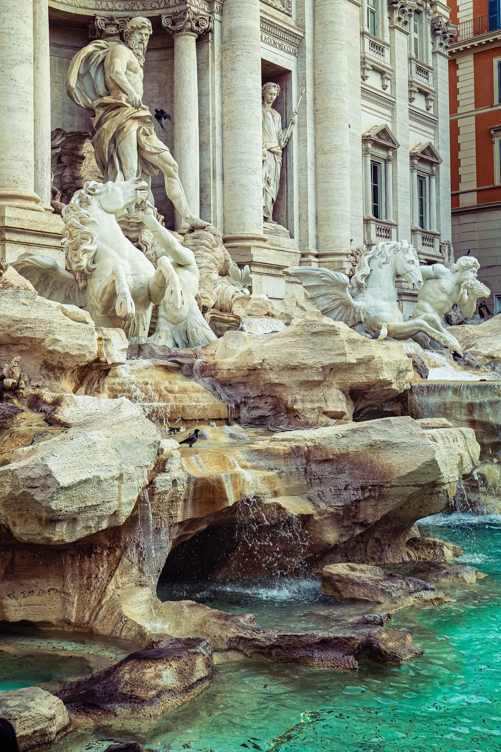
Company Kept is a study of scale, permanence, and the small, ordinary lives that carry on in the shadow of monumental art. Photographed in tight vertical framing at Rome's Trevi Fountain, the image isolates Oceanus and his sea horses mid-drama — muscular marble figures locked in eternal motion — while a scatter of real, living birds goes about its business at their feet: a black bird perched near Oceanus's outstretched leg, a gull resting calmly on the rock, a pigeon at the water's edge.
The composition holds close, letting the sculptural chaos of Nicola Salvi's design fill the frame without the flattening symmetry of a full facade view. The eye enters at Oceanus's face, travels down his raised leg to the rearing horse below, and settles at the waterline — where the birds, entirely unbothered by the spectacle around them, quietly steal the scene. The corrected teal water and warm travertine give the piece a believable, sunlit richness rather than the postcard oversaturation this fountain so often receives.
The work draws on Elliott Erwitt's lifelong interest in the quiet irony of animals unbothered by human grandeur — small, transient life set against something built to be eternal. Rather than photographing the Trevi Fountain as a landmark to be checked off, Company Kept finds its subject in the gap between the monumental and the mundane.
Design & Styling
With its tall vertical format, rich travertine and teal palette, and quiet narrative depth, Company Kept works beautifully in tall wall spaces — hotel corridors, stairwells, and entryways — where its scale and story reward a closer look.
Curated Pairings
To build a cohesive Rome collection, consider these companion pieces:
For the same fountain from a wider, more classical view: pair with Neptune's Court.
For continued Roman street life: complement with Modern Gladiators.
For quiet nocturnal atmosphere: consider Waiting for a Ride.
Fine Art Presentation
Available as a signed fine art print in ChromaLuxe® Metal (gloss, semi-gloss, or matte), framed paper, and acrylic presentation formats. ChromaLuxe® Metal is especially recommended to bring out the contrast between warm marble and the corrected teal water tones.
Note: Custom and oversized photographic prints are available. Please contact the studio directly to discuss custom framing, matting, or specialized museum glass options.
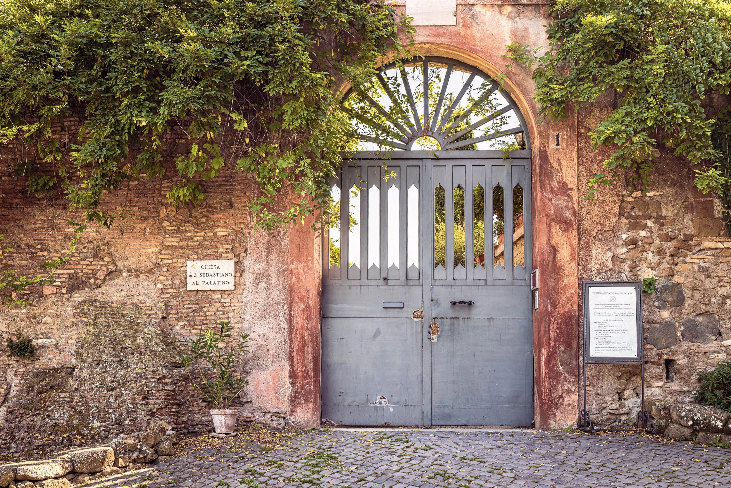
The Gate of San Sebastiano al Palatino is a study of quiet devotion, discovered along the Palatine Hill at the gated entrance to the Chiesa di San Sebastiano al Palatino — a working monastic church tucked behind Rome's more famous ruins. Wisteria and ivy spill from a terracotta wall above a wrought-iron gate, its fan-shaped transom catching the light of the garden beyond. A hand-lettered stone plaque names the church; a posted notice board lists hours of prayer. Nothing about the frame announces itself as a landmark — this is Rome as its residents and religious communities actually use it, not as tourists photograph it.
The composition holds to a disciplined symmetry, the arched gate centered and framed by cascading greenery above, with a terracotta pot anchoring the lower left corner. The eye travels up the cobblestone path to the gate itself, then rises through the fan-shaped ironwork to the light beyond — a quiet sequence of arrival, threshold, and passage. The gate's cool grey-blue tone offers the frame's only counterpoint to the warm ochre wall, holding its own against the surrounding color without disrupting the stillness of the scene.
The work draws on Wim Wenders' patience for doorways and thresholds as subjects in their own right, alongside Josef Sudek's quiet architectural studies of light and enclosure. Rather than spectacle, the photograph offers observation — a private corner of Rome, photographed with the same stillness its subject asks of its visitors.
Design & Styling
The warm terracotta palette, lush greenery, and old-world architectural detail make this piece especially well-suited to Mediterranean and Italian-inspired hospitality interiors — boutique hotels, wine bars, and courtyard-adjacent restaurant spaces. It pairs naturally with aged wood, wrought iron fixtures, and warm stone accents.
Curated Pairings
For continued Roman atmosphere and quiet human presence: pair with Waiting for a Ride.
For a study in golden-hour warmth on ancient stone: complement with Where Light Still Climbs, photographed at the Colosseum.
For shared European texture and light discipline: consider What the Ivy Remembers, from Prague.
Fine Art Presentation
Available as a signed fine art print in ChromaLuxe® Metal (gloss, semi-gloss, or matte), framed paper, and canvas presentation formats. Archival paper is especially recommended for this piece, lending a painterly, traditional quality that suits the old-world subject matter; ChromaLuxe® Metal offers a more contemporary alternative for modern hospitality settings.
Note: Custom and oversized photographic prints are available. Please contact the studio directly to discuss custom framing, matting, or specialized museum glass options.
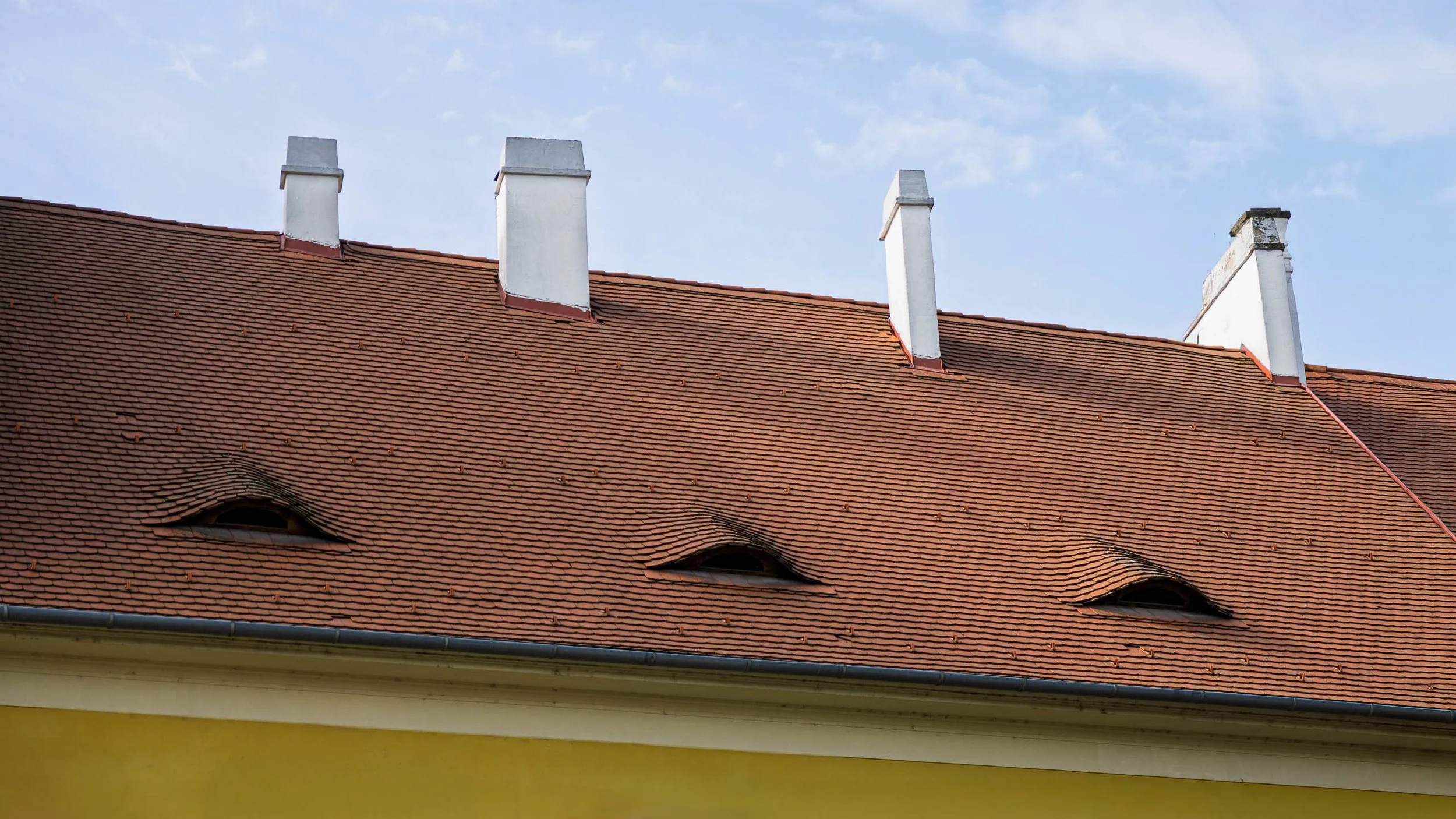
Three Eyes is an exploration of rhythm, repetition, and the subtle visual humor hidden within historic architecture. Photographed in Prague, the image isolates a section of roofline where three distinctive dormer windows appear almost human, peering outward from beneath rows of weathered terracotta tiles. What might ordinarily be overlooked becomes a study in pattern, character, and observation.
The photograph simplifies the architectural scene into a dialogue between shape, color, and proportion. Repeating roof tiles create a textured field across the frame, while the dormers introduce a playful interruption to the roof's otherwise orderly geometry. Above them, white chimneys punctuate the skyline, establishing a second rhythm that echoes the spacing of the windows below. Together these elements create a composition that is both formal and unexpectedly expressive.
While grounded in documentary observation, the image moves beyond straightforward architectural description. The eye-shaped dormers transform the building into something almost animate, encouraging viewers to discover personality within structure. The photograph reflects the quiet rewards of careful looking and the small visual surprises that reveal themselves while wandering historic cities.
Design & Styling
With its clean geometry, restrained color palette, and subtle sense of whimsy, Three Eyes works particularly well in hospitality spaces, healthcare environments, executive offices, libraries, and contemporary residential interiors. The image introduces texture, pattern, and architectural character while maintaining a calm and sophisticated visual presence.
Curated Pairings
To create a cohesive gallery wall, consider these companion pieces from the European Texture and Light collection:
For formal harmony: Pair with Study in Yellow and Blue #4, continuing the exploration of color relationships, geometry, and historic architectural details.
For atmospheric contrast: Complement this piece with Where the Evening Waited, introducing mood and narrative while maintaining a connection to Prague's architectural character.
For architectural continuity: Pair with The Last Lights On, extending the visual conversation between historic structures, rhythm, and urban observation.
Fine Art Presentation
Available as a signed fine art print in ChromaLuxe® Metal (gloss, semi-gloss, or matte), framed paper, framed canvas, and acrylic presentation formats. To preserve the roof textures, subtle color relationships, and architectural detail, ChromaLuxe® Metal, Fine Art Paper, or Low-Glare Acrylic presentation is highly recommended.
Note: Custom and oversized photographic prints are available. Please contact the studio directly to discuss custom framing, matting, or specialized museum glass options.
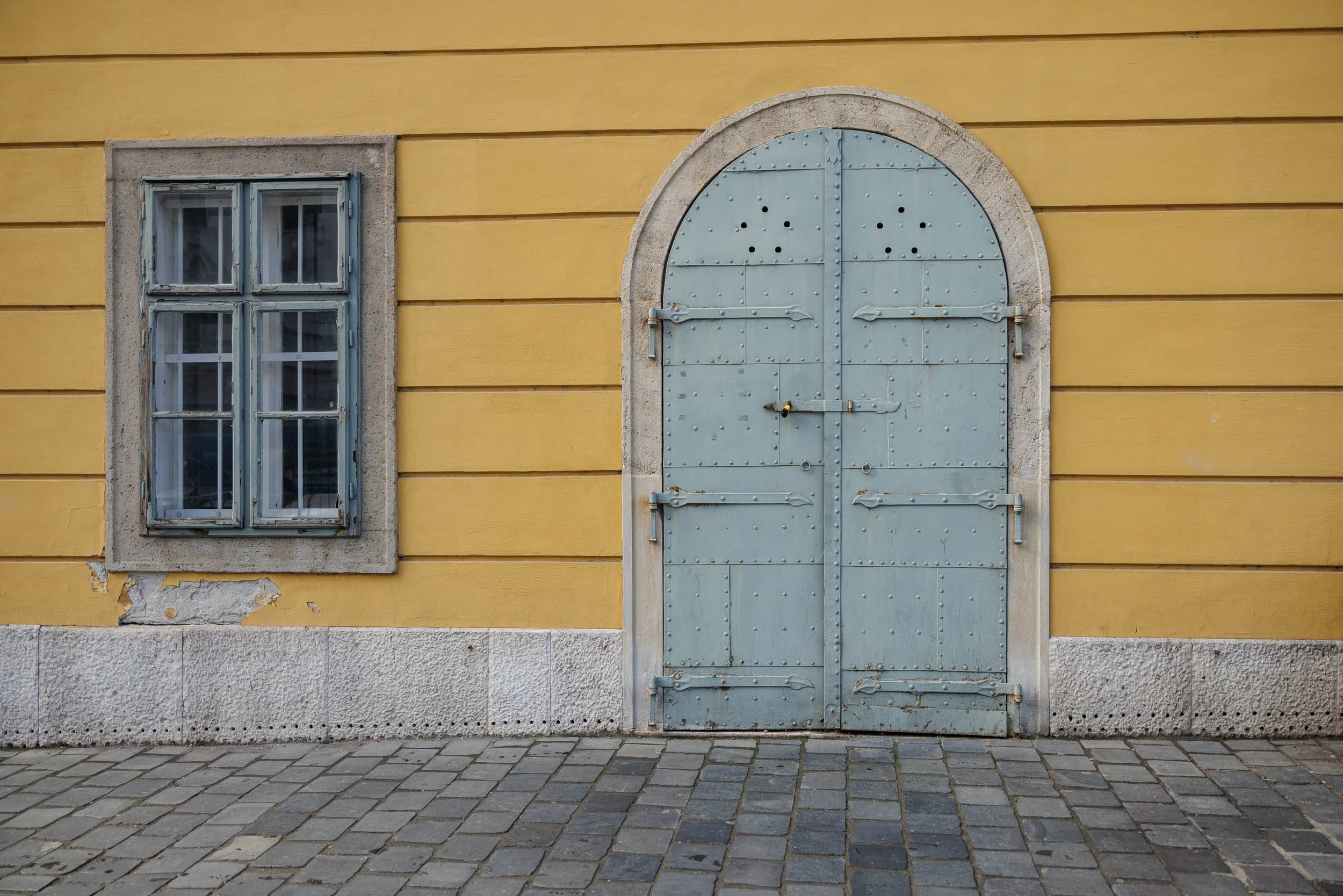
Study in Yellow and Blue #4 is a quiet exploration of color, geometry, and the subtle beauty found in overlooked architectural details. Photographed in Prague, the image centers on a weathered blue-gray door and an aging window set against a warm yellow façade, transforming an ordinary section of wall into a study of proportion, texture, and visual balance. Drawing inspiration from the observational clarity of Wim Wenders and the color sensitivity of Ernst Haas, the photograph examines how simple architectural forms can evoke a sense of place, memory, and permanence.
Rather than focusing on grand landmarks or dramatic moments, the composition finds meaning in restraint. The rectangular window and arched door create a dialogue between contrasting shapes, while the muted blue-gray tones of the woodwork provide a visual counterpoint to the warmth of the surrounding wall. Repeating horizontal lines, rivets, hinges, stone trim, and worn paint surfaces contribute to a layered visual rhythm that rewards careful observation. The result is an image that feels both timeless and contemporary—an architectural portrait built from color, texture, and form.
The photograph also reflects the passage of time. Weathered paint, worn stone, and subtle imperfections reveal the accumulated history of the building without overwhelming the composition. Small details become important: the aged window frame, the riveted metal door, the chipped plaster beneath the sill, and the worn cobblestones at street level. Together they create a sense of continuity between the present moment and the generations who have passed through this space before.
Design & Styling
Warm yellow, weathered blue-gray, and clean proportion make Study in Yellow and Blue #4 an easy fit for modern kitchens, dining rooms, design studios, and hospitality interiors that want a graphic accent without literal narrative. It pairs well with white, natural wood, and brushed metal.
Curated Pairings
To create a cohesive gallery wall around color and architectural detail, consider these companion pieces:
For color harmony: Pair with The Last Lights On, continuing the dialogue between architectural surfaces, color relationships, and the visual character of Prague.
For formal contrast: Complement this piece with Where the Evening Waited, introducing atmosphere and narrative while keeping a strong emphasis on architectural space.
For structure and texture: Pair with Reflections of Glass and Stone, extending the exploration of structure, texture, and urban observation.
Fine Art Presentation
Available as a signed fine art print on ChromaLuxe® Metal (gloss, semi-gloss, or matte), Glossy Anti-Glare Acrylic (TruLife), canvas, wood, and archival paper (framed or unframed). ChromaLuxe® Metal is the recommended presentation: it keeps the yellow façade and the blue-gray door as clean, saturated blocks with crisp edges. Framed archival paper is the alternative for a quieter read of the weathered surfaces, and acrylic for a deeper, glossier color field.
Note: Custom and oversized photographic prints are available. Please contact the studio directly to discuss custom framing, matting, or specialized museum glass options.
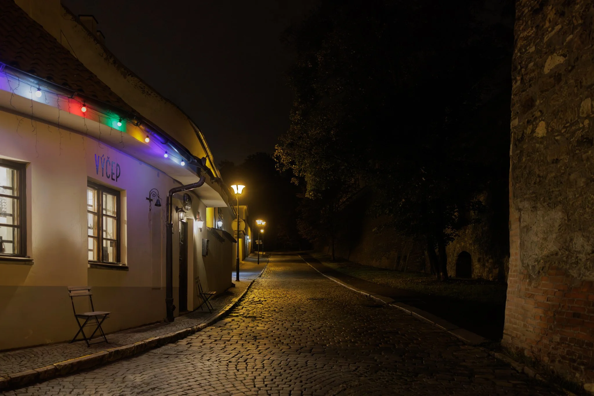
The Last Lights On is a study of solitude, hospitality, and the quiet moments that remain after a city begins to settle into the night. Photographed in Prague beneath a string of colored lights and the warm glow of streetlamps, the image transforms an ordinary street into a meditation on presence, absence, and the traces of human activity that linger after the day has ended. Drawing inspiration from the atmospheric urban sensibilities of Wim Wenders and the luminous color relationships of Ernst Haas, the photograph explores the emotional resonance that emerges when warmth and emptiness occupy the same space.
Rather than focusing on Prague's famous landmarks, the composition turns toward a quieter corner of the city. The illuminated building, empty chairs, and colorful lights create a small island of human warmth against the deep shadows of the medieval wall and trees beyond. The wet cobblestones reflect the remaining light and guide the viewer deeper into the scene, while the darkness surrounding the street suggests stories continuing beyond what can be seen. The resulting atmosphere is contemplative, cinematic, and intimate.
At the heart of the image is a contrast between welcome and solitude. The empty chair hints at a recent presence, while the glowing windows and lights suggest that life continues just beyond the frame. The photograph becomes less about architecture and more about anticipation—the final moments before closing, the pause between one day and the next, and the quiet beauty found when a city briefly belongs to itself.
Design & Styling
The strings of colored light and warm streetlamp glow in The Last Lights On suit bars, restaurants, hotel lounges, and evening-oriented rooms at home. On a dark wall, the colored lights read like a small celebration left on after the crowd has gone.
Curated Pairings
To create a cohesive gallery wall around atmosphere, urban texture, and implied human presence, consider these companion pieces:
For tonal harmony: Pair with Where the Evening Waited, continuing the exploration of Prague through quiet streets, warm light, and the lingering traces of human activity.
For narrative resonance: Complement this piece with The Bartender's Measure (Noir), extending the theme of hospitality, memory, and the spaces people temporarily inhabit.
For emotional continuity: Pair with Before the City Wakes, which shares a similar sense of anticipation and atmospheric stillness at a different moment in the city's daily rhythm.
Fine Art Presentation
Available as a signed fine art print on ChromaLuxe® Metal (gloss, semi-gloss, or matte), Glossy Anti-Glare Acrylic (TruLife), canvas, wood, and archival paper (framed or unframed). Acrylic is the recommended presentation: its depth makes the strings of colored lights and the streetlamp glow seem to come from within the print. ChromaLuxe® Metal is the alternative for crisper cobblestone texture, and framed archival paper for a more traditional night scene.
Note: Custom and oversized photographic prints are available. Please contact the studio directly to discuss custom framing, matting, or specialized museum glass options.
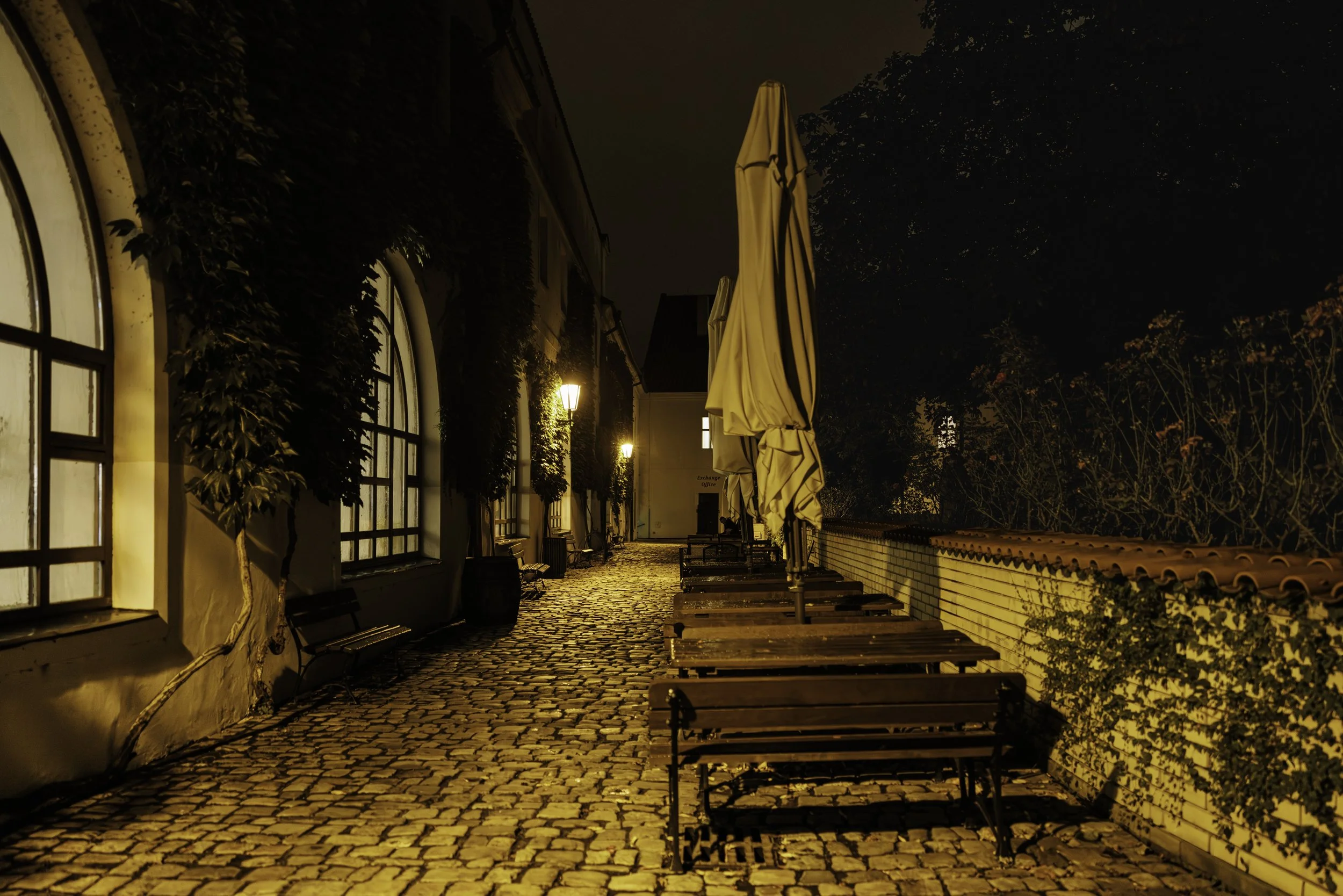
Where the Evening Waited is a contemplative study of atmosphere, memory, and the quiet intervals that exist between departure and return. Photographed in Prague after the day's activity had faded into evening, the image transforms an empty café terrace into a meditation on presence through absence. Rows of vacant tables, folded umbrellas, glowing streetlamps, and rain-darkened cobblestones combine to create a scene suspended between the end of one day and the beginning of the next. Drawing inspiration from the cinematic urban sensibilities of Wim Wenders and the luminous restraint of Ernst Haas, the photograph explores how light and place can evoke emotion long after people have disappeared from view.
Rather than focusing on Prague's celebrated landmarks, the composition invites attention toward a quieter and more intimate side of the city. The folded umbrellas stand like silent figures waiting in the darkness, while warm pools of lamplight guide the viewer through the narrow passageway toward a distant glow. The interplay between illuminated architecture, deep shadow, and reflective cobblestone textures creates a sense of anticipation and stillness. The resulting atmosphere is cinematic, contemplative, and timeless—an image less concerned with documenting a location than with capturing a fleeting emotional experience.
The photograph explores a recurring theme found throughout Robert Niemeier's work: the spaces people leave behind and the traces of human presence that remain. Empty tables suggest conversations already finished, while the illuminated windows and distant light hint at stories continuing beyond the frame. The image becomes an invitation to slow down and inhabit a moment that might otherwise pass unnoticed, revealing the quiet beauty found in ordinary places after the crowds have gone.
Design & Styling
The empty tables, folded umbrellas, and glowing streetlamps of Where the Evening Waited suit restaurants, cafés, bars, and dining rooms, where its quiet absence becomes a conversation piece. Low, warm lighting suits it best.
Curated Pairings
To create a cohesive gallery wall around atmosphere, urban texture, and implied human presence, consider these companion pieces:
For tonal harmony: Pair with Before the City Wakes, continuing the exploration of Prague through quiet streets, atmospheric light, and moments of stillness before the city fully awakens.
For narrative resonance: Complement this piece with The Bartender's Measure (Noir), extending the story of places shaped by human presence and the mood that lingers after the moment has passed.
For emotional continuity: Pair with Waiting for a Ride, which shares the same cinematic pacing and contemplative urban atmosphere with a more direct human element.
Fine Art Presentation
Available as a signed fine art print on ChromaLuxe® Metal (gloss, semi-gloss, or matte), Glossy Anti-Glare Acrylic (TruLife), canvas, wood, and archival paper (framed or unframed). Framed archival paper is the recommended presentation: its matte surface suits the quiet, rain-darkened scene and its rich tonal transitions. Acrylic is the alternative for the glow of the streetlamps, and ChromaLuxe® Metal for the crispest cobblestone texture.
Note: Custom and oversized photographic prints are available. Please contact the studio directly to discuss custom framing, matting, or specialized museum glass options.
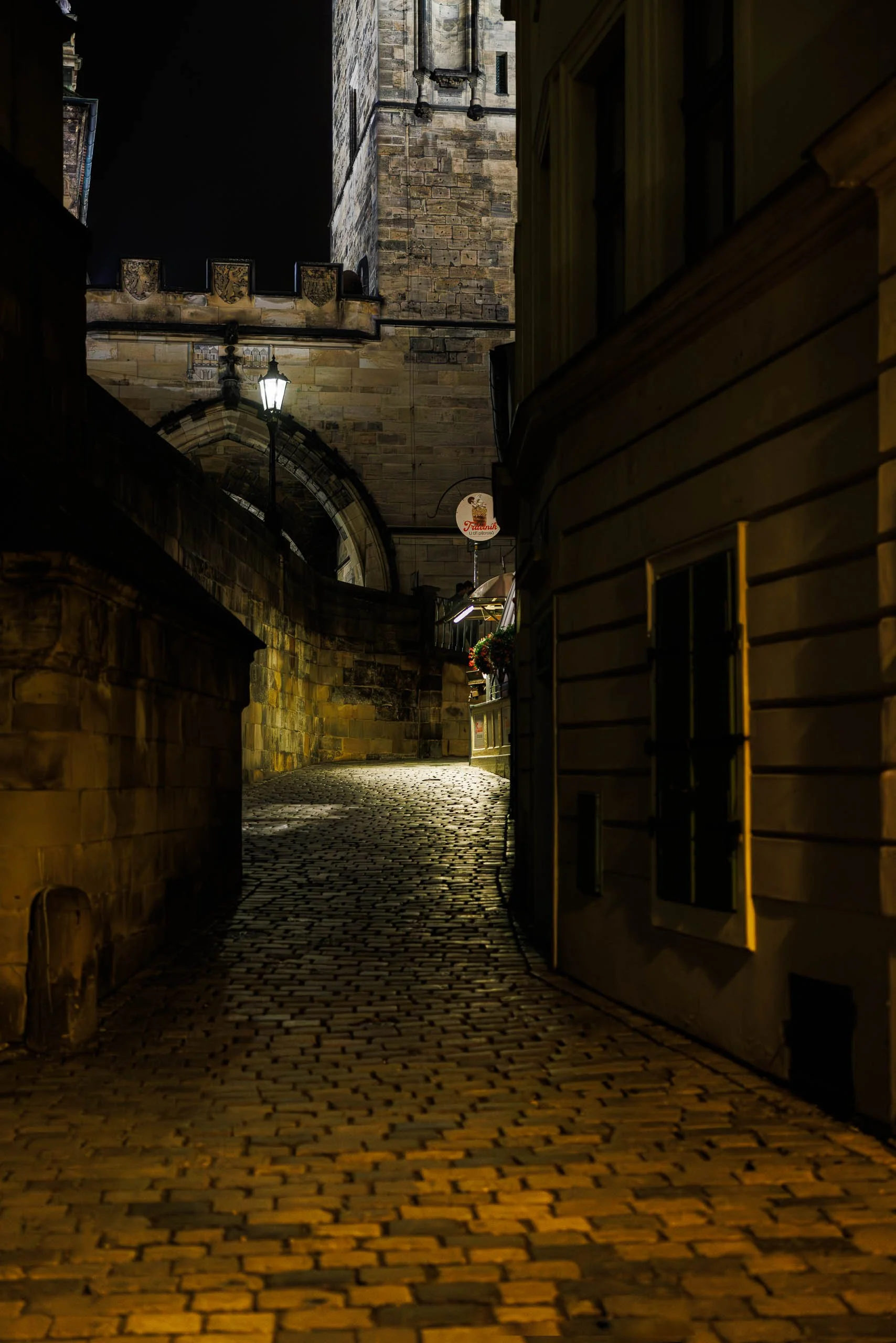
Around the Corner explores one of Prague's quieter passages, where history, light, and everyday life meet in unexpected ways. Photographed late at night beneath one of the city's medieval towers, the image follows a winding cobblestone lane illuminated by warm storefront light and a solitary streetlamp.
The composition is built around suggestion rather than revelation. The alley curves gently out of sight, inviting the viewer to continue forward while withholding what lies beyond. Ancient stone walls and weathered architecture create a sense of permanence, while the warm glow spilling across the cobblestones hints at the life of the city continuing just beyond the frame.
Rather than focusing on Prague's famous landmarks, the photograph explores the spaces between them—the overlooked streets, side passages, and quiet corners that reveal the city's character through atmosphere and discovery. The absence of people becomes part of the narrative. Human presence is felt through light, architecture, and traces of activity, allowing viewers to imagine their own story unfolding around the bend.
Drawing inspiration from the contemplative urban photography of Wim Wenders and the quiet observational approach found throughout European street photography, Around the Corner reflects on curiosity, memory, and the invitation to wander without a destination.
Design & Styling
Built on suggestion rather than revelation, Around the Corner suits reading rooms, hallways, wine rooms, boutique hotels, and studies where a winding, lantern-lit lane invites a second look. Its warm storefront glow works best on deep wall colors.
Curated Pairings
To build a wall around Prague after dark, consider these companion pieces:
For Prague after dark: Pair with Under the Crossing — Prague, exploring the city at night through architecture, atmosphere, and human presence.
For quiet anticipation: Complement with Before the City Wakes, the city in a moment of quiet anticipation before the day's activity begins.
For unhurried movement: Pair with A Walk Beside the River, continuing the themes of movement, place, and observation within Prague's historic streets.
Fine Art Presentation
Available as a signed fine art print on ChromaLuxe® Metal (gloss, semi-gloss, or matte), Glossy Anti-Glare Acrylic (TruLife), canvas, wood, and archival paper (framed or unframed). Acrylic is the recommended presentation: its depth suits a dark lane lit by warm storefronts and a single streetlamp, letting the glow seem to come from within the print. Framed archival paper is the alternative for a quieter, more tactile reading of the cobblestones and stone walls.
Note: Custom and oversized photographic prints are available. Please contact the studio directly to discuss custom framing, matting, or specialized museum glass options.
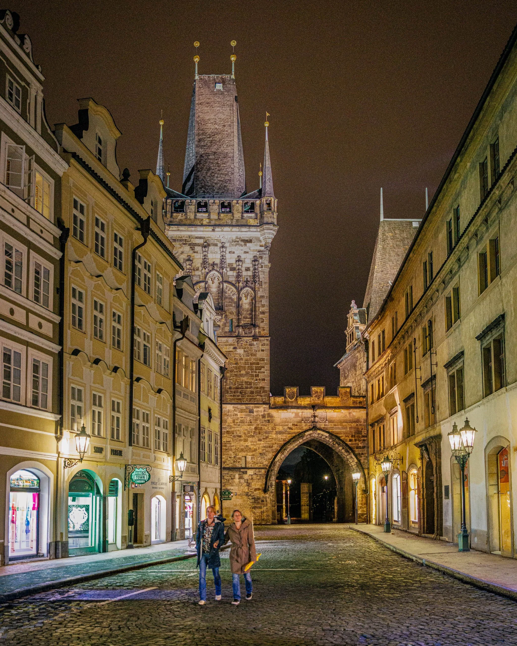
Under the Old Gate explores the quieter character of Prague after dark, when the city's celebrated landmarks become part of everyday life rather than destinations. Photographed beneath the Old Town Bridge Tower on a damp autumn evening, the image captures two figures walking through a street framed by centuries of architecture, warm lantern light, and rain-darkened cobblestones.
The photograph is built upon contrast. Ancient stone meets modern life. Warm light meets the darkness of night. Monumental architecture meets the small, fleeting presence of people moving through the city. The tower dominates the composition, rising above the street as it has for centuries, while the two figures provide scale and remind us that even the most historic places remain lived-in and continually changing.
The warm glow of storefronts and street lamps softens the scene, creating an atmosphere that feels both intimate and timeless. Rather than presenting Prague as a collection of famous landmarks, the image focuses on a moment of passage—a brief encounter between people and place. The wet cobblestones reflect the surrounding light, drawing the eye toward the gateway while reinforcing the sense of a city experienced through movement rather than observation alone.
Drawing inspiration from the atmospheric urban photography of Wim Wenders and the narrative sensibilities of Edward Hopper, Under the Old Gate reflects on the relationship between history, memory, and everyday experience. It invites viewers to imagine themselves walking these streets after the crowds have faded, when Prague reveals a quieter and more personal side of its character.
Design & Styling
With its lantern light, rain-dark cobblestones, and two figures walking through centuries of stone, Under the Old Gate suits wine rooms, restaurants, boutique hotels, and studies that want warmth and a sense of history. It reads well on deep, warm wall colors.
Curated Pairings
To create a cohesive gallery wall around Prague after dark, consider these companion pieces:
For Prague in solitude: Pair with Before the City Wakes, exploring the city through solitude, atmosphere, and early morning light.
For history and remembrance: Complement with Where Memory Waits, reflecting on history, remembrance, and human presence within Prague's historic spaces.
For memory and contemporary life: Pair with The Weight of Names, the intersection of memory, place, and contemporary life in Prague's Jewish Quarter.
Fine Art Presentation
Available as a signed fine art print on ChromaLuxe® Metal (gloss, semi-gloss, or matte), Glossy Anti-Glare Acrylic (TruLife), canvas, wood, and archival paper (framed or unframed). Framed archival paper is the recommended presentation: its soft matte surface suits the warm evening tones and the subtle transitions of lantern light on wet stone. Acrylic is the alternative for a deeper, glowing read of the lanterns.
Note: Custom and oversized photographic prints are available. Please contact the studio directly to discuss custom framing, matting, or specialized museum glass options.
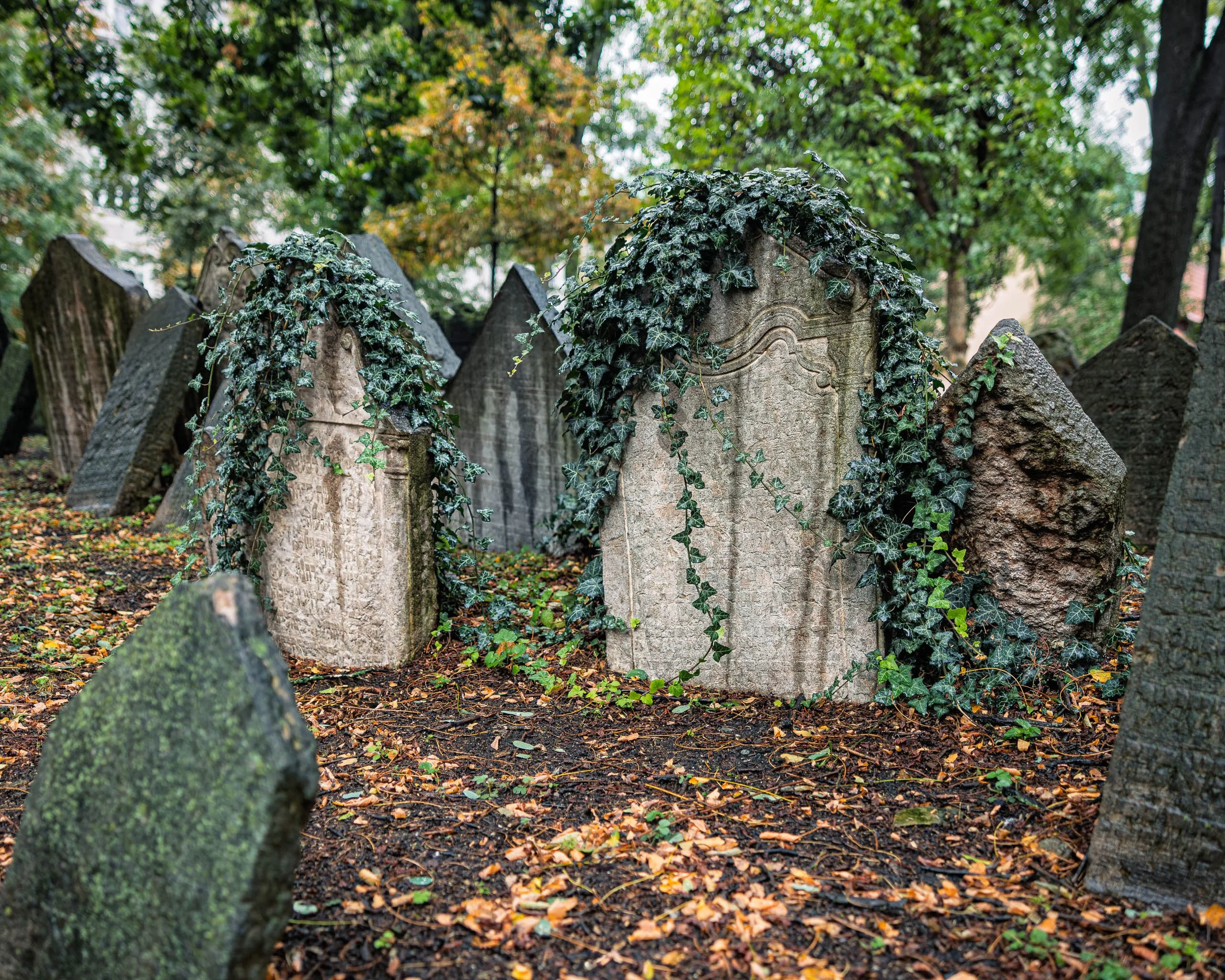
What the Ivy Remembers explores the relationship between memory, time, and the quiet persistence of nature. Photographed in Prague's historic Old Jewish Cemetery, the image centers on two weathered gravestones draped in ivy, their surfaces softened by centuries of rain, seasons, and remembrance.
The cemetery is one of Prague's most historically significant places. Generations were buried within its limited boundaries, creating a landscape unlike any other, where stones lean, overlap, and emerge from the earth in layered testimony to lives once lived. Rather than focusing on the scale of the cemetery, this photograph narrows its attention to a more intimate moment: ivy slowly reclaiming the markers while preserving their presence.
The composition is built around contrast. Stone meets living vine. Human memory meets the natural world. The weathered inscriptions fade while the ivy continues to grow, creating a visual meditation on endurance and renewal. The muted palette and soft light emphasize texture and atmosphere, encouraging a slower, more contemplative viewing experience.
Influenced by the poetic urban landscapes of Josef Sudek and the quiet observational approach of Wim Wenders, What the Ivy Remembers reflects on how places carry history long after individual stories have faded from view.
Design & Styling
With its subdued palette, rich textures, and contemplative mood, What the Ivy Remembers works especially well in libraries, studies, executive offices, hospitality environments, boutique hotels, historic properties, and residential spaces designed around reflection and calm. The image brings a sense of history and quiet permanence without overwhelming a space.
Curated Pairings
To create a cohesive gallery wall around memory and time, consider these companion pieces:
For a shared meditation on remembrance: Pair with Among the Names - Monotone, a meditation on memory and remembrance within Prague's Jewish Quarter.
For collective memory: Complement with Shoes on the Danube, exploring history, absence, and collective memory in Budapest.
For folklore in the same quarter: Pair with Golem Watches Over Her, blending folklore, history, and contemporary life in Prague.
Fine Art Presentation
Available as a signed fine art print on ChromaLuxe® Metal (gloss, semi-gloss, or matte), Glossy Anti-Glare Acrylic (TruLife), canvas, wood, and archival paper (framed or unframed). Framed archival paper is the recommended presentation: its matte surface suits the muted palette, the centuries-old stone texture, and the quiet Sudek-like mood. ChromaLuxe® Metal is the alternative for crisper detail in the ivy and the fading inscriptions.
Note: Custom and oversized photographic prints are available. Please contact the studio directly to discuss custom framing, matting, or specialized museum glass options.
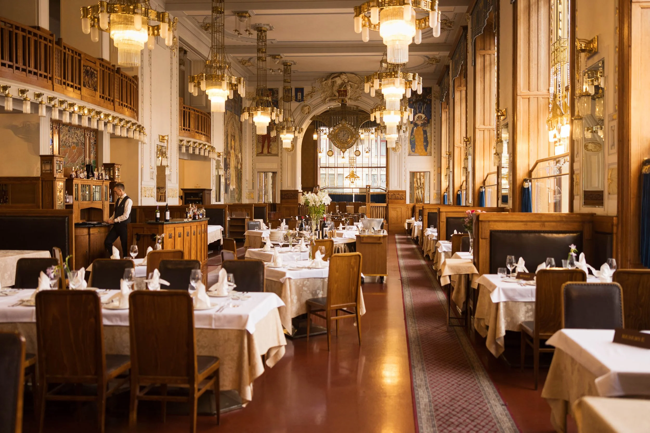
Before the Evening Rush explores a moment of quiet anticipation inside one of Prague's grand Art Nouveau dining rooms. Photographed shortly before service, the image captures the calm that exists between preparation and arrival, when the tables are set, the lights glow warmly overhead, and the room waits for the evening to begin.
The photograph is built upon rhythm and repetition. Chandeliers recede into the distance, table settings create visual structure, and rich woodwork frames the scene with warmth and elegance. At the edge of the composition, a lone waiter prepares for service, providing a subtle human presence that transforms the image from an architectural study into a narrative about hospitality, routine, and anticipation.
The warm tones and intricate craftsmanship celebrate a period when architecture, design, and public spaces were created with extraordinary attention to detail. Rather than focusing on a specific landmark, the photograph invites viewers to experience the atmosphere of a place where history remains woven into everyday life.
Drawing inspiration from the observational photography of Wim Wenders and the quiet narrative tradition of Edward Hopper, Before the Evening Rush reflects on the moments that exist just before activity begins, when a space seems to hold its breath in anticipation.
Design & Styling
With its receding chandeliers, set tables, and rich woodwork, Before the Evening Rush is a natural fit for restaurants, hotel dining rooms, wine rooms, and residences with a formal dining space. The warm, ordered rhythm suits paneled or deep-toned walls.
Curated Pairings
To build a wall around Prague's interiors and quiet anticipation, consider these companion pieces:
For Prague and quiet human presence: Pair with A Walk Beside the River, exploring the city through atmosphere, architecture, and quiet human presence.
For old and new: Complement with Between Eras, the dialogue between historic and contemporary architecture in the heart of Prague.
For the character of the city: Pair with Under the Crossing — Prague, continuing the exploration of place, movement, and the character of Prague.
Fine Art Presentation
Available as a signed fine art print on ChromaLuxe® Metal (gloss, semi-gloss, or matte), Glossy Anti-Glare Acrylic (TruLife), canvas, wood, and archival paper (framed or unframed). Framed canvas is the recommended presentation: its warmth and texture suit an Art Nouveau interior of woodwork and chandeliers. ChromaLuxe® Metal is the alternative for the glow of the lights at full intensity, and framed archival paper gives a more traditional, restaurant-gallery read.
Note: Custom and oversized photographic prints are available. Please contact the studio directly to discuss custom framing, matting, or specialized museum glass options.

A Walk Beside the River explores the quieter side of Prague, where daily life unfolds beneath the city's celebrated architecture. Photographed along the banks of the Vltava River on an overcast autumn morning, the image draws the eye toward the National Theatre while two pedestrians move through the scene at an unhurried pace.
The photograph is built upon balance. Water meets stone. Architecture meets landscape. History meets the ordinary rhythms of contemporary life. The river creates a natural pathway through the composition, guiding the viewer toward the theater while trees, benches, and embankments provide structure and stillness. The human figures remain small within the frame, yet they become essential to its narrative, offering scale and reminding us that cities are experienced one step at a time.
The subdued light and restrained palette emphasize atmosphere over spectacle. Rather than presenting Prague as a collection of landmarks, the image focuses on a moment of observation—a quiet passage through a city whose character is revealed as much in its everyday spaces as in its famous destinations.
Drawing inspiration from the contemplative urban photography of Wim Wenders, A Walk Beside the River reflects on the relationship between place, memory, and movement. It invites viewers to slow down and notice the moments that often become our most enduring travel memories.
Design & Styling
The muted autumn mood and unhurried rhythm of A Walk Beside the River suit living rooms, dining rooms, offices, and hospitality spaces that want a calm view of daily life beneath a great landmark. Pale walls and natural wood bring out its soft stone, water, and sky tones.
Curated Pairings
To build a wall around Prague's quieter side, consider these companion pieces:
For Prague in solitude: Pair with Before the City Wakes, exploring the city through solitude, atmosphere, and early morning light.
For architecture and human presence: Complement with Under the Crossing — Prague, continuing the relationship between architecture, human presence, and the rhythm of the city.
For old and new: Pair with Between Eras, the conversation between Prague's historic architecture and modern design.
Fine Art Presentation
Available as a signed fine art print on ChromaLuxe® Metal (gloss, semi-gloss, or matte), Glossy Anti-Glare Acrylic (TruLife), canvas, wood, and archival paper (framed or unframed). Framed archival paper is the recommended presentation: its matte, tactile surface preserves the subtle tonal transitions of the overcast river light and the stonework. ChromaLuxe® Metal is the alternative for crisper architectural detail.
Note: Custom and oversized photographic prints are available. Please contact the studio directly to discuss custom framing, matting, or specialized museum glass options.
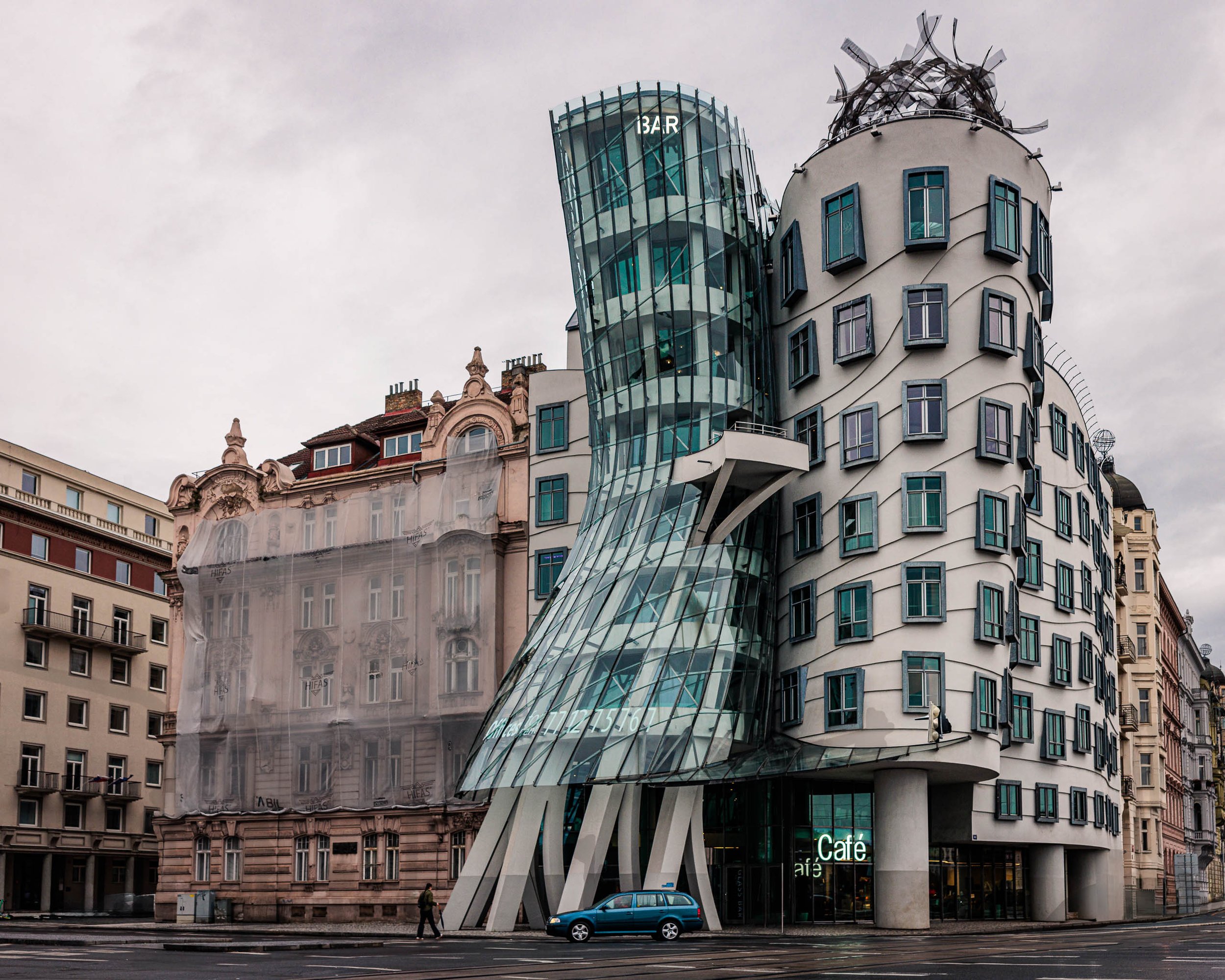
Between Eras explores the dialogue between historic and contemporary architecture in the heart of Prague. Photographed on a quiet, overcast morning, the image pairs the flowing curves of the iconic Dancing House with the ornate façade of a neighboring nineteenth-century building, creating a visual conversation between tradition and innovation.
The photograph is built upon contrast. Glass meets stone. Movement meets permanence. Organic curves rise beside classical ornamentation. Together the structures reflect Prague's unique ability to embrace change while preserving its architectural heritage. Rather than presenting the Dancing House as an isolated landmark, the image places it within the broader context of the city, revealing how modern design becomes part of an evolving urban landscape.
The subdued light and restrained color palette emphasize form, texture, and geometry. The overcast sky removes distraction and allows the eye to focus on the relationship between the buildings themselves. What emerges is less a photograph of a famous structure and more a study of how cities absorb new ideas while remaining connected to their past.
Drawing inspiration from the observational urban photography of Wim Wenders, Between Eras reflects on architecture not merely as design, but as a visible record of cultural change and continuity.
Design & Styling
The conversation between glass and ornamented stone in Between Eras suits architecture and design offices, hotel lobbies, contemporary residences, and executive spaces that value the dialogue between old and new. Its muted, overcast palette sits comfortably in neutral, modern rooms.
Curated Pairings
To build a wall around Prague's architecture, consider these companion pieces:
For history and change: Pair with A Measure of Change, Prague's evolving history through the Metronome and the passage of time.
For weather and architecture: Complement with When the City Held Its Breath, Prague architecture beneath dramatic weather and atmospheric light.
For urban form: Pair with Reflections of Glass and Stone, continuing the theme of urban form, structure, and visual rhythm.
For bridges and riverfront: Add Under the Crossing — Prague, extending the exploration of architecture and place through Prague's historic bridges and riverfront.
Fine Art Presentation
Available as a signed fine art print on ChromaLuxe® Metal (gloss, semi-gloss, or matte), Glossy Anti-Glare Acrylic (TruLife), canvas, wood, and archival paper (framed or unframed). Framed archival paper is the recommended presentation: its matte surface preserves the subtle tonal transitions and muted palette of an overcast morning. ChromaLuxe® Metal is the alternative for sharper glass reflections and stone detail.
Note: Custom and oversized photographic prints are available. Please contact the studio directly to discuss custom framing, matting, or specialized museum glass options.

A Measure of Change is a study of history, memory, and the passage of time. Photographed at Prague's Metronome overlooking the city, the image explores a place where political history, public space, and personal reflection intersect. Rendered in black and white beneath a sky filled with shifting clouds, the photograph emphasizes form, atmosphere, and the quiet tension between permanence and change.
The composition is anchored by the angular geometry of the Metronome itself, its long arm extending diagonally into the sky above Prague. Beneath it, layers of clouds move across the horizon while the city recedes into the distance. The structure appears simultaneously mechanical and symbolic—part instrument, part monument—marking the passage of time while standing on a site deeply connected to the changing history of the Czech Republic.
The Metronome occupies the location once dominated by the largest Stalin monument in Europe. After the fall of Communism, the monument was removed and the Metronome installed as a symbol of transformation, memory, and renewal. The photograph embraces that layered history while allowing the structure to function as a broader meditation on change itself.
Drawing inspiration from the contemplative visual language of Hiroshi Sugimoto and the atmospheric observations of Wim Wenders, the image invites viewers to consider the relationship between history, place, and the passage of time.
Design & Styling
With its angular geometry, drifting clouds, and monochrome restraint, A Measure of Change suits studies, libraries, executive offices, and boutique hotel corridors that welcome history and quiet reflection. The Metronome's long diagonal arm gives a large wall a strong line, and the soft gray sky keeps the piece calm beside wood, leather, and books.
Curated Pairings
To build a wall around Prague, history, and the built environment, consider these companion pieces:
For Prague in weather: Pair with When the City Held Its Breath, Prague beneath approaching storm clouds, the same tension between permanence and change.
For architecture and passage: Complement with Under the Crossing — Prague, extending the relationship between architecture, movement, and the passage of time.
For structure and memory: Pair with Reflections of Glass and Stone, continuing the exploration of structure, memory, and the built environment.
Fine Art Presentation
Available as a signed fine art print on ChromaLuxe® Metal (gloss, semi-gloss, or matte), Glossy Anti-Glare Acrylic (TruLife), canvas, wood, and archival paper (framed or unframed). Framed archival paper is the recommended presentation: its matte surface preserves the tonal subtlety of the shifting clouds and the fine detail of the Metronome's structure. ChromaLuxe® Metal is the alternative for a crisper, more graphic black and white.
Note: Custom and oversized photographic prints are available. Please contact the studio directly to discuss custom framing, matting, or specialized museum glass options.

Between Storm and Evening is an atmospheric study of weather, light, and the fleeting moments that transform a familiar city into something extraordinary. Photographed along Prague's Vltava River as a summer storm moved through the city, the image captures a brief rainbow emerging from a sky still heavy with rain while evening light illuminated the historic architecture below.
The composition is anchored by a band of soft color descending from the clouds toward the city, creating a visual connection between sky, river, and architecture. The warm tones of the rainbow echo the fading sunlight reflected across the rooftops and facades, while the darker water and storm-softened sky preserve the sense of weather still lingering over the scene. Rather than presenting Prague as a collection of landmarks, the photograph focuses on atmosphere and transition—the quiet interval between rainfall and nightfall when the city seems suspended between two moods.
Drawing inspiration from the color sensibilities of Ernst Haas and the observational approach of Wim Wenders, the image explores the emotional character of place through weather, light, and timing. It is less a photograph of a rainbow than a photograph of a city emerging from a storm.
Design & Styling
The rainbow, the storm-heavy sky, and evening light on historic rooftops give Between Storm and Evening an optimistic drama suited to living rooms, hotel lobbies, offices, and dining rooms. A pale wall lets the band of color read as the room's single bright note.
Curated Pairings
To build a wall around Prague, weather, and reflected light, consider these companion pieces:
For Prague in weather: Pair with When the City Held Its Breath, the same setting and weather-driven atmosphere, the city beneath approaching storm clouds.
For rain and early morning: Complement with Before the City Wakes, the contemplative mood of rain, architecture, and early morning discovery.
For water and reflection: Pair with Under the Crossing — Prague, extending the themes of water, reflection, and weather in the urban environment.
For structure and light: Add Reflections of Glass and Stone, pairing through its emphasis on structure, light, and visual rhythm within the city.
Fine Art Presentation
Available as a signed fine art print on ChromaLuxe® Metal (gloss, semi-gloss, or matte), Glossy Anti-Glare Acrylic (TruLife), canvas, wood, and archival paper (framed or unframed). ChromaLuxe® Metal is the recommended presentation: it holds the subtle color transitions in the sky and the rainbow while keeping detail through the architecture. Acrylic is the alternative for a luminous, deeper read of the evening light on the rooftops.
Note: Custom and oversized photographic prints are available. Please contact the studio directly to discuss custom framing, matting, or specialized museum glass options.
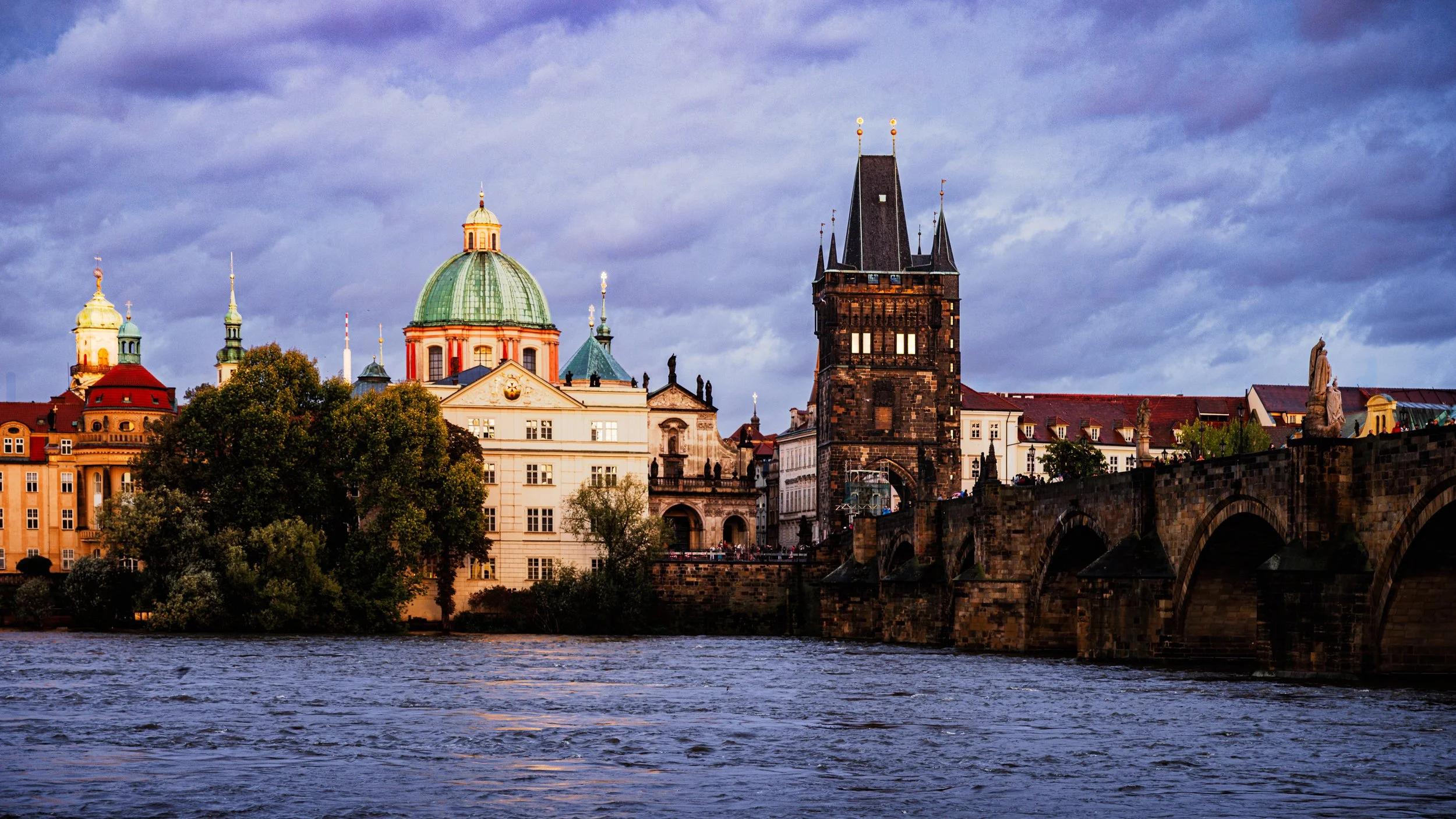
When the City Held Its Breath is an atmospheric study of light, weather, and architectural presence along Prague's historic Vltava River. Captured as a storm moved across the city at evening, the photograph records the brief interval when warm sunlight illuminated centuries-old domes, rooftops, and stonework while dark clouds gathered overhead.
The composition is anchored by the Gothic tower of Charles Bridge, whose dark silhouette rises against a sky filled with shifting weather. To its left, the illuminated dome and facades glow with the final warmth of the day, creating a visual tension between light and shadow, permanence and change. The river provides a quiet foreground rhythm, reflecting the subdued colors of the approaching storm and reinforcing the sense of anticipation that defines the scene.
Drawing inspiration from the atmospheric sensibilities of Ernst Haas and the cinematic observations of Wim Wenders, the photograph explores Prague not as a destination, but as an experience. Rather than focusing on landmarks alone, the image captures a fleeting emotional moment when the city seemed suspended between sunlight and rain, movement and stillness.
Design & Styling
The warm light on domes and rooftops beneath a darkening sky gives When the City Held Its Breath dramatic depth for lobbies, executive offices, dining rooms, and residences. Its contrast of gold and storm gray holds a large wall from across a room.
Curated Pairings
To create a cohesive gallery wall around Prague and weather, consider these companion pieces:
For the same setting and weather: Pair with Before the City Wakes, sharing the Prague setting and the focus on weather, light, and quiet discovery.
For water and reflection: Complement with Under the Crossing — Prague, continuing the themes of water, reflection, and urban stillness.
For structure and light: Pair with Reflections of Glass and Stone, extending the exploration of structure, light, and visual rhythm in the built environment.
For time and place: Add Inside the Hour, pairing through its focus on historic architecture, time, and the emotional character of place.
Fine Art Presentation
Available as a signed fine art print on ChromaLuxe® Metal (gloss, semi-gloss, or matte), Glossy Anti-Glare Acrylic (TruLife), canvas, wood, and archival paper (framed or unframed). ChromaLuxe® Metal is the recommended presentation: it holds the subtle tonal transitions in the storm clouds while keeping the warmth of the sunlit domes and stonework. Acrylic is the alternative for extra depth in the sky.
Note: Custom and oversized photographic prints are available. Please contact the studio directly to discuss custom framing, matting, or specialized museum glass options.
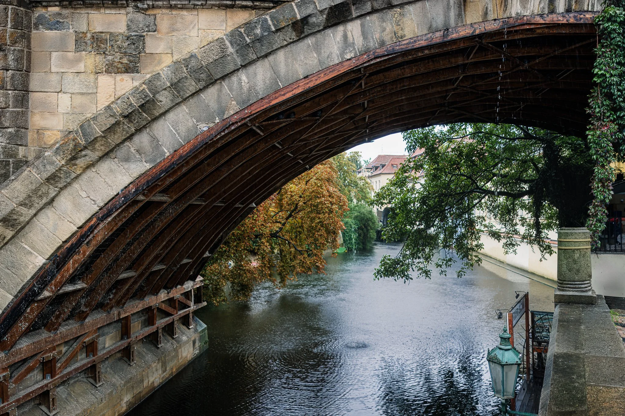
Some structures do their work above your head. What the Arch Carries looks up into a stone arch beside the Čertovka channel in Prague, where a curved lining of dark, rain-wet timber follows the masonry and steady autumn rain falls on the water below.
The composition is built on one long curve. The arch sweeps across the frame from the upper left, its timber ribs echoing the line of the stone, while rain drips from the underside and rings the water below. Through the opening the eye passes to rust and green autumn foliage and red-tiled rooftops along the narrow channel, then drops to the dark, rain-stippled surface. A weathered green lantern at lower right and ivy at the frame's edge add small, quiet notes of color, the kind of detail that rewards a longer look.
Drawing on the atmospheric sensibilities of Ernst Haas and the observational approach of Wim Wenders, the image is less about Prague as a destination than about standing inside the city during an ordinary moment of rain, noticing what the stone and timber above have quietly carried.
Design & Styling
The muted stone, deep-brown timber, and touches of rust and green in What the Arch Carries suit studies, libraries, boutique hotel corridors, restaurants, and homes with natural wood and stone. The strong diagonal of the arch gives a large wall structure, and the quiet color keeps it calm.
Curated Pairings
To create a cohesive gallery wall around Prague in the rain, consider these companion pieces:
For the same rain-soaked atmosphere: Pair with Before the City Wakes, sharing the rain-soaked Prague atmosphere and a quiet sense of discovery.
For the urban narrative: Complement with Streetcar #12, complementing the urban narrative and architectural character of the city.
For structure and reflection: Pair with Reflections of Glass and Stone, extending the theme of structure, reflection, and visual rhythm.
For the same crossing, with a figure: Add Under the Crossing — Prague, a hooded figure pausing beneath a warm sandstone arch: the same theme of stone, water, and shelter, with a person in it.
Fine Art Presentation
Available as a signed fine art print on ChromaLuxe® Metal (gloss, semi-gloss, or matte), Glossy Anti-Glare Acrylic (TruLife), canvas, wood, and archival paper (framed or unframed). Framed archival paper is the recommended presentation: its matte surface preserves the rain textures, the wet timber, and the weathered stone. Framed canvas is the warmer alternative for a living room, and ChromaLuxe® Metal adds crispness to the architectural detail and the rust tones in the foliage.
Note: Custom and oversized photographic prints are available. Please contact the studio directly to discuss custom framing, matting, or specialized museum glass options.
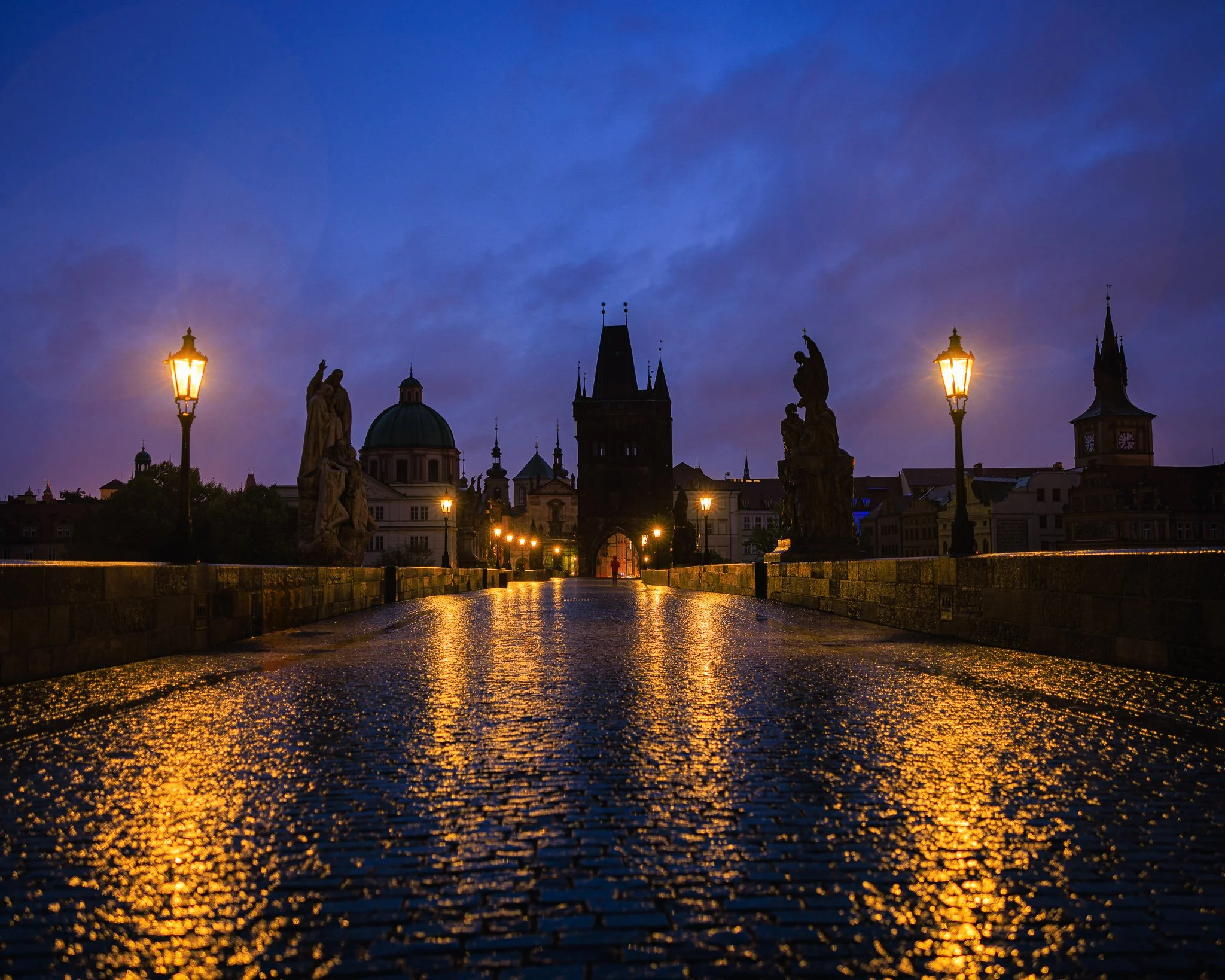
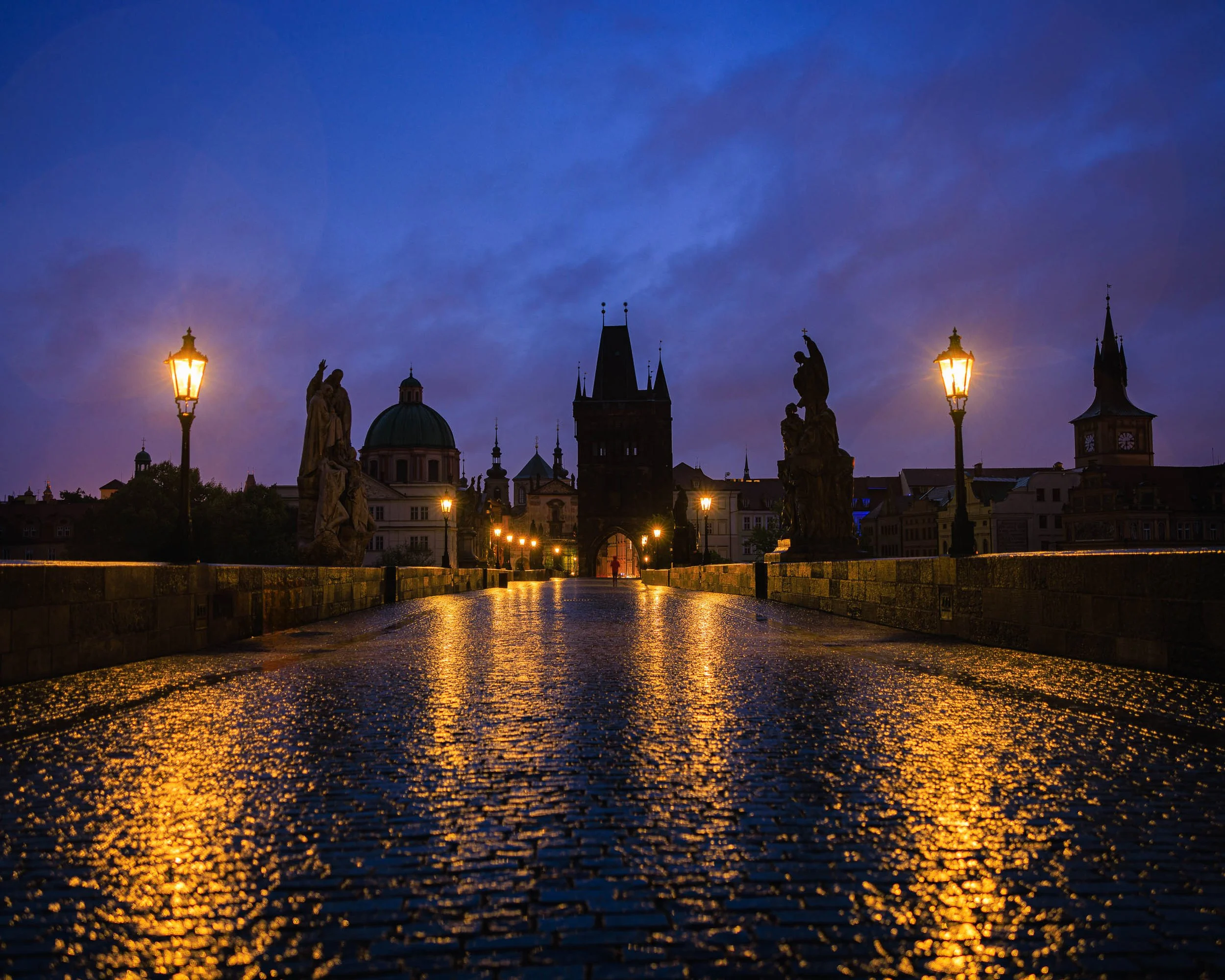
Before the City Wakes is an atmospheric study of solitude, weather, and the fleeting moments that exist between night and morning. Captured before dawn on Prague's historic Charles Bridge during a cold rain, the photograph transforms one of Europe's most visited landmarks into a place of stillness and reflection. Wet cobblestones glow beneath warm lantern light while deep blue clouds drift across the sky. In the distance, a lone figure runs through the ancient archway, creating a quiet narrative within the monumental architecture.
Drawing from the cinematic color sensibilities of Ernst Haas and the contemplative visual storytelling associated with Wim Wenders, the image explores the emotional contrast between permanence and transience. The bridge, statues, and towers have endured for centuries, while the solitary figure appears only for an instant before disappearing into the city beyond.
Rather than documenting a famous destination, the photograph focuses on atmosphere and experience—the cold air, the rain-soaked stones, and the rare moment when one of the world's great public spaces feels entirely your own. The resulting image balances architectural grandeur with human vulnerability, creating a scene defined by light, weather, and quiet anticipation.
Design & Styling
With its dramatic blue and gold palette, reflective wet cobblestones, and strong architectural symmetry, Before the City Wakes suits hospitality lobbies, boutique hotels, executive offices, and refined residences that want European atmosphere without a postcard. The lantern glow against deep blue reads especially well on dark walls.
Curated Pairings
To build a wall around Prague, weather, and solitary human moments, consider these companion pieces:
For complementary Prague atmosphere: Pair with Passing Through Prague, to continue the visual narrative of weather, architecture, and solitary human moments within the city.
For urban evening contrast: Complement this piece with After the City Settles, creating a visual conversation between Prague before dawn and Prague after dark.
For the same bridge district: Pair with Under the Old Gate, Prague after dark beneath the Old Town Bridge Tower on a damp autumn evening, when landmarks become part of everyday life.
Fine Art Presentation
Available as a signed fine art print on ChromaLuxe® Metal (gloss, semi-gloss, or matte), Glossy Anti-Glare Acrylic (TruLife), canvas, wood, and archival paper (framed or unframed). ChromaLuxe® Metal is the recommended presentation: it holds the rich blue tones, the lantern-lit gold, and the fine architectural detail. Acrylic is the alternative for the glow on the wet cobblestones, and framed archival paper gives a quieter, more painterly reading of the rain and mist.
Note: Custom and oversized photographic prints are available. Please contact the studio directly to discuss custom framing, matting, or specialized museum glass options.
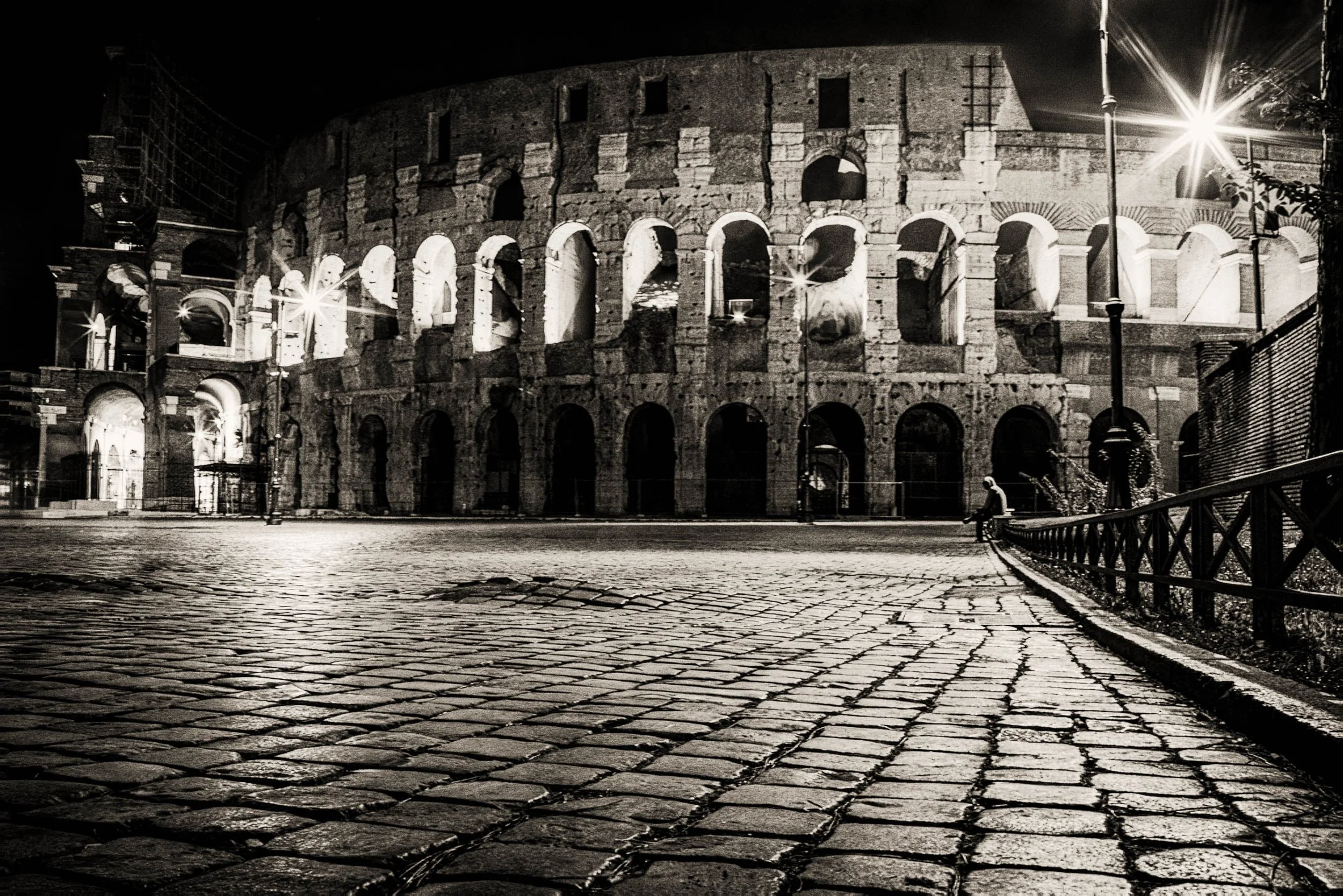
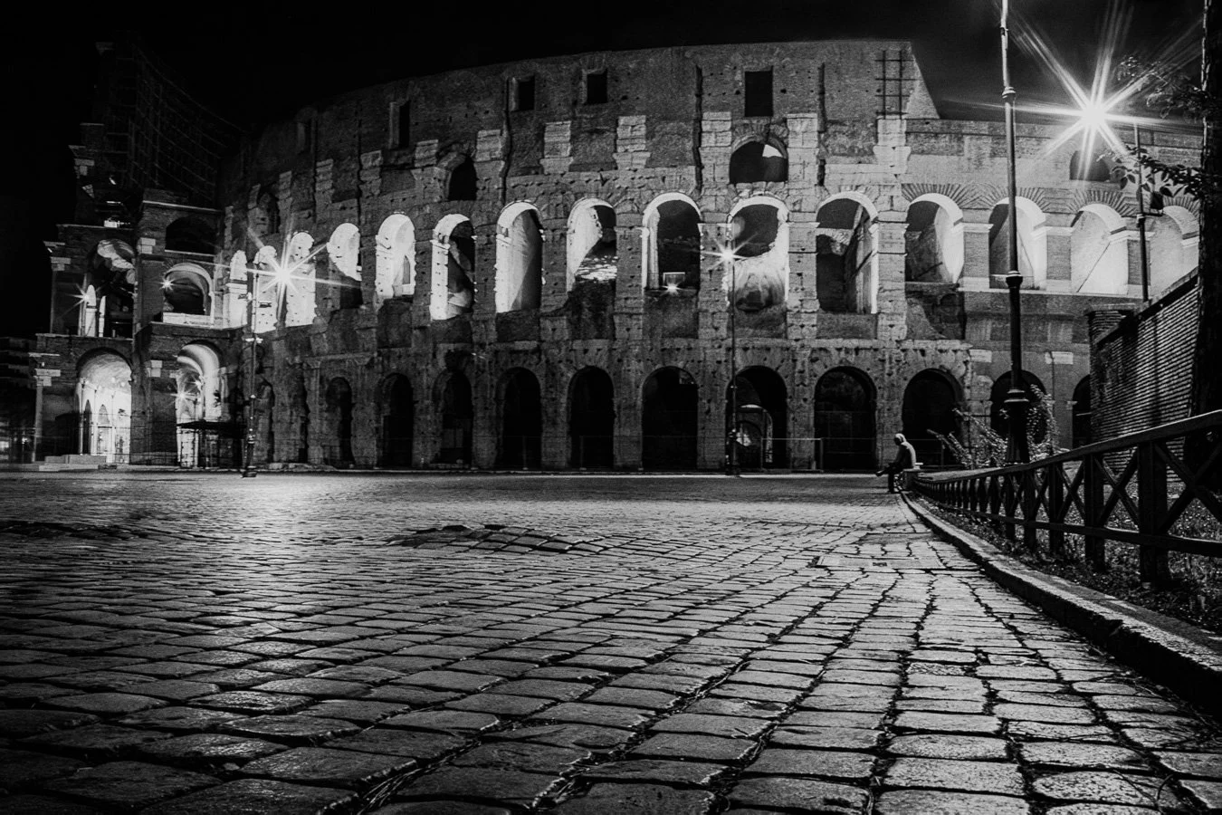
Night Watch (Noir) is a cinematic nighttime photograph captured in front of the Colosseum in Rome, exploring solitude, memory, and the quiet emotional tension that emerges within historic spaces after dark. A solitary mysterious figure stands beneath layered evening light and deep architectural shadow as the illuminated structure of the ancient Colosseum rises behind them, transforming the scene into a contemplative study of scale, silence, and human presence within monumental history. Drawing from the restrained cinematic pacing of Wim Wenders and the atmospheric realism of nocturnal urban photography, the image emphasizes mystery, stillness, and emotional narrative over literal documentation.
The composition balances the immense architectural weight of the Colosseum against the isolated human figure, allowing the photograph to function simultaneously as cityscape, narrative portrait, and atmospheric historical study. Rather than focusing on tourism or spectacle, the image explores the emotional quiet and psychological tension created when ancient architecture, shadow, and solitary presence briefly converge within the nighttime streets of Rome.
Design & Styling
With its restrained nighttime palette, layered architectural shadows, and cinematic urban atmosphere, Night Watch (Noir) works especially well in hospitality interiors, contemporary residential spaces, boutique hotel environments, offices, and collector-focused gallery settings. The image introduces sophistication, narrative tension, and contemplative atmosphere while maintaining a refined visual structure suited for thoughtfully designed interiors.
Curated Pairings
To create a cohesive gallery presentation, consider these companion pieces from the Color & Atmosphere and Lines of Quiet Architecture collections that share the same emphasis on atmosphere, urban solitude, and cinematic pacing:
For complementary architectural atmosphere: Pair with Crowned in Light to extend the relationship between illuminated architecture, layered night atmosphere, and contemplative urban space.
For tonal continuity and narrative pacing: Complement this piece with The Bartender’s Measure, which shares the same cinematic stillness and quiet emotional ambiguity found throughout the collection.
Fine Art Presentation
Available as a signed fine art print in ChromaLuxe® Metal (gloss, semi-gloss, or matte), framed paper, framed canvas, and acrylic presentation formats. To preserve the layered architectural shadows, luminous night detail, and cinematic tonal atmosphere, Satin Metal or Acrylic presentation is especially recommended.
Note: Custom and oversized photographic prints are available. Please contact the studio directly to discuss custom framing, matting, or specialized museum glass options.
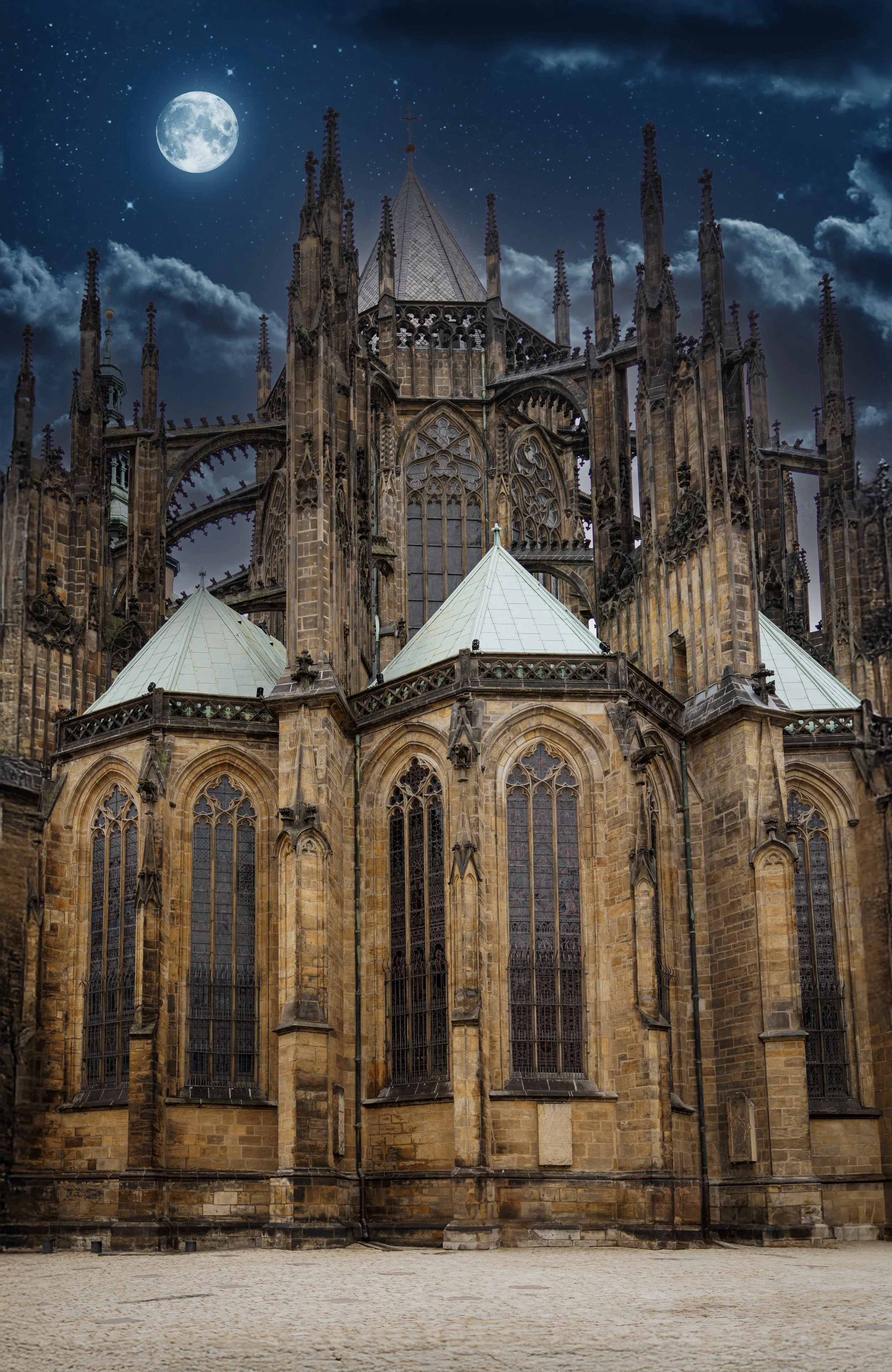
Cathedral Beneath the Moon is a cinematic study of permanence, silence, and the emotional architecture of night. Captured in Vienna, Austria beneath a luminous moonlit sky, this Gothic cathedral rises through layered clouds and deep cobalt tones, transforming the historic structure into an atmosphere of mystery and reverence. Drawing from the visual language of classic European cinema and the painterly nocturnal sensibilities of Ernst Haas and Wim Wenders, the image explores the tension between human craftsmanship and the timeless scale of the night sky.
The intricate Gothic spires and weathered stonework are balanced against the softness of drifting clouds and distant stars, allowing the cathedral to feel both monumental and fragile. Rather than functioning purely as architectural documentation, the image becomes an emotional meditation on solitude, history, and the enduring presence of sacred spaces within modern life
Moonlight is a quiet source: it reveals form more than color, and it flattens a scene into a few deep values. That suits Gothic architecture, which is built to draw the eye upward. Against a cobalt sky the spires do exactly that, and the layered clouds give the stone a slow, atmospheric backdrop.
Design & Styling
With its deep cobalt sky and moonlit Gothic spires, Cathedral Beneath the Moon suits libraries, studies, hotel lounges, cocktail bars, and residences that want a quiet, cinematic night mood. Deep blue or charcoal walls deepen the effect.
Curated Pairings
To build a wall around night, architecture, and cinematic stillness, consider these companion pieces:
For tonal harmony: Pair with Night Watch at the Colosseum (Monotone), to continue the dialogue between historic architecture and dramatic evening light.
For deep cobalt: Complement this piece with Where Sisters Rise, where a deep cobalt sky sits over terracotta sandstone, a very different landscape with the same rich blue.
For Gothic architecture from inside: Pair with The Gothic Sentinel, the soaring vertical forms and luminous light of a historic Prague church interior.
Fine Art Presentation
Available as a signed fine art print on ChromaLuxe® Metal (gloss, semi-gloss, or matte), Glossy Anti-Glare Acrylic (TruLife), canvas, wood, and archival paper (framed or unframed). Acrylic is the recommended presentation: its depth and luminosity suit a moonlit sky in deep cobalt tones and the fine Gothic detail rising through the clouds. ChromaLuxe® Metal is the alternative for crisper spires, and framed archival paper for a quieter, more painterly night.
Note: Custom and oversized photographic prints are available. Please contact the studio directly to discuss custom framing, matting, or specialized museum glass options.
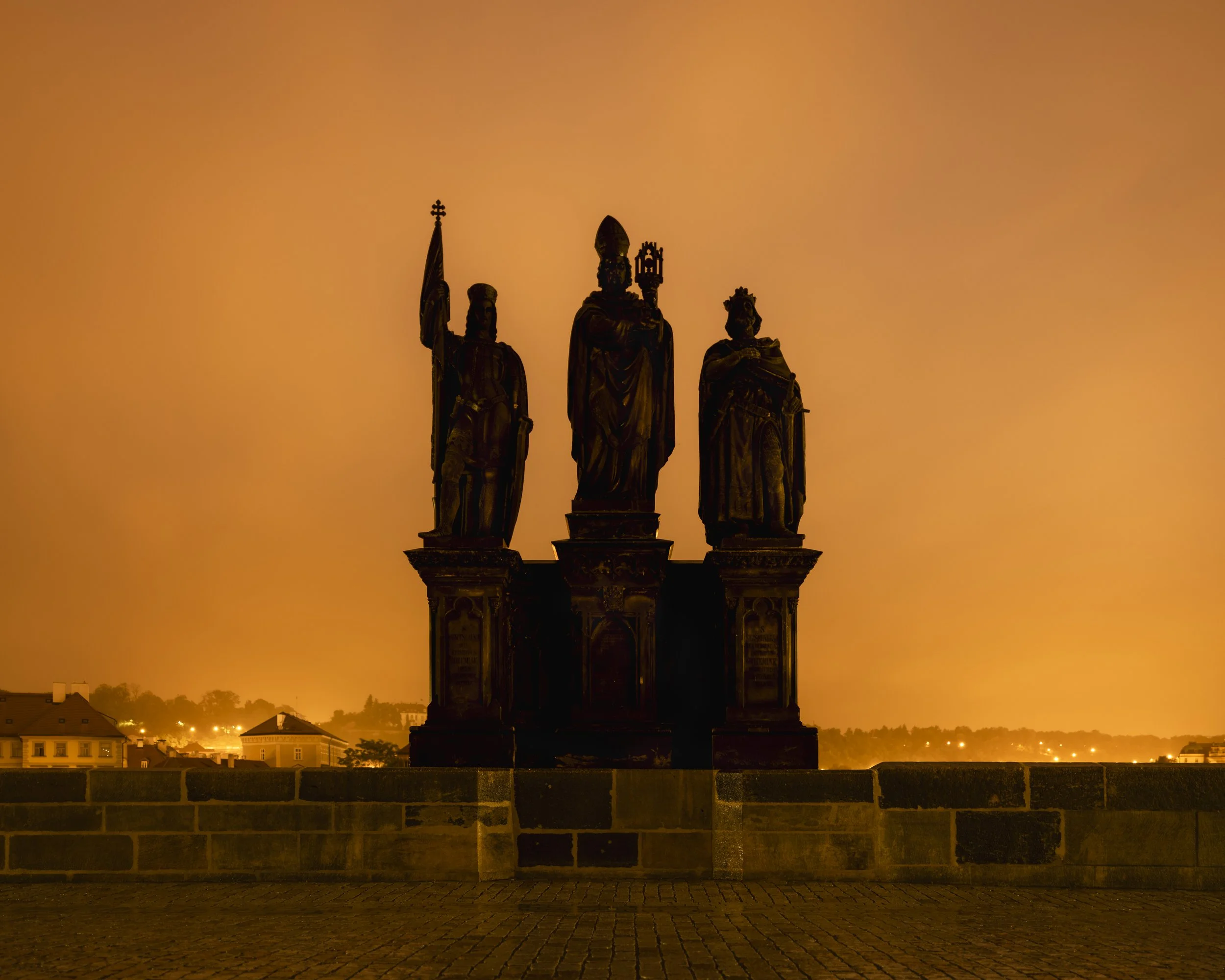
A trio of baroque saints stands silhouetted against a sky gone deep amber, the light pollution of Prague turning night into a single unbroken field of orange. Gateway of Time finds one of Charles Bridge's centuries-old statue groups reduced to pure shape: a knight bearing a flag, a bishop with mitre and crozier, and a crowned figure, all raised on carved stone pedestals above the bridge's parapet.
The composition is built on silhouette and scale. The three figures rise from a shared base into a sky with no clouds and no stars, only the warm glow thrown up by the city, and Prague's rooftops and scattered lights sit low along the horizon beneath them. The cobblestones of the bridge itself fill the foreground, holding the same warm cast as the sky above. Nothing in the frame is lit directly; every form is read by its edge against the light.
It is a study in what remains legible after dark: shape, gesture, and outline, in the patient, observational tradition of Wim Wenders, where a familiar monument becomes something closer to pure form.
Design & Styling
The deep amber sky and baroque silhouettes of Gateway of Time bring warmth and old-world gravity to studies, libraries, boutique hospitality, and homes with a European sensibility. It suits dark walls, where the glow reads as its own light source.
Curated Pairings
To build a wall around Prague and night light, consider these companion pieces:
For the same city, another hour: Pair with Where the Evening Waited, a cooler, nocturnal counterpart to this piece's warm glow.
Fine Art Presentation
Available as a signed fine art print on ChromaLuxe® Metal, Glossy Anti-Glare Acrylic (TruLife), canvas, wood, and archival paper (framed or unframed). ChromaLuxe® Metal (gloss, semi-gloss, or matte) is the recommended presentation: it holds the deep black of the silhouettes crisp against the saturated amber sky. Acrylic is the alternative for extra depth in the glow.
Note: Custom and oversized photographic prints are available. Please contact the studio directly to discuss custom framing, matting, or specialized museum glass options.
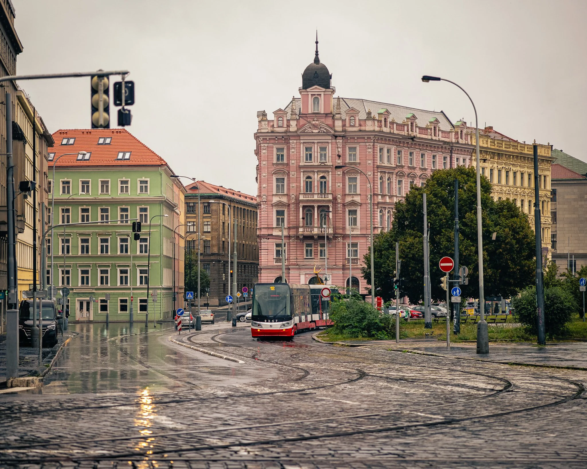
Streetcar #12 is a contemplative urban landscape photograph exploring movement, atmosphere, and the quiet rhythm of daily life within one of Europe's most enduring cities. Captured during a light rain in Prague, the image follows a red streetcar as it curves through wet cobblestone streets framed by historic architecture and muted pastel facades. Reflections shimmer across the pavement while soft overcast light settles over the city, transforming an ordinary commute into a study of place, memory, and motion.
Drawing from the observational storytelling traditions of Wim Wenders and the atmospheric color sensibilities of Ernst Haas, the photograph emphasizes the emotional character of the city rather than its famous landmarks. The streetcar becomes a visual thread connecting architecture, weather, and everyday life, creating a moment that feels both distinctly Prague and universally familiar.
Rather than documenting a tourist destination, the image focuses on the lived experience of the city—the quiet beauty found in rain-soaked streets, passing transit, and the subtle interactions between history and modern urban life. The sweeping tram tracks, reflective pavement, and restrained palette invite the viewer into a scene defined by movement, atmosphere, and the passage of time.
Design & Styling
The red streetcar against wet cobblestones and muted pastel façades gives Streetcar #12 a single, confident note of color for restaurants, cafés, offices, and living rooms. It suits pale or warm-neutral walls, where the red is the accent.
Curated Pairings
To build a wall around Prague, weather, and everyday life, consider these companion pieces:
For complementary Prague atmosphere: Pair with Passing Through Prague, extending the visual narrative of weather, architecture, and everyday life within the city.
For travel and cultural continuity: Complement this piece with Prague Lunch, which shares the same documentary approach to discovering a city through its ordinary yet memorable moments.
For another wet Prague street: Pair with Waiting for the Morning, a lone figure in a rain-soaked cobblestone passage with one vivid red bag, a single red note like the streetcar's.
Fine Art Presentation
Available as a signed fine art print on ChromaLuxe® Metal (gloss, semi-gloss, or matte), Glossy Anti-Glare Acrylic (TruLife), canvas, wood, and archival paper (framed or unframed). ChromaLuxe® Metal is the recommended presentation: it keeps the red of the streetcar pure against the muted pastel façades and holds the reflections in the wet pavement. Framed archival paper is the alternative, softening the overcast light for a more traditional read.
Note: Custom and oversized photographic prints are available. Please contact the studio directly to discuss custom framing, matting, or specialized museum glass options.
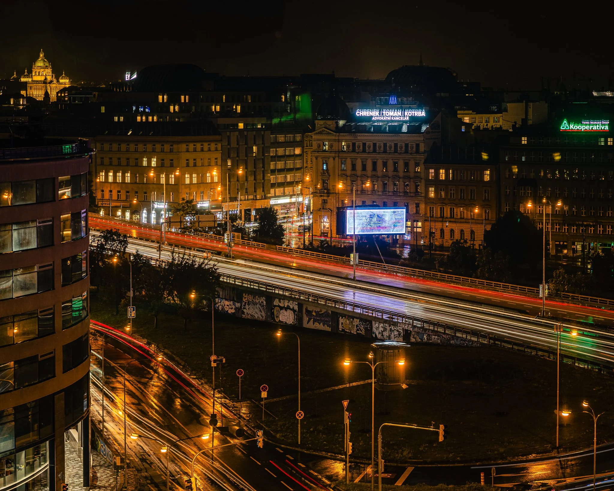
After the City Settles is an atmospheric cityscape exploring the transition between movement and stillness after nightfall. Captured during a rainy evening in Prague, the photograph transforms traffic, architecture, and weather into a layered study of light and time. Long exposures stretch vehicle headlights and taillights into luminous ribbons across wet streets while historic buildings emerge from the darkness in warm amber tones. In the distance, the illuminated dome of Prague's historic skyline provides a quiet visual anchor beyond the motion of the city below.
Drawing inspiration from the cinematic color sensibilities of Ernst Haas and the urban storytelling traditions of Wim Wenders, the photograph explores the emotional character of a city after dark. Rather than focusing on landmarks alone, the image captures the atmosphere created when rain, architecture, and movement converge. The resulting composition balances energy and calm, revealing the beauty hidden within ordinary urban rhythms.
The contrast between the flowing light trails and the permanence of the surrounding architecture creates a meditation on time itself—moments passing through structures that have endured for generations.
Design & Styling
The luminous ribbons of light and warm amber façades in After the City Settles bring energy and an after-dark atmosphere to lounges, restaurants, hotel corridors, offices, and modern residences. Against a dark or charcoal wall the light trails glow; in a brighter room they read as bold color.
Curated Pairings
To build a wall around Prague after rain, consider these companion pieces:
For complementary urban atmosphere: Pair with Streetcar #12, to continue the visual narrative of Prague through weather, movement, and city life.
For architectural continuity: Complement this piece with Passing Through Prague, which explores historic architecture and the quiet moments that unfold within the city: together they tell Prague after rain, one focused on movement and energy, the other on observation and reflection.
For Prague after dark: Pair with Under the Old Gate, two figures walking beneath the Old Town Bridge Tower on a damp evening, the same rain-dark cobblestones and warm light at a slower pace.
Fine Art Presentation
Available as a signed fine art print on ChromaLuxe® Metal (gloss, semi-gloss, or matte), Glossy Anti-Glare Acrylic (TruLife), canvas, wood, and archival paper (framed or unframed). ChromaLuxe® Metal is the recommended presentation: it holds the luminous headlight and taillight ribbons and the warm amber of the buildings at full saturation. Acrylic is the alternative where you want the trails to glow from within, and framed archival paper suits a quieter, more painterly reading of the wet streets.
Note: Custom and oversized photographic prints are available. Please contact the studio directly to discuss custom framing, matting, or specialized museum glass options.
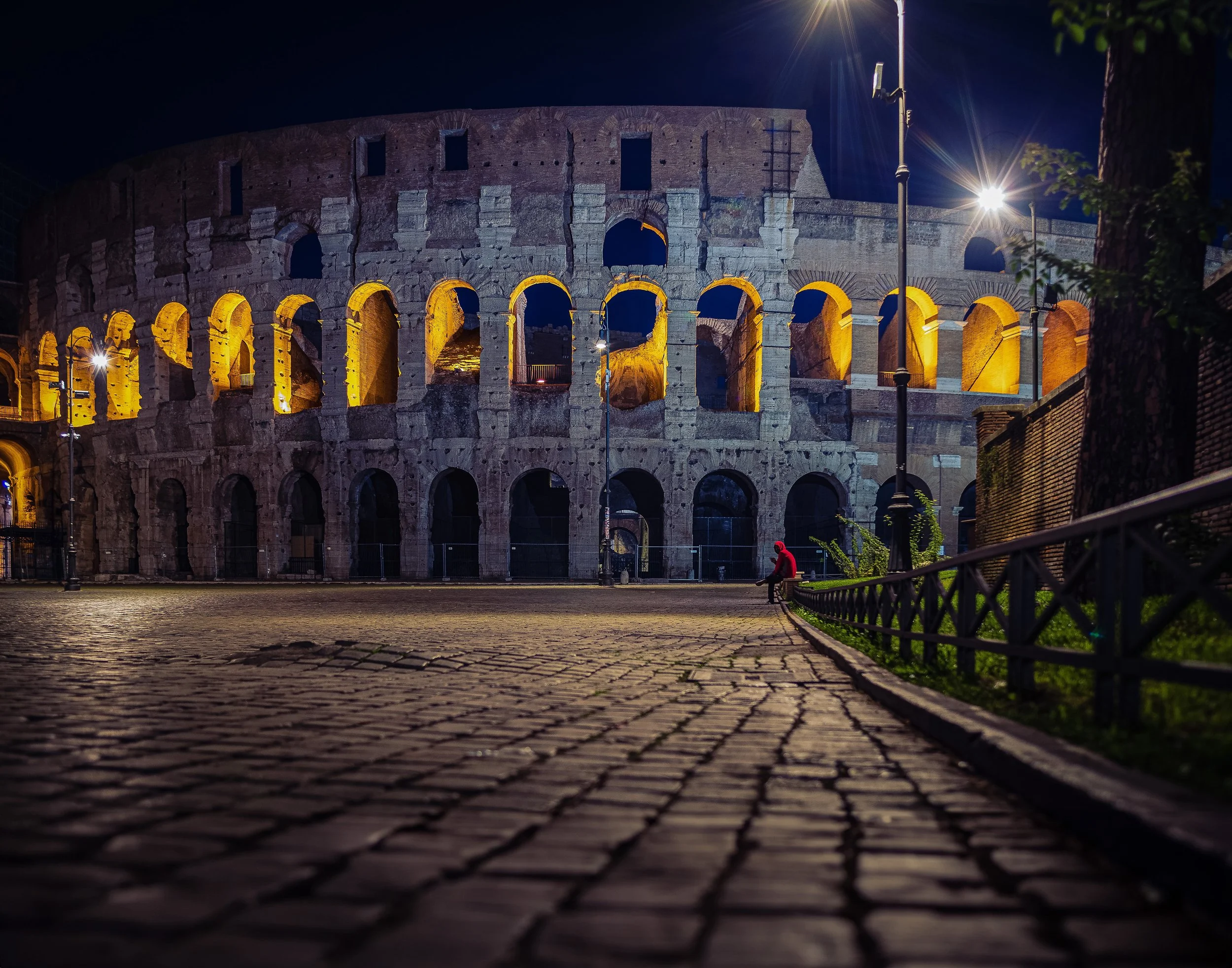
Waiting for a Ride finds a quiet human moment against one of the most photographed monuments on earth — a lone figure in a red coat seated on the cobblestones outside the Colosseum at night, dwarfed by the illuminated arches rising behind him. The image resists the postcard impulse. Rather than centering the monument as spectacle, it places a small, specific human presence in the foreground of an empty plaza, the ancient structure glowing gold in the distance like a stage set after the audience has gone home.
The composition does the patient work of separating subject from setting through scale and color alone. The warm amber light pouring through the Colosseum's arched openings dominates the upper register of the frame, while the cobblestone plaza in the foreground — rendered in cool blue-black shadow, textured and tactile — leads the eye steadily toward the solitary red figure at the base of the ancient wall. That single spot of red against the cool stone and warm architectural glow becomes the emotional center of the image, a human-scaled counterweight to nearly two thousand years of history looming above.
Drawing on the night photography traditions of Ernst Haas, whose color sensibilities transformed urban scenes into studies of light and atmosphere, and the patient observational stillness of Wim Wenders, Waiting for a Ride treats the Colosseum not as a tourist landmark but as a backdrop for the ordinary human business of waiting — for transportation, for a companion, for the night to end. The empty cobblestone plaza, devoid of the daytime crowds that normally fill this space, gives the image a rare sense of solitude in a location almost never photographed without people.
Design & Styling
With its rich amber and midnight-blue palette, dramatic architectural scale, and quiet human presence, Waiting for a Ride brings sophistication, atmosphere, and a sense of storytelling to any interior. The image works particularly well in executive offices, hospitality environments, dining rooms, and residential spaces where travel, history, and cinematic mood are valued. The warm gold light against deep blue night sky creates a striking color contrast that anchors a room without overwhelming it.
The image scales effectively from intimate sizes in a hallway or office to large statement pieces above a sofa or fireplace, where the architectural detail of the Colosseum's arches rewards close viewing while the overall composition holds its impact from across a room.
Curated Pairings
For a Rome at night collection: Pair with Night Watch (Noir) for two distinct studies of solitary figures against illuminated Roman architecture after dark — one seated, one standing, both finding quiet humanity within monumental history.
For a European night photography wall: Pair with The Last Lights On and After the City Settles for a grouping that moves between Prague and Rome, united by warm artificial light against deep night skies and the particular stillness of European cities after the crowds disperse.
For a contrast in scale and color: Pair with Cathedral Beneath the Moon for a wall built around monumental European architecture photographed in the quiet hours of night.
Fine Art Presentation
Waiting for a Ride is available as a signed fine art photographic print in multiple presentation styles. ChromaLuxe® Metal (gloss, semi-gloss, or matte) is the strongest choice for this image — the deep saturation of the amber arches against the midnight-blue sky, the fine texture of the cobblestones, and the crisp detail in the ancient stonework all benefit from the luminosity and contrast range that metal provides. TruLife Acrylic, printed on low-glare acrylic, adds dimensionality particularly suited to the layered depth of the composition. Framed and unframed paper prints are produced on archival paper, offering a softer, more atmospheric presentation with warmth in the shadow tones well suited to traditional and hospitality interiors. Canvas Framed brings texture that complements the historic stone subject matter.
For the strongest presentation, larger sizes are recommended — at scale, the architectural detail of the Colosseum's arches and the cobblestone texture in the foreground become genuinely immersive, while the small red-coated figure retains its quiet emotional weight.
Note: Custom and oversized photographic prints are available. Please contact the studio directly to discuss custom framing, matting, or specialized museum glass options.

The best part of a night out is the minute before it begins. A Night at the Opera finds Rome's Teatro dell'Opera glowing against the evening, its honey-colored stone facade lit by hanging lanterns and warm light spilling from the open doors, with banners for Giselle hanging on either side of the entrance.
Warm and cool share the frame. Across the top, the theater's name runs in dark, dimensional letters, cropped at the edge like a title card. Below it the facade builds a rhythm of stone piers, lanterns, and tall banners, and through the doors the lobbies glow with a red-carpeted stair at left and gilded fixtures within. Then the eye drops to the plaza, where the cobblestones turn a cool blue-violet in the night air and two women, one in a red jacket, one in dark, walk toward the entrance, small against the building and drawn toward the same warm threshold. Clipped shrubs in dark planters frame the right side, and at the far left edge a woman in a tan jacket stands half in the frame, looking at her phone, the one figure not heading in.
This piece sits in the tradition of Ernst Haas' color-forward street photography: a populated, layered urban scene where architecture and human gesture share the frame equally, neither one overwhelming the other. It is less about a single subject than about a place caught mid-anticipation, alive with the energy of people arriving somewhere they want to be.
Design & Styling
The warm stone, lantern gold, and cool blue-violet cobblestones of A Night at the Opera bring worldly elegance to entryways, studies, music rooms, and formal living rooms, and to hospitality spaces such as restaurants, boutique hotels, and performance venues, where the anticipation of a night out is the point. It pairs naturally with wood paneling, brass, and warm neutral walls.
Curated Pairings
To build a wall around Rome after dark and the anticipation of a night out, consider these companion pieces:
For gathering figures after dark: Pair with Waiting, a study in how light and gathering figures build atmosphere after dark.
For contrast: Complement with Enduring Silence, solitude versus company, stillness versus anticipation.
For Rome at night: Pair with Waiting for a Ride, a lone figure in a red coat on the cobblestones outside the Colosseum after dark, the same city and hour from a quieter angle.
Fine Art Presentation
Available as a signed fine art print on ChromaLuxe® Metal (gloss, semi-gloss, or matte), Glossy Anti-Glare Acrylic (TruLife), canvas, wood, and archival paper (framed or unframed). ChromaLuxe® Metal is the recommended presentation: it holds the depth of the stone facade, the warmth of the lantern light, and the cool blue-violet of the cobblestones. Framed archival paper gives a softer, more painterly read for a traditional interior, and TruLife acrylic adds luminosity and depth for a more contemporary space.
Note: Custom and oversized photographic prints are available. Please contact the studio directly to discuss custom framing, matting, or specialized museum glass options.
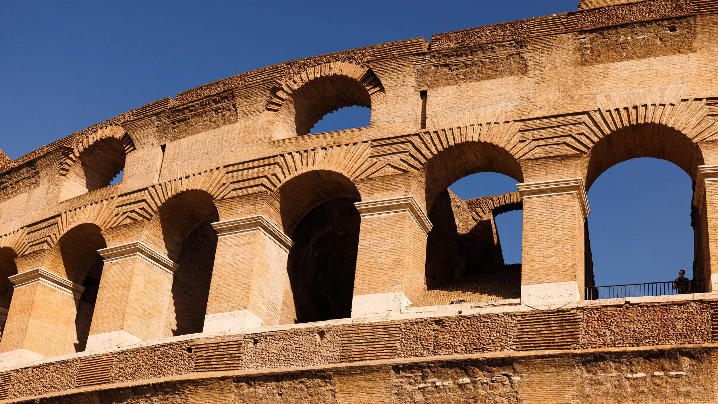
Where Light Still Climbs is a study of endurance, scale, and the particular gold that only late-day Roman light produces. Photographed along the Colosseum's upper arcade, the image follows a diagonal line of ochre stone rising from the lower corner of the frame, carrying the eye upward through a rhythm of repeated arches toward a lone figure standing at the structure's edge — a quiet reminder of just how immense this nearly two-thousand-year-old engineering achievement remains.
The composition holds close to the arcade's own geometry, letting the natural diagonal of the structure do the compositional work rather than imposing one. Deep shadow within the arches contrasts against sun-warmed travertine and brick, giving the frame real depth and a sense of the raw mass behind the façade. Rather than presenting the Colosseum as a static monument, the photograph captures the particular quality of late-day light that transforms ancient stone into something almost molten — the way empire and endurance become, briefly, indistinguishable from warmth itself. The lone figure at the far edge is deliberately small, present enough to register as human without competing with the architecture surrounding him.
Drawing inspiration from Ansel Adams' discipline with tonal structure and architectural geometry, alongside Wim Wenders' patience for letting a place's own logic define the frame rather than forcing drama onto it, Where Light Still Climbs explores themes of permanence, scale, and the quiet dignity of structures built to outlast their builders. The photograph reflects a distinctly observational sensibility: the Colosseum photographed as enduring mass, not tourist backdrop.
Design & Styling
The warm ochre and amber stone of Where Light Still Climbs, and its strong diagonal, bring depth, warmth, and a sense of arrival to hotel lobbies, executive offices, dining rooms, and homes with a love of Rome. It suits large walls.
Curated Pairings
To build a wall around Roman light and scale, consider these companion pieces:
For a nocturnal counterpoint: Pair with Night Watch at the Colosseum (Monotone), photographed at the same site after dark, against this piece's golden-hour warmth.
For Roman atmosphere and quiet human presence: Complement with Waiting for a Ride, the Colosseum at night with a quiet human presence.
For shared European texture and light: Pair with What the Ivy Remembers, from Prague, sharing the same discipline of texture and light.
Fine Art Presentation
Available as a signed fine art print on ChromaLuxe® Metal (gloss, semi-gloss, or matte), Glossy Anti-Glare Acrylic (TruLife), canvas, wood, and archival paper (framed or unframed). ChromaLuxe® Metal is the recommended presentation: it holds the warm tonality and deep shadow contrast, and the scale suits larger sizes. Acrylic is the alternative for extra depth in the golden light.
Note: Custom and oversized photographic prints are available. Please contact the studio directly to discuss custom framing, matting, or specialized museum glass options.

What the Door Remembers looks closely at the hardware of an aged wooden cabinet door in Paris — an ornate ring-pull knocker below, a separate iron latch mechanism above, both worn to a rust-orange patina that echoes the warm honey tones of the wood beneath them. Rather than documenting the door as a whole, the photograph isolates this quiet corner of use and wear, where decades of hands and weather have left their mark.
The color treatment preserves a specific harmony: the rust on the metal and the grain of the wood share the same warm register, so the two materials read less as separate objects than as one surface aging together. A vertical composition follows the door's own structure, connecting the two hardware pieces along a single line of sight.
Drawing on the atmospheric object studies of Josef Sudek, the image treats old hardware not as documentation but as a quiet meditation on time, use, and the particular beauty of things worn rather than new.
Design & Styling
With its warm, harmonious palette of rust and honey tones, What the Door Remembers works well in traditional and transitional interiors, studies, and reading rooms — spaces that welcome a sense of history and quiet craftsmanship.
Curated Pairings
To build a wall around texture, patina, and quiet architectural detail, consider these companion pieces:
For the same subject, a different register: Pair with What the Door Remembers, the black-and-white treatment of the same hardware.
For a shared European register: Complement with Old Friends, Windows and Glass, another quiet study of aged architectural materials.
For another worn threshold: Pair with Under the Old Gate, a Prague evening beneath the Old Town Bridge Tower — the same attention to the aged edges of a historic city.
Fine Art Presentation
Available as a signed fine art print on ChromaLuxe® Metal (gloss, semi-gloss, or matte), Glossy Anti-Glare Acrylic (TruLife), canvas, wood, and archival paper (framed or unframed). Framed archival paper is the recommended presentation: its matte, tactile surface suits a Sudek-style object study and lets the honey and rust tones read as one aging surface. Wood is a natural alternative for this subject, where the grain of the print echoes the door itself, and ChromaLuxe® Metal is the choice when you want the warm patina at its most intense.
Note: Custom and oversized photographic prints are available. Please contact the studio directly to discuss custom framing, matting, or specialized museum glass options.
European Texture & Light
European Texture & Light
Filters

No results found
No results match your search. Try removing a few filters.
Have Questions?
We'll review your message and get back to you within 48 hours.
Where Stone Meets Glass frames the Louvre's ornate Pavillon Sully against the sharp diagonal edge of I.M. Pei's glass Pyramid, photographed on a rainy December afternoon under a low, overcast Paris sky. On one side, Baroque stone sculpture — caryatids, a carved pediment, a centuries-old clock still keeping time above the words Pavillon Sully. On the other, a rippling, distorted reflection of that same facade, caught in glass that didn't exist when the stone was carved.
The composition turns entirely on that single diagonal line — the Pyramid's edge slicing the frame clean in two, old Paris and new meeting without transition. The day's flat, muted light keeps the palette quiet and cool, letting the architecture's own contrast — carved stone against smooth glass, solid form against wavering reflection — carry the image rather than any dramatic color or light.
It's a subject millions of visitors photograph every year, drawn to the same obvious tension between eras. This version leans into precision instead — a tight crop, a considered diagonal, and the particular grey of a Paris winter sky — to find something more specific than the postcard version of the same view.
Design & Styling
With its cool, architectural palette and strong graphic structure, Where Stone Meets Glass works well in contemporary offices, architecture and design firms, and any interior seeking a considered dialogue between classical and modern form. Its restrained color also suits spaces where a quieter, documentary register is preferred over a vivid focal piece.
Curated Pairings
To build a wall around European architecture and travel, consider these companion pieces:
For a shared city: Pair with Night Watch at the Colosseum (Monotone), another European landmark caught in its own particular light.
For a shared architectural register: Complement with The Gothic Sentinel, a quiet study of European religious architecture.
For a shared narrative thread: Round out the wall with Passing Through Prague, continuing the exploration of European architecture and quiet human presence within it.
Fine Art Presentation
Available as a signed fine art print in ChromaLuxe® Metal (gloss, semi-gloss, or matte), framed paper, framed canvas, and acrylic presentation formats. To preserve the cool tonal range and the fine detail in both the carved stone and the rippled glass reflection, ChromaLuxe® Metal or Acrylic presentation is recommended.