
 Image 1 of 1
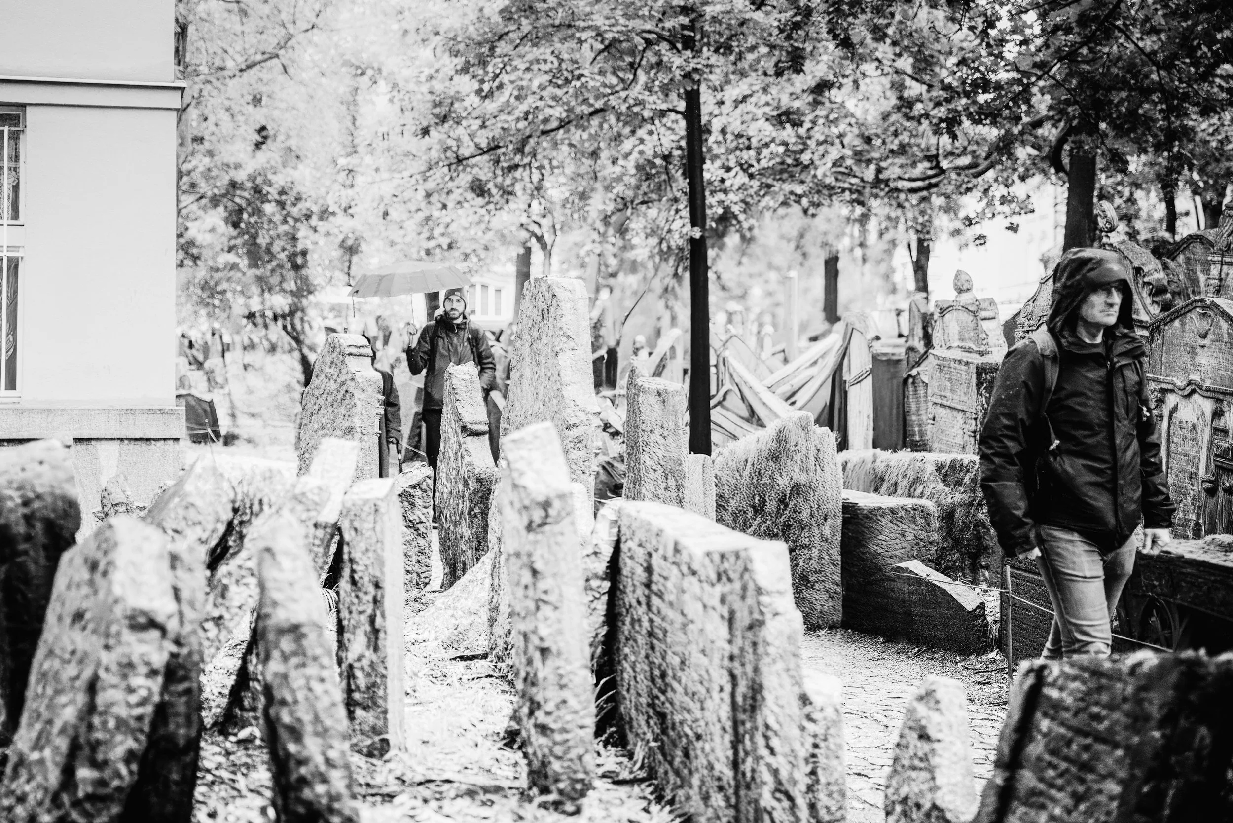
Some names are read as an inscription, and some are read as a landscape. Among the Names is a black-and-white study made in Prague's Old Jewish Cemetery, where centuries of burials within a small, walled plot left the ground unable to expand: stones lean, overlap, and rise from the earth in uneven rows, their carved inscriptions layered like sediment.
In monochrome, the cemetery's real subject comes forward: not any single grave, but the accumulation of names pressed close together, worn by weather and time until some are barely legible. The absence of color removes the season and the hour and leaves only stone, shadow, and text, so the eye reads the frame the way it would read a page: name after name, generation after generation.
The cemetery's crowded, layered ground is unlike anywhere else in Europe, generations buried within the same limited boundary. This piece stays with that density rather than any one marker, in the same quiet, observational tradition as Josef Sudek's Prague and Wim Wenders's patient attention to place.
Design & Styling
The restrained black-and-white palette and historic subject of Among the Names suit libraries, studies, memorial and cultural spaces, and any interior that wants gravity without color. It reads well in a grouping with other monochrome architectural or historic work.
Curated Pairings
To build a wall around memory, stone, and the passage of time, consider these companion pieces:
For the same cemetery: Pair with What the Ivy Remembers, a color study from the same Old Jewish Cemetery, where ivy has begun to reclaim two of its weathered gravestones.
Fine Art Presentation
Available as a signed fine art print on ChromaLuxe® Metal, Glossy Anti-Glare Acrylic (TruLife), canvas, wood, and archival paper (framed or unframed). Framed archival paper is the recommended presentation: its matte, non-reflective surface suits a black-and-white study of stone and text. ChromaLuxe® Metal (gloss, semi-gloss, or matte) is the alternative for deeper blacks and a crisper read of the carved names.
Note: Custom and oversized photographic prints are available. Please contact the studio directly to discuss custom framing, matting, or specialized museum glass options.
Some names are read as an inscription, and some are read as a landscape. Among the Names is a black-and-white study made in Prague's Old Jewish Cemetery, where centuries of burials within a small, walled plot left the ground unable to expand: stones lean, overlap, and rise from the earth in uneven rows, their carved inscriptions layered like sediment.
In monochrome, the cemetery's real subject comes forward: not any single grave, but the accumulation of names pressed close together, worn by weather and time until some are barely legible. The absence of color removes the season and the hour and leaves only stone, shadow, and text, so the eye reads the frame the way it would read a page: name after name, generation after generation.
The cemetery's crowded, layered ground is unlike anywhere else in Europe, generations buried within the same limited boundary. This piece stays with that density rather than any one marker, in the same quiet, observational tradition as Josef Sudek's Prague and Wim Wenders's patient attention to place.
Design & Styling
The restrained black-and-white palette and historic subject of Among the Names suit libraries, studies, memorial and cultural spaces, and any interior that wants gravity without color. It reads well in a grouping with other monochrome architectural or historic work.
Curated Pairings
To build a wall around memory, stone, and the passage of time, consider these companion pieces:
For the same cemetery: Pair with What the Ivy Remembers, a color study from the same Old Jewish Cemetery, where ivy has begun to reclaim two of its weathered gravestones.
Fine Art Presentation
Available as a signed fine art print on ChromaLuxe® Metal, Glossy Anti-Glare Acrylic (TruLife), canvas, wood, and archival paper (framed or unframed). Framed archival paper is the recommended presentation: its matte, non-reflective surface suits a black-and-white study of stone and text. ChromaLuxe® Metal (gloss, semi-gloss, or matte) is the alternative for deeper blacks and a crisper read of the carved names.
Note: Custom and oversized photographic prints are available. Please contact the studio directly to discuss custom framing, matting, or specialized museum glass options.