
 Image 1 of 1
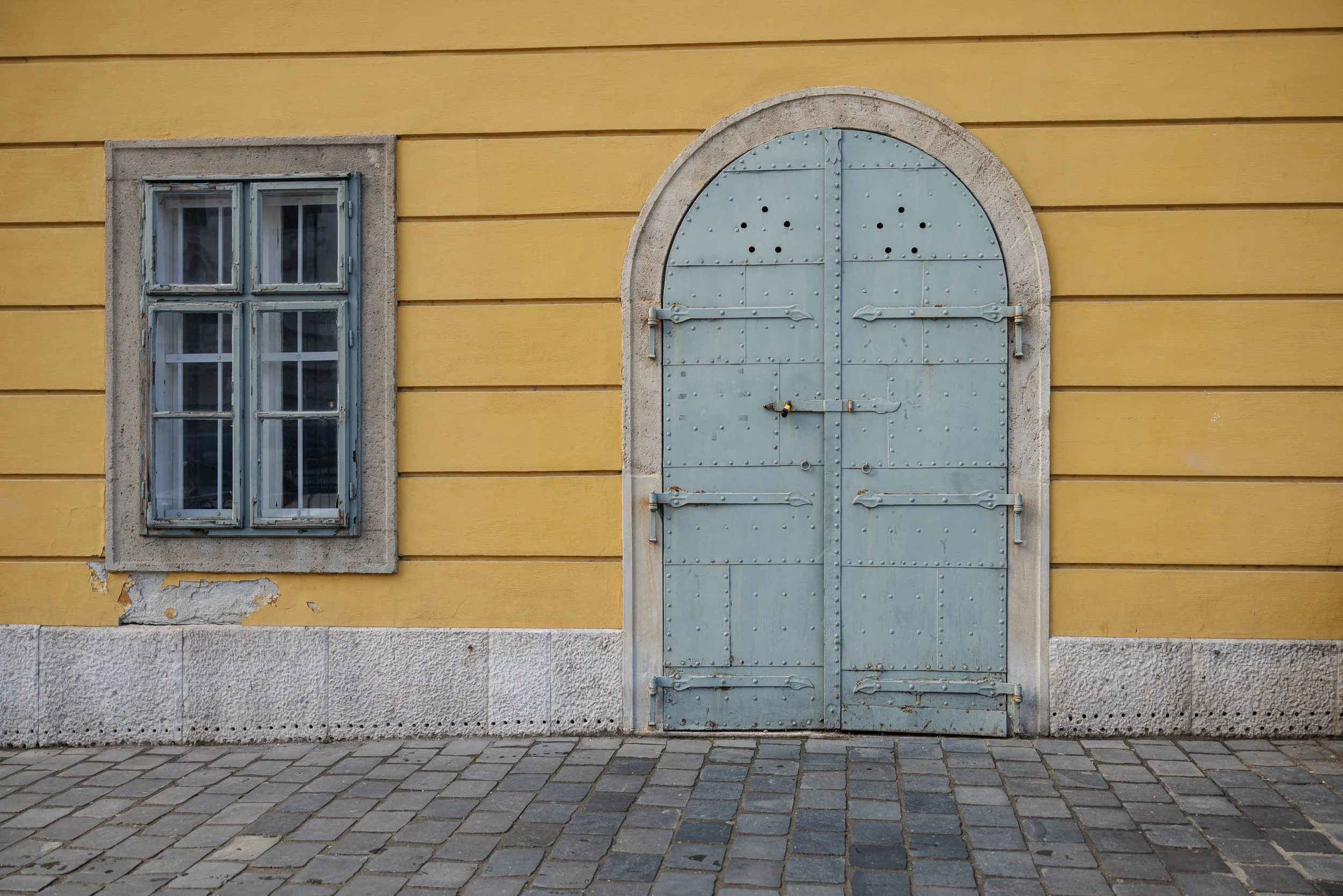
Study in Yellow and Blue #4 is a quiet exploration of color, geometry, and the subtle beauty found in overlooked architectural details. Photographed in Prague, the image centers on a weathered blue-gray door and an aging window set against a warm yellow façade, transforming an ordinary section of wall into a study of proportion, texture, and visual balance. Drawing inspiration from the observational clarity of Wim Wenders and the color sensitivity of Ernst Haas, the photograph examines how simple architectural forms can evoke a sense of place, memory, and permanence.
Rather than focusing on grand landmarks or dramatic moments, the composition finds meaning in restraint. The rectangular window and arched door create a dialogue between contrasting shapes, while the muted blue-gray tones of the woodwork provide a visual counterpoint to the warmth of the surrounding wall. Repeating horizontal lines, rivets, hinges, stone trim, and worn paint surfaces contribute to a layered visual rhythm that rewards careful observation. The result is an image that feels both timeless and contemporary—an architectural portrait built from color, texture, and form.
The photograph also reflects the passage of time. Weathered paint, worn stone, and subtle imperfections reveal the accumulated history of the building without overwhelming the composition. Small details become important: the aged window frame, the riveted metal door, the chipped plaster beneath the sill, and the worn cobblestones at street level. Together they create a sense of continuity between the present moment and the generations who have passed through this space before.
Design & Styling
Warm yellow, weathered blue-gray, and clean proportion make Study in Yellow and Blue #4 an easy fit for modern kitchens, dining rooms, design studios, and hospitality interiors that want a graphic accent without literal narrative. It pairs well with white, natural wood, and brushed metal.
Curated Pairings
To create a cohesive gallery wall around color and architectural detail, consider these companion pieces:
For color harmony: Pair with The Last Lights On, continuing the dialogue between architectural surfaces, color relationships, and the visual character of Prague.
For formal contrast: Complement this piece with Where the Evening Waited, introducing atmosphere and narrative while keeping a strong emphasis on architectural space.
For structure and texture: Pair with Reflections of Glass and Stone, extending the exploration of structure, texture, and urban observation.
Fine Art Presentation
Available as a signed fine art print on ChromaLuxe® Metal (gloss, semi-gloss, or matte), Glossy Anti-Glare Acrylic (TruLife), canvas, wood, and archival paper (framed or unframed). ChromaLuxe® Metal is the recommended presentation: it keeps the yellow façade and the blue-gray door as clean, saturated blocks with crisp edges. Framed archival paper is the alternative for a quieter read of the weathered surfaces, and acrylic for a deeper, glossier color field.
Note: Custom and oversized photographic prints are available. Please contact the studio directly to discuss custom framing, matting, or specialized museum glass options.