
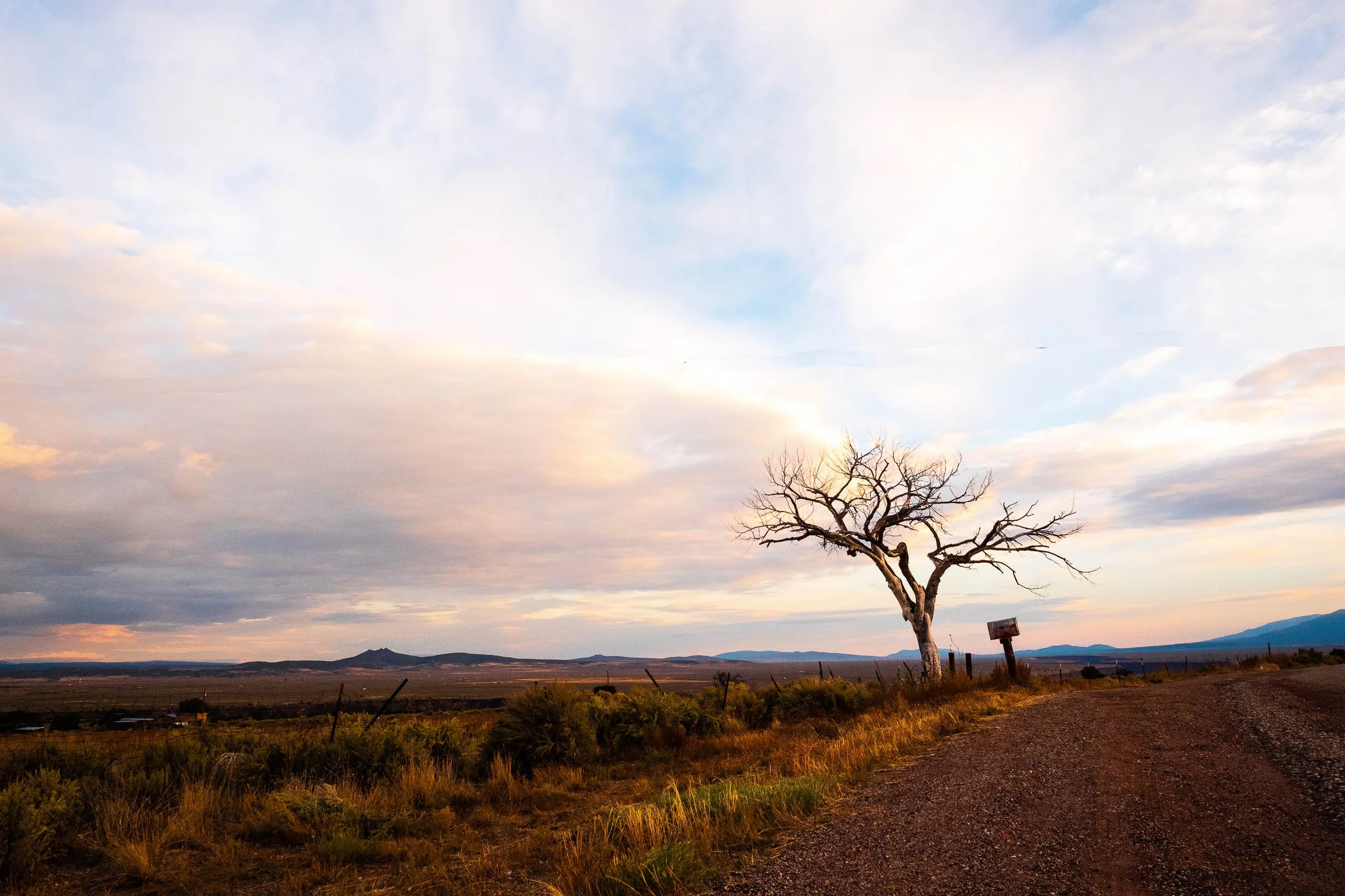
Summerfest - Evergreen, Colorado
Now in its 46th year, Summerfest features a fabulous selection of gallery-quality fine art and fine crafts chosen by a jury process. Live music, a children's craft area, food trucks, and a cocktail garden round out a spectacular entertainment experience in the pristine foothills of the Rocky Mountains. Summerfest is known for bringing in a dedicated art-buying crowd and offering our artist vendors the best services. Center for the Arts Evergreen, a non-profit, hosts this event, with proceeds supporting art programming year-round.
Explore a curated selection of fine art photographic prints curated specifically for Summerfest!
Each piece will be available for viewing and purchase at our exhibition booth, these are limited edition prints, so purchasing before the show will guarantee the purchase, and you will receive free shipping within the US!
To view panoramic works or vertical compositions in their true, un-cropped proportions, click any print to launch our distraction-free, full-screen viewing room. You may secure your selection online for direct fairground pickup.
This evocative fine art photography collection focuses on deep textures, cinematic color gradients, and quiet atmospheric light. From local Midwest and Colorado, Utah, New Mexico and beyond landscapes to intricate botanical forms, these pieces are meticulously printed on archival mediums designed to bring elegant depth and sophisticated structure to your interior spaces.
Limited Edition Prints and Originals only.
Metal Prints are in editions of 15 in each size, Sizes to 40 × 60 available.
Sign Up for my Collectors List for 10% off at Summerfest.
Drop by my booth: Say Summerfest, and receive free shipping within the United States.
Discount Code: SUMMERFEST10
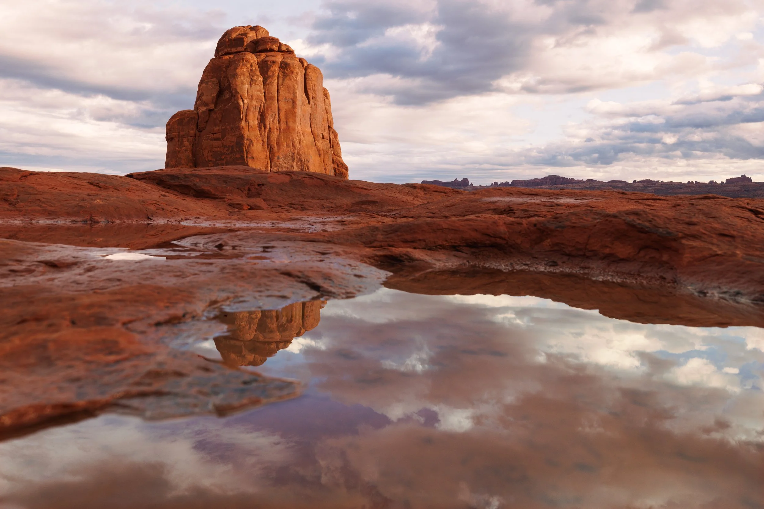
46th Annual Summerfest
July 18th and 19th, 2026
Saturday 10:00 am - 6:00 pm
Sunday 10:00 am - 5:00 pm
BOOTH: TBD
Held at Buchanan Field, 32003 Ellingwood Trail, Evergreen, CO 80439

A vendor's cart glows purple in the foreground, a customer's silhouette standing before it, while nine hot air balloons burn gold and orange behind them, lit from within before sunrise. The eye lands here first — cool, close, human — before it travels back into the warm spectacle of the balloon row, the American flag balloon anchoring the center of the line, checkerboard and striped envelopes filling out either side.
It's a rare thing in a Balloon Fiesta photograph: the balloons aren't the subject, they're the backdrop. The real moment is smaller and closer — someone browsing a lit-up novelty stand while, behind them, one of the largest annual gatherings of hot air balloons in the world quietly glows. Near and far, human and spectacle, doing two different jobs in the same frame.
This is Elliott Erwitt territory more than Haas here — the small human beat happening in front of the big public event, the kind of moment Erwitt built a career on finding at the edges of larger scenes.
Design & Styling
The saturated purple-to-gold color range and genuine human moment make this a strong, story-forward choice for hospitality lobbies, galleries, and contemporary interiors wanting a piece with both color drama and a human anchor.
Curated Pairings
For the same event, same night: Pair with Balloon Glow, Dawn Patrol, the sibling frame from the same balloon row.
For the same quiet anticipation: Complement with Dawn Patrol Wait, another family waiting in silhouette for the same sunrise.
For the same Balloon Fiesta grounds: Pair with Old Glory Rising.
For genuine night-sky and artificial-light continuity: Complement with Eclipse Rising, a copper-red lunar eclipse over Evergreen Lake against warm lakeside lights.
Fine Art Presentation
Available as a signed fine art print on ChromaLuxe® Metal (gloss, semi-gloss, or matte), Glossy Anti-Glare Acrylic (TruLife), framed canvas, and archival paper. Metal or acrylic is strongly recommended — both hold the saturated purple and gold with real depth against the black sky.
Note: Custom and oversized photographic prints are available. Please contact the studio directly to discuss custom framing, matting, or specialized museum glass options.

Eight balloons glow in a row before sunrise, each burner lighting its envelope from within like a paper lantern — checkerboard, cactus, sunburst, the stars and stripes of an American flag balloon, all held against a deep purple-black sky still dark enough to show stars. A dense band of crowd silhouette anchors the bottom of the frame, hundreds of people watching the same ritual glow before Dawn Patrol lifts off.
Look closer at the lower left and the piece opens up: a cluster of small novelty balloons — green smiley-face shapes among them — held near a softly lit vendor cart, almost lost in shadow at the base of the frame. It's a quiet, secondary detail easy to miss on a first pass, the kind of thing that rewards someone who actually looks rather than just scans the glowing row above it — a small human moment buried in the dark crowd rather than announced.
This is Ernst Haas territory — color and repetition as the subject itself, pattern over narrative — with a touch of Elliott Erwitt in the silhouetted crowd functioning as witness, and in that easy-to-miss detail tucked into the shadow.
Design & Styling
The saturated, self-illuminated color against deep night sky makes this a bold, contemporary choice for galleries, lofts, and hospitality interiors wanting genuine visual drama and instant recognizability as Balloon Fiesta.
Curated Pairings
For the same event, same night: Pair with Dawn Patrol Wait, a family waiting in silhouette for the same sunrise.
For the same Balloon Fiesta grounds: Complement with Old Glory Rising.
For a daylight counterpart in the same series: Pair with Balloon Parade.
For the same theme of quiet anticipation before dawn: Complement with Waiting for the Morning, a solitary figure holding the same pre-dawn stillness, half a world away.
Fine Art Presentation
Available as a signed fine art print on ChromaLuxe® Metal (gloss, semi-gloss, or matte), Glossy Anti-Glare Acrylic (TruLife), framed canvas, and archival paper. Metal or acrylic is strongly recommended — both hold the saturated color and deep black sky with real punch that paper can't match.
Note: Custom and oversized photographic prints are available. Please contact the studio directly to discuss custom framing, matting, or specialized museum glass options.

A family stands in silhouette against streaking red taillights at the Albuquerque International Balloon Fiesta, waiting in the dark for the balloons to rise. A support vehicle passes with its lights left on so the pre-dawn crowd can see it, its long exposure turning motion into pure color — red and amber light trails cutting horizontally through the frame, a cool blue glow from a child's light-up toy anchoring a second family group further off. The actual spectacle, still minutes away, is deliberately absent from the frame.
The composition holds a vast black sky above, more than half the image — a real choice, giving the moment scale and patience rather than cropping tight on the crowd. The family's stillness against the blur of light and motion around them is the entire subject: anonymous among thousands, waiting for the same sunrise everyone else came for.
This is Ernst Haas at his most direct — color as gesture, motion blur as subject, silhouette as anchor, a mode distinct from anything else in this catalog. There's no Adams or Wyeth reference that fits here; this is night photography built entirely on artificial light and human stillness.
Design & Styling
The saturated night color and strong silhouette work make this a bold, contemporary choice for spaces wanting genuine visual drama — galleries, lofts, hospitality lobbies, or any interior built around a single striking color-forward statement piece.
Curated Pairings
For the same Balloon Fiesta grounds: Pair with Old Glory Rising, photographed at the same event.
For a companion piece in mood and color: Complement with Balloon Parade, continuing the Balloon Fiesta theme in a different register — daylight and whimsy against this piece's dark, quiet anticipation.
Fine Art Presentation
Available as a signed fine art print on ChromaLuxe® Metal (gloss, semi-gloss, or matte), Glossy Anti-Glare Acrylic (TruLife), framed canvas, and archival paper. Metal or acrylic is strongly recommended here — both will hold the saturated reds and blues with real depth and punch that paper can't match on a piece built entirely on artificial color.
Note: Custom and oversized photographic prints are available. Please contact the studio directly to discuss custom framing, matting, or specialized museum glass options.
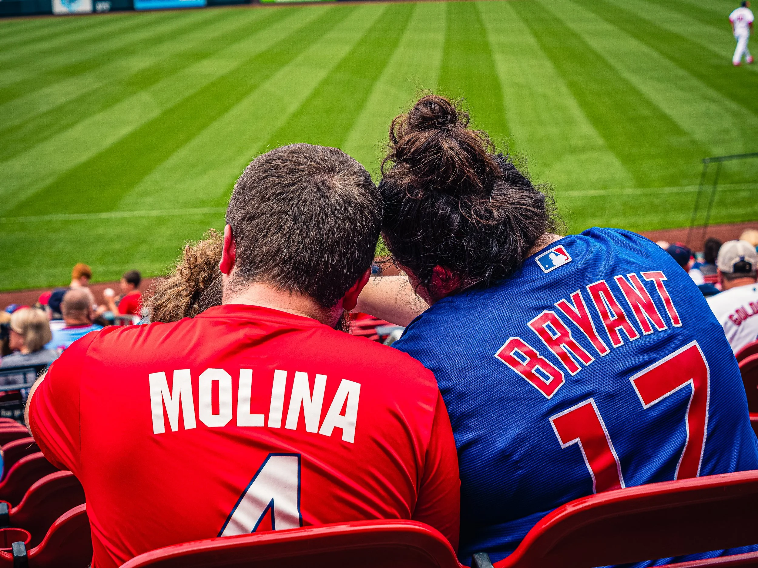
Love Across the Aisle finds a small moment of affection inside one of baseball’s oldest rivalries. A St. Louis Cardinals fan wearing Yadier Molina’s number 4 sits beside his Chicago Cubs companion in Kris Bryant’s number 17, their heads resting together while the game unfolds beyond them.
The photograph is built around opposites — Cardinals red against Cubs blue, rival loyalties against physical closeness, and the intimacy of the foreground against the broad geometry of the outfield. The alternating stripes of freshly cut grass pull the eye toward the distant player and establish the setting without requiring a stadium sign or recognizable landmark. The jerseys provide all the explanation the photograph needs.
What begins as baseball rivalry becomes something more universal: two people choosing different sides without allowing those differences to come between them. It is a candid photograph about affection, allegiance, and the ways shared experience can matter more than which team wins.
Baseball's old rivalries are usually played out in the stands as loudly as on the field. This frame finds the quiet exception: two fans in opposing colors, close enough that the colors become a joke only they share.
Design & Styling
Cardinals red against Cubs blue, and two heads resting together, make Love Across the Aisle a warm, funny piece for game rooms, sports bars, dens, and the home of any baseball family, especially in St. Louis and Chicago. It suits a gift for a mixed-loyalty couple.
Curated Pairings
To create a cohesive gallery wall around people sharing an experience, consider these companion pieces:
For candid human connection: Pair with Shared Attention, another photograph built around people sharing an experience rather than performing for the camera.
For understated human narrative: Pair with The Bartender's Measure (Noir), where gesture and circumstance similarly suggest a story beyond what is explicitly shown.
For Americana and everyday life: Pair with A Gentle Lesson, extending the theme of relationships revealed through small, unguarded moments.
Fine Art Presentation
Available as a signed fine art print on ChromaLuxe® Metal (gloss, semi-gloss, or matte), Glossy Anti-Glare Acrylic (TruLife), canvas, wood, and archival paper (framed or unframed). ChromaLuxe® Metal is the recommended presentation: it makes the Cardinals red, the Cubs blue, and the vivid geometry of the playing field pop. Framed canvas is the alternative for a den or game room, with a warmer, more tactile read.
Note: Custom and oversized photographic prints are available. Please contact the studio directly to discuss custom framing, matting, or specialized museum glass options.
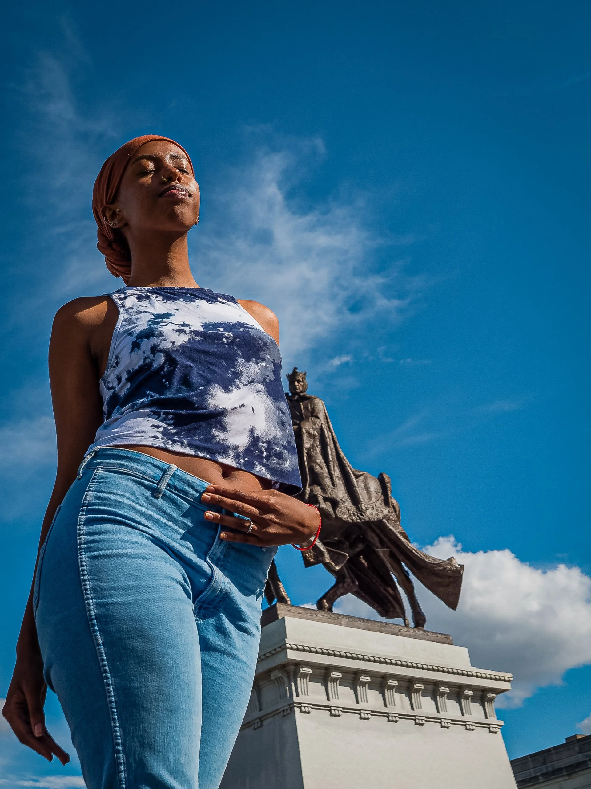
Standing Before Saint Louis is a study of presence, scale, and the conversation between a living figure and a monument to history. Photographed from a low perspective on Art Hill in St. Louis, a young woman stands beneath an expansive blue sky while the equestrian figure of King Louis IX of France rises behind her.
The bronze sculpture is Apotheosis of St. Louis, the monument to the city's namesake that stands before the Saint Louis Art Museum. Designed by Charles Henry Niehaus, its original plaster version appeared at the 1904 World's Fair; the permanent bronze version was dedicated in 1906. Before the Gateway Arch, the statue served for decades as one of the city's defining visual symbols.
Yet the photograph reverses the monument's expected hierarchy. From the extremely low camera position, the woman becomes larger than the king behind her. Her closed eyes and quiet posture contrast with the fixed, heroic gesture of the bronze figure. She is immediate, warm, and alive; Louis remains distant, dark, and immovable.
The expansive sky provides both separation and scale. Rather than treating the statue simply as a St. Louis landmark, Standing Before Saint Louis uses it as a counterpoint between past and present, monument and individual, inherited history and contemporary life. The photograph ultimately asks a simple visual question: when a living person and a monument occupy the same frame, which one possesses the greater presence?
Design & Styling
The young woman before the monument of King Louis IX in Standing Before Saint Louis gives a St. Louis wall a human scale and a sense of place. It suits homes, offices, and civic spaces where the city is a point of pride.
Curated Pairings
To create a cohesive St. Louis display, consider these companion pieces:
For the same hill: Pair with Reflections of Glass and Stone, the St. Louis Art Museum on Art Hill in autumn light, the same landmark seen through glass.
For a St. Louis landmark at dusk: Complement with Evening at the Pavilion, another Forest Park landmark in evening light.
For monumental St. Louis: Pair with Held Arch, the Gateway Arch in monochrome, the other great civic monument of the city.
Fine Art Presentation
Available as a signed fine art print on ChromaLuxe® Metal (gloss, semi-gloss, or matte), Glossy Anti-Glare Acrylic (TruLife), canvas, wood, and archival paper (framed or unframed). ChromaLuxe® Metal is the recommended presentation: it keeps the blue sky and the warm skin tones accurate and the monument crisp. Framed archival paper is the alternative for a softer, portrait-like read.
Note: Custom and oversized photographic prints are available. Please contact the studio directly to discuss custom framing, matting, or specialized museum glass options.

The Last Note turns its attention to a single antique gramophone, its fluted brass horn catching soft window light against a darkened room. The scalloped bell dominates the frame, its ribbed metal surface alive with reflection and shadow, while the turntable and wooden cabinet below recede into quiet obscurity. Nothing about the composition asks to be noticed loudly — it simply waits, the way the object itself has waited, silent, for whatever the last song played on it might have been.
The black and white treatment strips the scene to pure form and light: the horn's curves, the tonearm's angle, the worn grain of the cabinet wood. It's a study in stillness and memory — an object built for sound, photographed in total silence, holding onto whatever it once played.
Design & Styling
With its warm tonal range and quiet, nostalgic presence, The Last Note suits reading rooms, private studies, music rooms, or vintage-inspired interiors looking for a piece with genuine character and history. Its restrained monochrome palette also works well in galleries or hallways alongside other still-life and architectural detail work.
Curated Pairings
For direct thematic echo, pair with What the Door Remembers, another monochrome study of a weathered antique object holding onto memory.
For architectural stillness, complement with Within the Nave, extending the quiet, contemplative mood into interior space.
For atmospheric harmony, pair with The Long Watch, bringing the same patient, waiting quality into a different setting.
Fine Art Presentation
Available as a signed fine art print in ChromaLuxe® Metal (gloss, semi-gloss, or matte), acrylic, framed paper, canvas, and wood presentation formats. Metal or a matte archival paper is recommended to hold the tonal range across the horn's reflective surface without competing glare.
Note: Custom and oversized photographic prints are available. Please contact the studio directly to discuss custom framing, matting, or specialized museum glass options.

Storm Break, Telluride captures a single evening at the Telluride Jazz Festival, where a passing mountain storm broke apart into brilliant pink and gold just as the crowd settled in for the night. A couple in the foreground — him in a plaid shirt and white cowboy hat, his arm around her shoulder — stand watching the sky, small and human against the scale of the mountains and the storm above them.
Tents, string lights, and a small fire pit ember glow scatter warm points through the darkening field, while the storm-lit clouds overhead do most of the emotional work — dramatic, brief, and entirely unrepeatable. It's less a formal composition than a document of a specific night: the kind of sky that makes an entire festival crowd stop and look up at once.
Design & Styling
With its warm Americana feel and mountain festival setting, Storm Break, Telluride suits casual living spaces, mountain or ski-town interiors, and music or festival-themed rooms. It works well as a nostalgic accent piece for anyone who's spent a summer evening at a Colorado mountain festival.
Curated Pairings
To create a cohesive gallery wall, consider these companion pieces:
For western/Americana continuity: Pair with A Gentle Lesson, extending the warm, human-centered western fine art register.
For festival/event energy: Complement with Shovel Racer - Angel Fire, another mountain-region event captured in a candid, human moment.
For human presence in a crowd: Pair with Shared Attention, extending the theme of figures caught in a shared moment.
Fine Art Presentation
Available as a signed fine art print in ChromaLuxe® Metal (gloss, semi-gloss, or matte), framed paper, framed canvas, and acrylic presentation formats. The storm-lit sky and warm foreground tones both hold up well on ChromaLuxe® Metal, which keeps the color vivid without letting the darker crowd areas go flat.
Note: Custom and oversized photographic prints are available. Please contact the studio directly to discuss custom framing, matting, or specialized museum glass options.

Where She Paused is a study in scale, silence, and the particular hush that settles over the Louvre's Grande Galerie when it briefly empties of crowds. Rows of marble Corinthian columns march down the corridor beneath a vaulted glass ceiling, each arched skylight receding into a soft, luminous distance. In the foreground, a woman pauses beside a sculpted marble bust, her figure rendered as a near-solid silhouette against the polished stone — a single point of stillness inside an architecture built for thousands of passing visitors.
The composition moves on a deliberate diagonal: a carved bust in the near foreground, her silhouette a beat further back, and the full architectural recession of the gallery unspooling behind her toward a final arched doorway. That layering of foreground, mid-ground, and vanishing point gives the image real depth and a slow, cinematic pull down the hall. Converting to black and white strips away the competing color temperatures of daylight and interior lighting, letting the image resolve into pure structure — repeating rhythm, marble texture, and a long, patient recession of light.
Drawing on the architectural stillness of Josef Sudek and the graphic, structural clarity of Hiroshi Sugimoto, the photograph treats one of the world's most-photographed interiors not as a documentation of grandeur but as a quiet meditation on time and scale — a single figure, absorbed in looking, inside a space built to outlast her.
Design & Styling
With its restrained monochrome palette and architectural gravity, Where She Paused suits libraries, executive offices, reading rooms, and formal residential or hospitality settings looking for a quiet, well-traveled presence. The repeating columns and long sightline also make it a strong fit for wide hallways or stairwells where the eye can follow the recession down the frame.
Curated Pairings
To create a cohesive gallery wall, consider these companion pieces:
For architectural kinship: Pair with The Gothic Sentinel, continuing the study of vaulted interior space, columns, and quiet architectural grandeur.
For human presence: Complement with Among the Witnesses, extending the theme of a solitary figure held inside a monumental historic space.
For atmospheric depth: Pair with Sanctuary of Light, introducing a second grand interior with its own quiet, luminous recession of light.
Fine Art Presentation
Available as a signed fine art print in ChromaLuxe® Metal (gloss, semi-gloss, or matte), framed paper, framed canvas, and acrylic presentation formats. Because this image relies on deep, clean blacks in the silhouette and shadowed marble, ChromaLuxe® Metal is especially well suited — it holds shadow detail and gives the blacks real punch without crushing. Framed archival paper is a strong alternative for a softer, more traditional gallery feel.
Note: Custom and oversized photographic prints are available. Please contact the studio directly to discuss custom framing, matting, or specialized museum glass options.
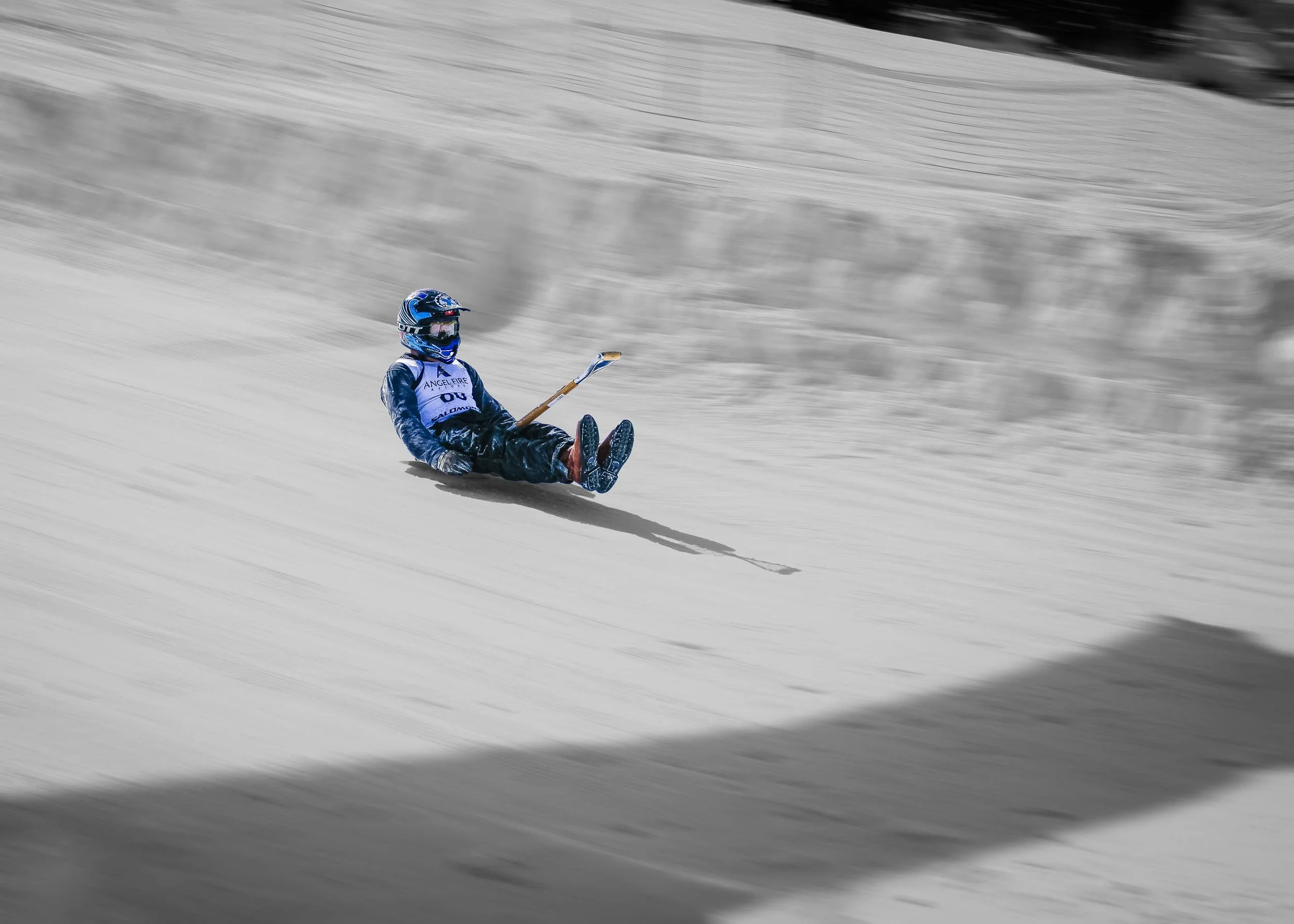
Shovel Racer captures one unrepeatable instant from the World Championship Shovel Races at Angel Fire Resort: a competitor going down a groomed slope on a snow shovel, still moving fast enough that the slope behind him dissolves into pure motion, at speeds up to 70 MPH. Selective color strips the scene down to a single element: the racer's blue helmet and suit, with a touch of warm tan in the shovel handle, are the only color surviving against an otherwise fully desaturated frame. The packed snow, the streaked motion blur, and the long shadow trailing behind him all read in black, white, and gray, isolating the human figure as the one fixed point in an otherwise dissolving world.
The composition leans into imbalance rather than resolving it. The racer sits well off-center, upper-left of the frame, leaning back with his boots forward, and a long diagonal sweep of empty slope stretches into the lower right, negative space that reads less like emptiness and more like implied momentum, the visual equivalent of watching him keep sliding past the edge of the shot. A curved band of shadow across the lower frame and a dark wedge in the upper corner hold the slope in place, and the handle of the shovel adds a small note of chaos to an already off-balance moment: not a posed action shot, but a genuine, unrepeatable fraction of a second.
Shovel racing itself is exactly what it sounds like: competitors sliding down a groomed slope on nothing more than a snow shovel, chasing speed with essentially no equipment to control it. That inherent absurdity is part of what makes the moment worth freezing: the seriousness of the racer's helmet, goggles, and bib, set against the sheer unlikeliness of the sport itself.
Design & Styling
With its bold graphic contrast and single surviving note of color, Shovel Racer works well as an energetic accent piece for game rooms, ski lodges, offices with a sense of humor, or any space that wants a jolt of motion and personality rather than a quiet, contemplative anchor. It is a strong conversation starter, more at home paired with other action or lifestyle photography than with restrained landscape work.
Curated Pairings
To build a cohesive grouping of in-motion Human Presence work, consider these companion pieces:
For narrative energy: Pair with Her Run, continuing the theme of a single human figure caught mid-motion, unposed and unresolved.
For the same instinct in rodeo: Complement with Out of the Chute, extending the American action-photography thread into rodeo culture: different sport, same instinct for freezing chaos mid-motion.
For another absurd winter moment: Pair with Winter Flight, a costumed diver leaving the dock for icy water, another deadpan human moment frozen mid-flight.
Fine Art Presentation
Available as a signed fine art print on ChromaLuxe® Metal (gloss, semi-gloss, or matte), Glossy Anti-Glare Acrylic (TruLife), canvas, wood, and archival paper (framed or unframed). ChromaLuxe® Metal is the recommended presentation: it keeps the blacks and grays clean and the blue accent vivid without competing tonal shifts. Acrylic is the alternative for added depth. Offered from 12×8 up to 36×24.
Note: Custom and oversized photographic prints are available. Please contact the studio directly to discuss custom framing, matting, or specialized museum glass options.
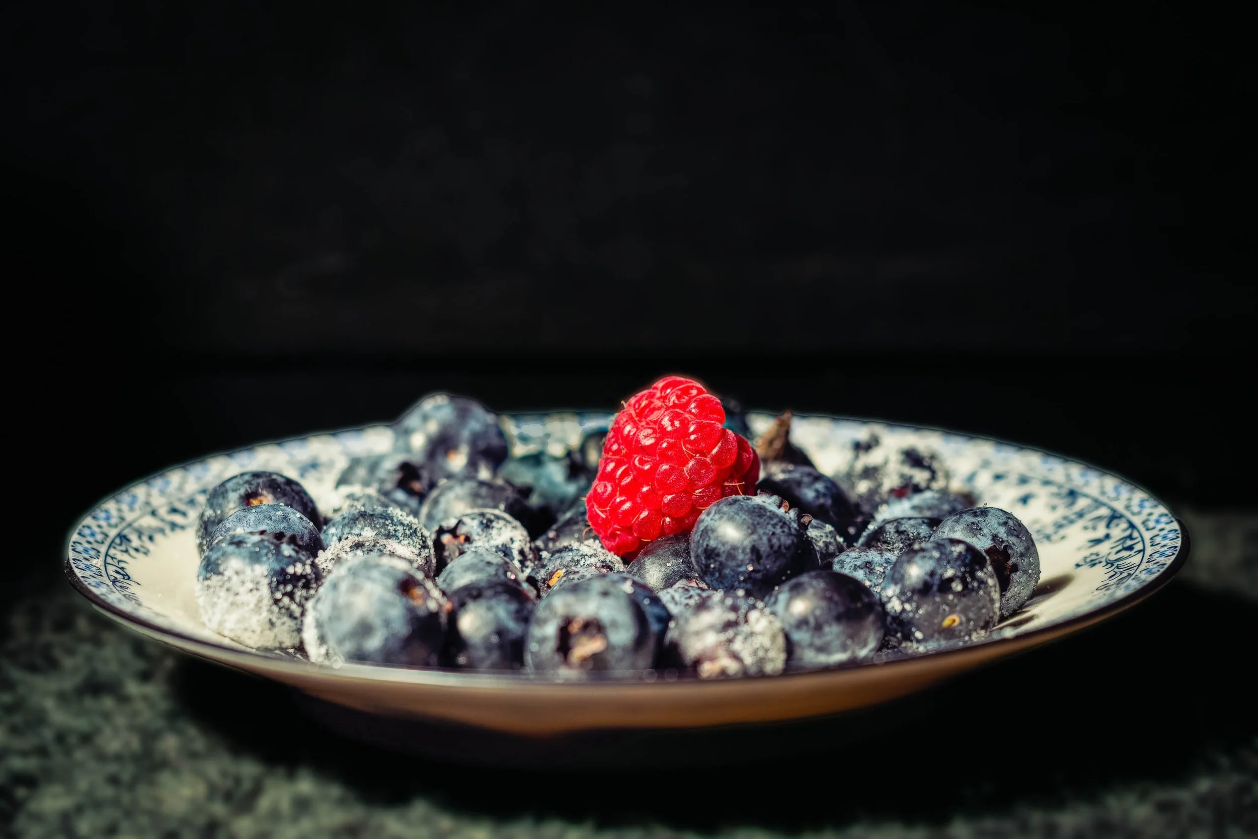
Still Life for Grandmother returns to the same inherited blue-and-white china as Breakfast With Grandmother, but in a completely different register — a single hard light source, a field of pure black, and a composition that owes more to Dutch still-life painting than to any breakfast table. The blueberries pile in low, dense shadow, their frosted bloom and star-shaped blossom scars picked out only where the light finds them directly. One raspberry breaks the field of blue-black with real authority, its individual drupelets and fine hairs rendered in crisp, deliberate detail.
The china itself all but disappears into pattern and reflection — a curve of silver trim catching the light along the rim, the blue design blurring into abstraction at the edges of focus. What's left is texture, weight, and a kind of quiet solemnity that the warmer, brighter version of this same china doesn't carry. The foreground surface, rough-hewn stone, grounds the whole composition in something older and more permanent than a breakfast table — closer to memory than to morning.
This is a deliberately restrained image: no landscape, no architecture, no wide gesture, just the specific, particular weight of an object that outlasts the person who owned it.
DESIGN & STYLING
Still Life for Grandmother suits spaces built around quiet contemplation rather than bright energy: formal dining rooms, entryways, reading rooms, and healthcare or hospice environments where a dark, dignified still life reads as restful rather than somber. Paired with warmer lighting, the deep blacks and jewel-toned blues hold real presence without becoming heavy-handed.
The low-key palette pairs naturally with dark wood, wrought iron, aged brass, and deep neutral walls — interiors that want gravity and history rather than brightness.
CURATED PAIRINGS
For the direct companion piece: Pair with Breakfast With Grandmother — same china, same year, an entirely different mood; together they make the case for how much light and background change what an object means.
For color harmony: Complement with Lavender Rhapsody — the same jewel-toned blues and purples, in a very different key.
For shared tonal restraint: Add The Long Watch to extend the same dark, quiet, deliberate mood into a different subject entirely.
FINE ART PRESENTATION
Still Life for Grandmother is available as a signed fine art photographic print in multiple presentation styles. ChromaLuxe® Metal (gloss, semi-gloss, or matte) suits this piece particularly well — true blacks and a glossy surface both reinforce the dramatic, high-contrast treatment. Acrylic adds even more depth to the blacks for a more contemporary presentation. Framed archival paper offers a softer, more traditional reading if the space calls for it, and Canvas Framed adds texture without fighting the image's own restraint.
Note: Custom and oversized photographic prints are available. Please contact the studio directly to discuss custom framing, matting, or specialized museum glass options.
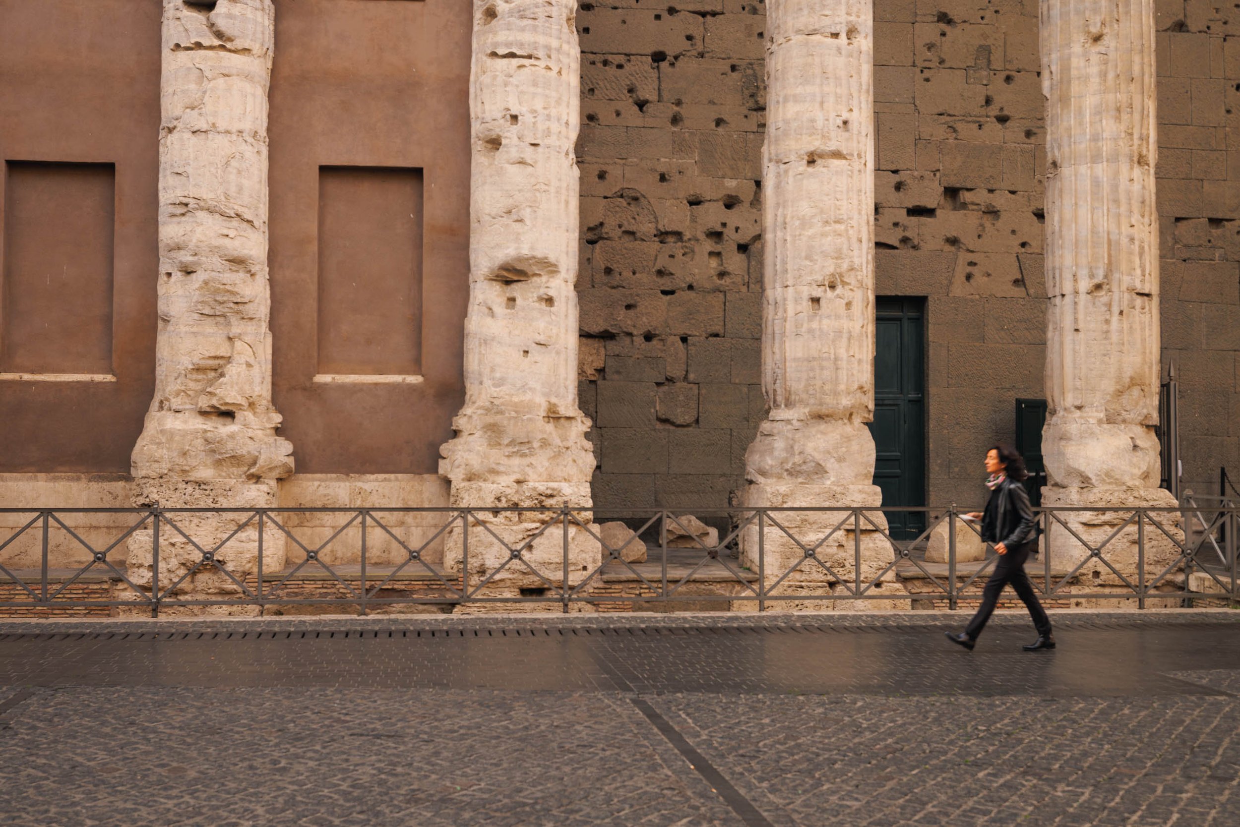
Passing the Pantheon is a study of permanence and passage — a fleeting human moment unfolding beneath the monumental columns of Rome's Pantheon. Photographed along Piazza della Rotonda, the composition reduces one of the world's most recognizable landmarks to its essential elements: weathered travertine columns, scarred masonry, rhythmic iron fencing, and a solitary pedestrian moving quietly across the frame.
The photograph relies on restraint rather than spectacle. The repeating columns establish a measured visual cadence while the lone figure provides both scale and narrative, reminding us that buildings constructed nearly two thousand years ago continue to serve as the backdrop for ordinary lives. The generous negative space and horizontal composition allow the eye to move naturally from one architectural rhythm to the next before settling on the passerby, whose presence transforms the image from an architectural study into a meditation on time itself.
The work draws on traditions of minimalist architectural photography and the quiet observational approach of photographers who find meaning in everyday encounters with historic places. Rather than emphasizing the grandeur of the Pantheon as an isolated monument, Passing the Pantheon explores how extraordinary architecture becomes woven into the routines of modern life. The image suggests that history is not confined to museums or guidebooks but exists in the simple act of walking home, going to work, or passing through a familiar street.
Design & Styling
With its restrained palette of warm limestone, aged masonry, and muted earth tones, Passing the Pantheon complements contemporary interiors, hospitality environments, executive offices, libraries, and residential spaces seeking a sophisticated architectural presence. Its clean geometry and subtle narrative make it equally effective as a standalone statement piece or within a curated collection of European fine art photography.
Curated Pairings
To build a cohesive collection celebrating architecture, history, and quiet human presence, consider these companion pieces:
For another European architectural study: pair with The Bartender's Measure.
For a dialogue between historic and contemporary architecture: complement with Reflections of Glass and Stone.
For another contemplative image exploring place and atmosphere: consider Between Us, the Field.
Fine Art Presentation
Available as a signed fine art print in ChromaLuxe® Metal (gloss, semi-gloss, or matte), framed fine art paper, acrylic face mount, and canvas presentation formats. ChromaLuxe® Metal is recommended for preserving the subtle tonal transitions of the limestone while maintaining exceptional detail throughout the architectural textures.
Note: Custom and oversized photographic prints are available. Please contact the studio directly to discuss custom framing, matting, or specialized museum glass options.

Breakfast With Grandmother is built from the smallest possible cast of characters: a small mound of blueberries, one solitary raspberry, and the edge of a vintage blue-and-white porcelain cup and saucer, all held in soft, warm, low directional light. The focus falls precisely on the nearest blueberries — close enough to read the frosted bloom on their skin, the tiny star-shaped blossom scars, individual drops of condensation — while everything behind dissolves into a gentle wash of purple-grey shadow and out-of-focus china pattern.
The single raspberry does the quiet compositional work of the piece. Against a field of blue-black, its warmth pulls the eye first, then releases it into the detail of the berries beside it. The teacup, barely legible as anything but color and pattern, supplies the memory the title asks for — not through any literal narrative, but through the specific, particular kind of porcelain that shows up on grandmothers' breakfast tables and nowhere else quite the same way.
This is Robert Niemeier's quietest register: no landscape, no architecture, no distance — just texture, warmth, and a title that turns a simple bowl of fruit into something considerably more personal.
DESIGN & STYLING
Breakfast With Grandmother was built for exactly the kind of space that benefits from warmth without demanding attention: kitchens, breakfast nooks, dining rooms, and — notably — healthcare and senior living environments, where nostalgic, homelike imagery like this has real, documented value in memory care and reminiscence-focused settings. It reads as calm rather than sentimental, restorative rather than saccharine.
The tight macro crop and soft purple-to-warm palette also work well in smaller residential wall groupings, bathrooms, and hospitality settings looking for something intimate rather than monumental.
CURATED PAIRINGS
For color harmony: Pair with Lavender Rhapsody — the same jewel-toned blues and purples, carried from garden to table.
For a shared memory theme: Complement with Where Memory Waits — very different subjects, same quiet meditation on what objects carry forward.
For restorative stillness: Add The Garden's Quiet Anchor to extend the same soft, contemplative macro treatment.
FINE ART PRESENTATION
Breakfast With Grandmother is available as a signed fine art photographic print in multiple presentation styles. Framed and unframed archival paper prints suit this piece especially well — the softer, more tactile paper surface complements the warmth and intimacy of the subject better than a high-gloss finish would. Canvas Framed is a strong match for the same reason, adding texture without competing with the delicate out-of-focus china. ChromaLuxe® Metal (gloss, semi-gloss, or matte) and Acrylic are both available for a more contemporary, high-contrast presentation if that suits the space better.
Smaller and mid-range sizes are recommended for this piece — it's an intimate subject, and it holds its warmth best at a scale that invites a close look rather than a room-filling statement.
Note: Custom and oversized photographic prints are available. Please contact the studio directly to discuss custom framing, matting, or specialized museum glass options.
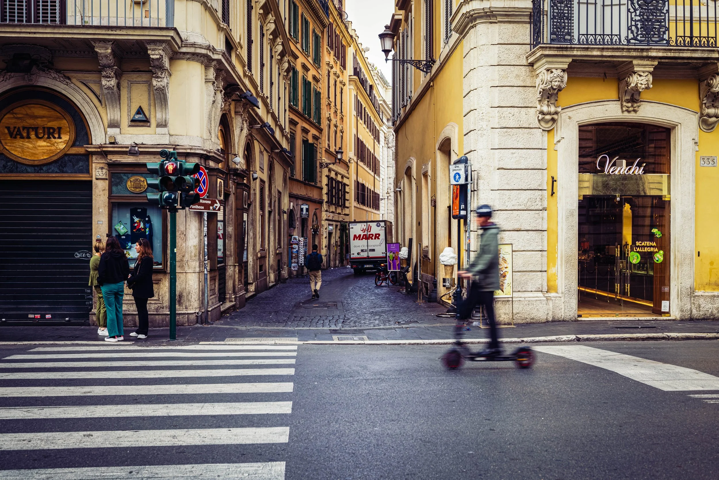
Corner of Via della Croce is a study of layered motion: the ordinary collision of pedestrians, delivery trucks, scooters, and centuries-old architecture that defines a Roman street corner on any given afternoon. Photographed at a busy intersection, with a sign pointing toward Piazza Navona and the Pantheon, the frame stacks depth in bands: a blurred scooter rider crossing the foreground mid-motion, a woman in black waiting at the curb beside the traffic light, and the street receding into warm, hazy distance where a delivery truck idles and a lone walker continues on.
The composition leans into candid layering rather than a single clear subject. Ochre, gold, and cream facades with green shutters, wrought-iron balconies, and an ornate carved corbel rise on both sides of a narrow cobbled street, and a street lamp leans out into the small gap of pale sky. Against them the cool gray asphalt and a broad white zebra crossing sweep into the frame at lower left, and the unresolved blur of the scooter gives the scene a genuine sense of a moment caught mid-motion rather than staged. Small accents keep the eye moving: a red pedestrian signal, a No Parking sign, a gelato cone on the sidewalk, the red lettering on the delivery truck. Nothing here was arranged; the street simply does what streets do, and the photograph trusts that to be enough.
The work draws on the color-street tradition of Saul Leiter: his interest in flattening a scene into layered planes of color and motion rather than isolating a single subject against a clean background. This is Rome as it is actually lived in: commerce, foot traffic, and architecture layered into one unresolved, ordinary moment.
Design & Styling
The warm ochre and gold architecture, the cool gray street, and the candid energy of Corner of Via della Croce suit Italian-themed restaurants, cafés, wine bars, and boutique hospitality spaces looking for authentic street life rather than postcard grandeur. At home it works in studies, dining rooms, and entryways, especially beside warm wood and plaster.
Curated Pairings
To build a cohesive Rome street collection, consider these companion pieces:
For continued candid Roman street energy: Pair with Modern Gladiators, a solitary figure at a busy Roman intersection as traffic sweeps around him in luminous ribbons.
For quiet nocturnal contrast: Complement with Waiting for a Ride, a lone figure in red on the cobblestones outside the Colosseum at night, the same city with the traffic gone.
For shared old-world atmosphere: Consider A Night at the Opera, figures crossing a lantern-lit Roman plaza toward the doors of the theater.
Fine Art Presentation
Available as a signed fine art print on ChromaLuxe® Metal (gloss, semi-gloss, or matte), Glossy Anti-Glare Acrylic (TruLife), canvas, wood, and archival paper (framed or unframed). Framed archival paper is the recommended presentation: its matte surface suits the documentary, editorial feel of a candid street scene and the layered planes of color. ChromaLuxe® Metal is the alternative for the saturated ochre and gold and the crisp architectural detail, and canvas gives a softer, more painterly read.
Note: Custom and oversized photographic prints are available. Please contact the studio directly to discuss custom framing, matting, or specialized museum glass options.
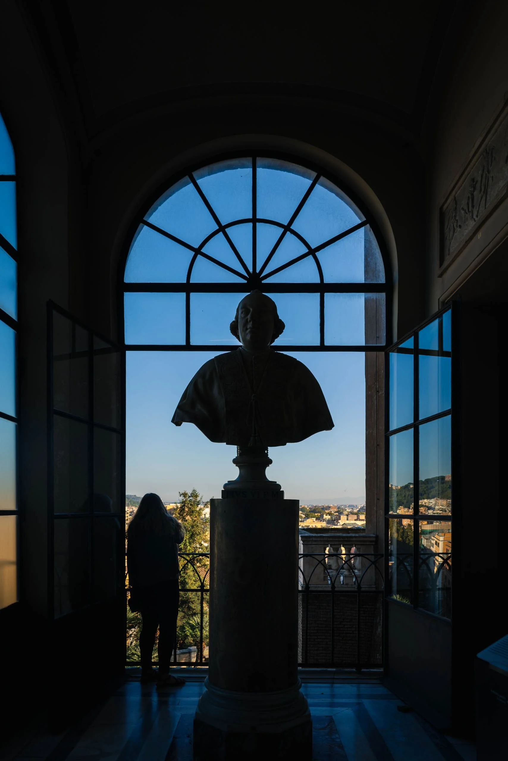
What Pius Still Watches is a study of time, vantage, and quiet succession. Photographed at blue hour, the image frames a marble bust of Pope Pius VI, backlit against the darkening Roman sky, standing sentinel over a city that has changed almost entirely since his era. Below him, a lone visitor leans against the balcony rail, taking in the same view — a quiet echo between a historical figure carved in stone and a living person doing, in this moment, exactly what he once might have done.
The composition holds to a deliberate symmetry, the arched window framing the bust dead-center, with the silhouetted figure positioned just off to the side below — close enough to draw the comparison, far enough to remain its own quiet moment. Deep architectural shadow fills the foreground, giving way to a rich gradient of evening blue and the warm glow of the city beyond. Both bust and figure are held in true silhouette, letting form and gesture carry the image rather than detail.
The work draws on Josef Sudek's patient studies of light through enclosure, alongside Henri Cartier-Bresson's interest in placing disparate eras within a single frame. Rather than a straightforward architectural or portrait study, the photograph offers a quiet meditation on vantage itself — who has stood at this window, and what has and hasn't changed in the view before them.
Design & Styling
With its rich blue-hour palette, historical gravitas, and sweeping city view, What Pius Still Watches brings a sense of grandeur and quiet sophistication to a space. The photograph works particularly well in boutique hotel lobbies, museum-adjacent hospitality settings, and Italian or "grand tour"-inspired interiors where history and atmosphere are equally valued.
Curated Pairings
To build a cohesive Rome-at-night gallery wall, consider these companion pieces:
For a continued nocturnal register: pair with Night Watch (Noir) at the Colosseum, photographed after dark at the same city's most iconic ruin.
For quiet Roman atmosphere and human presence: complement with Waiting for a Ride.
For shared evening elegance: consider A Night at the Opera, photographed at Rome's Teatro dell'Opera.
Fine Art Presentation
Available as a signed fine art print in ChromaLuxe® Metal (gloss, semi-gloss, or matte), framed paper, and acrylic presentation formats. ChromaLuxe® Metal is especially recommended for this piece — its reflective quality will deepen the blues of the sky while keeping the silhouette crisp and graphic.
Note: Custom and oversized photographic prints are available. Please contact the studio directly to discuss custom framing, matting, or specialized museum glass options.

Every bar has a rhythm, and the bartender keeps it. The Bartender's Measure (Noir) is a cinematic study of ritual, solitude, and the quiet emotional gravity in an ordinary gesture: a bartender behind the counter, beneath layered bar light and softened shadow.
In this mid-tone noir edit, pools of light emerge gradually from the surrounding darkness while reflections and glass textures build a sense of suspended time. The hands are protected from the shadow work so the motion blur of the bar spoon stays visible, a deliberate Haas-style detail that keeps the gesture alive inside the stillness. The bartender becomes less a portrait subject than an emotional anchor within the room.
The image draws on the contemplative urban sensibilities of Wim Wenders and the atmospheric tonal language of Ernst Haas, exploring the fragile tension between intimacy and distance in public spaces after dark.
Design & Styling
With its layered night atmosphere and restrained cinematic tones, The Bartender's Measure (Noir) suits cocktail bars, restaurants, lounges, studies, and hospitality interiors, and any room that wants a quiet, late-hour mood. On a dark wall, the pools of light appear to glow from within.
Curated Pairings
To create a cohesive gallery wall around solitary figures and after-dark stillness, consider these companion pieces:
For tonal harmony: Pair with Night Watch at the Colosseum (Monotone), to continue the dialogue between solitary figures, layered architectural light, and quiet nocturnal observation.
For atmospheric contrast: Complement this piece with Waiting, which mirrors the same emotional restraint and cinematic pacing in a more open urban space.
For another bartender at work: Pair with Behind the Bandana, a St. Louis bartender bent over her work, her hands and hair rendered as pure movement.
Fine Art Presentation
Available as a signed fine art print on ChromaLuxe® Metal (gloss, semi-gloss, or matte), Glossy Anti-Glare Acrylic (TruLife), canvas, wood, and archival paper (framed or unframed). Framed archival paper is the recommended presentation for the noir edit: its matte surface lets the mid-tone shadows and the spoon's motion blur read like a darkroom print. ChromaLuxe® Metal is the alternative for deeper contrast in the glass and reflections.
Note: Custom and oversized photographic prints are available. Please contact the studio directly to discuss custom framing, matting, or specialized museum glass options.
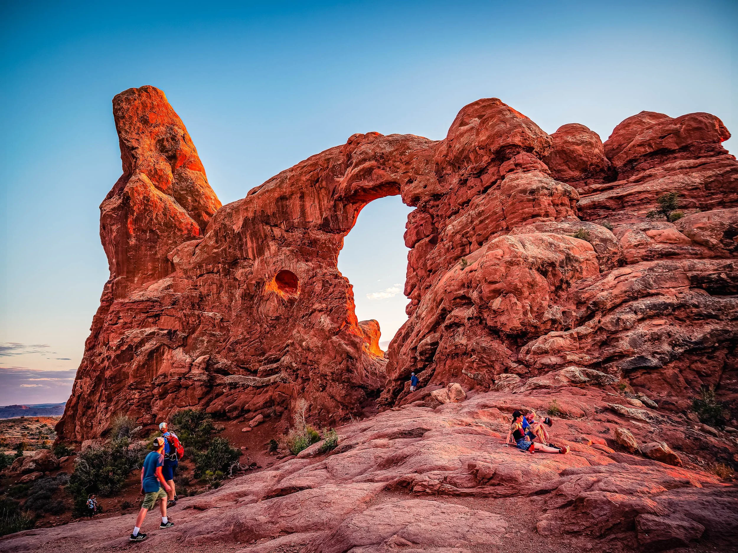
At the Edge of Wonder explores the relationship between human curiosity and the immense scale of the natural world. Photographed at sunset in Arches National Park, Utah, the image captures visitors gathering beneath a towering sandstone formation as the final light of day ignites the rock in shades of red, orange, and gold. Rather than presenting the landscape as an empty wilderness, the photograph embraces the presence of those drawn to experience it, transforming the scene into a reflection on exploration, discovery, and shared wonder.
The composition is built around the sweeping arch that spans the center of the frame, linking two massive rock structures carved by millions of years of erosion. Human figures scattered throughout the landscape provide a sense of scale while introducing multiple narratives within a single image. Some move through the scene, others pause to observe, and one rests quietly in the warm light. These individual moments create a visual dialogue between the fleeting nature of human experience and the enduring permanence of the landscape. Drawing inspiration from the color sensitivity of Ernst Haas and the cinematic sense of place found in the work of Wim Wenders, the photograph balances monumental form with intimate observation.
Color plays a central role in the image's emotional impact. The fiery sandstone glows against the cool blue evening sky, creating a natural complementary palette that heightens both atmosphere and depth. The transition from daylight to dusk becomes part of the story, emphasizing the brief window when landscape, light, and human presence align. The resulting photograph is less about a specific landmark and more about a universal experience—the feeling of standing before something larger than oneself and pausing long enough to appreciate it.
Design & Styling
With glowing red, orange, and gold sandstone and small visitors gathered beneath it, At the Edge of Wonder brings scale and a human way in to lobbies, offices, mountain and desert homes, and hospitality spaces. The warm rock holds a large wall well.
Curated Pairings
To create a cohesive gallery wall around the Southwest, consider these companion pieces:
For thematic continuity: Pair with The First Aperture, continuing the exploration of iconic natural formations and the experience of discovery in the American Southwest.
For visual contrast: Complement with Enduring Silence, a quieter, more contemplative interpretation of monumental landscapes that keeps a strong sense of scale.
For sculptural form: Pair with Where Sisters Rise, extending the dialogue between stone, light, and desert geology in the same red-rock and blue-sky palette.
Fine Art Presentation
Available as a signed fine art print on ChromaLuxe® Metal (gloss, semi-gloss, or matte), Glossy Anti-Glare Acrylic (TruLife), canvas, wood, and archival paper (framed or unframed). ChromaLuxe® Metal is the recommended presentation: it holds the luminous red, orange, and gold of the sunset sandstone and its fine texture. Acrylic is the alternative for extra depth in the evening color, and canvas for a warmer, more tactile Southwestern read.
Note: Custom and oversized photographic prints are available. Please contact the studio directly to discuss custom framing, matting, or specialized museum glass options.
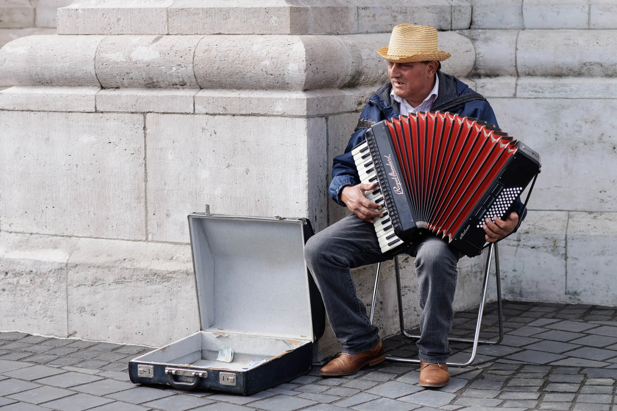
The Musician of Buda explores the relationship between individual expression and the enduring presence of place. Photographed in Budapest's historic Castle District, the image captures a street musician seated beneath centuries-old stone architecture, his vivid red accordion bringing warmth, color, and life to a quiet corner of the city. The scene reflects a moment that is both ordinary and memorable—a musician at work, surrounded by the history and permanence of the built environment.
Rather than focusing solely on the performer, the photograph considers the dialogue between human presence and architecture. The massive stone walls and monumental forms speak to generations of history, while the musician introduces a temporary yet deeply human element. His music exists only in the moment, transforming the space around him and creating a connection between place and passerby. The open instrument case at his feet hints at both livelihood and invitation, adding another layer to the narrative.
The restrained palette of pale stone, muted pavement, and soft afternoon light allows the red accordion to become the visual center of the composition. Drawing inspiration from documentary and street photography traditions, the image celebrates the small moments that give character and meaning to historic cities. It is a study of music, resilience, and the ways people leave their mark on places that have endured far longer than any individual life.
Design & Styling
With its balance of architectural structure and human presence, The Musician of Buda works particularly well in music rooms, studies, libraries, hospitality environments, offices, healthcare settings, and residential interiors. The photograph introduces warmth, narrative, and cultural character while maintaining a calm and timeless visual presence.
Curated Pairings
For human presence: Pair with The Bartender's Measure to explore the lives of individuals whose work and presence help define the atmosphere of a place.
For European storytelling: Complement this piece with Waiting for a Ride, where everyday life similarly unfolds through observation, gesture, and quiet narrative.
For urban character: Pair with Among the Names to create a collection focused on memory, culture, and the people who bring historic cities to life.
Fine Art Presentation
Available as a signed fine art print in ChromaLuxe® Metal (gloss, semi-gloss, or matte), framed paper, framed canvas, and acrylic presentation formats. ChromaLuxe® Metal and Framed Fine Art Paper are particularly well suited to preserving the subtle textures of the stone architecture, the richness of the accordion's color, and the quiet atmosphere of the scene.
Note: Custom and oversized photographic prints are available. Please contact the studio directly to discuss custom framing, matting, or specialized museum glass options.
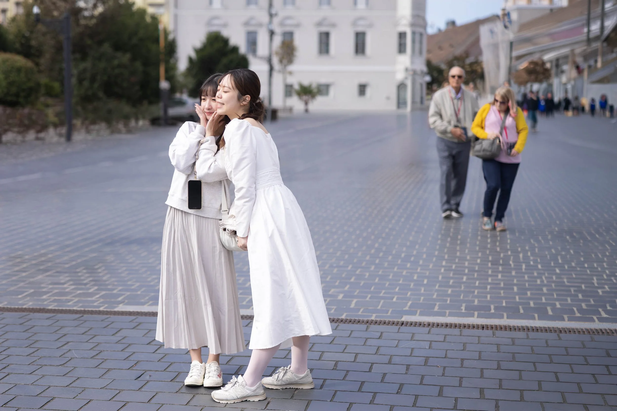
A Shared Moment explores the quiet connections that unfold within public spaces and the fleeting interactions that often define our memories of a place. Photographed in Budapest, Hungary, the image captures two friends sharing a private moment within the openness of a city square. Their relaxed posture and natural expressions create an intimate focal point while the surrounding environment quietly continues around them.
Rather than emphasizing the architecture or scale of the city, the photograph focuses on human presence and emotional resonance. The two women occupy a small portion of the expansive plaza, yet their interaction immediately anchors the scene. Behind them, an older couple moves through the background, introducing a second layer of life that expands the narrative beyond the foreground subjects. The resulting composition becomes a study of connection, observation, and the overlapping experiences that coexist within shared public spaces.
The restrained palette of soft whites, cool gray paving stones, and muted urban tones reinforces the photograph's contemplative atmosphere. Drawing inspiration from the observational traditions of street photography and the quiet narratives found in everyday life, the image celebrates a brief moment that might otherwise pass unnoticed.
Design & Styling
Two friends in an easy, private moment give A Shared Moment a warm human center for living rooms, dining rooms, cafés, hotel corridors, and offices. Its soft depth of field and unforced gesture make it a welcoming piece rather than a statement.
Curated Pairings
To build a wall around quiet human connection in public places, consider these companion pieces:
For human connection: Pair with Waiting, continuing the exploration of quiet moments and individual presence within public environments.
For narrative atmosphere: Complement this piece with Waiting for a Ride, where everyday life similarly unfolds through gesture, anticipation, and observation.
For European storytelling: Pair with The Bartender's Measure (Noir), a collection centered on human experience, place, and visual narrative.
Fine Art Presentation
Available as a signed fine art print on ChromaLuxe® Metal (gloss, semi-gloss, or matte), Glossy Anti-Glare Acrylic (TruLife), canvas, wood, and archival paper (framed or unframed). Framed archival paper is the recommended presentation: its matte, tactile surface suits the soft depth of field and the quiet tonal transitions. ChromaLuxe® Metal is the alternative for a slightly crisper, more luminous city square.
Note: Custom and oversized photographic prints are available. Please contact the studio directly to discuss custom framing, matting, or specialized museum glass options.
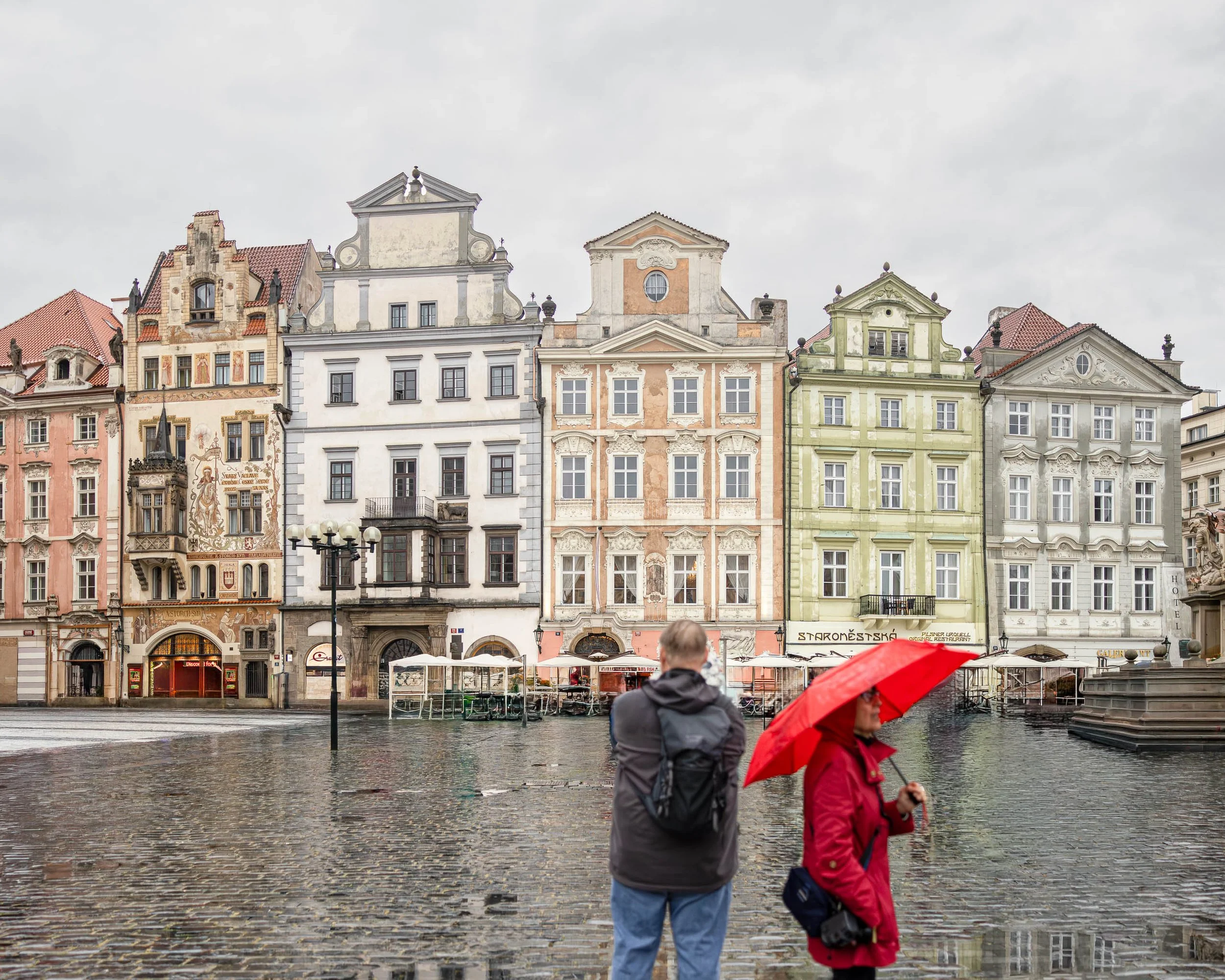
A Pause in the Rain explores the quiet moments that exist between destinations. Photographed on a rainy afternoon in Prague's Old Town Square, the image captures two figures occupying the same space yet inhabiting different experiences. One stands still, facing the historic facades of the city. The other moves through the scene beneath a bright red umbrella, adding a fleeting note of color against the subdued tones of stone, sky, and rain.
The nearly empty square transforms a normally crowded location into a place of contemplation. Rain softens the edges of the city and dampens the noise of daily life, allowing architecture, weather, and human presence to share equal importance. The figures remain slightly anonymous, encouraging viewers to project their own stories onto the scene rather than focusing on specific individuals.
The composition balances permanence and transience. The historic buildings have witnessed centuries of change, while the two figures represent a brief moment that will disappear almost as quickly as it arrived. Reflections in the wet cobblestones reinforce this dialogue between memory and impermanence, creating a visual rhythm that moves the eye through the square.
Influenced by the observational sensibilities of Wim Wenders and the atmospheric use of color associated with Ernst Haas, A Pause in the Rain is ultimately a photograph about presence—about the brief moments when weather, place, and human experience align to create something quietly memorable.
Design & Styling
With its restrained color palette, architectural character, and subtle human narrative, A Pause in the Rain works particularly well in executive offices, hospitality environments, libraries, cultural institutions, residential interiors, and contemporary commercial spaces.
The image introduces a sense of calm observation while maintaining enough visual tension to encourage repeated viewing. It pairs especially well with interiors that emphasize reflection, travel, history, and thoughtful design.
Curated Pairings
To create a cohesive gallery wall, consider pairing A Pause in the Rain with:
The Weight of Names — continues the exploration of memory, history, and human presence within Prague.
Before the City Wakes— extends the theme of solitude and atmosphere in historic European spaces.
Where Memory Waits— complements the image through its quiet reflection on remembrance, passage, and place.
Fine Art Presentation
Available as a signed fine art print in ChromaLuxe® Metal (gloss, semi-gloss, or matte), framed paper, framed canvas, and acrylic presentation formats.
Recommended Presentation: ChromaLuxe® Metal. This presentation preserves the subtle reflections in the rain-soaked cobblestones while maintaining detail throughout the architecture and sky.
Larger presentation sizes are particularly effective, allowing viewers to appreciate both the architectural detail and the relationship between the two figures within the expansive square.
Note: Custom and oversized photographic prints are available. Please contact the studio directly to discuss custom framing, matting, or specialized museum glass options.
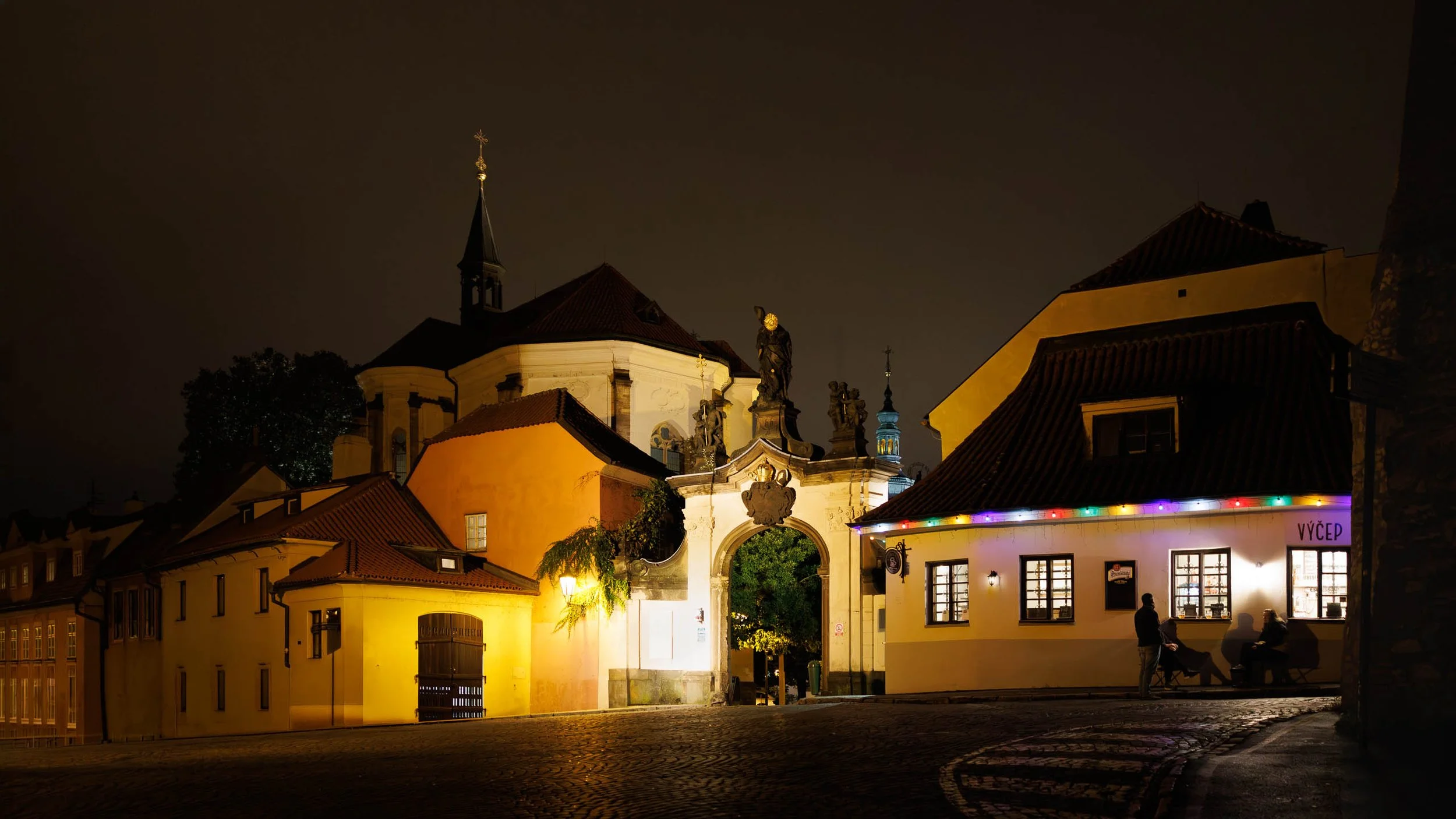
Last Call in Prague explores the quieter hours of the city, when the crowds have faded and only a handful of conversations remain beneath the glow of historic architecture. Photographed on a warm evening near Prague Castle, the image captures three figures gathered outside a neighborhood pub while centuries of history surround them.
The composition is built upon contrasts. Warm interior light spills from the tavern windows into the darkness of the street. Ancient stonework and baroque architecture stand unchanged while everyday life unfolds beneath them. The curved roadway guides the eye through the scene, connecting the illuminated pub, the ornate gateway, and the church rising above the rooftops beyond.
Although Prague is celebrated for its landmarks, the photograph focuses on something more personal. The figures gathered outside the pub become the emotional center of the image, transforming the architecture from backdrop into lived experience. Their presence reminds us that cities are remembered not only through monuments and history, but through conversations, friendships, and the simple rituals of everyday life.
The restrained palette of amber light, deep shadows, and subtle architectural detail creates an atmosphere of intimacy and discovery. Rather than documenting a famous destination, Last Call in Prague reflects on the moments that remain after the sightseeing ends and the city returns to itself.
Drawing inspiration from the observational urban photography of Wim Wenders and the cinematic use of light found throughout European street photography, the image explores memory, place, and the enduring relationship between people and the cities they inhabit.
Design & Styling
Warm pub light spilling onto a street beneath the Prague Castle skyline gives Last Call in Prague an unhurried, convivial mood for bars, restaurants, dining rooms, and home bars. It suits dark wood, brass, and warm neutral walls.
Curated Pairings
To create a cohesive gallery wall around Prague in the evening, consider these companion pieces:
For Prague in solitude: Pair with Before the City Wakes, exploring the city through solitude, atmosphere, and early morning anticipation.
For architecture, light, and people: Complement with Under the Crossing — Prague, continuing the relationship between architecture, light, and human presence within Prague's historic streets.
For mystery and discovery: Pair with Around the Corner, the quieter side of Prague through mystery, atmosphere, and discovery.
Fine Art Presentation
Available as a signed fine art print on ChromaLuxe® Metal (gloss, semi-gloss, or matte), Glossy Anti-Glare Acrylic (TruLife), canvas, wood, and archival paper (framed or unframed). Framed canvas is the recommended presentation: its warmth and texture suit a convivial evening scene and a bar or dining room. ChromaLuxe® Metal is the alternative for the warm interior light at full glow, and framed archival paper for a more traditional reading of the castle architecture.
Note: Custom and oversized photographic prints are available. Please contact the studio directly to discuss custom framing, matting, or specialized museum glass options.
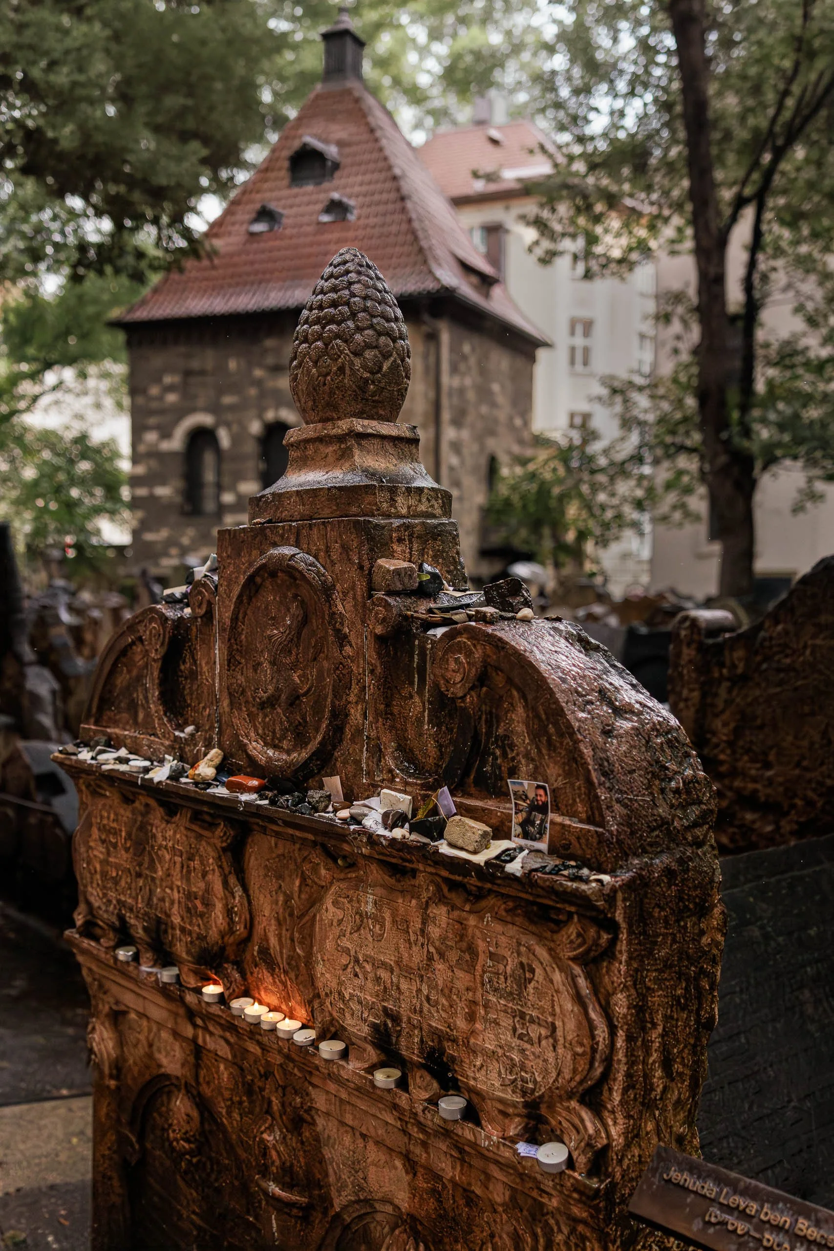
The Stones They Leave Behind explores the enduring act of remembrance and the quiet rituals through which memory is carried forward. Photographed in Prague's historic Jewish Cemetery after rain, the image centers on a weathered tombstone covered with stones, photographs, and candles left by visitors who continue to return, remember, and honor lives long past.
The composition is built around evidence of human presence rather than people themselves. The monument occupies the foreground with a sense of permanence and gravity, while the offerings reveal a continuing relationship between the living and the dead. Each stone, photograph, and candle represents an individual act of remembrance, transforming the tombstone from a historical artifact into a living place of memory.
The rain-softened light contributes to the atmosphere of reflection. Wet stone surfaces reveal centuries of texture and wear, while the small flames of the candles introduce warmth into an otherwise subdued scene. Beyond the monument, the cemetery chapel and surrounding tombstones provide context without distraction, reminding viewers that this single memorial exists within a much larger landscape shaped by history, faith, and time.
Influenced by the contemplative traditions of Josef Sudek and the observational sensibilities of Wim Wenders, The Stones They Leave Behind is less concerned with documenting a specific location than with exploring the universal human desire to remember. The photograph reflects on the ways memory survives through ritual, repetition, and small gestures of care passed from one generation to the next.
Design & Styling
With its rich textures, restrained palette, and contemplative subject matter, The Stones They Leave Behind works particularly well in libraries, studies, healthcare environments, hospitality settings, executive offices, and thoughtfully designed residential interiors.
The image introduces depth, history, and quiet reflection while maintaining a strong visual presence. Its combination of architecture, ritual, and human narrative makes it especially effective in spaces intended to encourage contemplation and meaningful conversation.
Curated Pairings
To create a cohesive gallery wall, consider pairing The Stones They Leave Behind with:
The Weight of Names — explores memory through the encounter between an individual and the collective record of history.
Where Memory Waits — continues the Prague narrative through themes of remembrance, passage, and human presence.
Before the City Wakes — complements the image through atmosphere, quiet observation, and the experience of place.
Fine Art Presentation
Available as a signed fine art print in ChromaLuxe® Metal (gloss, semi-gloss, or matte), framed paper, framed canvas, and acrylic presentation formats.
Recommended Presentation: ChromaLuxe® Metal. This presentation preserves the subtle shadow detail, wet stone textures, and candlelight while maintaining the contemplative mood of the image.
Larger presentation sizes are particularly effective, allowing viewers to discover the individual offerings, photographs, and stones that give the image its emotional resonance.
Note: Custom and oversized photographic prints are available. Please contact the studio directly to discuss custom framing, matting, or specialized museum glass options.
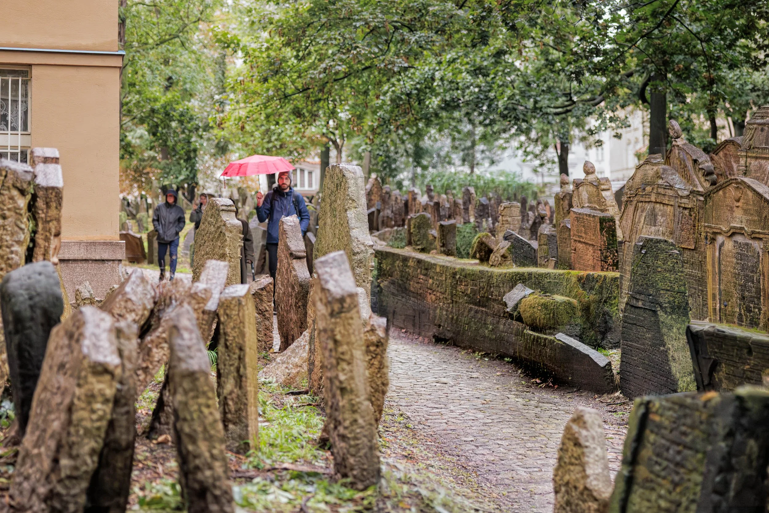
Where Memory Waits explores the relationship between the living and the traces they inherit from those who came before. Photographed in Prague's historic Jewish Cemetery on a rainy afternoon, the image captures a visitor carrying a red umbrella as he moves through a narrow pathway surrounded by centuries-old tombstones.
The composition balances movement against permanence. The visitor continues forward through the scene while the leaning stones remain fixed in place, bearing witness to generations of history. The red umbrella provides a point of human presence within a landscape shaped by memory, creating a visual connection between contemporary life and the stories preserved within the cemetery.
The photograph is filled with subtle contrasts. The weathered stones speak of endurance and time, while the visitor's brief passage suggests the temporary nature of individual experience. Moss-covered surfaces, soft rain light, and the winding pathway create an atmosphere of quiet reflection rather than solemnity. The image invites viewers to consider how places preserve memory and how we move through environments shaped by lives we never knew.
Influenced by the observational sensibilities of Wim Wenders and the color-driven atmosphere of Ernst Haas, Where Memory Waits is less about documenting a historic site than about exploring the universal experience of encountering history within everyday life. It is a photograph about remembrance, passage, and the enduring dialogue between past and present.
Design & Styling
With its layered composition, atmospheric color palette, and narrative sense of place, Where Memory Waits works particularly well in libraries, executive offices, hospitality environments, healthcare spaces, studies, and thoughtfully designed residential interiors.
The image introduces visual depth and quiet contemplation while maintaining a strong sense of human presence. Its combination of history, atmosphere, and storytelling makes it especially effective in spaces intended to encourage reflection and conversation.
Curated Pairings
To create a cohesive gallery wall, consider pairing Where Memory Waits with:
The Weight of Names — continues the exploration of memory, history, and individual reflection.
Golem Watches Over Her — extends the Prague narrative through themes of history, culture, and human presence.
Before the City Wakes — complements the image through its atmosphere of quiet observation and discovery.
Fine Art Presentation
Available as a signed fine art print in ChromaLuxe® Metal (gloss, semi-gloss, or matte), framed paper, framed canvas, and acrylic presentation formats.
Recommended Presentation: ChromaLuxe® Metal. This presentation preserves the subtle textures of the stonework, the atmosphere of the rain-softened light, and the richness of the red umbrella while maintaining detail throughout the scene.
Larger presentation sizes are particularly effective, allowing viewers to experience the layered depth of the cemetery and the relationship between the visitor and the surrounding landscape of memory.
Note: Custom and oversized photographic prints are available. Please contact the studio directly to discuss custom framing, matting, or specialized museum glass options.

Modern Gladiators explores the tension between the individual and the relentless movement of contemporary life. Photographed at dusk in Rome, the image captures a solitary figure standing at the edge of a busy intersection while streams of traffic sweep around him in luminous ribbons of light.
The composition balances stillness against motion. The pedestrian remains grounded and contemplative while the city races past in every direction. Long exposure transforms ordinary traffic into flowing bands of energy, turning the intersection into a modern arena where daily life unfolds as a quiet act of endurance and navigation.
The title draws a connection between contemporary urban life and Rome's ancient history. Where gladiators once entered the arena to face uncertainty, today's city dwellers move through environments defined by speed, complexity, and constant motion. The photograph suggests that courage is often found not in grand gestures but in ordinary moments of persistence.
Influenced by the observational sensibilities of Wim Wenders and the color-driven atmosphere of Ernst Haas, Modern Gladiators is less about Rome as a destination and more about the universal experience of finding one's place within the flow of modern life.
With its dynamic light trails, strong architectural structure, and contemporary urban narrative, Modern Gladiators works particularly well in executive offices, hospitality environments, technology spaces, modern residential interiors, and corporate collections.
The image introduces movement and energy while maintaining a thoughtful human presence, making it especially effective in spaces designed to inspire creativity, reflection, and engagement.
To create a cohesive gallery wall, consider pairing Modern Gladiators with:
Waiting for a Ride — continues the theme of human presence within the urban environment.
Night Watch at the Colosseum (Monotone) — extends the Roman narrative while exploring solitude and observation.
The Bartender's Measure — complements the image through its study of ritual, character, and everyday experience.
Among Strange Flowers — adds a quieter contemplative counterpart centered on observation and discovery.
Under the Crossing — balances the energy of the city with architectural atmosphere and reflection.
Available as a signed fine art print in ChromaLuxe® Metal (gloss, semi-gloss, or matte), framed paper, framed canvas, and acrylic presentation formats.
Recommended Presentation: ChromaLuxe® Metal. This presentation preserves the luminous quality of the light trails while maintaining detail in the shadows and architectural elements throughout the scene.
Larger presentation sizes are particularly effective, allowing the viewer to experience the contrast between the still figure and the flowing movement of the city.
Note: Custom and oversized photographic prints are available. Please contact the studio directly to discuss custom framing, matting, or specialized museum glass options.
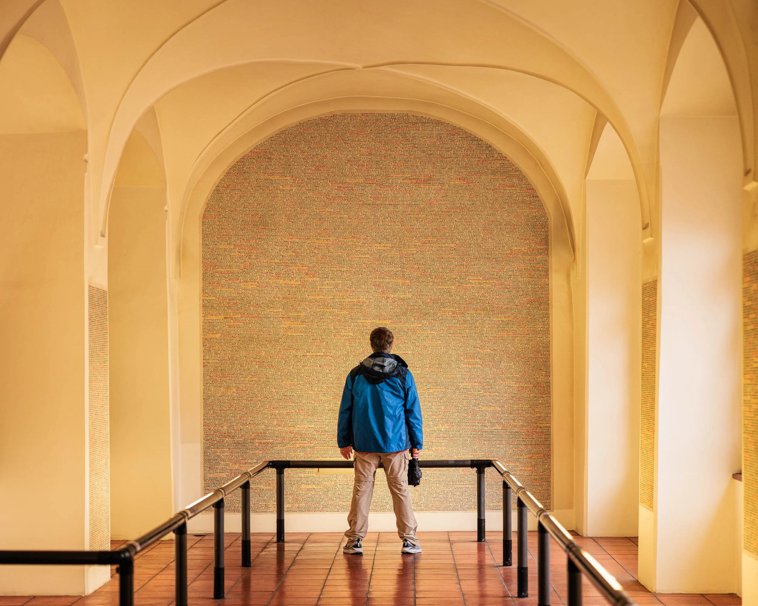
The Weight of Names explores the relationship between individual experience and collective memory. Photographed in Prague, the image captures a solitary visitor standing before a vast wall of names, creating a moment of reflection on history, remembrance, and the enduring impact of human lives across generations.
The composition balances a single human presence against the scale of something far larger. The visitor occupies only a small portion of the frame, yet becomes its emotional center. Surrounded by soaring arches, converging railings, and a seemingly endless field of names, he stands as a reminder of how individuals encounter history—not through grand events, but through quiet moments of observation and contemplation.
The architecture reinforces this sense of reflection. Repeating forms guide the viewer inward while the warm tones of the space create an atmosphere of permanence and dignity. Against this restrained palette, the visitor's blue jacket becomes a subtle point of focus, emphasizing both presence and vulnerability. The image invites viewers to consider how memory is preserved and how the stories of countless lives continue to shape the present.
Influenced by the contemplative visual language of Wim Wenders and the humanistic traditions of European photography, The Weight of Names is less about documenting a specific location than about exploring the universal experience of standing before something larger than oneself. The photograph asks viewers to slow down, reflect, and consider the relationship between personal experience and collective remembrance.
Design & Styling
With its strong architectural structure, restrained color palette, and contemplative narrative, The Weight of Names works particularly well in executive offices, libraries, educational institutions, healthcare environments, professional waiting areas, and thoughtfully designed residential interiors.
The image introduces a sense of reflection and quiet presence while maintaining a clean architectural aesthetic. Its combination of human narrative and formal design makes it especially effective in spaces intended to encourage thought, learning, creativity, and meaningful conversation.
Curated Pairings
To create a cohesive gallery wall, consider pairing The Weight of Names with:
Among the Names — continues the exploration of memory, history, and personal reflection.
Shoes on the Danube — extends the theme of remembrance through place and historical presence.
Golem Watches Over Her — complements the Prague narrative while exploring the relationship between people, history, and cultural memory.
Fine Art Presentation
Available as a signed fine art print in ChromaLuxe® Metal (gloss, semi-gloss, or matte), framed paper, framed canvas, and acrylic presentation formats.
Recommended Presentation: ChromaLuxe® Metal. This presentation preserves the subtle tonal transitions, architectural detail, and restrained color palette that could compete with the contemplative nature of the image.
Larger presentation sizes are particularly effective, allowing viewers to fully experience the relationship between the solitary figure and the scale of the surrounding architecture.
Note: Custom and oversized photographic prints are available. Please contact the studio directly to discuss custom framing, matting, or specialized museum glass options.
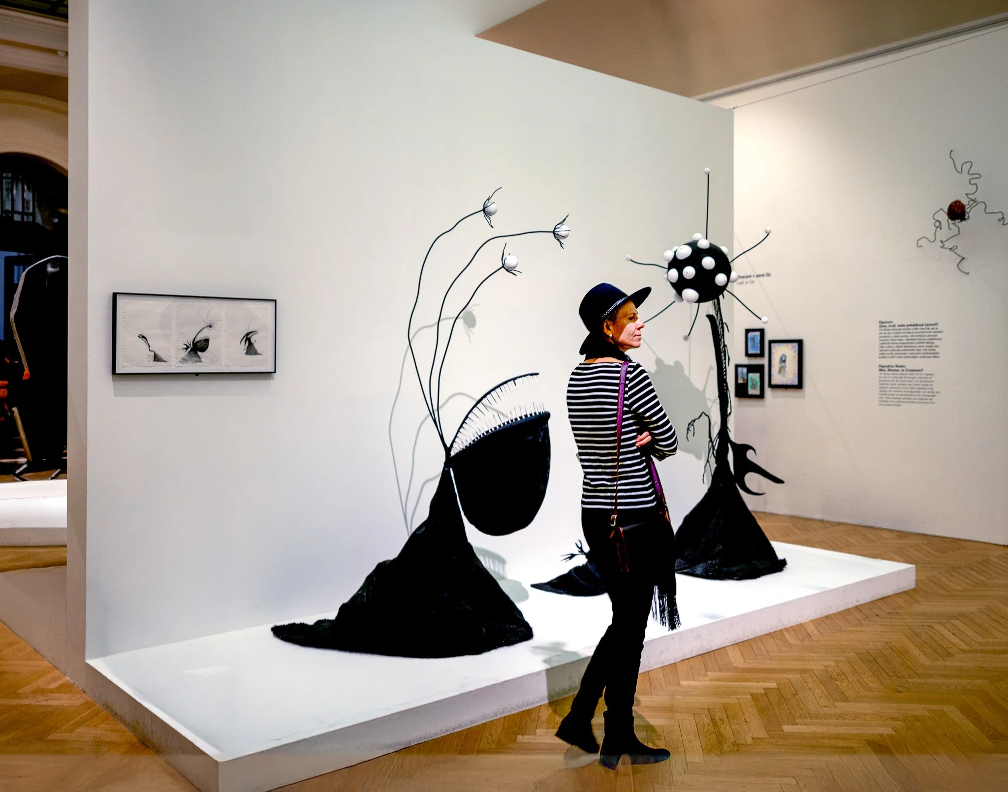
Among Strange Flowers explores curiosity, observation, and the quiet relationship between people and art. Photographed inside a Prague gallery, the image captures a solitary visitor pausing among a collection of whimsical sculptural forms that appear to grow from the gallery floor like strange botanical specimens.
The photograph balances human presence against an imaginative environment. The visitor's striped clothing echoes the monochromatic forms of the installation, creating a visual connection between observer and artwork. Surrounded by oversized flowers, abstract seedpods, and organic shapes, she appears momentarily suspended between the familiar and the fantastical. Rather than documenting the exhibition itself, the image focuses on a fleeting moment of engagement—an encounter between imagination and observation.
The restrained palette and spacious composition allow the sculptural forms to breathe while emphasizing the visitor's role within the scene. The result is both playful and contemplative, inviting viewers to consider the ways art transforms ordinary spaces into places of discovery.
Drawing inspiration from the observational photography of Wim Wenders and the human-centered storytelling found in contemporary documentary work, Among Strange Flowers celebrates the simple act of wandering, noticing, and wondering.
Design & Styling
The whimsy of sculptural forms that appear to grow from a gallery floor makes Among Strange Flowers a natural fit for design studios, creative offices, galleries, and modern homes with an art-minded owner. The solitary visitor gives the scene human scale.
Curated Pairings
To build a wall around galleries, looking, and human presence, consider these companion pieces:
For observation in a gallery: Pair with Shared Attention, exploring connection and observation within a gallery setting.
For quiet contemplation: Complement with Waiting, continuing the theme of quiet contemplation and human experience.
For people in public space: Add Modern Gladiators, a contemporary study of people interacting within public spaces.
Fine Art Presentation
Available as a signed fine art print on ChromaLuxe® Metal (gloss, semi-gloss, or matte), Glossy Anti-Glare Acrylic (TruLife), canvas, wood, and archival paper (framed or unframed). Acrylic is the recommended presentation: its depth and clarity suit the imaginative sculptural forms and the tonal relationships of a gallery interior. Framed archival paper is the alternative for a quieter, more traditional gallery-print read.
Note: Custom and oversized photographic prints are available. Please contact the studio directly to discuss custom framing, matting, or specialized museum glass options.
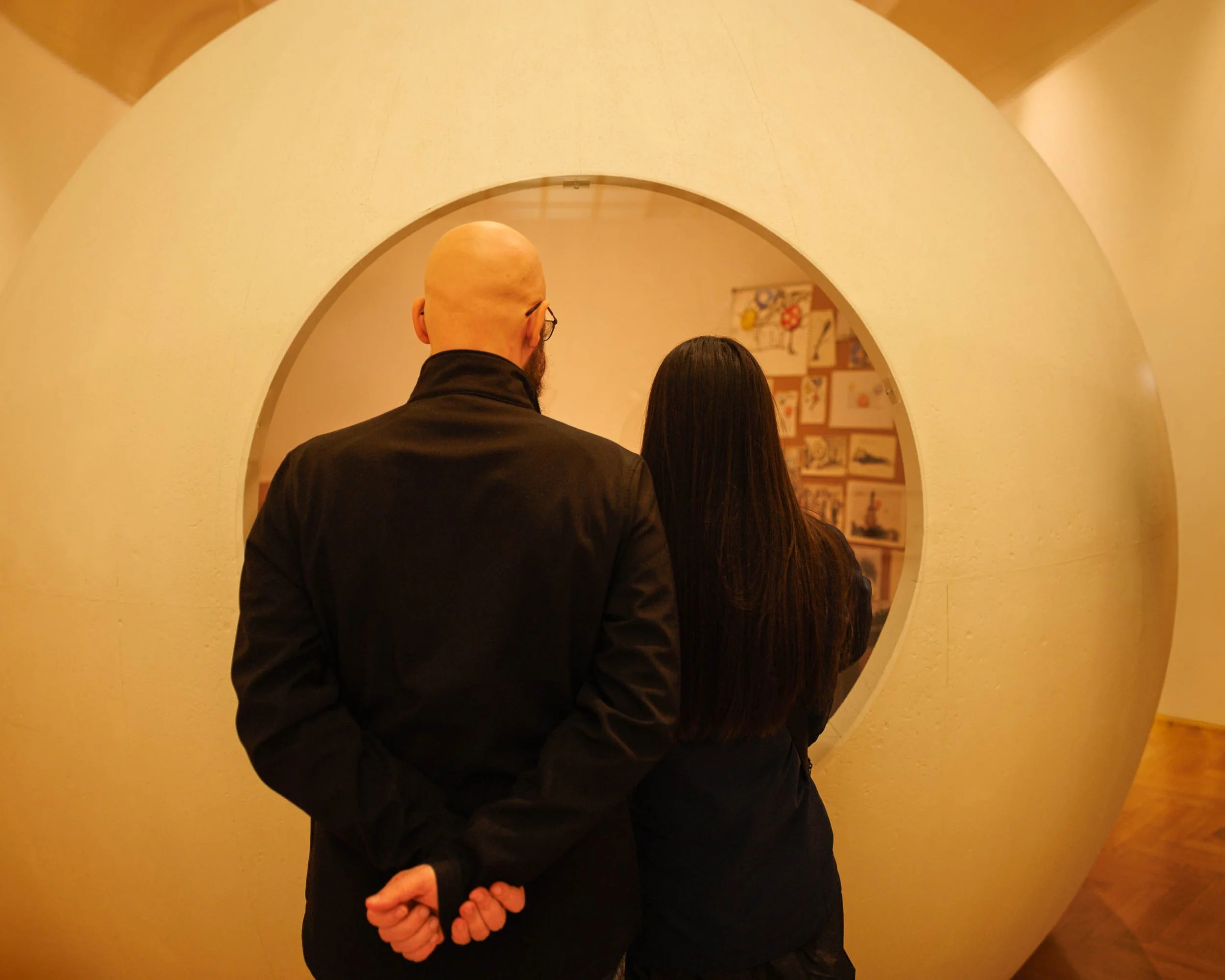
Shared Attention is a study of observation, connection, and the quiet moments that unfold within cultural spaces. Photographed in a Prague gallery, the image captures two visitors standing before an exhibition, framed by a large circular architectural opening that transforms an ordinary act of looking into a carefully composed visual narrative.
The photograph is built around a simple human gesture. Standing side by side, the figures direct their attention toward artwork beyond the circular frame. Their anonymity invites viewers to step into the scene themselves, transforming the image from a portrait of specific individuals into a reflection on shared curiosity and discovery. The circular structure creates a frame within a frame, guiding the eye toward both the viewers and the objects of their attention while emphasizing the relationship between people, art, and space.
The warm tones of the gallery environment reinforce a sense of intimacy and contemplation. Rather than focusing on the artwork itself, the photograph explores the act of engagement—the moment when two people pause together to observe, interpret, and experience something beyond themselves.
Drawing inspiration from the observational sensibilities of Wim Wenders and the quiet humanism found in much of contemporary documentary photography, Shared Attention reflects on the universal experience of looking, learning, and connecting through art.
Design & Styling
Two visitors framed by a large circular opening turn an ordinary act of looking into a composition, so Shared Attention suits galleries, design and creative offices, and modern homes with an art-minded owner. The geometry is graphic enough for a clean, contemporary wall.
Curated Pairings
To build a wall around galleries and looking together, consider these companion pieces:
For solitude and anticipation: Pair with Waiting, exploring solitude, reflection, and quiet anticipation.
For remembrance and individual experience: Complement with Among the Names - Monotone, examining remembrance and individual experience within a shared historical space.
For people in public space: Add Modern Gladiators, a contemporary study of people interacting within public environments.
Fine Art Presentation
Available as a signed fine art print on ChromaLuxe® Metal (gloss, semi-gloss, or matte), Glossy Anti-Glare Acrylic (TruLife), canvas, wood, and archival paper (framed or unframed). Acrylic is the recommended presentation: its clarity suits the architectural geometry and the warm gallery light. Framed archival paper is the alternative for a quieter, more traditional gallery-print read.
Note: Custom and oversized photographic prints are available. Please contact the studio directly to discuss custom framing, matting, or specialized museum glass options.
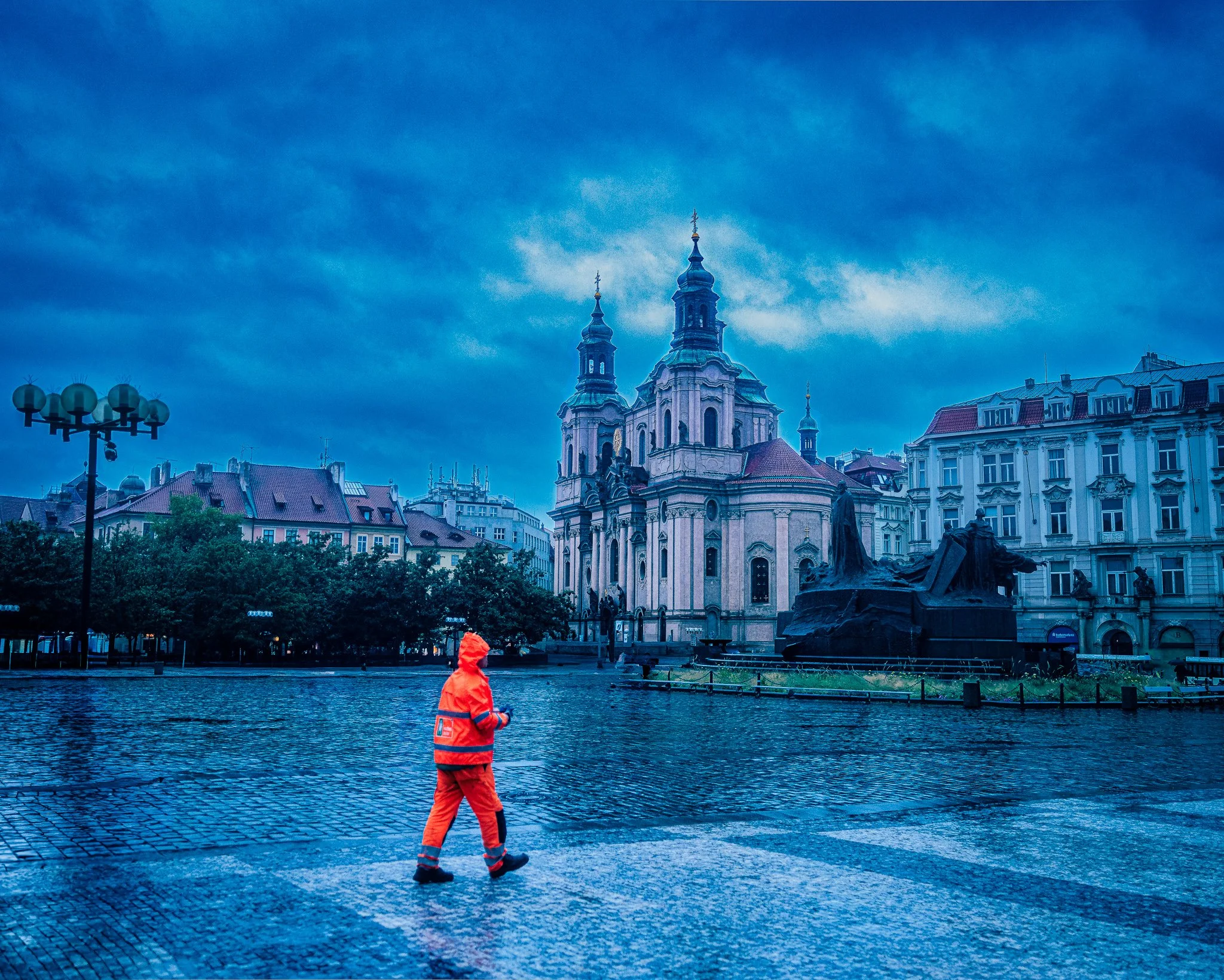
Between Storms is a study of solitude, resilience, and the fleeting moments that unfold between weather and history. Photographed in Prague's Old Town Square during a passing storm, the image captures a solitary figure in bright orange rain gear crossing the wet cobblestones beneath darkening skies. Behind him, centuries of architecture stand quietly against the approaching weather, creating a visual dialogue between the individual and the enduring city.
The composition is built upon contrast. The vivid figure moves through a landscape of cool blues, muted stone, and storm-laden clouds, becoming both a focal point and a narrative catalyst. The empty square, reflective pavement, and dramatic sky transform an ordinary moment into something cinematic, inviting viewers to imagine the story unfolding beyond the frame.
Drawing inspiration from the atmospheric storytelling of Wim Wenders, the contemplative mood of European street photography, and the emotional resonance of places shaped by time, Between Storms explores themes of perseverance, transition, and the quiet relationship between people and the cities they inhabit. Rather than documenting a landmark, the photograph celebrates a brief human moment within a much larger historical landscape.
The result is an image that reminds us that even the most ordinary journeys become meaningful when set against the backdrop of weather, memory, and place.
Short Description
A solitary figure crosses Prague's Old Town Square beneath gathering storm clouds, creating a cinematic study of atmosphere, history, and human presence.
Design & Styling
The orange rain gear against a deep blue storm sky in Between Storms gives a wall one confident note of color for executive offices, hospitality spaces, living rooms, and studios. Pale walls let the orange be the point.
Curated Pairings
To create a cohesive display around Prague in weather, consider these companion pieces:
For solitude in Prague: Pair with Before the City Wakes, two different moments of solitude within the historic streets of Prague.
For hidden stories: Complement with Waiting for Redemption, continuing the exploration of human stories hidden within the architecture and history of Prague.
For a single note of color in rain: Pair with Waiting for the Morning, a lone figure with one vivid red bag on a rain-soaked passage.
Fine Art Presentation
Available as a signed fine art print on ChromaLuxe® Metal (gloss, semi-gloss, or matte), Glossy Anti-Glare Acrylic (TruLife), canvas, wood, and archival paper (framed or unframed). ChromaLuxe® Metal is the recommended presentation: it makes the orange against the blue storm sky glow and holds the reflections in the wet cobblestones. Acrylic is the alternative for extra depth.
Note: Custom and oversized photographic prints are available. Please contact the studio directly to discuss custom framing, matting, or specialized museum glass options.
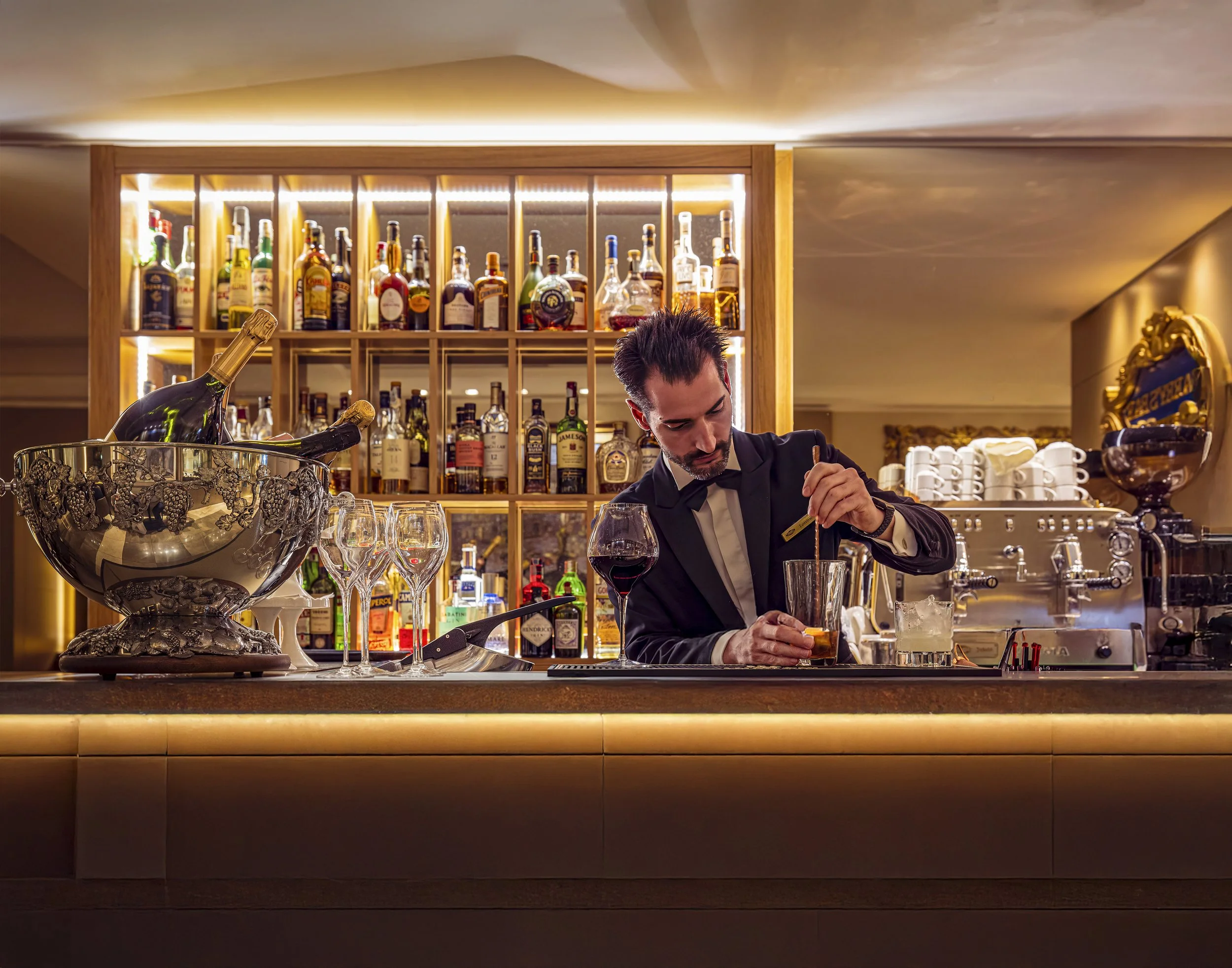
The Bartender's Measure (Color) is a documentary-style photograph exploring ritual, craftsmanship, and the quiet choreography of hospitality. Captured within the warm interior of a traditional European bar, the image focuses on the precise moment a bartender measures a pour, transforming an everyday action into a study of gesture, concentration, and human connection. Rich amber tones, reflected light, and layered interior details create an atmosphere that feels both intimate and timeless.
Drawing from the observational storytelling traditions of Wim Wenders and the luminous color sensibilities associated with Ernst Haas, the photograph celebrates the beauty found within ordinary moments. Rather than focusing on spectacle or nightlife, the image explores the quieter side of hospitality—the measured movements, practiced skill, and small rituals that transform service into craft.
The shallow depth of field and carefully layered composition allow the viewer to become an observer rather than a participant, creating a sense of presence and narrative without fully revealing the story. The result is an image centered on atmosphere, gesture, and the enduring human desire to gather, converse, and connect.
Design & Styling
With its warm amber palette, intimate lighting, and narrative atmosphere, The Bartender's Measure (Color) belongs in restaurants, cocktail bars, wine rooms, lounges, and boutique hotels, and in home bars and dining rooms that want warmth and craft. Against deep wood or a dark green wall, the amber reads as glowing light.
Curated Pairings
To create a cohesive gallery wall around hospitality and gathering, consider these companion pieces:
For complementary hospitality atmosphere: Pair with Prague Lunch, to extend the visual narrative of food, drink, and shared cultural experience.
For narrative continuity: Complement this piece with Passing Through Prague, which shares the same observational approach to everyday moments in richly atmospheric places.
For another bartender at work: Pair with Behind the Bandana, a St. Louis bartender bent over her work, her hands and hair rendered as pure movement.
Fine Art Presentation
Available as a signed fine art print on ChromaLuxe® Metal (gloss, semi-gloss, or matte), Glossy Anti-Glare Acrylic (TruLife), canvas, wood, and archival paper (framed or unframed). ChromaLuxe® Metal is the recommended presentation for the color version: it holds the amber highlights and the reflected light in the glass at full warmth. Framed canvas is a softer alternative for a home bar or dining room. For the same moment in a quieter register, the Noir version prints best on archival paper.
Note: Custom and oversized photographic prints are available. Please contact the studio directly to discuss custom framing, matting, or specialized museum glass options.
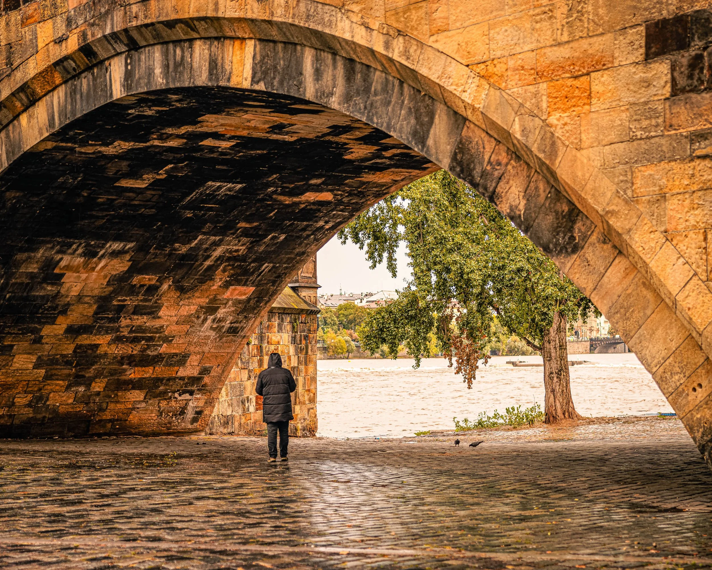
Shelter is often just a place to stand. Under the Crossing finds a single hooded figure standing beneath the massive stone arch of Prague's Charles Bridge on a rainy afternoon, back to the camera, looking out toward the Vltava River.
The arch does the framing. Its warm, weathered sandstone curves across the top and right of the frame, and the deep shadow of the vaulted underside on the left leads the eye down to the figure, small, dark, and low in the opening. Beyond, the river runs pale and rippled past a riverside tree in green and rust, with the rooftops of the city faint in the distance, and a pair of pigeons on the wet cobblestones adds a last quiet detail. The contrast of scale is the point: a lone person pausing within a structure built to outlast centuries of weather.
Drawing inspiration from the cinematic observation of Wim Wenders and the quiet emotional spaces found in Edward Hopper's work, the photograph considers the spaces beneath and between destinations, the places where people pause, reflect, and briefly step outside the current of daily life.
Design & Styling
The warm ochre stone, wet cobblestones, and solitary figure of Under the Crossing suit studies, libraries, executive offices, boutique hotel rooms, and homes that welcome travel and quiet contemplation. The warm palette works against cream, deep green, or charcoal walls.
Curated Pairings
To create a cohesive gallery wall around solitude in Prague, consider these companion pieces:
For a complementary Prague narrative: Pair with Passing Through, exploring two distinct moments of solitude within Prague's historic spaces.
For thematic harmony: Complement with Between Facades, continuing the exploration of individuals moving through environments shaped by history, architecture, and time.
For the same crossing, without the figure: Add What the Arch Carries, a rain-soaked stone arch beside the Čertovka channel: the same theme of stone, water, and shelter, with no person in it.
Fine Art Presentation
Available as a signed fine art print on ChromaLuxe® Metal (gloss, semi-gloss, or matte), Glossy Anti-Glare Acrylic (TruLife), canvas, wood, and archival paper (framed or unframed). ChromaLuxe® Metal is the recommended presentation: it brings out the warm ochre of the sandstone, the texture of the wet cobblestones, and the crisp edge of the arch. Framed archival paper is the alternative for a quieter, more contemplative read, and canvas for a softer, more painterly rain.
Note: Custom and oversized photographic prints are available. Please contact the studio directly to discuss custom framing, matting, or specialized museum glass options.
The Breath Before Flight is a portrait of anticipation: before a balloon rises, it is nothing but color, cable, and held breath. Looking straight up from beneath the envelope at the Albuquerque International Balloon Fiesta, the image lets bands of coral red, orange, violet, and indigo glow like stained glass against a cerulean sky scattered with high, cotton-white clouds.
The eye lands first on the red band at the center of the envelope, then follows the suspension cables as they fan downward to the polished steel burner frame in the lower right, where the image comes back down to earth. The envelope's seams and the cables cut the sky into fine lines, while the open blue at lower left gives the frame room to breathe. Along the upper left, a frayed edge of fabric catches the low, warm light — a reminder that this is working equipment, not a picture-book balloon.
No figure appears, yet the frame belongs in Human Presence: the burner, carabiners, and rigging are the pilot's station, the hardware of an act of trust. This is Ernst Haas territory — color as the subject itself — with Saul Leiter's instinct for the partial view, a familiar subject seen from the angle where almost no one stands.
Design & Styling
With its saturated palette and upward energy, The Breath Before Flight works as a statement piece in hospitality lobbies, resort and boutique hotel corridors, restaurants, and Southwest-inspired interiors. It also suits creative offices, family rooms, and aviation-minded spaces that want optimism rather than quiet contemplation. On a white or warm neutral wall, the coral and blue become the room's color anchor.
Curated Pairings
To build a wall around Balloon Fiesta color and the view upward, consider these companion pieces:
For the same vantage: Pair with Old Glory Rising, also photographed looking straight up beneath an envelope at the same event — a symmetrical, patriotic mandala set against this piece's off-center rig and cables.
For the same glow: Pair with Balloon Glow, Dawn Patrol, where the same translucent nylon becomes a light source — seen up close in daylight here, and as a row of lanterns before sunrise there.
For a deliberate contrast: Complement with Between Signals, where a communications tower's struts, dishes, and cables cross a deep blue twilight sky beneath a crescent moon — another look upward at human engineering reaching into the blue, cool and nocturnal where this one is warm and bright.
Fine Art Presentation
Available as a signed fine art print on ChromaLuxe® Metal (gloss, semi-gloss, or matte), Glossy Anti-Glare Acrylic (TruLife), framed canvas, and archival paper. ChromaLuxe® Metal is the recommended presentation: the dye-sublimation process holds the saturated coral-to-violet bands and the fine cable lines with crisp, clean edges. Glossy Anti-Glare Acrylic (TruLife) is the alternative for a piece hung in a bright lobby or restaurant, where its depth intensifies the backlit glow of the fabric.