
 Image 1 of 1
Still Life for Grandmother
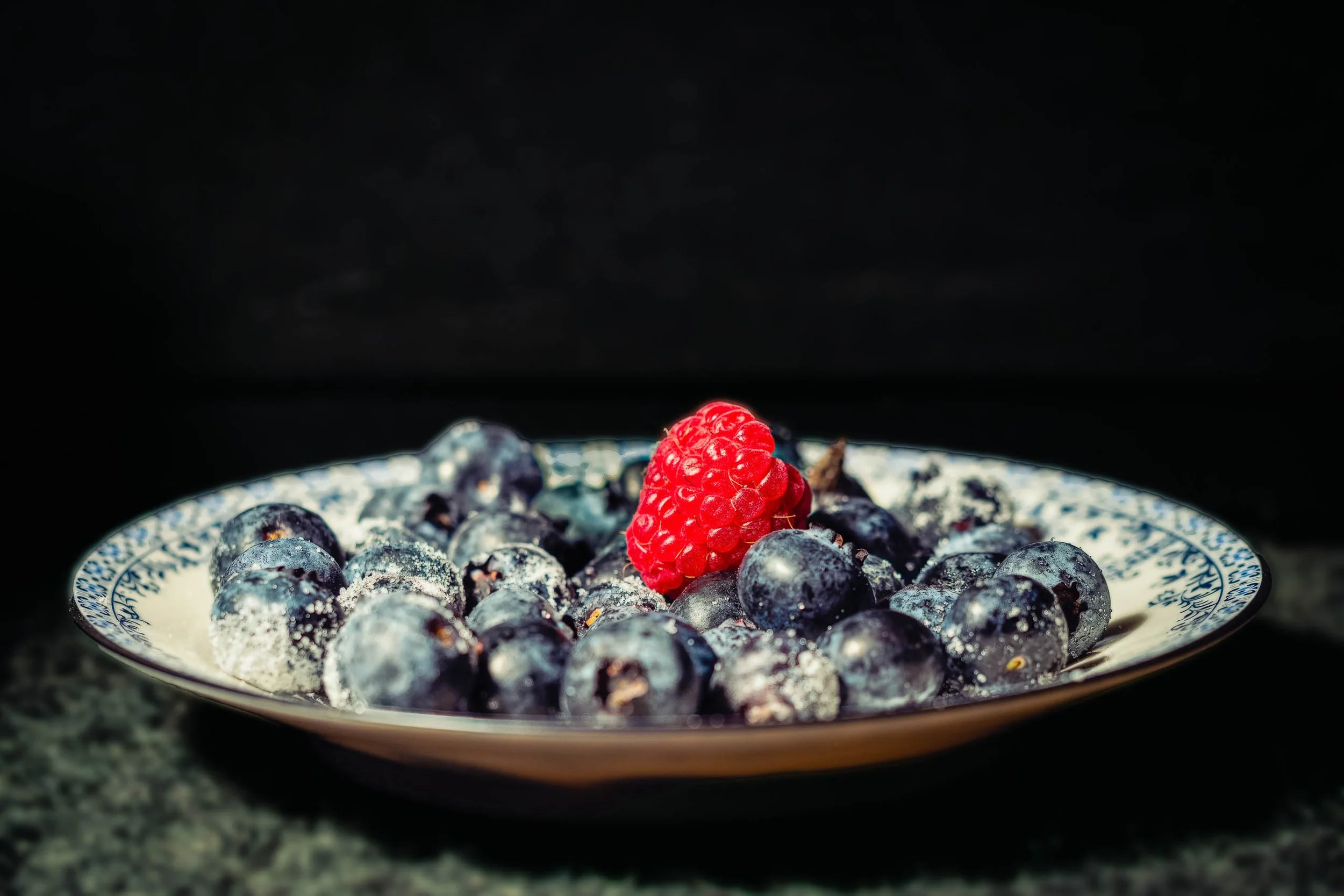
Still Life for Grandmother returns to the same inherited blue-and-white china as Breakfast With Grandmother, but in a completely different register — a single hard light source, a field of pure black, and a composition that owes more to Dutch still-life painting than to any breakfast table. The blueberries pile in low, dense shadow, their frosted bloom and star-shaped blossom scars picked out only where the light finds them directly. One raspberry breaks the field of blue-black with real authority, its individual drupelets and fine hairs rendered in crisp, deliberate detail.
The china itself all but disappears into pattern and reflection — a curve of silver trim catching the light along the rim, the blue design blurring into abstraction at the edges of focus. What's left is texture, weight, and a kind of quiet solemnity that the warmer, brighter version of this same china doesn't carry. The foreground surface, rough-hewn stone, grounds the whole composition in something older and more permanent than a breakfast table — closer to memory than to morning.
This is a deliberately restrained image: no landscape, no architecture, no wide gesture, just the specific, particular weight of an object that outlasts the person who owned it.
DESIGN & STYLING
Still Life for Grandmother suits spaces built around quiet contemplation rather than bright energy: formal dining rooms, entryways, reading rooms, and healthcare or hospice environments where a dark, dignified still life reads as restful rather than somber. Paired with warmer lighting, the deep blacks and jewel-toned blues hold real presence without becoming heavy-handed.
The low-key palette pairs naturally with dark wood, wrought iron, aged brass, and deep neutral walls — interiors that want gravity and history rather than brightness.
CURATED PAIRINGS
For the direct companion piece: Pair with Breakfast With Grandmother — same china, same year, an entirely different mood; together they make the case for how much light and background change what an object means.
For color harmony: Complement with Lavender Rhapsody — the same jewel-toned blues and purples, in a very different key.
For shared tonal restraint: Add The Long Watch to extend the same dark, quiet, deliberate mood into a different subject entirely.
FINE ART PRESENTATION
Still Life for Grandmother is available as a signed fine art photographic print in multiple presentation styles. ChromaLuxe Metal suits this piece particularly well — true blacks and a glossy surface both reinforce the dramatic, high-contrast treatment. Acrylic adds even more depth to the blacks for a more contemporary presentation. Framed Photo Rag paper offers a softer, more traditional reading if the space calls for it, and Canvas Framed adds texture without fighting the image's own restraint.
Note: Custom and oversized photographic prints are available. Please contact the studio directly to discuss custom framing, matting, or specialized museum glass options.
Still Life for Grandmother returns to the same inherited blue-and-white china as Breakfast With Grandmother, but in a completely different register — a single hard light source, a field of pure black, and a composition that owes more to Dutch still-life painting than to any breakfast table. The blueberries pile in low, dense shadow, their frosted bloom and star-shaped blossom scars picked out only where the light finds them directly. One raspberry breaks the field of blue-black with real authority, its individual drupelets and fine hairs rendered in crisp, deliberate detail.
The china itself all but disappears into pattern and reflection — a curve of silver trim catching the light along the rim, the blue design blurring into abstraction at the edges of focus. What's left is texture, weight, and a kind of quiet solemnity that the warmer, brighter version of this same china doesn't carry. The foreground surface, rough-hewn stone, grounds the whole composition in something older and more permanent than a breakfast table — closer to memory than to morning.
This is a deliberately restrained image: no landscape, no architecture, no wide gesture, just the specific, particular weight of an object that outlasts the person who owned it.
DESIGN & STYLING
Still Life for Grandmother suits spaces built around quiet contemplation rather than bright energy: formal dining rooms, entryways, reading rooms, and healthcare or hospice environments where a dark, dignified still life reads as restful rather than somber. Paired with warmer lighting, the deep blacks and jewel-toned blues hold real presence without becoming heavy-handed.
The low-key palette pairs naturally with dark wood, wrought iron, aged brass, and deep neutral walls — interiors that want gravity and history rather than brightness.
CURATED PAIRINGS
For the direct companion piece: Pair with Breakfast With Grandmother — same china, same year, an entirely different mood; together they make the case for how much light and background change what an object means.
For color harmony: Complement with Lavender Rhapsody — the same jewel-toned blues and purples, in a very different key.
For shared tonal restraint: Add The Long Watch to extend the same dark, quiet, deliberate mood into a different subject entirely.
FINE ART PRESENTATION
Still Life for Grandmother is available as a signed fine art photographic print in multiple presentation styles. ChromaLuxe Metal suits this piece particularly well — true blacks and a glossy surface both reinforce the dramatic, high-contrast treatment. Acrylic adds even more depth to the blacks for a more contemporary presentation. Framed Photo Rag paper offers a softer, more traditional reading if the space calls for it, and Canvas Framed adds texture without fighting the image's own restraint.
Note: Custom and oversized photographic prints are available. Please contact the studio directly to discuss custom framing, matting, or specialized museum glass options.