
 Image 1 of 5
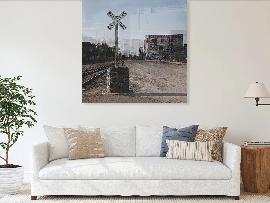 Image 2 of 5
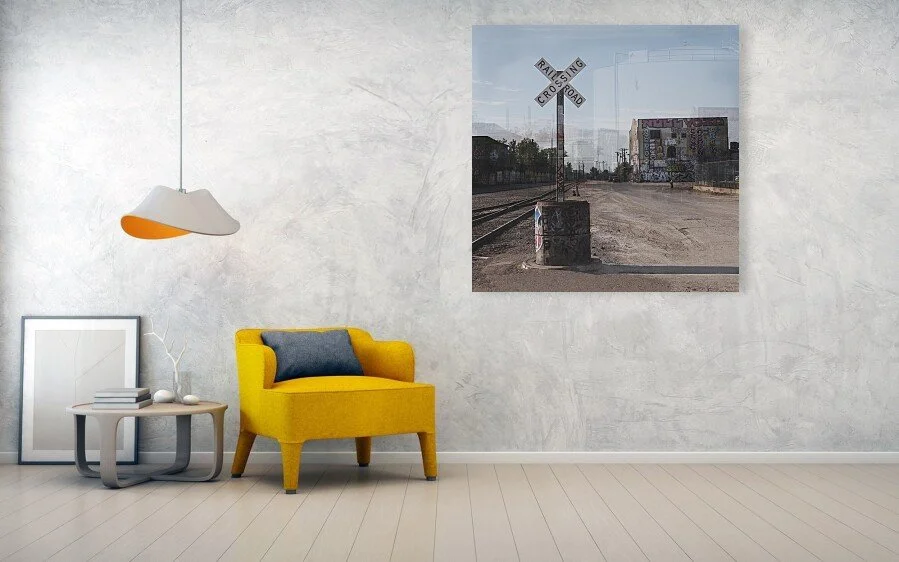 Image 3 of 5
 Image 4 of 5
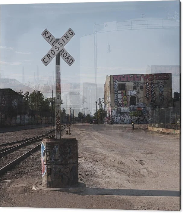 Image 5 of 5
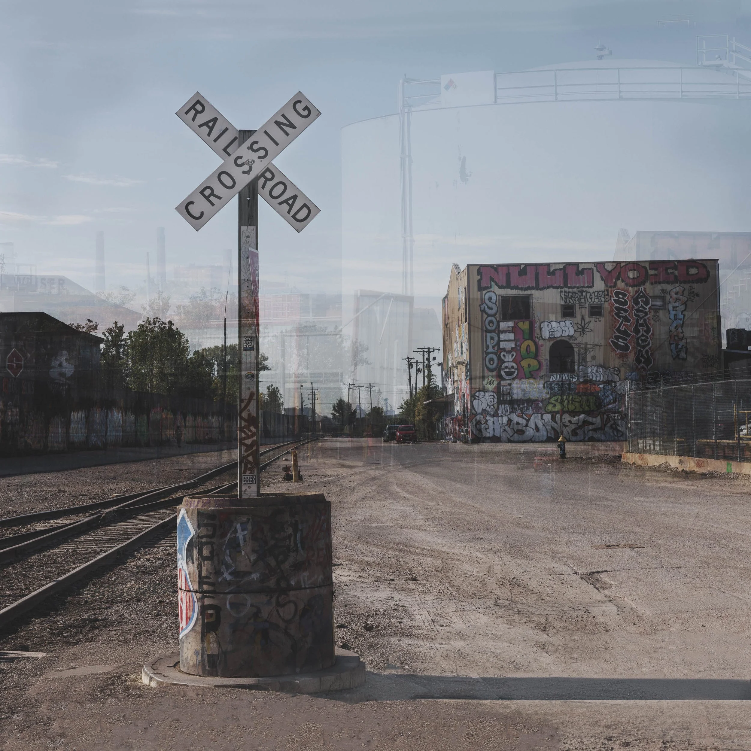
A crossing is a place that asks you to stop and look, and a place that has been crossed more times than anyone could count. What the Crossing Remembers is a multiple-exposure photograph of a railroad crossing sign in St. Louis, its pale blue-gray sky and sand-tan ground holding a stack of moments laid over one another.
The eye goes first to the sign, sharp in the left third of the square, its crossbuck bright against the haze. From there it drops down the post to the concrete base, where a small painted shield and layers of graffiti reward the person who looks closely, then follows the rails out toward the distance and the road that runs to a graffiti-covered warehouse. Around that sharp center, everything else is a ghost: a pale storage tank, the warehouse seen from another angle, utility poles and rooflines that appear and thin out as if the place were being remembered, not recorded. The sign stays put while the scene around it shifts, which is the whole idea.
The image is made from several exposures of one crossing, blended in Photoshop, in the tradition of Pep Ventosa's layered work, with the color and motion of Ernst Haas and the quiet attention Wim Wenders gives to overlooked American places.
What the Crossing Remembers suits lofts, studios, dens and offices, as well as restaurants, taprooms, boutique hotels and lobbies where an industrial but calm focal point is wanted. The square format fits a stairwell, the space above a console, or a wall that needs a quiet center. Warm brick, black steel, walnut, concrete and linen all sit comfortably beside its soft blue and tan. It is a natural gift for anyone with ties to St. Louis, or anyone who loves trains and the places they pass through.
For the same railroad world: Pair with The Last Giant, Union Pacific's Big Boy locomotive from a dramatic low angle, the monumental, sharp counterpart to this small crossing sign dissolving into its surroundings.
For the same road past rusted tanks: Pair with Before the Storm Breaks, a pale gravel road bending past rusted tanks and weathered brick in Missouri, the same quiet industrial setting in a single sharp frame under heavy sky.
For the same industrial subject, in deliberate contrast: Pair with Plant, Dusk, smokestacks, ductwork and a chain-link fence in deadpan black and white, the plain, unromanticized record beside this layered color memory.
Available as a signed, numbered limited edition print (edition of 15) in Gallery Metal, ChromaLuxe® Metal (Gloss, Semi-Gloss or Matte), TruLife Acrylic, archival paper, canvas, and wood. Archival paper is the strongest choice: the translucent layers and the soft haze reproduce like a painting on paper, without the hard sheen that would flatten the overlap. ChromaLuxe® Metal in Matte suits an industrial loft or taproom, where the rust, concrete and black type of the sign gain weight on the metal. TruLife (Low-Glare) Acrylic is the alternative if you want the sky to glow and the layers to gain depth.
Note: Custom and oversized photographic prints are available. Please contact the studio directly to discuss custom framing, matting, or specialized museum glass options.