
 Image 1 of 5
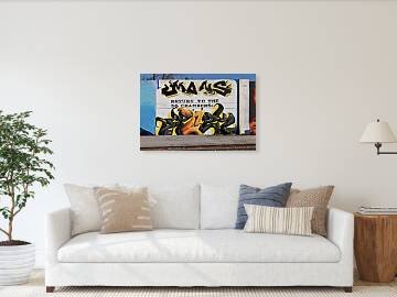 Image 2 of 5
 Image 3 of 5
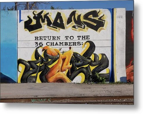 Image 4 of 5
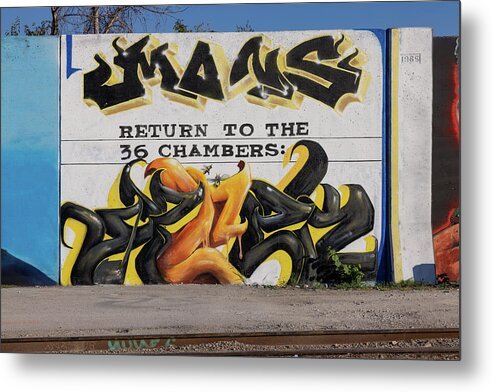 Image 5 of 5
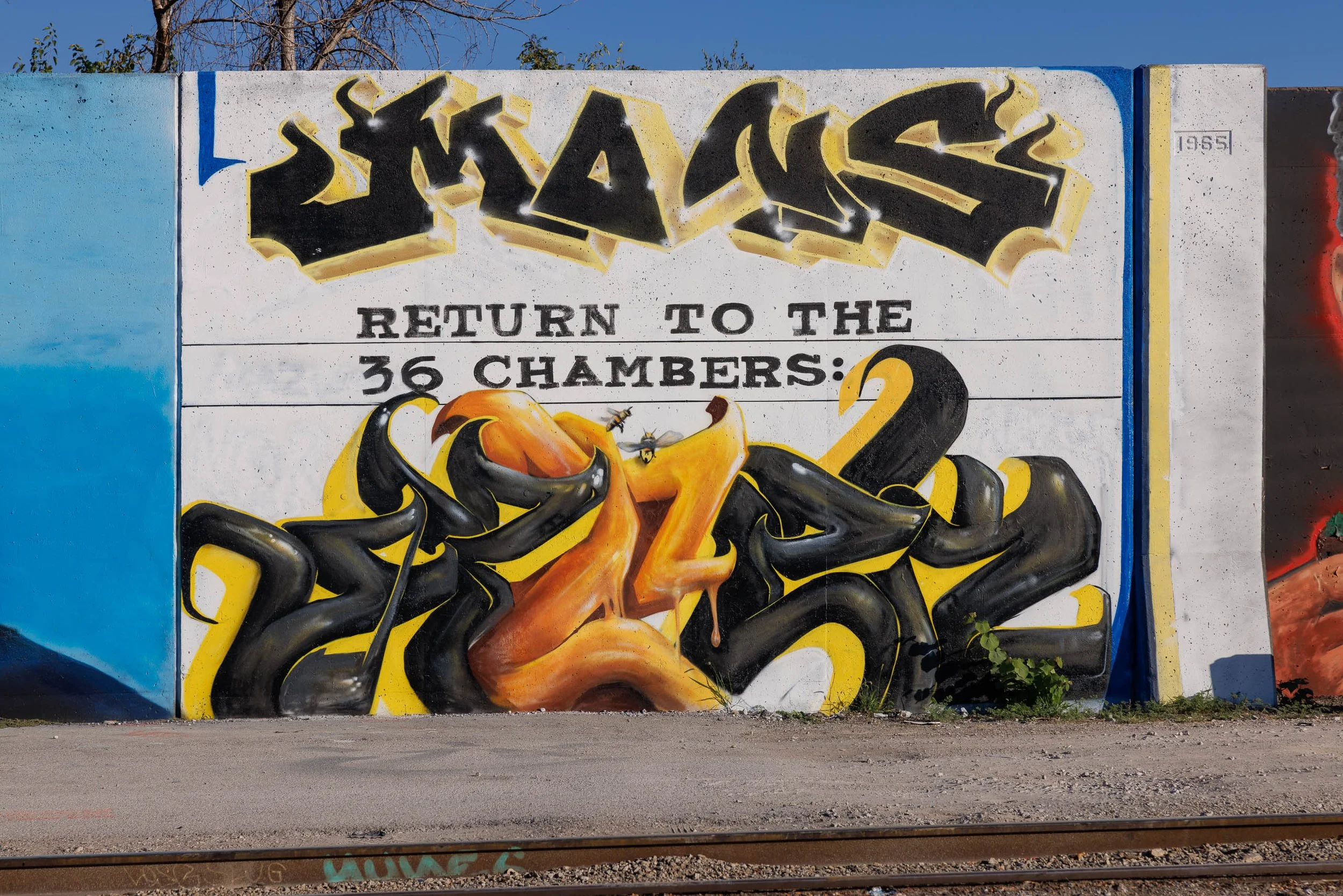
Sweetness and warning often arrive together. Honey and Ink finds a black and honey-gold mural on a white concrete wall in St. Louis: glossy black letterforms outlined in gold and flecked with white sparkles across the top, and below a tangle of molten orange and black forms with honey running from their edges, set off by a band of slab-serif type ruled between two black lines.
The eye lands first on the heavy black lettering across the top, drops to the ruled line of type, and then finds what the wall hid in plain sight: two small bees hovering at the center of the honey, painted so convincingly they seem to have landed on the wall. From there the eye settles into the glossy tangle below, while the blue edge and pale yellow stripe at right close the frame like a border.
This is Ernst Haas territory, graphic form and color as the whole subject, with Saul Leiter's instinct for the small detail that rewards a second look. The photograph stays frontal and unhurried so the painted surface does the talking.
Honey and Ink suits restaurants, cafes and bakeries, bars, recording and creative studios, and kitchens or offices that want black-and-gold punch with a sense of humor. Against a white or warm neutral wall, the black reads as a graphic anchor and the honey orange as the accent.
To build a wall around this piece, consider these companion pieces:
For a deliberate contrast: Pair with What the Wall Remembers, a faded painted advertisement on old brick, the same idea of a painted wall as public record, ghostly and weathered where this one is glossy and freshly spray-painted.
For the same palette: Pair with Teeth of Time, amber and orange bursting through blue-black patina, the same warm-against-dark color relationship as the honey against the black forms here.
For lettering as the subject: Pair with No Vacancy, a hand-lettered neon sign glowing red-orange against darkness, another frame where the words and the glow are the picture.
Available as an open edition print, unsigned and unnumbered, in ChromaLuxe® Metal (gloss, semi-gloss, or matte), Glossy Anti-Glare Acrylic (TruLife), canvas, wood, and archival paper (framed or unframed). ChromaLuxe® Metal is the recommended presentation: the density of the blacks, the gloss on the honey-orange forms, and the white sparkle highlights all gain from metal's contrast and brightness. Glossy Anti-Glare Acrylic (TruLife) adds depth for a bolder presentation, and archival paper suits a quieter, more graphic read.
Note: This is an open edition print, unsigned and unnumbered, available in the sizes and materials listed above.
Sweetness and warning often arrive together. Honey and Ink finds a black and honey-gold mural on a white concrete wall in St. Louis: glossy black letterforms outlined in gold and flecked with white sparkles across the top, and below a tangle of molten orange and black forms with honey running from their edges, set off by a band of slab-serif type ruled between two black lines.
The eye lands first on the heavy black lettering across the top, drops to the ruled line of type, and then finds what the wall hid in plain sight: two small bees hovering at the center of the honey, painted so convincingly they seem to have landed on the wall. From there the eye settles into the glossy tangle below, while the blue edge and pale yellow stripe at right close the frame like a border.
This is Ernst Haas territory, graphic form and color as the whole subject, with Saul Leiter's instinct for the small detail that rewards a second look. The photograph stays frontal and unhurried so the painted surface does the talking.
Honey and Ink suits restaurants, cafes and bakeries, bars, recording and creative studios, and kitchens or offices that want black-and-gold punch with a sense of humor. Against a white or warm neutral wall, the black reads as a graphic anchor and the honey orange as the accent.
To build a wall around this piece, consider these companion pieces:
For a deliberate contrast: Pair with What the Wall Remembers, a faded painted advertisement on old brick, the same idea of a painted wall as public record, ghostly and weathered where this one is glossy and freshly spray-painted.
For the same palette: Pair with Teeth of Time, amber and orange bursting through blue-black patina, the same warm-against-dark color relationship as the honey against the black forms here.
For lettering as the subject: Pair with No Vacancy, a hand-lettered neon sign glowing red-orange against darkness, another frame where the words and the glow are the picture.
Available as an open edition print, unsigned and unnumbered, in ChromaLuxe® Metal (gloss, semi-gloss, or matte), Glossy Anti-Glare Acrylic (TruLife), canvas, wood, and archival paper (framed or unframed). ChromaLuxe® Metal is the recommended presentation: the density of the blacks, the gloss on the honey-orange forms, and the white sparkle highlights all gain from metal's contrast and brightness. Glossy Anti-Glare Acrylic (TruLife) adds depth for a bolder presentation, and archival paper suits a quieter, more graphic read.
Note: This is an open edition print, unsigned and unnumbered, available in the sizes and materials listed above.