
 Image 1 of 1
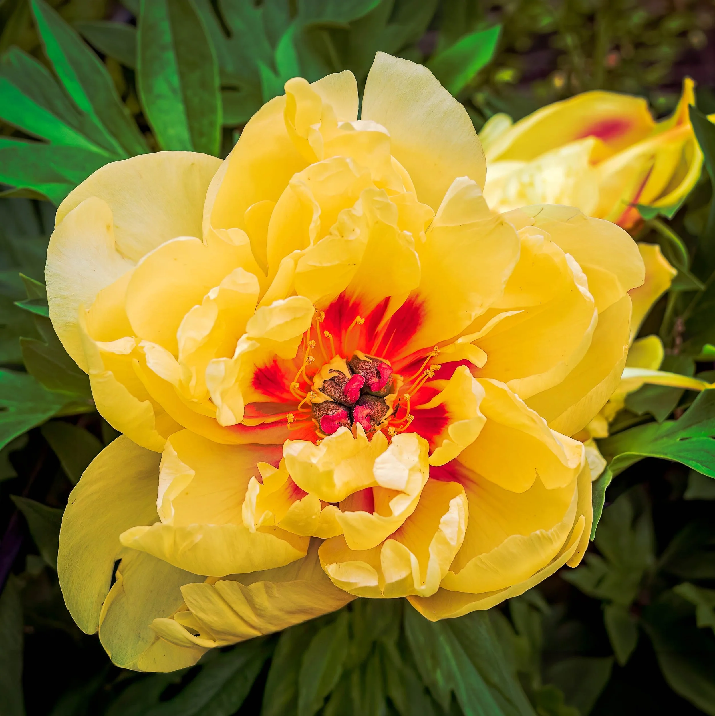
Gold and Ember is a study in contrast — the soft, ruffled abundance of a fully open yellow peony giving way at its center to a burst of red-orange so vivid it reads almost like flame. Photographed close and direct, the image lets the flower's own architecture do the composing: layer after layer of crepe-thin petals spiraling inward, opening onto a core where color intensifies suddenly, radiating outward in streaks before settling around a cluster of dark, textured seed pods tipped in bright pink.
The composition is built on that single transition — cool, pale yellow at the edges warming steadily toward the saturated center — with the stamens' fine gold filaments threading through the red like sparks caught mid-air. A second, softly out-of-focus bloom rests in the upper right, present but deliberately unresolved, giving the eye a sense of the fuller garden without competing with the main subject.
Where much of the surrounding botanical work leans toward restraint and quiet, Gold and Ember is unapologetically bold — a piece built for color and presence rather than subtlety, treating the peony's natural fire-at-the-heart structure as the entire subject.
With its saturated yellow-to-red palette and confident, graphic center, Gold and Ember works best as a statement piece — entryways, great rooms, dining spaces, or any wall that can hold a bold color anchor. It's a strong fit for spaces wanting warmth and energy rather than a calming, neutral presence.
To build a cohesive botanical grouping, consider these companion pieces from the Botanical Studies collection:
For tonal harmony: Pair with Golden Solitude, extending the warm yellow palette in a quieter, more solitary botanical study.
For color echo: Complement with Scarlet Crown, carrying the same vivid red into a poppy's more delicate, papery form.
For narrative continuity: Pair with When the Field Ignites, continuing the fire-and-bloom visual language in a wider macro composition.
Available as a signed fine art print in ChromaLuxe® Metal (gloss, semi-gloss, or matte), acrylic, canvas, and paper presentation formats, in square sizing from 12×12 up to 60×60. Given the saturation in the center burst, ChromaLuxe® Metal presentation is recommended to hold the red-orange gradient cleanly; Acrylic will intensify the color further for a more dramatic presentation.
Note: Custom and oversized photographic prints are available. Please contact the studio directly to discuss custom framing, matting, or specialized museum glass options.
Gold and Ember is a study in contrast — the soft, ruffled abundance of a fully open yellow peony giving way at its center to a burst of red-orange so vivid it reads almost like flame. Photographed close and direct, the image lets the flower's own architecture do the composing: layer after layer of crepe-thin petals spiraling inward, opening onto a core where color intensifies suddenly, radiating outward in streaks before settling around a cluster of dark, textured seed pods tipped in bright pink.
The composition is built on that single transition — cool, pale yellow at the edges warming steadily toward the saturated center — with the stamens' fine gold filaments threading through the red like sparks caught mid-air. A second, softly out-of-focus bloom rests in the upper right, present but deliberately unresolved, giving the eye a sense of the fuller garden without competing with the main subject.
Where much of the surrounding botanical work leans toward restraint and quiet, Gold and Ember is unapologetically bold — a piece built for color and presence rather than subtlety, treating the peony's natural fire-at-the-heart structure as the entire subject.
With its saturated yellow-to-red palette and confident, graphic center, Gold and Ember works best as a statement piece — entryways, great rooms, dining spaces, or any wall that can hold a bold color anchor. It's a strong fit for spaces wanting warmth and energy rather than a calming, neutral presence.
To build a cohesive botanical grouping, consider these companion pieces from the Botanical Studies collection:
For tonal harmony: Pair with Golden Solitude, extending the warm yellow palette in a quieter, more solitary botanical study.
For color echo: Complement with Scarlet Crown, carrying the same vivid red into a poppy's more delicate, papery form.
For narrative continuity: Pair with When the Field Ignites, continuing the fire-and-bloom visual language in a wider macro composition.
Available as a signed fine art print in ChromaLuxe® Metal (gloss, semi-gloss, or matte), acrylic, canvas, and paper presentation formats, in square sizing from 12×12 up to 60×60. Given the saturation in the center burst, ChromaLuxe® Metal presentation is recommended to hold the red-orange gradient cleanly; Acrylic will intensify the color further for a more dramatic presentation.
Note: Custom and oversized photographic prints are available. Please contact the studio directly to discuss custom framing, matting, or specialized museum glass options.