
Open Edition Prints
Open Edition: Affordable Fine Art Photography Prints
Small Prints, Real Craft
Not every image needs a gallery wall. This collection gathers smaller, more affordable open edition prints — under 16 inches, printed on archival Photo Rag paper. These are open editions rather than limited, numbered pieces, which keeps them accessible without sacrificing print quality.
Perfect for gifts, casual collectors, or anyone who wants a piece of the work without committing to a full-size, limited-edition print.

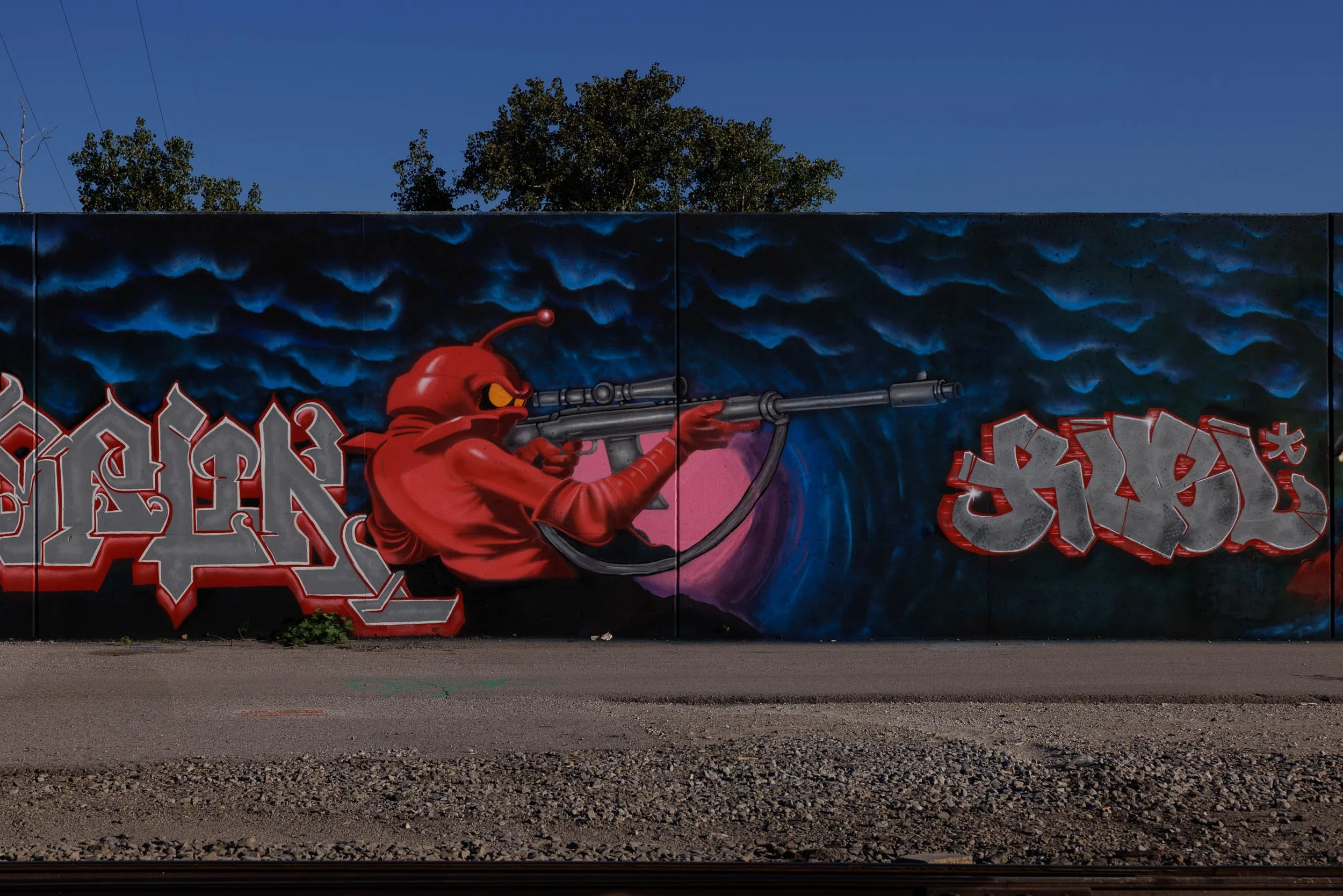
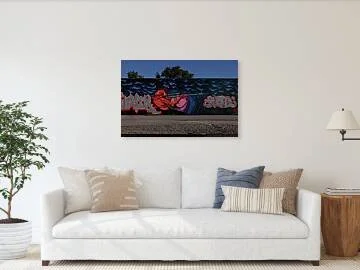
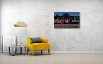
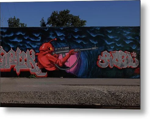
Patience is its own kind of composition. Sight Line finds a red, helmeted, antennaed figure in a crimson hood settled behind a scoped rifle, one amber eye narrowed against the glass, on a long mural wall in St. Louis. Behind the barrel, a pink halo glows against a deep field of blue cloud waves, and silver block lettering outlined in red bookends the scene at left and right.
The eye lands first on the amber eye, the smallest and brightest point in the frame, then slides along the long barrel to the right, where it meets the silver lettering that balances the composition. The pink halo and the cobalt wave pattern give the red figure a clean, saturated field to push against. Below the wall, a band of gravel and a few weeds hold the frame to the ground. The photograph keeps the wall flat and frontal, so the figure's patience, not the camera's angle, sets the mood.
The color logic is pure Ernst Haas: one saturated red figure held against a cooler blue field, so that the whole picture turns on the relationship between two hues.
Design & Styling
Sight Line suits game rooms, bars, creative studios, dens, and collectors of pop-surrealist and lowbrow art. The weapon imagery makes it less suited to healthcare, education, or family-focused spaces.
Curated Pairings
To build a wall around this piece, consider these companion pieces:
For the same color logic: Pair with Between Signals, a single precise subject set in a deep blue field, cool and quiet where this one is red and loaded.
For the closest scale contrast: Pair with Storm Over Metropolis, a caped statue against a sky torn open by lightning, another heroic figure held against a storm-charged sky, a monument where this one is a painted wall.
For the same cobalt sky: Pair with Waiting Out the Storm, layered cobalt blues with ember-orange light, the same deep blue field that backs the red figure here.
Fine Art Presentation
Available as an open edition print, unsigned and unnumbered, in ChromaLuxe® Metal (gloss, semi-gloss, or matte), Glossy Anti-Glare Acrylic (TruLife), canvas, wood, and archival paper (framed or unframed). ChromaLuxe® Metal (gloss) is the recommended presentation: the crimson figure, pink halo, and cobalt waves all depend on saturation and crisp edges. Glossy Anti-Glare Acrylic (TruLife) adds depth to the blue field for a bolder hang, and framed archival paper suits a quieter setting.
Note: This is an open edition print, unsigned and unnumbered, available in the sizes and materials listed above.
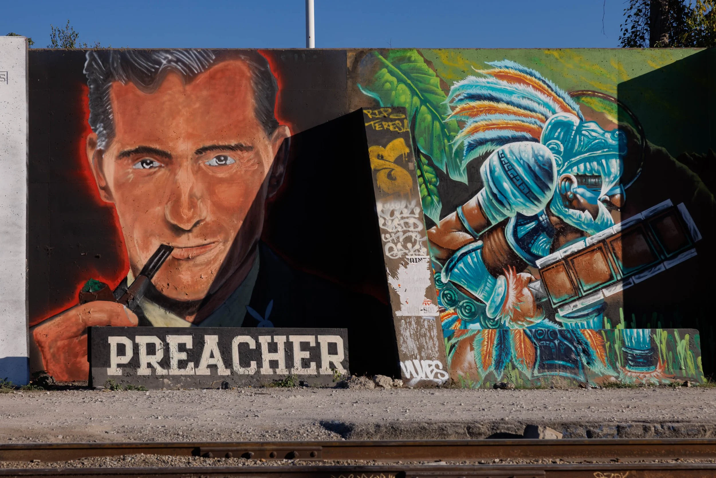
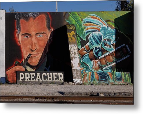
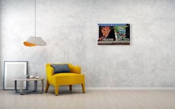
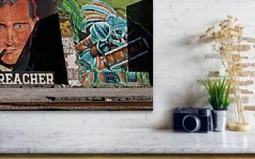
Light decides what a wall is allowed to say. Where the Shadow Falls finds a painted portrait of a man in a dark suit, a pipe held to his lips and a thin red glow outlining his shoulders, on a black concrete wall in St. Louis. A slab-serif PREACHER sits on a block at his feet, and a hard wedge of real shadow, cast by the neighboring barrier, cuts across his chest and darkens the wall beside him.
The eye lands first on the pale blue-gray eyes, the brightest point on the face, then follows the line of the pipe down to the white lettering. From there the shadow wedge takes over, its straight edge running diagonally from the portrait toward the lower right and pushing the eye across to the second mural: a turquoise warrior in a feathered headdress, bright against deep green. A pair of rails crosses the foreground and ties the whole wall to its place.
This is Edward Hopper's logic, hard-edged light as the real subject of a flat wall, with the Ernst Haas habit of letting a saturated color, here the turquoise, steal the second beat of the picture.
Design & Styling
Where the Shadow Falls suits cigar and whiskey bars, lounges, libraries and studies, media rooms, and lofts that want a moody portrait with real graphic punch. The intense gaze and heavy shadow make it less suited to calming-focused environments such as healthcare or senior living.
Curated Pairings
To build a wall around this piece, consider these companion pieces:
For a deliberate contrast: Pair with What the Wall Remembers, a faded painted figure on old brick, the same idea of a man painted onto a city wall, ghostly with age where this portrait is vivid and freshly done.
For the same light: Pair with Waiting, layered shadow and a single figure in a cinematic urban frame, where light and shade carry the mood as they do here.
For the same warm-on-dark treatment: Pair with The Bartender's Measure (Color), rich amber tones and layered interior light around a single figure, the same cinematic warmth set against a dark ground.
Fine Art Presentation
Available as an open edition print, unsigned and unnumbered, in ChromaLuxe® Metal (gloss, semi-gloss, or matte), Glossy Anti-Glare Acrylic (TruLife), canvas, wood, and archival paper (framed or unframed). ChromaLuxe® Metal (semi-gloss) is the recommended presentation: the red outline glow and the turquoise feathers hold their saturation, and the shadow wedge stays clean and sharp-edged. Glossy Anti-Glare Acrylic (TruLife) deepens the blacks for a more dramatic hang, and framed archival paper gives a softer, more traditional presentation.
Note: This is an open edition print, unsigned and unnumbered, available in the sizes and materials listed above.
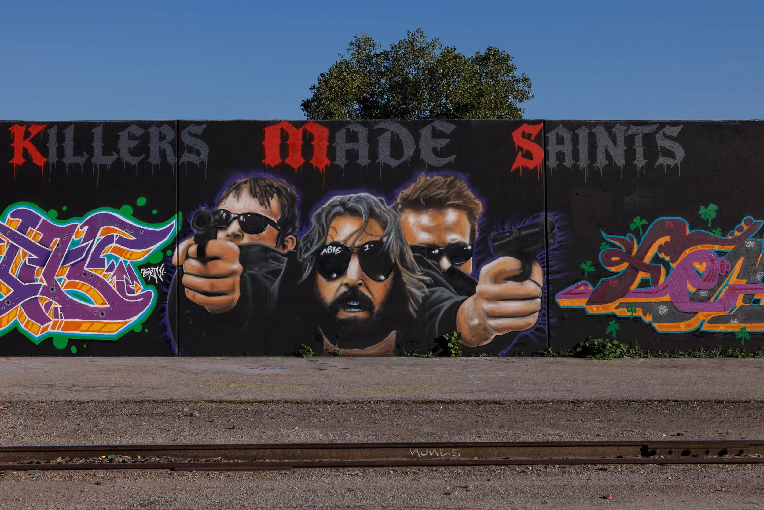
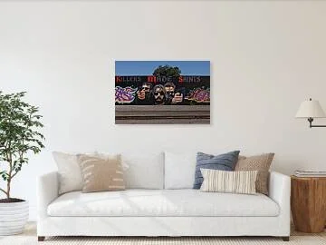
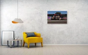
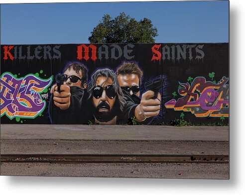
Some portraits don't ask for attention. They take it. Saints in Black Glass finds three figures emerging from a black concrete wall in St. Louis, each in dark sunglasses, two of them with arms extended toward the viewer and pistols in hand, a violet glow outlining them against the dark. Above them, hand-painted gothic lettering drips in blood red and storm gray.
The eye lands first on the central figure, a bearded face with long gray hair and glasses that catch a highlight, then swings left and right along the two outstretched arms, whose foreshortened hands are the largest forms in the picture. The red capital letters in the line above pull the eye up and across, while the purple and orange letterforms at left and right hold the edges. Above the wall, a clear blue sky and a lone cottonwood give the dark band room to breathe.
The treatment is straight-on and deliberate, closer to Wim Wenders' patient American frames than to a street snapshot: no angle tricks, just the wall at the light that gives its skin tones the most warmth.
Design & Styling
Saints in Black Glass suits bars and lounges, game and media rooms, studios, lofts, and spaces that want cinematic attitude. Given the weapons imagery, it is not suited to healthcare, education, or family-focused environments.
Curated Pairings
To build a wall around this piece, consider these companion pieces:
For the same cinematic treatment: Pair with The Bartender's Measure (Noir), a cinematic black-and-white study where pools of light emerge from deep darkness, the same dark-ground drama translated to a human subject.
For the same city: Pair with Behind the Bandana, another St. Louis frame built around one figure in motion, with a glowing sign overhead as atmosphere, rather than the scenery around it.
For the figure and the monument: Pair with Standing Before Saint Louis, a living figure photographed against the bronze of the city's namesake, the same relationship between a person and a larger-than-life image.
Fine Art Presentation
Available as an open edition print, unsigned and unnumbered, in ChromaLuxe® Metal (gloss, semi-gloss, or matte), Glossy Anti-Glare Acrylic (TruLife), canvas, wood, and archival paper (framed or unframed). Glossy Anti-Glare Acrylic (TruLife) is the recommended presentation: the black wall and violet halo gain real depth behind acrylic, and the highlights on the glasses and skin tones hold their luminosity. ChromaLuxe® Metal (semi-gloss) is the alternative for a crisper, more graphic read, and framed archival paper suits a quieter, more traditional setting.
Note: This is an open edition print, unsigned and unnumbered, available in the sizes and materials listed above.
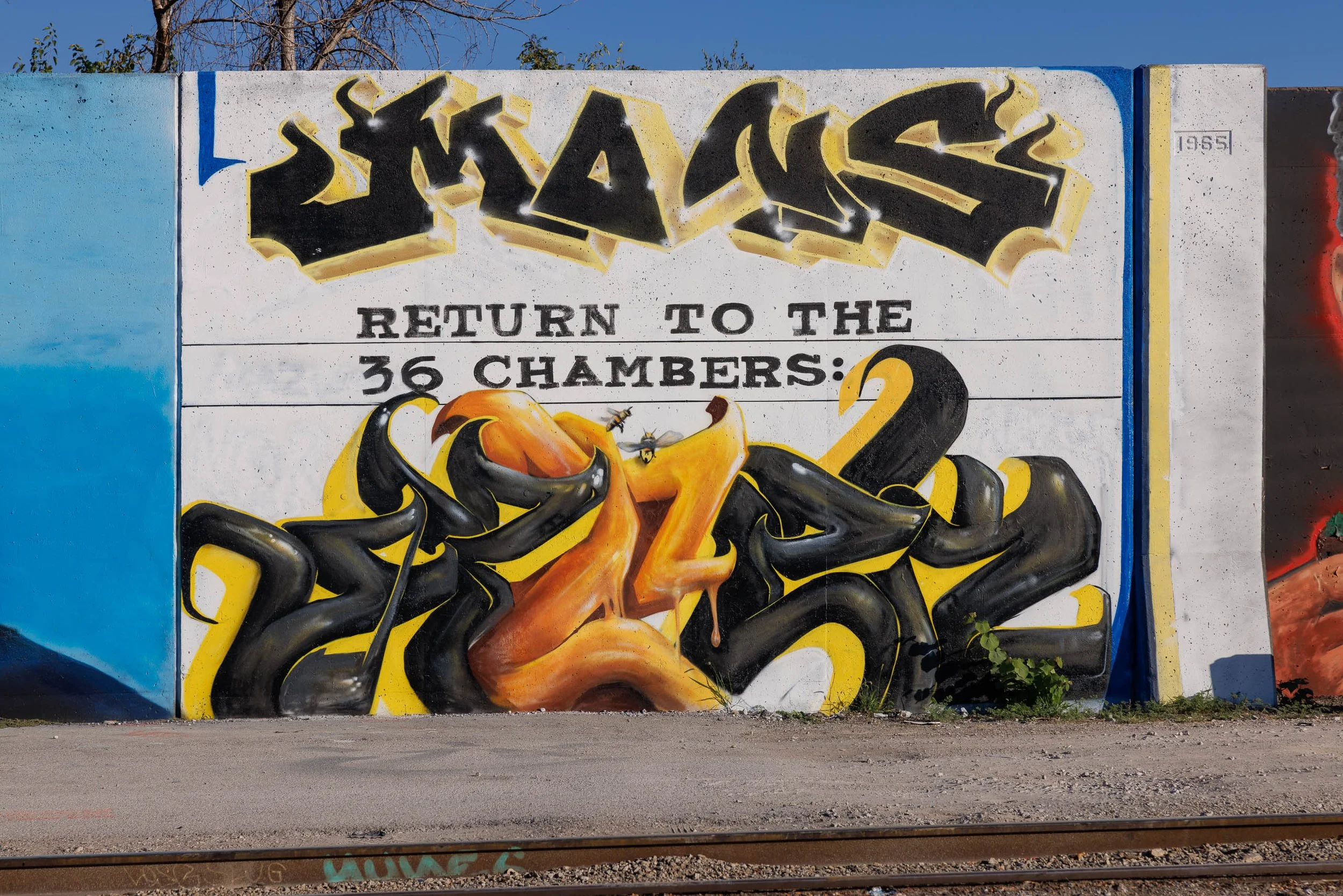
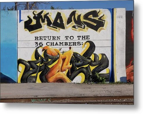
Sweetness and warning often arrive together. Honey and Ink finds a black and honey-gold mural on a white concrete wall in St. Louis: glossy black letterforms outlined in gold and flecked with white sparkles across the top, and below a tangle of molten orange and black forms with honey running from their edges, set off by a band of slab-serif type ruled between two black lines.
The eye lands first on the heavy black lettering across the top, drops to the ruled line of type, and then finds what the wall hid in plain sight: two small bees hovering at the center of the honey, painted so convincingly they seem to have landed on the wall. From there the eye settles into the glossy tangle below, while the blue edge and pale yellow stripe at right close the frame like a border.
This is Ernst Haas territory, graphic form and color as the whole subject, with Saul Leiter's instinct for the small detail that rewards a second look. The photograph stays frontal and unhurried so the painted surface does the talking.
Design & Styling
Honey and Ink suits restaurants, cafes and bakeries, bars, recording and creative studios, and kitchens or offices that want black-and-gold punch with a sense of humor. Against a white or warm neutral wall, the black reads as a graphic anchor and the honey orange as the accent.
Curated Pairings
To build a wall around this piece, consider these companion pieces:
For a deliberate contrast: Pair with What the Wall Remembers, a faded painted advertisement on old brick, the same idea of a painted wall as public record, ghostly and weathered where this one is glossy and freshly spray-painted.
For the same palette: Pair with Teeth of Time, amber and orange bursting through blue-black patina, the same warm-against-dark color relationship as the honey against the black forms here.
For lettering as the subject: Pair with No Vacancy, a hand-lettered neon sign glowing red-orange against darkness, another frame where the words and the glow are the picture.
Fine Art Presentation
Available as an open edition print, unsigned and unnumbered, in ChromaLuxe® Metal (gloss, semi-gloss, or matte), Glossy Anti-Glare Acrylic (TruLife), canvas, wood, and archival paper (framed or unframed). ChromaLuxe® Metal is the recommended presentation: the density of the blacks, the gloss on the honey-orange forms, and the white sparkle highlights all gain from metal's contrast and brightness. Glossy Anti-Glare Acrylic (TruLife) adds depth for a bolder presentation, and archival paper suits a quieter, more graphic read.
Note: This is an open edition print, unsigned and unnumbered, available in the sizes and materials listed above.
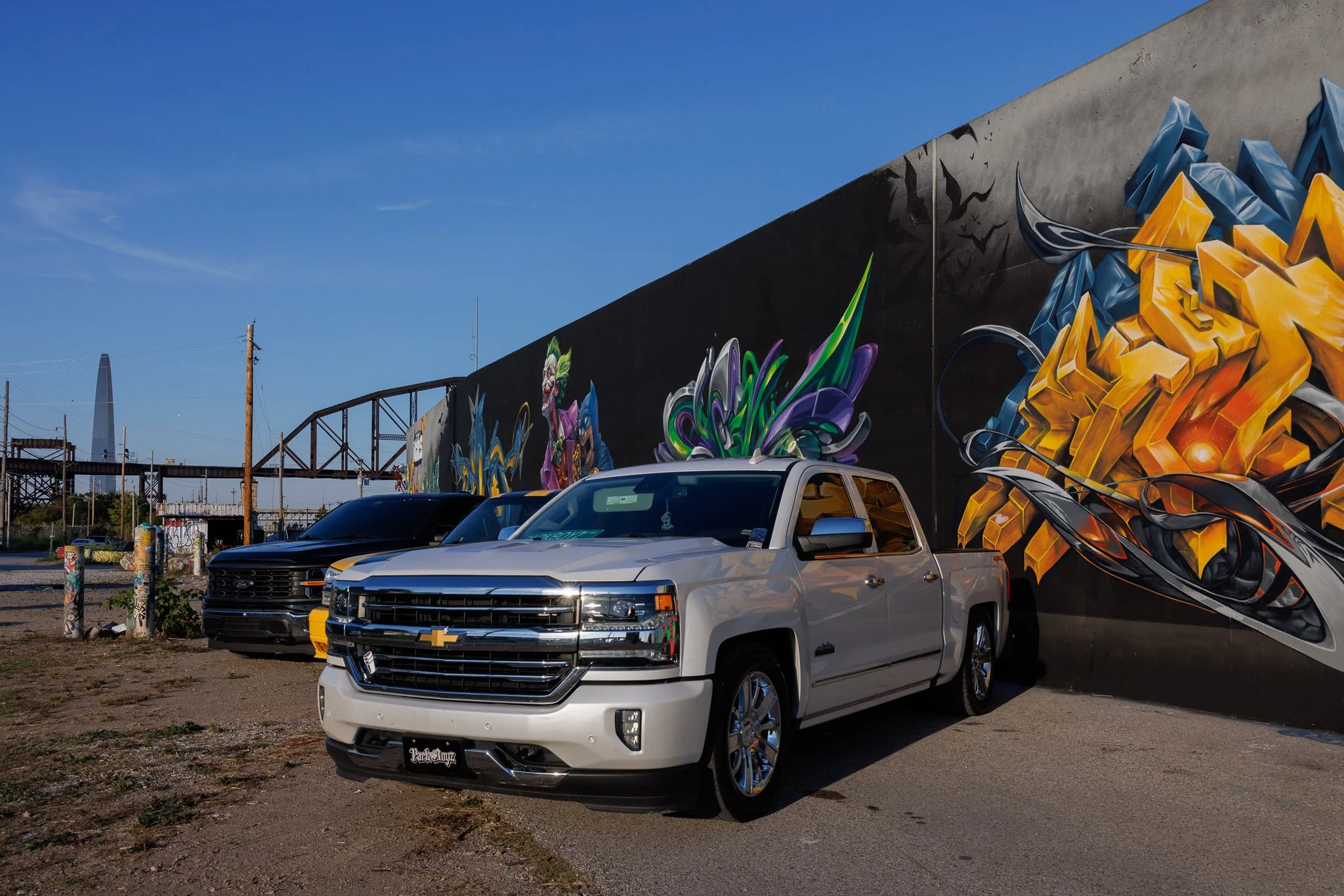
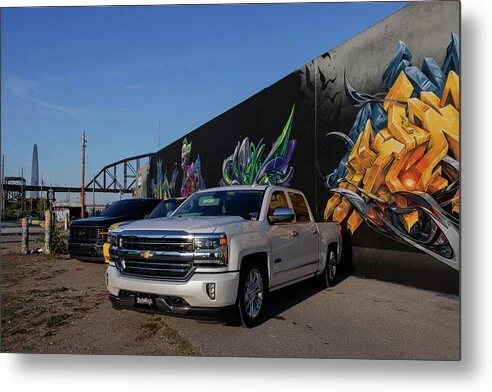
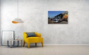
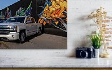
Pride of ownership has its own kind of portrait light. Pearl and Gold finds a pearl-white Chevrolet Silverado parked nose-out beside a long concrete wall in St. Louis, late sun raking across its chrome grille and spilling a warm amber reflection down the passenger door. Behind it, a black Ford and a yellow truck wait in line, and a mural of gold block lettering wrapped in steel-blue shards climbs the wall at right.
The eye lands first on the chrome grille and the bright bowtie, the sharpest highlights in the frame. From there the wall's long diagonal carries it up and to the right into the gold letterforms, then back down the roofline to the rusted truss bridge receding at left. At the far end of that bridge, small and easy to miss, the Gateway Arch stands in the haze, the quiet detail that tells you exactly where you are.
This is Ernst Haas territory, color as the subject, pearl against amber against a deep blue sky, with Wim Wenders' patience for the American edge-of-town: working trucks, old steel, and a wall that someone repainted by hand.
Design & Styling
Pearl and Gold suits sports bars and breweries, dealership lounges, garages and shop offices, game rooms, and St. Louis-themed interiors that want local identity without a postcard skyline. Hung on a charcoal or warm gray wall, the pearl body becomes the room's brightest note.
Curated Pairings
To build a wall around this piece, consider these companion pieces:
For the same place: Pair with Held Arch, also photographed in St. Louis with the Gateway Arch as the anchor, the monochrome counterpart to the Arch glimpsed here in the distance.
For a deliberate contrast: Pair with Crowned in Light, the Arch at night under fireworks, deep blues and bursting light against this piece's low golden daylight.
For the machine as the subject: Pair with The Last Giant, another American machine photographed from a low, respectful angle, where the vehicle is the hero rather than the backdrop.
Fine Art Presentation
Available as an open edition print, unsigned and unnumbered, in ChromaLuxe® Metal (gloss, semi-gloss, or matte), Glossy Anti-Glare Acrylic (TruLife), canvas, wood, and archival paper (framed or unframed). ChromaLuxe® Metal is the recommended presentation: the chrome highlights, pearl paint, and saturated gold lettering all depend on the brightness and crisp edges metal delivers. Glossy Anti-Glare Acrylic (TruLife) is the alternative for a piece hung opposite windows, and framed archival paper gives a quieter, more traditional read.
Note: This is an open edition print, unsigned and unnumbered, available in the sizes and materials listed above.

Before the Harvest is a close study of tomatoes ripening on the vine, photographed at the point when summer growth has begun to give way to maturity. Three red tomatoes hang beneath an intricate network of stems and leaves, their rounded forms emerging from a soft field of garden greens.
The photograph is built around color and repetition — saturated red fruit against layered green foliage, smooth skins against the fine hairs and angular structure of the vine. Small imperfections, drying leaves, and uneven surfaces remain visible rather than being cleaned away, grounding the image in the reality of a working garden rather than an idealized still life.
What began as an ordinary garden detail becomes a quiet study of abundance, season, and the brief interval when something growing is finally ready to be gathered.
A tomato on the vine is at its most photogenic in the last days before it is picked, when the color has deepened and the skin holds a soft sheen. The picture catches that brief window, and the layered greens around the fruit keep it grounded in a working garden.
Design & Styling
With its warm reds and layered natural greens, Before the Harvest works especially well in kitchens, breakfast areas, dining rooms, garden rooms, and casual contemporary interiors. It brings strong color to a space without becoming overly graphic or decorative.
The image also fits naturally into farmhouse, organic-modern, biophilic, and food-oriented interiors, where its emphasis on fresh produce and natural growth provides both warmth and familiarity.
Curated Pairings
To create a cohesive gallery wall, consider these companion pieces:
For botanical color: Pair with Lavender Rhapsody, extending the emphasis on saturated natural color and organic form.
For close observation: Pair with Summer's Unfolding, connecting the image to another intimate study of seasonal growth.
For garden atmosphere: Complement with Scarlet Crown, creating a grouping built around red botanical forms and the progression of the growing season.
Fine Art Presentation
Available as an open edition print (unsigned and unnumbered) on ChromaLuxe® Metal (gloss, semi-gloss, or matte), Glossy Anti-Glare Acrylic (TruLife), canvas, wood, and archival paper (framed or unframed). ChromaLuxe® Metal in a satin or semi-gloss finish is the recommended presentation: it preserves the rich reds of the fruit and the layered greens of the garden while keeping the fine surface texture of the tomatoes and vines. For farmhouse and organic-modern kitchens, canvas or wood adds a warmer, more tactile read.
Note: This is an open edition print, unsigned and unnumbered, available in the sizes and materials listed above.
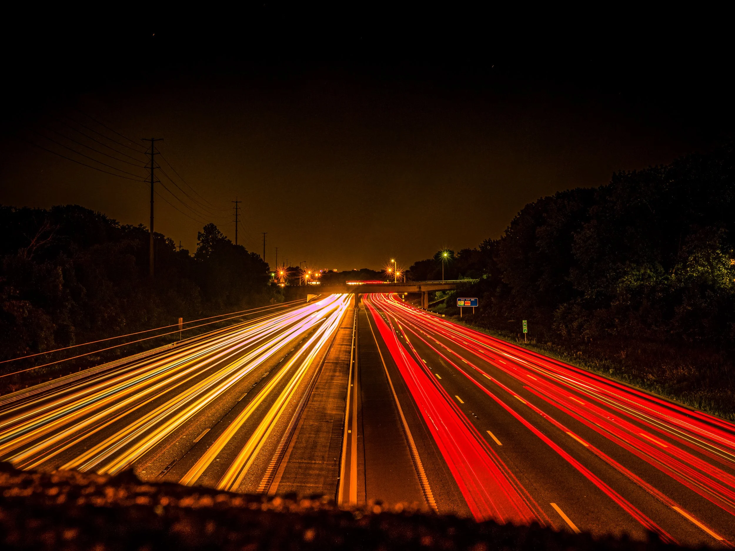
Exit 280 is a study of velocity held still — the ordinary machinery of a nightly commute on Interstate 64 in St. Louis transformed, through a long exposure, into rivers of pure color streaming beneath a black night sky. Shot from an overpass looking down the interstate, the frame splits cleanly in two: headlights bleeding white and gold on the left, taillights burning red on the right, both converging toward a second overpass in the distance where a scatter of streetlights marks the edge of town. A single faint meteor traces the upper sky — an unplanned accident of a long shutter, and the only thing in the frame that isn't man-made.
The composition does the simplest thing well: two lanes of color funnel the eye straight down the vanishing point to the bridge, while dark tree lines on both edges hold the frame like a proscenium. A blurred foreground — chain-link fencing caught mid-exposure — grounds the vantage point without needing to explain it; you understand instantly this was shot from above, looking down through the rail. The asphalt itself is pushed to a true, deep black, so the light has nothing to compete with — every trail reads as pure, saturated color against near-nothing.
The image draws its clearest lineage from Ernst Haas, whose pioneering use of color and motion blur first found beauty in the ordinary churn of city traffic. Where much of that tradition centers a still figure inside the motion, Exit 280 removes the figure entirely — there is no one here, only the trace of everyone who passed. It's commute as abstraction: I-64, driven a thousand times, seen for once as something closer to a river of light than a route home.
Design & Styling
With its saturated reds, ambers, and cool blacks, Exit 280 brings energy and motion to a space without requiring a literal subject — a strong fit for hospitality lobbies, cocktail bars, corporate lounges, and contemporary offices looking for a bold, graphic statement piece.
Curated Pairings
To build a cohesive wall around movement, light, and the American road, consider these companion pieces:
For lineage continuity: Pair with Modern Gladiators, which shares the same long-exposure, color-motion tradition.
For thematic continuity: Complement with Between the Exits, continuing the exploration of the American highway as subject.
For night-photography continuity: Pair with All Colors, One Night, extending the study of saturated color against a black night sky.
Fine Art Presentation
Available as an open edition print (unsigned and unnumbered) on ChromaLuxe® Metal (gloss, semi-gloss, or matte), Glossy Anti-Glare Acrylic (TruLife), canvas, wood, and archival paper (framed or unframed). ChromaLuxe® Metal is the recommended presentation: it holds the saturated reds, golds, and ambers against a true black with nothing to compete. Acrylic is the alternative where you want the light trails to glow from within, in a lounge or bar.
Note: This is an open edition print, unsigned and unnumbered, available in the sizes and materials listed above.

A working Peterbilt tanker truck, caught at the exact moment the setting sun drops between its twin exhaust stacks — not accidental, not waited-for by chance, but the kind of precise alignment that turns a piece of job-site equipment into something closer to a portrait. Shot low and close, the truck fills the frame with real weight and presence, its purple-blue paint and chrome grille catching the last warm light of the day.
This is industrial machinery treated with the same reverence usually reserved for landscape or human subjects — the truck as icon rather than inventory. The backlight does the heavy lifting: soft rim light traces the chrome, the amber marker lights, and the mirror, while the cab itself settles into a controlled, legible silhouette. Below, the truck sits parked at the lot's hashmarks, grounded in a specific, ordinary place at the end of an ordinary workday.
Design & Styling
The rich purple-blue paint against a warm sunset palette gives this piece real graphic punch for garages, workshops, offices with an industrial or automotive theme, and any space where American machine culture is part of the design language. It's a natural conversation piece for a collector drawn to trucks, Route 66 imagery, or working-class Americana.
Curated Pairings
For machine-as-Americana continuity — "The Last Giant", a study of the Big Boy 4014 steam locomotive, sharing this piece's interest in industrial machinery as subject.
For industrial form continuity — "Iron Cathedral", another piece finding architectural presence in industrial structure.
For mechanical detail continuity — "Teeth of Time", a close study of weathered gearwork sharing this piece's appreciation for machine texture and form.
Fine Art Presentation
Given the strong backlight and chrome detail, this piece is especially well suited to ChromaLuxe® Metal (gloss, semi-gloss, or matte) print, which will intensify the rim light and keep blacks clean, or an archival paper print for a softer presentation. Framed and unframed options available on request.
Note: Custom and oversized photographic prints are available. Please contact the studio directly to discuss custom framing, matting, or specialized museum glass options.
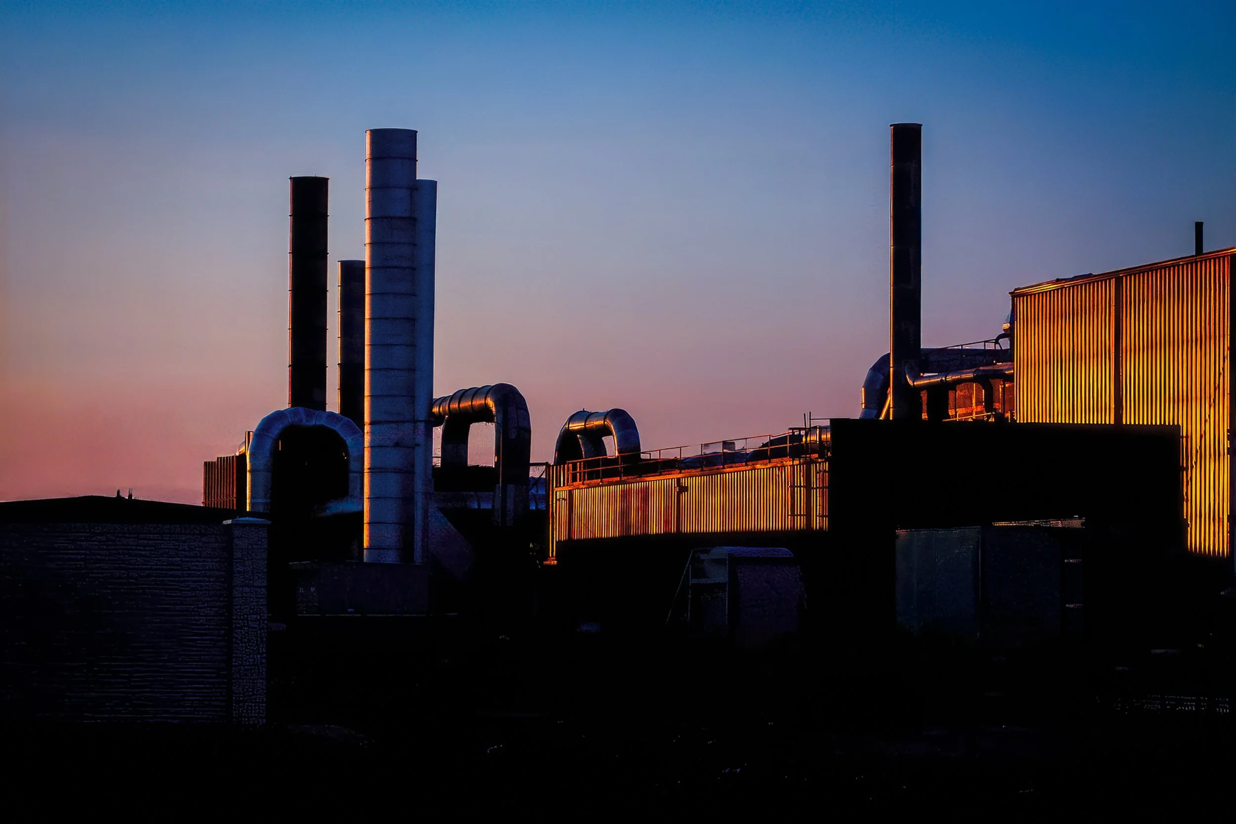
Pipes, stacks, and corrugated siding resolve into pure graphic silhouette against a gradient sky — cool blue-violet fading through mauve into warm amber at the horizon. Nothing here is staged; this is the ordinary architecture of industry, caught at the one moment of the day when it stops looking utilitarian and starts looking sculptural.
The composition builds a rhythmic procession of verticals — two tall smokestacks anchoring the left, a third standing apart on the right — connected by the looping curves of exposed piping. The single break in the silhouette is a corrugated metal wall on the right edge, still catching the last direct light of the day in a warm gold that the rest of the structure has already surrendered to shadow. That one lit panel is doing the real work in the frame: it's proof the sun hasn't fully set, a held breath before the whole scene goes dark.
This is industrial architecture treated as graphic study rather than documentation — form and silhouette over detail, in the tradition of industrial landscape photography that finds structure and rhythm in utilitarian design.
Design & Styling
The strong graphic silhouette and warm-to-cool gradient make this a natural fit for modern, minimalist interiors — lofts, offices, and industrial-style residential spaces where exposed brick, steel, and concrete are already part of the palette. It reads well in a large format in an open living space or office reception area, where its clean geometry holds up at a distance while the corrugated highlight rewards a closer look.
Curated Pairings
For industrial continuity — Steel Echoes, another study in industrial architecture and structural rhythm.
For industrial landscape mood — Before the Storm Breaks,sharing this piece's interest in industrial form against a dramatic sky.
For dusk and color continuity — Counting the Violet Hour, another twilight piece built on a similar cool-to-warm gradient.
For dusk and color continuity — Counting the Violet Hour, another twilight piece built on a similar cool-to-warm gradient.
For the same golden-hour industrial light: Pair with Between the Stacks, which finds the same precise alignment between structure and setting sun, on working equipment rather than architecture.
Fine Art Presentation
Given the strong silhouette and clean gradient, this piece is especially well suited to ChromaLuxe® Metal (gloss, semi-gloss, or matte) print, which will hold deep, clean blacks and intensify the gold highlight without introducing texture the image doesn't need. An archival paper print is also available for a softer, more matte presentation. Framed and unframed options available on request.
Note: Custom and oversized photographic prints are available. Please contact the studio directly to discuss custom framing, matting, or specialized museum glass options.
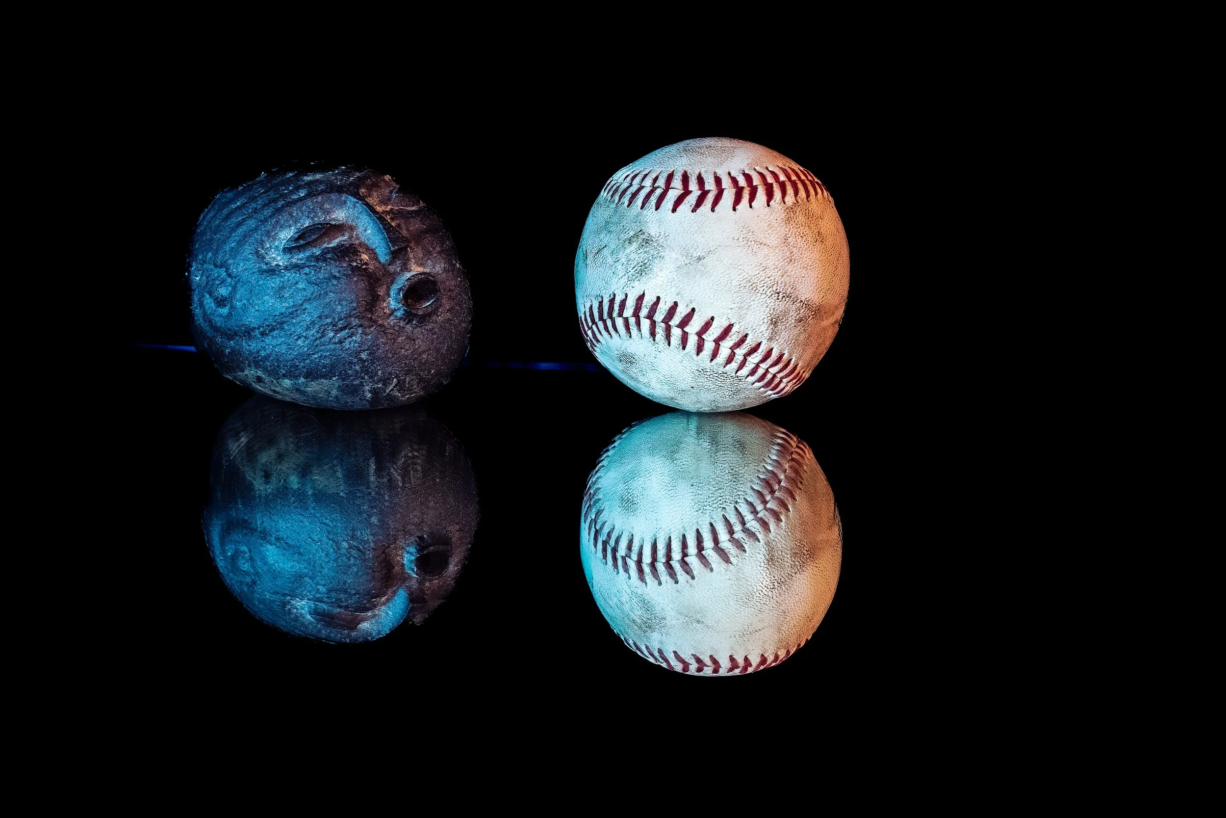
Blowing Foul is a playful photographic still life built around one of baseball's most familiar gestures—the almost irresistible urge to help a ball cross the foul line with a little extra breath.
A weathered carved stone faces a worn baseball across a field of black. The stone's open mouth appears to blow toward the ball, transforming two unrelated objects into characters in a small visual story. Their reflections extend the scene below, creating a second, quieter version of the encounter while preserving the physical character of the reflective surface.
Color gives the photograph another layer of visual play. Cool blue light defines the carved stone and one side of the baseball, while warm amber light enters from the opposite direction. The opposing colors reinforce the relationship between the objects: stone and ball, cool and warm, imagination and reality.
For baseball fans, the gesture recalls the wonderfully human spectacle of a player attempting to persuade a slowly rolling ball to go foul. Yet the photograph does not depend entirely on knowing the reference. At its simplest, Blowing Foul is a visual joke—a stone apparently trying to influence the fate of a baseball with nothing more than an imaginary breath.
Design & Styling
The black field lets the stone face and the baseball read as a single joke, which makes Blowing Foul a good fit for sports bars, dens, game rooms, offices, and any baseball household. It works as a standalone statement, and it sits well beside more serious pieces.
Curated Pairings
To build a wall around objects, gesture, and quiet humor, consider these companion pieces:
For the black-and-white edition: Pair with Blowing Foul, the same still life in monochrome, a study in two readings of one joke.
For deadpan humor: Complement with No Parking, two barn swallows unbothered on a No Parking sign, another photograph whose joke depends on recognition.
For baseball and affection: Pair with Love Across the Aisle, rival fans with their heads together, the warm side of baseball.
Fine Art Presentation
Available as an open edition print (unsigned and unnumbered) on ChromaLuxe® Metal (gloss, semi-gloss, or matte), Glossy Anti-Glare Acrylic (TruLife), canvas, wood, and archival paper (framed or unframed). Framed archival paper suits the deep black and the tactile detail of the stone and baseball, and ChromaLuxe® Metal gives a sharper, more graphic read.
Note: This is an open edition print, unsigned and unnumbered, available in the sizes and materials listed above.

Drifting Reflection is a still, unhurried study of a mallard hen at rest on calm water, her mirrored reflection settling beneath her like a second, quieter version of the same moment. Light catches the intricate scalloping of her feathers, layers of brown, buff, and cream edged in soft white, while the surrounding water holds a cooler slate-blue and violet calm.
The composition favors restraint over drama, and it is cropped close. She enters from the left edge with her head turned in profile, the bill just meeting the border, and her body carries off the right side, so the picture reads as a portion of a moment rather than a whole. Above her, faint ripples streak across the water; around her breast, small rings spread outward, the only motion in an otherwise still frame. Below, the reflection softens and elongates her into an olive-gold wash, closer to watercolor than mirror, with a hint of warm orange at the edge. A flash of blue on her wing, the speculum, adds one small, jewel-like accent.
This piece continues a quieter thread in the collection: subjects observed rather than staged, water treated as both setting and subject, and a palette that stays warm without tipping into saturation. It rewards a slower look: the feather detail, the dark, glossy eye, and the gentle shift in color between bird and reflection all ask for a moment of stillness from the viewer, too.
Design & Styling
With its calm palette and restrained subject, Drifting Reflection is especially well suited to senior living and healthcare environments, wellness centers, spas, and residential spaces seeking a grounding, nature-forward presence without visual noise. It also works well as a smaller accent piece in offices and waiting rooms where a moment of calm is welcome.
Curated Pairings
To build a cohesive water-themed grouping, consider these companion pieces from the Reflections & Water collection:
For subject harmony: Pair with Where the Water Rests, another study of a waterfowl subject at rest on still water, extending the quiet, observational tone.
For tonal contrast: Complement with Stillness After Rain, trading the warm feather palette for a cooler, post-storm reflection on stone and water.
For a signature anchor: Pair with Enduring Silence, bringing a larger-scale, exhibition-proven still-water piece into the same wall grouping.
Fine Art Presentation
Available as an open edition print (unsigned and unnumbered) on ChromaLuxe® Metal (gloss, semi-gloss, or matte), Glossy Anti-Glare Acrylic (TruLife), canvas, wood, and archival paper (framed or unframed). ChromaLuxe® Metal is the recommended presentation: it gives the richest color depth in the feather detail. Acrylic adds extra luminosity to the reflected light in the water.
Note: This is an open edition print, unsigned and unnumbered, available in the sizes and materials listed above.

Slow Steps, Italy captures a quiet, candid moment — an elderly man in a hat, cane in hand, walking through a shaded garden as dappled sunlight breaks through the trees ahead of him. There's an unhurried, timeless quality to the scene, the kind of moment that could belong to almost any decade.
The soft, layered greens of the garden and the warm patch of light drawing the eye forward give the image a gentle narrative pull — a small, human moment set against the quiet backdrop of an Italian afternoon.
Design & Styling
With its warm, documentary charm, Slow Steps, Italy suits casual living spaces, reading nooks, and travel-themed interiors looking for a quiet, nostalgic accent piece.
Curated Pairings
To create a cohesive gallery wall, consider these companion pieces:
For quiet European travel: Pair with A Walk Beside the River, extending the theme of unhurried movement through a European setting. (Limited edition — a different pricing tier than this open edition print.)
For human presence abroad: Complement with Passing Through Prague, another candid, observational moment of a figure in a European city. (Limited edition — a different pricing tier than this open edition print.)
For quiet passage: Pair with Under the Crossing — Prague, extending the theme of a solitary figure moving through a historic European space. (Limited edition — a different pricing tier than this open edition print.)
Fine Art Presentation
Available as an open edition print in ChromaLuxe® Metal (gloss, semi-gloss, or matte), acrylic, wood, canvas, framed canvas, archival Luster paper, and framed Luster paper. Open edition prints are unsigned and not individually numbered, keeping them accessible without sacrificing print quality — the same care and craftsmanship that goes into every limited edition piece, sized for a shelf, a desk, or a first step into collecting original photography.
Note: Custom and oversized photographic prints are available. Please contact the studio directly to discuss custom framing, matting, or specialized museum glass options.

Crimson Bloom is a close, saturated study of two sea nettle jellyfish, their coral-red bells overlapping in the frame as they drift against a deep, glowing violet backdrop. Thin, dark tentacles trail and curl above the bells like ink strokes across the water, tracing loose, calligraphic lines through the saturated color field.
The composition leans fully into color as its subject: the warm red-orange of the bells sits in direct complementary contrast against the cool violet-blue water, giving the image a bold, almost abstract quality rather than a straightforward wildlife record. A soft glow of amber light pools at the center of the nearer bell, adding a sense of internal luminosity to the translucent form.
This is a departure from quieter, more restrained work — a vivid, immersive color piece built for spaces that want something striking and alive rather than contemplative.
Design & Styling
With its bold, saturated palette, Crimson Bloom works well in family rooms, casual living spaces, coastal or ocean-themed interiors, and any setting looking for a vivid, eye-catching accent piece. Its strong color contrast also suits aquariums, marine-themed retail, and hospitality spaces built around a lively, vibrant mood.
Curated Pairings
To create a cohesive gallery wall, consider these companion pieces:
For the jellyfish pairing: Pair with Drifting Silence, extending the underwater jellyfish study in a quieter tonal register. (Limited edition — a different pricing tier than this open edition print.)
For cooler contrast: Complement with Deep Drift, a blue jellyfish study that pairs naturally with this piece's warm coral tones. (Limited edition — a different pricing tier than this open edition print.)
For a playful color echo: Pair with Guardian of the Bloom, a macro study that shares this piece's name and its bold, saturated color sensibility. (Limited edition — a different pricing tier than this open edition print.)
Fine Art Presentation
Available as an open edition print in ChromaLuxe® Metal (gloss, semi-gloss, or matte), acrylic, wood, canvas, framed canvas, archival Luster paper, and framed Luster paper. Open edition prints are unsigned and not individually numbered, keeping them accessible without sacrificing print quality — the same care and craftsmanship that goes into every limited edition piece, sized for a shelf, a desk, or a first step into collecting original photography.
Note: Custom and oversized photographic prints are available. Please contact the studio directly to discuss custom framing, matting, or specialized museum glass options.
Before the Move captures a quiet moment of tension on a chessboard — two opposing sets of carved figures facing off across the wooden squares, one dark and richly detailed, the other cast in warm gold. Shallow depth of field brings a single dark piece into sharp focus in the foreground, its ornate carving catching the light, while the ranks behind soften into a warm, glowing blur.
Shot in available window light, the image leans into warm tones and quiet stillness — less a document of a game in progress than a study of anticipation, two sides poised before the next move.
Design & Styling
With its warm palette and quiet, contemplative mood, Before the Move suits studies, libraries, game rooms, and any space that appreciates a still, thoughtful accent piece. Given St. Louis's strong chess culture and the World Chess Hall of Fame's presence in the region, this piece has natural appeal for local collectors and chess enthusiasts.
Curated Pairings
To create a cohesive gallery wall, consider these companion pieces:
For still life kinship: Pair with Still Life for Grandmother, extending the study of quiet, carefully arranged objects and warm light. (Limited edition — a different pricing tier than this open edition print.)
For narrative warmth: Complement with The Bartender's Measure (Noir), another interior scene built on warm light and quiet tension. (Limited edition — a different pricing tier than this open edition print.)
For contemplative mood: Pair with Quiet Industry, extending the theme of stillness and quiet focus into a landscape setting. (Limited edition — a different pricing tier than this open edition print.)
Fine Art Presentation
Available as an open edition print in ChromaLuxe® Metal (gloss, semi-gloss, or matte), acrylic, wood, canvas, framed canvas, archival Luster paper, and framed Luster paper. Open edition prints are unsigned and not individually numbered, keeping them accessible without sacrificing print quality — the same care and craftsmanship that goes into every limited edition piece, sized for a shelf, a desk, or a first step into collecting original photography.
Note: Custom and oversized photographic prints are available. Please contact the studio directly to discuss custom framing, matting, or specialized museum glass options.
Mural/Grafitti
Filters
No results found
No results match your search. Try removing a few filters.
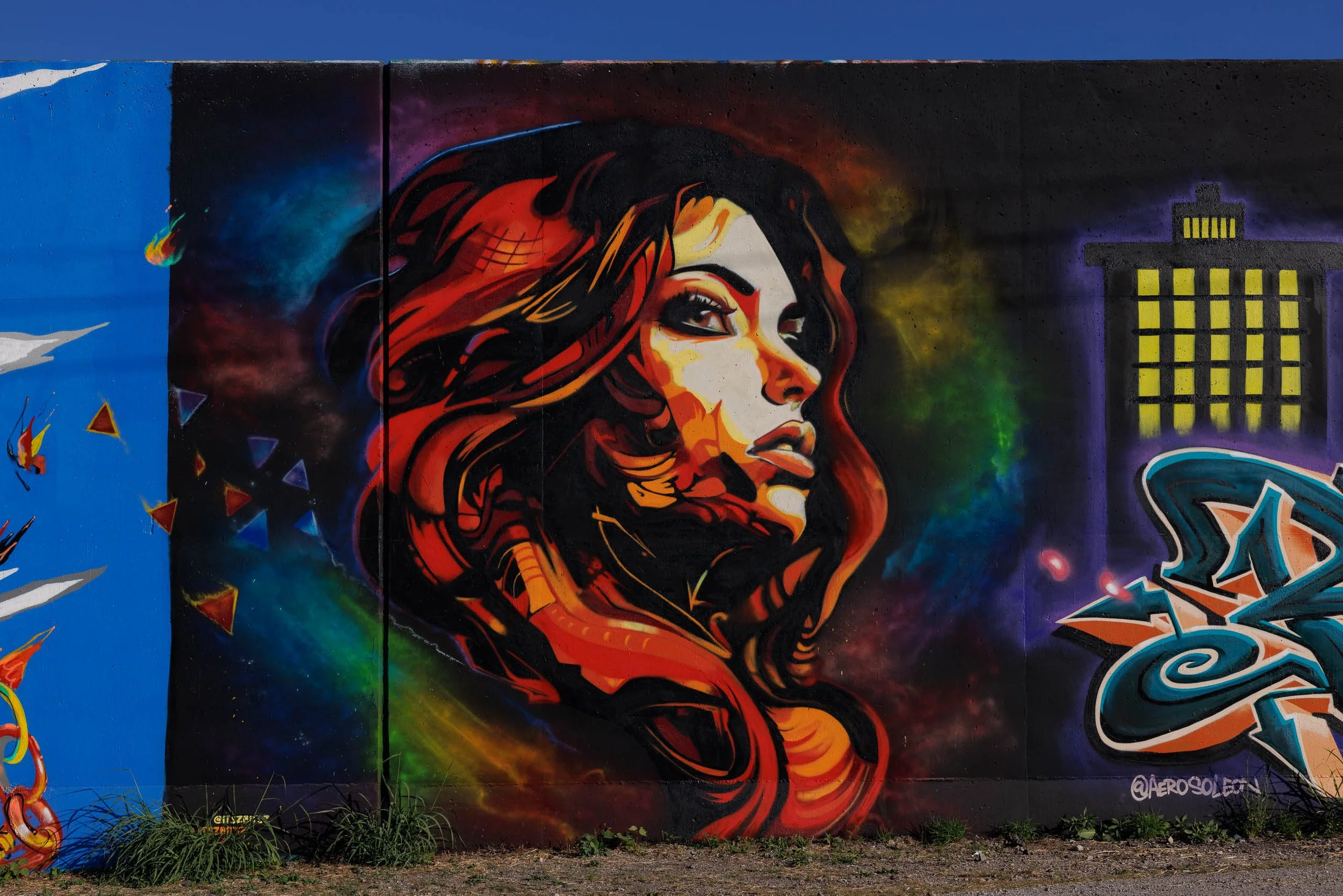
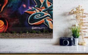
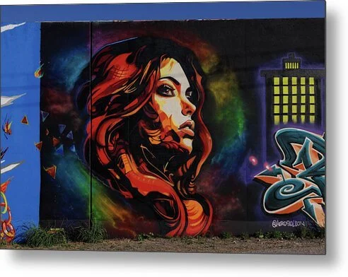
A face turned toward light is its own kind of weather. Ember Profile finds a woman in three-quarter profile on a black wall in St. Louis, her hair painted as flowing ribbons of red and orange and her skin built from planes of cream and amber, with a haze of green, violet, and orange glowing behind her. At right, a grid of yellow windows lights a dark tower. A strip of cobalt-blue wall at left, scattered with small triangular shards, gives the dark panel a bright edge.
The eye lands first on her eye and the sharp line of the brow, follows the nose to the lips, and then rides the hair's ribbon of red down and out of the frame. The glowing yellow windows at right counterbalance the head, and the blue strip at left stops the eye from leaving. The black ground does the rest, so every highlight reads as emitted light.
This is Ernst Haas territory, saturated color as the whole subject, with Saul Leiter's feeling for bright color held inside a strict geometric frame.
Design & Styling
Ember Profile suits salons and spas, boutique hotel lounges, restaurants and bars, creative offices, and apartments that want a single glowing figure to anchor a dark or neutral wall. The saturated palette and strong gaze make it a statement piece rather than a calming one.
Curated Pairings
To build a wall around this piece, consider these companion pieces:
For the same composition: Pair with Kali - Grace in Profile, another profile portrait at the Saint Louis Zoo, the same side-on pose and quiet dignity in a very different subject.
For the figure and the portrait: Pair with Where She Paused, a woman pausing beside a sculpted marble bust, the same conversation between a living figure and a portrait of one.
For the same palette: Pair with Held Court, a tawny mane in loose, individual strands against deep shadow, the same warm tones set against black.
Fine Art Presentation
Available as an open edition print, unsigned and unnumbered, in ChromaLuxe® Metal (gloss, semi-gloss, or matte), Glossy Anti-Glare Acrylic (TruLife), canvas, wood, and archival paper (framed or unframed). Glossy Anti-Glare Acrylic (TruLife) is the recommended presentation: the glow of the hair and skin against the black wall reads as luminous depth behind acrylic. ChromaLuxe® Metal (gloss) is the alternative for a crisper, more graphic finish, and framed archival paper suits a quieter setting.